Park / The Screameasy
-
 30-June 24
- Views 9,436
- Downloads 306
- Fans 7
- Comments 38
-

-
 93.50%(required: 70%)
 Gold
Gold

RobDedede 100% yes Turtle 100% yes Cocoa 95% no J K 95% no Liampie 95% no wheres_walto 95% yes Xtreme97 95% no G Force 90% no pants 90% yes posix 90% no RWE 90% no Scoop 90% yes 93.50% 41.67% -
 Description
Eighteenth amendment passed: After one year from the ratification of this article, the manufacture, sale, or operation of rides and associated machinery for amusement within, the importation thereof into, or the exportation thereof from the United States and all its territories is hereby prohibited.
-
7 fans
 Fans of this park
-
 Full-Size Map
-
 Download Park
306
-
 Objects
1
-
 Tags
Tags
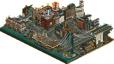
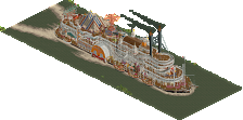
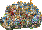
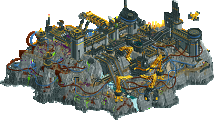
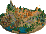
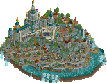
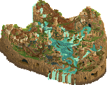
Arctic Top Guns chasing the sky against a busy period correct US cityscape. R4 is upon us, and things get serious.
Welcome to Base-X: Elon Musk watched a bit to much Top Gun so he decided to make this interactive experience!
concluded
Eighteenth amendment passed: After one year from the ratification of this article, the manufacture, sale, or operation of rides and associated machinery for amusement within, the importation thereof into, or the exportation thereof from the United States and all its territories is hereby prohibited.
Voting rules- The poll will stay open for ~72hrs.
- Do not vote unless you have viewed both parks in-game.
- Everyone may vote except members of either team. Any illegitimate votes will be ignored or removed.
- Anyone with an account that predates the start of H2HX, or who has been drafted onto a team, may vote in this
match. Anyone with a newer account must pass the admins' account integrity checks.
- Voting is monitored by the admins to improve fairness.
Note: in the readme for the Canes park it says a menu will appear. This is not the case. The plugin will run without a menu.
And before people ask. The tools to manage the animations generated by the plugin will be developed tomorrow.
full reviews to come eventually of course. but @jazzcats: 100 no notes holy crap
Sorry to say but this was the easiest vote of the contest so far.
Everything about the Canes park felt unfinished to me. The opening sequence was hard to follow and I despise the crash pop-up windows stopping the music. I don't get any immersion from the effect, I mostly just want it to stop. The plug-in not executing what it suggests it's supposed to do is a tough look. I thought the base was undercooked and lacked density. Some of the CTRs are cool. Better luck next round.
It's pretty obvious that the Jazzcats park is top tier work. Very cool concept, incredible sign work, stunning architecture, awesome layering makes this so fun to explore. This is easily the top park of the contest so far and I don't think it's even close. Great job builders
The Jazzcats park is definitely my favorutie H2H park of all time. I don't think something has made me so impressed since Sea of Sagas. The architecture, vintage sign work and the underground/layer work is all so fantastic. 100/100
I'll post my reviews of both parks later on, but I genuinely feel Screameasy can be the first H2H park to win Spotlight. Great job guys!
Not sure what more to say than this feels like perfection. Wow.
Screameasy is probably my favorite park I've ever opened in this game. The theme and execution are outstanding, with incredible detail that is simply mind-blowing. It's truly a masterpiece!
I think I made the right choice betting on a 90%+ park this H2H. WOW Jazzcats, absolutely unreal on all fronts. Canes had a great little park with a fun concept and a cool intro sequence, but my god.
There is so much content in screameasy its going to take me a couple times opening it to digest everything, utterly astounding.
Base X it was a novel idea, fun execution with the missiles. Felt a bit rushed but its no fault of its own being involved in this matchup.
Wow.
Great park Jazzcats. I've viewed it a few times but I still don't feel I've seen everything yet, there is so much to discover.
Base X, fun concept, the ice falling, pumps moving, the new CTRs created were great, amazing surge of music at the start but was then interrupted by so many explosions Awesome concept though that I think you guys can still be proud of considering you've faced park of the competition.
Episode 4, Part 1: gamma is flabbergasted, again
I'm still trying to keep these relatively short, but goddamn. This is likely the strangest matchup we've had so far, and there's so much that could be talked about here. In any case, I'll stick to talking about the parks:
Base X
Look, I'm not gonna rub salt into the wound. I think it's more sensible (and worthwhile) to talk about the cool things this park has, and that's exactly what I'm gonna do.
First off, I respect the commitment to recreating the entire cinematic sequence from Top Gun Maverick(?). It's a really cool idea, and the new CTRs (and the music!) elevate the immersion factor. The landscaping is really nice too, smart idea to use Tolsimir rocks for the canyons and Fisch rocks for the snowy/icy parts. The coaster, while a bit boxy, still has some great moments and elements, and I do appreciate you going for a coaster type we haven't seen in this contest yet. Finally, while I'm not entirely sure if it was worth the effort, the little plugin-aided animated effects sprinkled throughout the park add that extra movement and charm, which is always nice to see.
Overall, this is a park where I can definitely see the ideas on display and its potential. I believe that, with just some more time and resources, this really had the chance of becoming something special. I hope that you guys carry the same enthusiasm and creativity forward to Round 5!
TL;DR: dynamic, experimental, untapped potential.
The Screameasy
Well, shit. Firstly, it's gonna be hard to talk about this park without being able to mention the main builder behind it, but I'll try nonetheless. As everyone above (and probably below) me is saying, yeah, this one is a masterpiece. It truly is one of those H2H parks that make you question how people are able to come up with things like it in the limited time the contest format offers.
I could probably spend hours on end discussing every single detail and stylistic choice that makes the entire park so special, but I'll stick to the big picture here. The concept is genius, and so easy to grasp. It really makes me wonder how no one thought of it before. And of course, the execution is what shines here. It's a perfect mix of cityscape and amusement park, with both aspects genuinely nearing perfection as we know it. So much care was put into preserving sightlines, and using angles and perspective cleverly for the building cutaways. I also wanna bring special attention to all the ads and billboards everywhere. The murals are amazing, and all the signs make me theorize that the Merriweather sign objects were made with this park in mind
I know I probably kept this review shorter than the park actually deserves, but I think the builders know what they were able to achieve here. This one is for the NE history books. Now, if only I could decide between this and V.E.R.B for my personal favorite of H2HX...
TL;DR: detailed, well-composed, special.
Yeah, this is yet another tough matchup to talk about. Now more than ever, I'd just like to say that it's truly hard for me (and probably most people) to think a H2H park is bad. Unless a park is obviously unfinished, they're usually all awesome creations, and those behind them should always be proud of that, especially in the short timeframe that they're created. So, to whom it may concern, please keep your head up!
I decided that I might be more likely to leave reviews if I do it twice. First some short general observations and first reactions, and later an in depth examination... Let's try this approach. This is a terrible match to try it with first, because the outcome is rather obvious. The Jazzcats got this. What a fun concept, and what an excellent execution of it. Puts Gangland to shame, and I fucking love Gangland. The architecture is immaculate, and all the staff scenes and billboards really help to sell the setting. Interiors are also very rich and well composed - in isolation. I say that because some interiors are a bit harder to read in their urban surroundings, mainly the central golden one. I need to focus to make sense of what I'm looking at, what is inside and outside, and what the general geometry is. This is the only significant criticism I have of this park... Base X may be one of the weakest park in H2HX so far, mainly because of the execution which looks quite rushed, and in places outright unfinished. I'm not a huge fan of the coaster layout, but the interactions are fun, for example with the icicles falling as the train passes through. The ideas make up for some of the aesthetic shortcomings. The targets, the vehicles, the tire tracks (cool detail!)... It's a fun map for sure, but unfortunately your chosen soundtrack is a bit too appropriate.
Base X:
Very fun idea, but perhaps the execution wasn't quite there. For example, parts of the base were very cool, like the massive tower near the landscaping archway, as well as the diagonal runway. I do like the opening sequence, but all the pop-up windows were a little distracting. I can't complain too much about that, though, since the same thing happens in Terry and I's Waterloo park. This park is full of cool new CTRs, which is also awesome. I loved the snow crawler in particular. Overall, cool and fun park, 'Canes. You shouldn't feel bad about it at all. There is more to H2H than the competitive side, sometimes. If you were to take the parks that won H2H rounds versus the H2H parks I pull up to stare at while I make a phone call or send an email 2 years later, there's no correlation there, man. I tend to look at the parks I thought were most fun… I have a feeling Base X might be one of them.
The Screameasy:
This park has gotten me thinking about how we view this game. As in, what is perfection? Is it something we are aspiring toward constantly, but never quite achieve? To me, I think there needs to be a functional, achievable state of “perfection.” I don't think perfection should perpetually live outside the realm of possibility, with every damn-good park doomed to score 95%. I think the more reasonable take is to view the maximum-possible score being given to parks that achieve the maximum-possible level of quality, given what has proven to be possible in the community at the time. For me, this park achieves that. I think we should also remember this park was built for a contest, on a deadline. That makes it even more impressive to me. In terms of the spotlight consideration, I think this park does deserve spotlight, for many reasons.
->It is of amazing quality
->It incorporates a unique theme in an extremely clever and organic way
->The rides are superb, and are themed excellently
->The park is oozing with content. I would daresay this park has more content than some spotlights, or at least a similar amount, without feeling totally cramped.
Thus, to me, there is no reason why this park should not be spotlight. It represents the pinnacle of creative excellence our community strives toward. H2H is one of the most bombastic, most popular spectacles NE has to offer. It therefore makes sense to me that we would give the site's highest accolade to the best park for that contest we have seen in seasons. There is a reason the RCT TikTok gravitated first to H2H.
I would also like to suggest something that may prove highly controversial, and is another reason why I believe a H2H park should be able to win a spotlight accolade: that H2H parks and contests are proving to be the bread-and-butter of this community, perhaps more so than solo full-scale parks these days.
Solo full-scale parks are without question still a cornerstone of NE, but the fact is, to me, nothing brings the community together in such a big way as big contests like H2H. There is genuine thrill, excitement, and joy that comes along with them. Why not honor the best creations of those contests with the highest-possible accolade, especially when such an accolade is still highly rare for contest parks and is only even considered for parks with the utmost quality and most/best-integrated content?
I'm open to a discussion, but that's my take!
I have risen from my 80 hour week to say - wow. What a showing with Screameasy. I'll try to get in some more meaningful reviews once work dies down a little bit (as if) - but this park deserves a special shoutout. Amazing work, Jazzcats.
Oh my god?? The Screameasy is such a major feat, I don't even know where to start. The concept is a perfect mix of familiar and innovative, the most delicious type of gimmick. Even being built by a team, I can't even begin to imagine how this can go through all the stages of conception, building, polishing and not take like a year. Do you all just have superhuman levels of creativity or is there some other, more relatable process you follow??
I'll probably be returning for weeks just to take in all the individual peep scenes. I had to give up trying to find them all on my first viewing because I was so overwhelmed by the sheer amount of substance in the map. "I heard there's Sharks in the water" "I heard there are Jets" was a personal fave (New York timelines be damned). Despite the map's mathematical levels of intricacy, there's still so much joy in every piece.
That Woodbine billboard made with 1/8 glass squares blows me away each time I look at it. The discipline that it must take to create something like that, especially when it's such a small piece of the overall puzzle... Christ. You're all true artists in so many ways.
Side note, I'd be curious to hear the justification for having the ~illicit~ parachute tower extend above the roof. It's not a knock from me, if anything it adds to the sense of danger.
The actual layout of the map was maybe a bit convoluted and compositionally the bridge didn't entirely work for me (though the design of it is beautiful). For my money, this is absolutely deserving of a spotlight. If H2H parks are going to be eligible for accolades then surely they're also up for spotlight consideration. So excited to see how that shakes out.
Bravo to the Jazzcats!
Some apologies to Base X for being the victim of comparison, as others have said. I like it as its own standalone map, though I have similar complaints about the window pop-up heavy chase scene and relative lack of substance. The "base" concept has so much mystery to it that I wished there were more cutaway scenes to build out the narrative.
I do really enjoy the massive land arch and mix of Tols and Fisch rocks. Winter parks in RCT will always have a special place in my heart.
Base X
my overall feeling on this park is that it's a great collection of ideas, which are impressive on their own merits, but don't quite contribute to making the park a sum of its parts.
first of all the theme, which i like very much. it's been a while since we've seen a good snow theme, and this one is a really fresh take on it landscape-wise. i really like the snow cascading down the grey rocks, it's a daring aesthetic that i think you've pulled off pretty well. the big land arch is an impressive main feature, but it's a little unpolished in places. there are a lot of nice ideas for the landscape and setting, most of them work well but some feel a little unfinished/unnecessary. the floating ice is an example.. like, i get it, but i just don't think it looks good enough to add that much.
the coaster is cool, some great moments and an interesting layout. orange is a strong choice that i'm not sure i'd have gone with, but i don't hate it. the coaster station being the only building in that green is slightly strange, would maybe have preferred something closer to the blue of the rest of the base.
some highlights for me were the monorail train taking the snowmobile ride over the gap, the tracks in the snow, the curved solar panels in the corner, and the diagonal bridge. overall a good park with an interesting twist on a theme that's hard to make look great, well done.
The Screameasy
could wax lyrical on this park for a while, hope this doesn't drag on. this is probably the best theme i've ever seen in RCT. there may have been better parks due to size, or complete package or whatever. but in terms of a single map, this is probably my favorite ever. it's clever, makes sense without any explanation, and obviously looks amazing. but that doesn't do this justice, because you could give this exact theme idea to anyone else and it wouldn't be nearly this good.
this is one of those themes that isn't just a twist on an existing one, but one of those that feels so natural it's amazing we haven't seen it done before. it also feels like the most "complete" actualization of a concept that i can remember. like i said, i feel like a lot of people could have taken this idea and run with it. but everyone else would have stopped 60% of the way along, or 75%, and it would have been good enough. or even great. but this is perfect. i'd be shocked if this isn't the best park in this whole competition. and the only way i can see it being topped, honestly, is the same builder(s) doing something else. i hope it happens. just on another level right now. like pants said, i just can't imagine the process. from conception, to ideation, to building, refining, polishing... all that in a contest with short deadlines. so impressive.
the scale is also something that not many people are attempting. it's just different from everyone else. it's big. but it doesn't feel big, because the proportions are spot on. each building has so much intricacy, detail, and just LOVE involved, it comes across as so seamless. everywhere you look there is something happening, but also everything feels like it's in the right place.
there's genuinely too much amazing stuff to pick out everything that i love, but a few parts that stick out to me -
- obviously the signage. again, this park would have been great with one or two signs in this style, really standing out - putting in the work to make so many and have them all different... next level. spearmint gum sign and the arrow sign are personal faves, as well as the peanut, squibb and the smoking one. christ.
- the ratrace sign - found the e, and it's the same ride, so when you click it it tells the story. and the people named to give even more backstory.
- stolen lunapark entrance ride vehicles as scenery in the hidden park. up there with best ever object usage.
- sewer rats.
- the dock building arches are outstanding.
- there's litter where there should be litter, there are leaves where there should be leaves, there are wires where there should be wires, pipes where there should be pipes. it's just so true to the concept.
- the bridge. again. remove this massive bridge, it's still a great park. it's genuinely a risky choice to include it, as it'll cover up stuff with it's size and placement. but it sets the park in such a familiar place and time, again just strengthening the theme.
that's the point, really. every single piece of scenery, of which there are MANY, are all contributing to furthering the theme for the viewer. when parks like this get made, winning and losing a contest really doesn't matter at all. this is just such a historic piece of art for this community. thank you for it.
I am not feeling very verbose so I'll just sum it up in a few words.
I like the Hurricanes' park idea better but the Jazzcats blew them out of the water with their execution of the idea.
For the Canes' park I liked the dogfights and the wing coaster but aside from those there wasn't quite enough to hold my interest for a while compared to the Jazzcats park.
I think that the Jazzcats had a bit of an awkward premise with it being much harder to hide a roller coaster than alcohol but this is a very well sold lie. Plenty of scenery to chew on and very ornately composed roller coaster layouts well integrated into the environment.
I respect the talent of both teams but for me the Screameasy is the clear winner.
Base X: Nice leak Canes, you could've hid the fact that Elon Musk was your secret fourteenth player. But seriously...
+ Love the concept and setting. One of those "How has no one made that?" ideas.
+ Timed sequence is really cool. Loved all the aerobatic action and the interactions with the landscape. It almost feels like a modern reimagining of a classic H2H park like Battlefield RCT.
+ Great aesthetic with the modern architecture decorated with orange and blue. Great colors that stand out from the icy expanses.
+ Great new CTRs! Love all the jets and snow vehicles, and the way the missiles have steam effects sells it. I already have an unorthodox design in mind for the stealth bomber-themed wing coaster.
+ The landscaping kicks ass. The huge arch feels a little oversized but I appreciate the drama.
+ Titan Missile Launch is placed and decorated so well.
+ Love the helicopter facade on the building under the rock arch.
= Love the inclusion of a wing coaster as the main layout. Some awkwardness here and there and two stations with one train is a questionable move IMO, but I love how it interacts with the landscape.
- Unfortunately I'm finding a lot of flaws with the dogfight sequence and plugin. All the action is spread around the map so it's hard to follow unless you're fully zoomed out. When you're fully zoomed out, you miss the finer details that the plugin allows for. What I really wish you had done was had the action follow the coaster a la Battlefield RCT to keep the viewer's focus in one place. Additionally, Danger Zone is a great addition (two of them weren't needed though) until the pop-up windows mute it completely. Advanced notice to hold Shift + Backspace like Rob and Terry's GT entry would have been nice. On top of all that, it lags up my game which affects viewing the park after the sequence is over.
- While it may be more accurate this way, I think the snow having virtually no contrast between its shades hampers the aesthetic of the park. One shade darker results in so much more detail. This could have been an easy palette modification that could have gone miles IMO.
- The Elon Musk/SpaceX theme feels tacked on and honestly pretty corny tbh. The park worked really well as a military base in the middle of the Arctic with a cool dogfight sequence, and the SpaceX theme only really goes as far as just naming rides.
- Hate to come across as rude, but is this park unfinished? I'm noticing little gaps here and there, lack of polish in some areas, and a huge glass building with no interior whatsoever. Unfortunate if time got the best of you, as I think some proper polish would have really helped this park compete with many others. Except...
The Screameasy: Je vais shit myself. I think we've found the perfect park.
+ This might be the most detailed park ever made, not just in terms of fidelity but all the little scenes going on. I counted; there are eighty one staff members with quotes in their names. HOW?! I genuinely can't comprehend how you can pack this much into 3600 tiles.
+ My god this idea is so FUN. It's such a simple "X but Y" in theory but it is pushed to its absolute limit here. Beautiful, almost surreal indoor parks hidden inside unassuming city blocks, existing parks burned down in protests, ride manufacturers converting to alcohol distributors, stolen parts from parks hidden in buildings, the list goes on. This is a quintessential H2H park in the way it goes so IN on one concept.
+ Archi is beyond reproach.Detail, shape, texture, accuracy, the whole nine yards.
+ The park with Blind Tiger is a solid gold in its own right. Hell, Blind Tiger's curved station deserves some sort of award because my god.
+ Best signs in the game and it's hardly even close. I genuinely thought the Woodbine sign was a new object, but no. It's goddamn pixel art. That is damn near photorealistic! Again, HOW?!
+ The Art Deco theming behind Whipper Snapper is FLAWLESS. Just in general this is just such flawless execution of one theme. I can't stop yapping about this park.
+ The peeps going through the tunnels on the map edge is a great touch, not just because it brings attitude and life to it but it ties it into the narrative.
+ If I forgot to mention something, it's most likely a positive.
= That bridge is crazy. Love the layered trolley and subway tracks. Just a shame that it kinda blocks one of the views.
- I'm not a staff member with a funny alliterative name. That is my one flaw. Jesus Christ almighty tap dancing on a stick. We've had some amazing parks but I was thinking nothing has exactly shredded my face off yet. Then y'all pull out this bastard and singlehandedly reduce me to atoms. If this gets 90%+ and Spotlight then I don't even care because the builders 3000% deserve it. Bitch all y'all want about how NE is dead because of that. Top 1 H2HX park and top 3 park at least in any Head-2-Head. Again, WOW Jazzcats. I can't say enough good about this park and y'all deserve this huge win.