Park / Bugs and Bots
-
 14-June 24
- Views 7,872
- Downloads 228
- Fans 2
- Comments 32
-

-
 82.50%(required: 70%)
 Gold
Gold

ottersalad 95% no RobDedede 90% no G Force 85% no Milo 85% no RWE 85% no CoasterCreator9 80% no Mulpje 80% no Recurious 80% no Scoop 80% no Terry Inferno 80% no Turtle 80% no pants 75% no 82.50% 0.00% -
 Description
Before there were Bots, there were Bugs… and now there’s Bugs & Bots. ENLIST TODAY
-
2 fans
 Fans of this park
-
 Full-Size Map
-
 Download Park
228
-
 Objects
1
-
 Tags
Tags
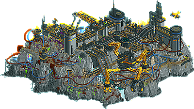
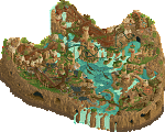

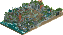
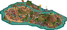
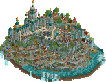

Futuristic and loud military apocalypse against a large millenial museum-mall complex. This match requires more than one viewing.
Before there were Bots, there were Bugs… and now there’s Bugs & Bots. ENLIST TODAY
concluded
Welcome to Millennium Discovery Museum! Explore the wonders of Science, History and the Arts within our four levels of interactive exhibits.
Voting rules- The poll will stay open for ~72hrs.
- Do not vote unless you have viewed both parks in-game.
- Everyone may vote except members of either team. Any illegitimate votes will be ignored or removed.
- Anyone with an account that predates the start of H2HX, or who has been drafted onto a team, may vote in this
match. Anyone with a newer account must pass the admins' account integrity checks.
- Voting is monitored by the admins to improve fairness.
Thank you for your non-contribution
i've been having a blast exploring these! they both score very high on the fun-factor scale with tons of little details to discover. the huge mech in Bugs and Bots is probably up there with the coolest RCT set-pieces i've ever seen. i love how the mechs are in animated positions, makes them a lot more interesting to look at. my favourite details are probably the ant farm and the forklift fight scene, so good. overall i really love the parks' aesthetic, it feels very intentional and fresh. discovery museum is great all the same; there's a lot more to it than meets the eye at first. aside from the detailed and lively museum exhibits i think my favourite thing about this entry is all the structural details. i'm often not really sold by exploring a park with cutaway view, but in this park its really fun to use because you can move up and down to dissect how all the floors and supports fit together from a technical standpoint which is great! it reminds me of it was done in Tokyo Dome but this feels even more elaborate, really sells the whole park for me.

definitely going to use the three day window here to make sure i've seen everything that went into these parks. great match guys
Museum has some really cool tricks and ideas and will probably be a map I go back and try to discover all the details in many times. The switch track is obviously one of the best details and works flawlessly, so that was super impressive. Bugs and Bots has such a fresh feeling style and really is a creative approach to the game, something we haven't seen before. It really functions pretty flawlessly and has tons of atmosphere.
Ended up going with Bugs and Bots, it was a real hard choice but to me just feel a bit more technically proficient and creative.
Didn't want to but still null voted. Both parks had so much merit.
LHC full of effort and set piece mania. Modern meta H2H park trying to muscle a storyline into you with most everything being animated. Lots of impressive design choices, and then sometimes still a "park"? This was perhaps the only thing that held it back for me: the artistic direction could've been clearer. Overall a very impressive park.
HC felt retro in a good way. Initially a bit awkward and grey, but as you keep looking you discover strokes of genius over and over. I'm not a fan of cutaway, but this was one of the more pleasant ones. I loved how you played with the slightly dorky mall/expo theme and played it against itself in a way, while combining lots of technical prowess to enhance ride design, rendered in a retro style. It was refreshing and unexpectedly engaging to look at.
Loved both parks.
Overall impressions:
HC: Upon first look this park may look a little bit simple/bland. However, when you start to closely scrutinise everything you can see the genius in this park. I loved all the little details and the cool custom rides. Some favourites: the zipline, the rooftop walk, the paper airplane competition, the rc cars. I also thought the coaster layout was very well done. The switch track trick was amazing. My only complaint is that I thought the second half was maybe a bit fast pacing wise. This park had just so many fun moments everywhere, it was really fun to explore. Initially I thought it was going to be an easy choice, but this park really grew on me and it made the choice really hard for me.
LHC: The style of this park is closer to the modern meta. Overall this park is just really well done. I love the coaster layouts although especially near the end its maybe a bit hard to follow in places. The big mech structures were really well done and overall this park also had many clever ideas. My favourite area was the area near the splash boats ride, where you have so many things going on on multiple layers with the splash boat, the inverted coaster and the rotating flat ride.
In the end I decided to go for the LHC because I thought the overall aesthetics of the park were just a bit better, but it was very close for me and I almost null voted.
Bugs and Bots
The verticality is great, as it allows for a lot of interaction between different parts and pieces. Consistent color choices throughout make it really cohesive. And of course, the entire four-legged mech made out of spaceships? Insanity. I wouldn't have the patience for that shit. I think my favorite part is probably all the infrastructure, particularly some of the truss structures around the map. Always enjoyed these things in RCT for whatever reason. I think this map is probably the “better” than the map its opposing, but maybe a bit less on the exploration and fun factor than its opponent. Nice job with the map LHC!
MDM
I’ll be honest, when I first opened this map my reaction was “H2H7 called and it wants its park back.” While I still think that’s true in that the areas of the map seem a little underdetailed compared to our current meta, it does somewhat fit the theme. It’s also been a while since we’ve seen a map with only a little crunch, and it feels somewhat refreshing here. The place where this map really shines is in the interior details. You did a fantastic job modeling this type of interactive museum with the exhibits, and an even better job working RCT rides into them. The swing launch/switch track is cool, and the coaster self-dueling is great. I do think the layout seems a bit forced into the map in order to get these details to work (things like the super shape turn around the tower and the corkscrew directly into a 180-degree turn at the end), but overall, it’s not bad. I had a lot of fun exploring this map HC!
I’m still deciding on who to vote for, as I see these parks pretty evenly matched for completely different reasons.
Bugs and Bots
I don't know if it's been said before, or maybe I'm wrong, but there's a big Starship Troopers vibe here! First of all, those mechanical legs... fantastic! A super immersive park, I loved the sound effects, the music, the voices, all those movements, it's addictive. I really enjoyed exploring your park, there are so many things to see and great little scenes (like the turretbot, the shooting range etc etc), it makes the park incredibly lively and fun to explore. I really like the way you've brought some life into the caves to break up the monotony, and the splash boats are really cool here! On the negative side: I'm not a big fan of the cliff work, it's a bit rough and grey, but I like the hollowed-out effect and the quarry look of the right. My other negative point is the architecture: it's a bit massive, lacking in some detail imo and giving a rather monotonous and dull effect overall. On the other hand, I really like this gray and yellow color scheme, which provides a nice contrast!
MDM
A Futuroscope extension?
Well, I'll be honest, I'm not a big fan of this exterior building, it looks a bit dated and seems to lack detail. I would have imagined something in the Richard Rogers style with pipes that pop out (a bit like the Georges Pompidou center in Paris). Inside, though, it's great! There's so much to look at! The planetarium is a great idea, and the solar system is really cool. In fact, I think this level is my favorite, and perhaps the one I understood the most in a way. The science corner is really nice too but a little more complicated to understand visually, Momentum is great, I love the way it interacts with the building, it reminds me of Objectif Mars at Futuroscope haha. I also really liked the first floor, especially the hall with the planes and the pixel art, it's incredible! Overall, there's a cool retro vibe to this park, a little break in this meta filled with new objets, my only negative point as I said is the exterior design, but the interior is really cool and strong !
Bugs and Bots:
+ I think this is my new favorite park of the contest. This park is so FUN! What a fun map, I genuinely can't think of a better way to describe it. The Starship Troopers influence is so obvious.
+ Mechs everywhere and not a single miss. Such creative use of existing CTRs and they're all so convincing. The gigantic four-legged mech is one of the coolest things I have ever seen in this game. I'm overwhelmed thinking about how much time it must have taken to set up all that train-itecture.
+ Love the bugs adding movement everywhere. The ants clipping into the Droomvlucht eagles to create flying wasps is such a smart move.
+ For Great Justice/Truth are RIDICULOUS, as are the supporting ride. Excavator Blade is FLAWLESS.
+ The sound design blew my head off on first listen. The sudden barrage of laser guns and yelling soldiers instantly nails the atmosphere. Speaking of which, THE VOICE ACTING! I'm so Joshpilled with our free and easy-to-use AI voices that I've been sleeping on the simple pleasure of doing funny voices with your buds. Hex Schwarzenegger and nin(?) filling up the bug hole sent me. Makes me miss voice chat with the homies.
+ I'd pretty much need to write an entire sub-review for all the fun little details in this park. Special mention goes to the crane repeatedly squishing the bug and the forklift fight.
+ Great use of color. The map is very gray but the yellow, bright green, and purple do enough to break the monotony. I don't feel like brown or red rocks would have had the same effect; gray just really amplifies those other colors. It works very well on both a macro and a micro scale, except...
- Making the buildings mostly gray as well wasn't a wise choice IMO. I experimented with coloring the buildings beige and it makes a world of difference on the macro level. It's enough to differentiate the buildings from the rocks but subtle enough to not take away from the vibrant purples and greens.
- Splash Boats had some awkward pacing near the end. Also the name is a little weak IMO.
Millennium Discovery Museum:
+ Super clean and stylish exterior. Love the curvy forms and the sculptures throughout.
+ OK anyway the interior. Wow. So good. Execution is near flawless, so clean and understandable yet so detailed too. Shoutout to the TED Talk stage, The Alexander Experience, and the flight museum with the pixel art.
+ The coolest part of this park is not something you experience ingame. Y'all made a website?! What a way to immerse us in this museum. Such a cool idea, wow.
+ Momentum is an insane layout. Y'all popped off on the Intamins. The backwards duel and functioning transfer track are ridiculous.
+ CTRs pull so much weight on this map. The RC cars, the tiny peeps in the play area, the diagonal elevators, the solar panels, I can go on. I can see a lot of these getting use down the road.
+ TERRY BANGER!!!!!!! The custom audio for the kids jumping on the giant piano is great too.
= This is a really sad vote because I really can't find any huge flaws with this map. Maybe some of the paths get a little repetitive? It's just an instance where I like one map more than the other, and unfortunately Bugs & Bots thoroughly has my heart.
obligatory "these parks are so evenly matched, voting is very hard". it's true, but that does seem the case almost every match.
if i'm being completely honest, neither of these themes are particularly favorites of mine, but both do a very commendable job of accomplishing what they set out to do. i can appreciate the skill and lots of the maps for the high level and great ideas throughout.
Bugs and Bots
this is a fun map, like i said personally not what i enjoy that much, but definitely a ton to see / find / enjoy. imposing set pieces, the scale of which is particularly impressive. i always find it hard to mix massive stuff like the big yellow walker with smaller scale scenes and theming, and you do a really good job here. the yellow walkers are up there with the coolest visuals this contest. absolutely spot on, perfect, no notes.
the other thing this park does really well, which takes a lot of work, is movement. it would be impressive to see this map alone, with what's there, but with static turrets / bugs etc. but you've put the work in to make them move which adds a ton of life to what's going on. little stories and scenes everywhere highlighted by these moving rides as scenery, and i know how much work that is.
personal highlights were the big walker obviously, the starship troopers meme poster, the moving turrets, and the round spinning ride, really nicely put together.
Millenium Discovery Museum
i think this one was overall more my taste, but suffered sliiiiightly from some weaker areas. the main thing i couldn't get past was the color scheme, it felt kinda childish. i think if you change the primary colors to a sleeker, more modern palette then you end up with a really sophisticated scientific theme, which personally would have resonated more. but there's so much to see and explore that i can't hold that against it too much.
gotta start with the coaster, which fit perfectly. the working moving track was an incredible idea, very well executed. but didn't feel like a gimmick, as the rest of the coaster was brilliant and could stand alone on merit. the other rides were pretty nice, but a special shoutout to the functional auditoriums. had to dig in and see exactly what was going on there, great stuff.
completely built out interiors on a whole map this scale is something incredible, and there are tons of small things to find, which works well with the theme. personal favorite parts - pendulum pre-launch show, the planets, tiny go karts, the roof structure of each level as you cut away. very impressive.
overall a tough matchup with both maps having cool enough stuff to get the vote. i think the science museum had more stuff to find, and probably more good ideas, but i find myself wanting to vote for what i think the coolest part of both maps was, which is the massive yellow walker. good job all.
I'm glad to hear some people liked the way I was reviewing the parks, and to help make up my mind, plus I think these parks deserve more reviews, I decided to bring back the way I did the reviews
Bugs and Bots by The Lonely Hearts Club
-Concept: ***
Very unique concept, really clever use of structure design and ctr to elevate the concept to another level.
-Content: ***
The way the macro was set up, allowed for great opportunities in terms of content creation, and with the turning of the view another dose of content was discovered.
-Quality: **
Very solid quality throughout the piece, although some color and object choices were a bit questionable for me, in an aesthetic point of view.
Overall;
The atmosphere when opening the park, with all the pumping warhammer music and custom sound design was great. Really set that dark and war-like mood. The immense mech created with trackitecture immediately stood out and was a great kind of 'weenie' of the park. I can't imagine how much time, frustration and dedication it must've taken to get all the ride vehicles in the correct x/y/z coordinates, but it created an awesome and memorable visual for sure! All the other custom created mechs, drills, turbines and spinning blades were very well constructed as well.
The Fisch rock work was of a very high quality throughout and especially the gradienting on them stood out in a positive way. Loved how you've used those 1-view Fisch Rock Crack objects to create that dripping kinda acid along the rock formation, and the various subtly placed bushes.
All the battle scenes were another highlight, and for some obscure reason I loved seeing those spiders crawl up to the top level and then being massacred by the turret
Speaking of those spiders, some color choices like the purple, stood out a bit too much, maybe a darker shade suited better. Also wasn't a fan of those light road lines on the top level paths, I was thinking I had underground view on somehow, and those sandy curved grass trims didn't do the aesthetic any good I felt. You get I'm nitpicking here, because it's just really hard to make up my mind, and have to dig in order to make a choice..
The rides were well crafted and a ton of fun to follow along throughout the map. I loved seeing the coasters duel and dip in and out of the rock formations. On the backside of the park, when you turn views there's a nice cluster of rides, interacting well with each other. Bit of a pity the splash boats run into each other after the big splash, but that's what they sometimes do I guess.. Love the gradienting with the yellow on the water + Fisch rocks, although I wasn't really sure about those yellow pointy Fisch rocks in some spots..
Very nice geometry on the architecture though, and clever use of the Ethan 'marble block with ridge' and Liam suspended coaster support objects, to create more detail. Again not really sure about the color scheme, as I felt it was a bit monotone, but at the same time that suited the concept and theme well.
====================
Millennium Discovery Museum by the Hurricanes
-Concept: ***
Great concept, and loved 'discovering' everything the concept has to offer!
-Content: ***
Every layer of the building(s) offers new and unique content so if you add up everything, there's like 4 times the content of a 'normal' park.
-Quality: **
Some spots felt a bit more polished than others, but overall very nice quality in a kind of retro way.
Overall;
When opening the park I immediately hoped to see a full on cut-away park, and was very glad to find out someone had the balls to do it. It was so much fun to discover all the little things and ideas you guys put into the park, and what I liked most about the park was the sort of 80s/retro kinda vibe I got from it. It's probably a mix of the sound design, old fashion object usage/construction (although there were a ton of new objects and ctr in there) and lack of crunch that created this atmosphere, but I loved it! ). It had a nice layout and pacing and I loved that it duelled with itself. Also loved the little preshow with the peep-editor hacked 'entertainers' and the pendulum: I can totally imagining myself up there enjoying the show! Its queue line and backstage area were also nice to discover.
 ).. Loved the rotating MDM letters though, and those solar panels ctr were top notch!
Another thing that stood out to me immediately was the insane and unique hacks on Momentum: Seeing that panel lift up and then the coaster travelling out of the main building and going over that track switch was just so clever and well done, hats off to whoever figured this out (although seeing who created the 'train-track' ctr I have an idea
Also really appreciated all the murals you guys did throughout all the different floors; it created a bit more modern visuals, but still staying true to that retro vibe the park has. The dino head one has to be my favorite.
The new Xtreme cinder blocks were a clever way of doing the building walls, as when you use the cut-away, the walls still have some nice aesthetic detail with those top bits of the objects having more detail on them. Combined with those curvy glass walls it created some nice variation in what otherwise would be a big bulky mass. Also, when using cut-away to go to a lower floor it was so nice to see the detail on the vents and structure supports on the roof. One of my favorite multi-level features to discover with cutaway was that vertical aquarium, which ended on top of a building as a little pond, very clever!
I've posted some gifs on the discord of some of my other favorite rides and interactive exhibits, but they are just a ton of fun to watch and really uniquely created. All those new Kenos ctr's make it seem they are from the base game, and that way the peepable theatres and peep scenes blend in so nicely in the whole.
The outside part also was nice overall, but in parts fell a bit off in terms of quality. For example the water edge with those Fisch rocks felt a bit sloppy and random, not really adding to the aesthetic, and the colored bits on the road, just before the roundabout, felt a bit random and stood out in a negative way for me (again, I'm nitpicking here, to make up my mind
====================
So hard to choose between these 2 parks, as they are so evenly matched imo, in a completely different way. I felt in the end the fun-factor was a bit higher in MDM for me, and I'm just a sucker for cut-away and discovering all the little inside details of buildings, and that was done to a very high and unique level in MDM I felt. That said, BAB was a very high level quality park as well, and I almost ended up null voting on this.
Well done everyone!
Both these parks are really strong, I love that they excel in very different ways. It would be reductionist to describe this matchup as style vs substance, but to some degree I think that's how I saw it.
Museum -
Innovation, innovation, innovation. The CTRs included here are excellent: benches, theater seating, paper airplanes, tiny peeps, transfer track, RC cars! I had a lot of fun cutting away to the different levels and was pleasantly surprised to see full interiors, thought-out exhibits, and impressive engineering. Where this park excels is in the micro and execution of ideas. The macro and overall structure is... meh. The surrounding area is quite weak in terms of aesthetic and content. You get away with it because you produced 4 levels of interesting interiors, but I think that was the deciding factor for me in a close match like this
Bugs -
Good lord this is stylish. The color balance, textures, and structures are so impressive. The mechanical robot crab is unbelievable, using ships to create leg shapes is special. This entire park is one giant set piece, but I love the different scenes you've created: guns firing at bugs (great object usage for flying bullets), a rock crushing bugs.. I'm beyond impressed by what you've created here.
In the end I went with Bugs because of the artistic vision and stunning sculptures/textures/action. MDM was an excellent exploration of fun ideas all executed well within the "acceptable" limits of rct. These are both excellent parks, and this is a great cap on the best round of the contest so far
Bugs and Bots:
Great intense atmosphere, tons of action all around the map. Impressive mahcinery setpieces and impressive landscaping with some good dramatic use of height through the map, also, I really like the sound design, it really completes the whole experience, the music changing with each part of the map to fit each area is especially nice.
Millenium Discovery Museum:
A nice use of cut-away to have a full building while having complete detailed interiors. And those interiors are great, so many micro-detailing and motion that really capture the feel of those interactive exhibits and make this so lively. Really like the main coaster as well, such a cool dueling moment on the launch and having a moving swtich track is a cool touch.
Episode 3, Part 3: gamma keeps it short
Yeah, sorry, I can't keep doing what I did last time. That's not to say that this is a worse matchup, but I need to keep these reviews shorter for my sanity's sake. So, here we go:
Bugs and Bots
Awesome concept. Great chance to just pump out some cool-ass military sci-fi stuff, and that you most certainly did. All the mechs, vehicles and weapons are super sick. Setpieces are really cool (and funny) as well, especially the main battle with the impressive sound design. Rides are cool and inventive, and the dueling coasters have some of the best layouts we've seen so far, in my opinion. Landscaping also struck me as really good.
Overall, I love how solid, committed, and fun this park is. Honestly, I have no real complaints about it. Awesome job!
TL;DR: bugs, and, bots.
Millennium Discovery Museum
Oh man, I just got hit with a blast of Florida trip nostalgia. Never really been a museum guy, but goddamn, does this make me wanna go visit one right now. Building exteriors are modest but stylish, interiors are amazing (you made me not hate cutaway view for once), the website on the QR code is just genius. That coaster has some actual wizardry, and a really nice layout to boot. To be honest, what caught my attention the most is all the stuff going on outside the actual museum, and the perfect vibe it creates. Hell, even the parking garage looks cool to me!
While perhaps less technically impressive than the opposing park, it more than makes up for it in sheer vibes (and innovation, of course). An entry that punches up - and packs quite a punch at that.
TL;DR: millennium, discovery, museum.
Yet another amazing matchup. I dare say that Round 3 has been the strongest so far, awesome parks across the board. I hope we can keep this pace going for the next round!
Amazing work all!
I've got to say, this match was much tougher to vote on than I expected. My initial impression was to vote for bugs, but then after spending more time in the museum park, I was leaning that way. Then shifted back again lol.
MDM
This map is really special and will be remembered fondly I think. It has that classic Kumba charm all throughout, and reminds me why you've been such a legend in this game for so long. Regardless of who built it, your influence is felt all throughout this map. The longer I spent exploring, the more impressed I was. There's just SO much content here. So many new objects, rides, ideas, etc. We'll be pulling realistic content from this map for a long time - so thank you for that.
As someone who works in the themed entertainment design space - specifically designing exhibits for large science museums, this map really struck a chord. Every aspect was considered from top to bottom. There is thoughtful attention to detail for each gallery, specific science displays and interactive exhibits, wayfinding, etc. Even the back of house infrastructure felt super believable and appropriate. There's a lot of love poured into this map, and you can tell that the builders were passionate about the science/education aspect of this map. It feels nostalgic and fun, and the music perfectly encapsulates that. The most unrealistic things of this map are the huge budget this museum has for a coaster, dark rides, and massive crowds lol. Also the lack of screaming, destructive children on field trips.
I sincerely applaud you guys for taking this approach to a H2H map - this one is really special. I'm sure we'll continue to discover new details and ideas in this map each time its opened. This is my favorite Hurricane's park to date.
Bugs
Man this is just so sick haha. There is so much tension and atmosphere felt everywhere you look, and the more you explore, the deeper the worldbuilding goes. Aesthetically, this map feels very art directed - which is a good thing. The painted yellow and black metal really gives this a strong industrial space outpost vibe, and contrasts nicely against the backdrop. I will say, I do think a light tan or even white would have popped even better than the grey walls or towers. A great strength in this design style is the repetition. The repeating scaffolding, industrial beams, arrays, etc. It speaks very strongly to a builder (or art director) as someone with a strong sense of design. Specifically environmental design. Specifically video game environmental design. This feels like an open world video game thats Starship Troopers, Jurassic Park River Adventure, and Creepy Crawlers all in one. Keeping the aesthetics for the bugs very tight with the purple and green "guts" is such a smart move. Visual contrast is key.
I think my favorite section of the map is the drop down for the splash boats. This section of the map is just so filled with tension, it's fantastic. The constant upward motion of the lift hills on the left combined with the constant downward motion of the water is so effective. Everything is layered and interacting so well - combined with the repetitive mechanical structures and tall metal walls. It's both a place that I want to be from a theme park ride perspective, but a section of the ride that I don't want to be in - as it's such a buildup of tension.
The audio does wonders here. I love the different distinction of tracks depending on your position on the map. The frantic battle sounds of the bug invasion, the steady pulse of industrial vibes in the base section, the creepy vibes of the bug caves. It's flawless. And of course the voices are incredibly well done and funny.
This map seems like it was absolutely a blast to build - and incredibly fun for those who saw it being built. I get the strong impression that this was a large team effort from multiple non-builders in regards to feedback, sound design, planning, etc. And thats what H2H is all about.
Pains me to vote against a museum park, but I had to go with Bugs in the end. Phenomenal work to all - these are two of my favorite maps of the contest.
Tough call but I went with Bugs and Bots in the end - the aesthetic execution was just too good. There was something hyper-distilled about it - simple concept clearly communicated, striking colour scheme, breathing space for the important set pieces (the 4-armed mech was outstanding) and everything contributing to the narrative - especially the landscaping, loved the excavated look you achieved. Clearly led by someone who's a professional in environmental design.
MDM was also wonderful - I'm usually not very interested in interiors but the care you put into making sure every single cutaway unit look good and the level of structural detail (e.g. the block objects, ceiling structure/air-con) won me over. The more I look over this the more impressed I am with how cleverly planned out everything is and how nothing is overlooked in terms of how a museum like this would function. I should mention that the outdoor/macro picture is great too - love the central walkway and all the planters/foliage which go a long way to soften the expanse of walls. The visual style is quite cartoony and might look aged or goofy to some, but I think it works well for this project - it's RCT after all.
Millenium Discovery Museum – Hurricanes
Awesome opening with that backwards element embracing the atom-statue. Oh wow, it’s also self-duelling. Look at that switch-track. This is one mind-blowing layout. Love it. The museum is a very large building. I like the graphics like the earth and the QR-code, but the building does look very crude. The amphitheatre is cool. Sky-walk looks like a lot of fun too. Those sinderblocks are an interesting addition. This park really feels like a next level in building indoors. Amazing interior-work. And the QR-codes work! That’s nuts. This park really feels like it could be part of the Smithsonian Institute. Amazing world-building. You guys even included Alexander’s time at Hogwarts. Such an overlooked part of history. But bad puns aside, this really is a park that screams fun and that I will probably revisit many times.
Bugs and bots – Lonely Hearts Club
Wow, that giant robot is one damn impressive centre piece. So many interesting shapes and so much movement despite being static. All the little bug-scenes are fun. A fun nod to the Starship Troopers movie. Love the use of the robo-coaster as a flatride. Great choice to go for that neon acid green for the bug-blood. Actually, I love the stylistic colour choices in this park: the dull grey backdrop, with the yellow/black, red/blue and purple/green colour-combo’s works fantastic.
Conclusion
I liked both parks a lot and had a lot of fun going through both of them. It’s a though choice between the beautiful aesthetic and giant sculptures of B&B versus the insane interior-work on the museum. In the end, the coaster of MDM just kept me staring mezmerized at my laptopscreen for longer than the B&B’s did, so my vote goes to the Hurricanes.
Millennium Discovery Museum
I'm so glad we got a full cutaway park this H2H to really go at odds with Tokyo Dome City. The whole map is so full of content without ever feeling overstuffed. I really appreciated the attention to detail with respect to building logistics, e.g. the freight elevator, HVAC system, etc. The coaster is fantastic and I could envision it in real life. Unfortunately, once I had gone through each level with cutaway view, there wasn't much to keep my attention on the park, but that should highlight just how much there is within the buildings themselves. It really feels like a real place that my school would have taken me on a field trip. The hacks involved are also impressive, especially the sliding door and switch track. Congrats on such a complete and thorough exploration of this concept!
Bugs and Bots
I completely echo Alex's sentiment about the clear vision and strong artistic direction winning out in the end. I am also admittedly a big fan of Starship Troopers (the movie) and The Forever War (the book), so the theme and story knocked it out of the park for me. This is one of those parks where a certain someone knew they had a powerhouse concept from the very beginning, and it really shows throughout the map. The dueling coasters might also be my favorite of the contest so far, though I wish it was easier to watch throughout the entire layout. The colors and setpieces throughout are a visual treat, and are a great tether to the organization of the entire scene. Though the action (and soundtrack) is chaotic, the structure is neat and readable. Congrats on one of my favorite H2HX parks so far.
In the end, I had to go with my heart and gut. That goes without saying, this is potentially the best match of the contest, and I will absolutely be revisiting both parks. Great work, both teams!