Park / Millennium Discovery Museum
-
 14-June 24
- Views 10,056
- Downloads 391
- Fans 3
- Comments 32
-

-
 78.50%(required: 70%)
 Gold
Gold

Milo 85% RobDedede 85% CoasterCreator9 80% Mulpje 80% posix 80% RWE 80% Turtle 80% G Force 75% pants 75% Recurious 75% Scoop 75% wheres_walto 75% 78.50% -
 Description
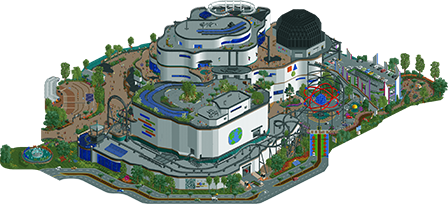
Welcome to Millennium Discovery Museum! Explore the wonders of Science, History and the Arts within our four levels of interactive exhibits.
-
3 fans
 Fans of this park
-
 Full-Size Map
-
 Download Park
391
-
 Objects
1
-
 Tags
Tags


![park_2095 [NEDC] Archimedes - #1/9 (Winner)](https://www.nedesigns.com/uploads/parks/2095/aerialt1885.png)

![park_3211 [MM2014 R3] Heart of Darkness](https://www.nedesigns.com/uploads/parks/3211/aerialt2825.png)
The poll is now closed. The final voting score was:
The Lonely Hearts Club have secured a vital second victory, putting both teams level on wins and blocking the Canes from a clean path to the playoffs.
Bugs
MDM
Excellent work, Hurricanes. I love this map. For starters, Terry's custom music really sells the theme so well. I could imagine hearing it as I walk into the IMAX theater at a giant science museum. A lot of people have been commenting how this park feels "dated" or "retro." I'm not sure if I see that. Sure, there are places, particularly the edges of the map near the water, that maybe could have benefitted from some more precise object usage, but that's about it for me. Even if this park isn't executed in the most advanced way, it doesn't need to in order to be successful. The sheer amount of incredible hacking, great coaster, atmosphere, and highly-detailed cutaway views are what push this park to success, for me. I was pretty worried when I first saw the match! I knew this map would bring a serious challenge to Bugs & Bots, and it certainly was a worthy opponent.
Some more highlights (not comprehensive and in no particular order): the rotating sign, the particle sculpture, the skywalk, the little outdoor theater area, the many awesome CTRs by kenos (especially the elevators), the layered half-diagonal bridges connecting the two main buildings, the switch track, and just all the interiors. One other thing I really appreciate was how you had one building as the science building and one as the humanities building. That feels like something a real museum would do. Also, the website + QR code was such a cool touch!
Excellent work Kumba, Terry, Congoy, and Otter!
MDM
Exteriors: I get it. Buildings exist like this in real life. People will have a field day with this when my opryland park gets released. Not every building IRL has a ton of trims and textures. Some are simply monotoned/monotextured and have an interesting shape. There's a "what looks good in the game" versus "what it looks like in reality" debate there and I tend to find that viewer appreciation leans to the former but builder satisfaction goes for the latter. Some of the glass windows being inset help a lot. The geometric shapes in orange/blue/green hurt a little! Again though, I get it for the theme. I have spent a ton of time in these places in the last 9 years of my life and this is largely true to how they look.
Coaster: I do wish, however, that they had coasters this cool IRL. I love how the coaster duels with itself and the switch track, of course. It's exactly how a coaster in this setting would look.
Roofs: the skywalk is the standout attaction here. Very cool, will definitely be stealing that! Imitation being the highest form of flattery and all that. The gardens on the other roof felt a little blocky and jarring with the asphalt. 4-way lift shaft - super cool.
3rd floors: zero gravity moon bounce is a really neat idea. The walls over here felt like they needed a little more love, perhaps a purple in there. Good to see a solid planetarium done well. The other building feels more lively. Love the RC track, crunch labs is a thing my kiddos have enjoyed so love to see that there too. The ballpit is fantastic. Pretty sure I'd be buried at the bottom of that contracting hideous diseases!
2nd floors: starting with the momentum station, I love the little water area. The B&M supports as pipes work really well. The laser prism is really good as well, although I wish the object didn't have a 3d edge along its top (I'm being picky I guess!). History lessons over on the other side are my favourite area of the museum. The foliage is a little more messy, which I like, and there's a really good setup to the exhibitions, and their explanatory signs in from of them. This part really came through well for you guys with a really high level of execution.
1st floors: underneath the history area, this felt a little unfinished to me. The other building has some lovely floor patterns to guide guests around. I love all the details here like the paper airplanes, jet engines, zero g ride, and of course the brontosaurus. This feels like an area where you guys really had the time to fulfil your vision.
One last thing! I can't help but note this was a really good H2H idea. Often I feel like votes are cast through looking at a park for quite a short period of time. No-one could in good conscious vote on this matchup without first looking through each layer of the museum - across both buildings - level by level. This was a great shout and a really good idea for the contest. Great job hurricanes! Really enjoyed it.
Bugs and Bots
First let me say I knew we'd go up against a nin park, and I was dreading the day that this park was released. This park is insane. Easily the best park of the contest so far, well besides Lostileth of course. The storytelling, the atmosphere, the placemaking, ride design, details are all extremely well executed. Everything is where it should be, nothing seems out of place. I think concise and cohesive are the best ways to describe this park.
The bug invasion is really well told through all the various scenes of battles/fighting between the troopers and the bugs. We got mechs, bots, troops, vehicles, turrets, cannons, there's so much going on. You think you've seen one amazing set piece to rotate the screen and find one that is even better. The giant 4 legged mech walker thing is stupid cool.
The dueling coaster is superbly well done. The support work alone I give massive props for. Not easy to pull off and it was definitely worth the effort. Also really good layering here, you have the flyer coaster, the splash boats, and the dueler all using the same tower structure. Really neat.
In terms of the architecture and world building, there is quite a lot to enjoy and take in. The ant farm looking thing was really cool and alludes to the base I'm guessing initially exploiting or harvesting them, only for them to get out of control? Either way, it's a great map edge filler.
Lastly wanted to point out a great case-in-point for how good this park is. The detailing of things like lift supports are so extra in the best way possible. This over-engineered alien world is so reminiscent of some of the best environments in other video games. Reminds me a lot of Mars in Destiny 2 and all the structures around the Warminds in D2. Or even Armored Core - this feels like something in that sort of architectural style.
Really want to applaud you guys for building such a wonderful park. I'm so jealous of it and wish I had a helping hand in making it! Parks like this inspire me to boot up the PC and play RCT not something else. My score might surprise a few, but genuinely think this park is something special.
MDM
Just want to quickly say that I am proud of the work that went in to MDM. The ancient history exhibit was a lot of fun to add. The ancient artifact exhibits were simple, but immersive I think. The mummy sarcophagus was a fun addition along with the Alexander the Great ride. Was really fun to try to jog my memory of Alexander's life without using Wikipedia. Wish I could've done more with the amphitheater, but oh well.
Shoutout to Kumba for the ambitious idea. I think the idea was great, just came up against the wrong kind of park. A full cutaway park is out of my comfort zone, but was definitely worth the effort. Was amazing to see the wizardry of Terry and Congoy. The painstaking work to do the micro detailing on the murals by Terry was incredible. Wish more people recognized the work that went into just the dinosaur face! Congoy also really stepped it up on this park. His hacks of course were creative and new, but I think what really shined was his thoughtfulness, attention to detail, and willingness to help anywhere he could.
With the Museum, I felt the fun nostalgic vibes in both the music selection and the object usage itself reminding us of a past life at NE and in our childhood science museum trips. The park really shines with its extra detailed interior scenes that bring so much joy to the viewer with the process of discovery; I felt as if I were a guest exploring an actual science museum! Digging through all the little scenes and great set pieces throughout the different levels was so much fun, and there’s a ton of great work with unique object usage and great mural / exhibit design present on all floors. Some of my favorites include the rocket / airplane exhibit, the prism scattering light, the planetarium seating (so smooth!) and the RV racing. Momentum was also a great coaster, perfectly fitting in with the museum vibe; I get Desperado / NYNY / Thunder Dolphin vibes with how the coaster is a feature attached to a building. Where the park suffered slightly for me is the exterior planning - the overall massing was a bit undercooked and I wish the building wasn’t just curvy geometry in a sea of surrounding parking and roads, but perhaps section-sliced at one view to allow for it to be larger, signal to the viewer that it’s fully cutaway friendly, and also provide a cleaner overall design for the building that also extends the fantasy off map. You could have used an architect on the team to help direct this
Bugs and Bots screamed “I HAVE A VISION!” - because this was such a clearly realized map with lead builders who definitely had a very clear idea of what they wanted to build. The biggest draw for me is the huge verticality of the landscaping and the architecture of the military base. You all know I LOVE mega structures and tall builds, so this really satisfied my sweet tooth. The style of parkmaking is also right up my alley, with a very heavy world-building focus that was immersive through the many detailed battle scenes and little corners with narrative elements that created a fully believable world. The mechanical spider-machines are so cool with its incorporation of CTR to create shapes you couldn’t make with just CSO. My favorite bits have to be the ant farm, the main setpiece of the mechanical spider, the excavator and drill, and the integration of the base with all the rides weaving in and out. There were some really bold macro decisions that stood out, with the giant conveyor lifts and the jungle boats riding the edge of the cliffs, super cool stuff that really created unique forms on the map. The dueling coasters had some super cool moments with some great sightlines, but it did suffer from too many underground “connections” that were hard to follow; I lost the trains multiple times trying to follow the layout. As a slight detractor, the landscaping felt overly reliant on fisch rocks in a way that made it look blocky and fake instead of smooth and organic; it’s hard not to compare with Sambhava’s which did more with the same object set. I also think although the color scheme was great as a whole, it did become a bit drab in certain areas with so much gray and dull colors. However, overall this park was stylish and visionary, and won my vote in the end.
Congrats to both teams for some really really fun work this match.
alright, finally got some time to check out the parks, been pretty much on the road since the start of r3
bugs n bots: awesome park, bombabstic, explosive, etc. I love the concept and more importantly i love that you actually made yellow and purple look good together. I agree with alex that the fisch rocks actually work here as excavated walls, and the landscaping in general is top notch. coasters have a really fun layout with a particularly great narrative piece as they enter the hatching grounds for the second launch, although I admit I kept losing track of the trains in that second half. one tiny awesome detail is the gearing on the centrifugal ride, it works so perfectly. i think the back half with the water ride is a tad weaker than the front, maybe too much piss or something---i wanted the yellow on the robots to really stand out. on that note, man, they're great. that giant robot is exquisite, easily the best large scale mech/thing i've ever seen in game.
museum: on first glance I thought it would be hard to compare, but actually, this came close for me. maybe I would have even voted for it, its immensely likeable. first, that coaster is maybe the best in the comp. the way it duels with itself is perfect, and obviously that transfer track. I love the happy, optimistic energy, boppy music, and silly things like the ted talk. all the floors are pretty well executed, theres a lot to see. this would be such an amazing museum if i was a kid. cool murals, cool structures, lots of layers and elevation, really a great park and a genuinely solid contender against an awesome park
These parks are so different it's wild. Bugs 'n bots was very extravagant. It impressed me immediately because of the big set pieces. MDM is much more reserved and started impressing me more upon viewing because of its detailistic approach. Wouldn't say this is micro vs. macro because the micro in BnB was obviously great and MDM was also great on the outside. In the end I just preferred BnB.
Absolutely epic leg game!
Love the Jurassic Park vibe in that giant geometric structure, and how it translates to the conveyor thing by the mech zaddy. Nin slays the dueling coasters so hard, so much iconography. Underrated coaster supports. One of my favorite concepts in the contest for sure. I love the ant farm, OMG!
Millennium Discover
I love this idea so much; it's so wholesome!
The peepable everything is incredible. Each layer of the park is absolutely brilliant. The coaster is completely genius. The bench CTR and the skywalk are absolutely taint-tickling. The structural integrity is awe-inspiring. Love the classic RCT feel of this park overall. The website is such an awesome feature. The exhibits in the park do justice to themselves without words. It's just an amazing layer of confirmation and some of the best extra material so far for sure.
Here are the reviews for this march! This was a tough one to vote on-- both super high quality entries.
Millennium Discovery Museum:
https://youtu.be/LSGFE8AHd-o
Bugs and Bots:
https://youtu.be/NhiDga6ypXY