Park / Imagination Megapark
-
 27-June 24
- Views 1,252
- Downloads 140
- Fans 2
- Comments 5
-
 Description
A huge fantasy park made for a Youtube series. 8 Themed areas, each with a distinct theme.
You can find a full tour of the park here (warning: it's 1 hour long) https://www.youtube.com/watch?v=JkDwYsLu97M -
2 fans
 Fans of this park
-
 Full-Size Map
-
 Download Park
140
-
 Objects
2
-
 Tags
Tags
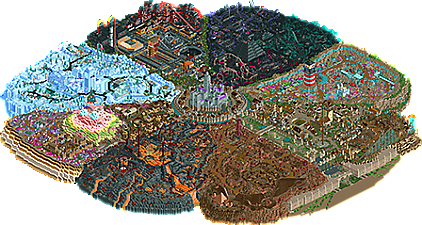
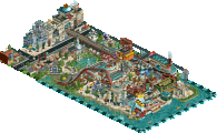
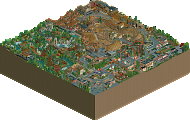
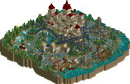
Absolutely huge park that looks even larger than the already large map size, I love the grand scale of everything. Fun themes, a lot of bold choices and an interesting pizza slice layout. Ride design is a real highlight, so many clever and creative hacks and ideas all through like the airship ride that give this character. Lives up to the name, a lot of imagination and it definitely feels like a megapark in the classic way from the early days of RCT.
Thank you Lurker, and thank you MrTycoonCoaster! I'm glad you guys like the park, and thanks for actually leaving a comment!
Congratulations on finishing what is likely one of the biggest parks on NE. As with your previous releases, Imagination Megapark has a nice mix of casual building and more intuitive, focused efforts.
The coolest part is the imagination. I don’t know how you come up with these ideas, but it’s something for other fantasy builders to take note of (myself included). It’s nice to see, and gets me thinking outside the box a little bit.
My general criticisms and praise tend to remain the same for each section, but I’ll go through each one in clockwise motion.
First the entrance area. One of the nicer parts of IM, I like the towering, suspended bridge with overhanging vines, as well as the classic RCT sandstone architecture with the expanded color palette. Being a fantasy build, one thing I would have done differently is make the actual entrance area distinctively fantasy. While I get having a parking lot helps your audience understand fundamental basics to building parks, I’d lean more into the fantasy. For example, have the guests enter on a crumbling bridge through a thick layer of clouds. The dkso pieces work nicely creating this atmosphere.
The central area is by far my favorite bit. Great castle. A bit monochromatic and bland in spots, but neatly composed, and interesting enough with layers. Despite being expansion piece crazy with the surrounding taverns, the actual proportions and heights look passable. I do think they could have benefited greatly from additional |_| walls and wooden post fence layers in front of the windows.
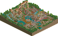
Desert of Doom has some fairly solid landscaping, and the various rides blend well into it. Good layout on the woodie, though I might have swapped the ending section out for the beginning. The bumper car demolition derby is laughably creative. Most of the architecture is pretty washed out and could use things like actual awnings stretching out a bit into the paths for better interaction (a criticism for most of your buildings if I’m being frank), but the shapes are good.
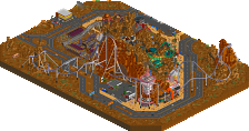
Onto the Lava Lands. I think this is probably the one section that relied so heavily on height and gimmicks, the lack of polish becomes more apparent. Particularly with the landscaping. At least it’s consistent, but I wonder how the volcano would have looked had it been constructed out of black colored volcano pieces. Criticisms aside, some of the ride ideas are fun, like the conveyor belt and the zipline on-top of the volcano.
Marshmallow Mountain is actually quite good, despite having a massively silly mountain made out of marshmallow blocks, lol. Overall, the architecture here is probably the nicest in IM, particularly the gingerbread townsquare. I also like how you blending the theming into the neighboring area with the Intamin wrapping around the ice cream. Lots of fun, playful, and toy-like ideas.
Frozen Fields has quite a few intriguing areas that made me look a bit closer. It’s tough to read at times because of the monochromatic setting. I think introducing some whites and greys to the mix would have helped greatly, but the townsquare and the building buried into the hillside above your alpine coaster are the best bits.
Science Station is likely the strongest, most intricate area of IM. The 2814 inspirations are apparent, but cyberpunk has dated pretty far back in these contests. One of the strongest coasters to boast, too. The zero gravity ride in the space setting looks lovely. Glad you included the ruins pieces for stars! The teleporting reverse freefall coaster is cleverly done.
Misery Marsh is perhaps the most unusually striking of the bunch, and possibly what IM will be most well-known for. It looks like a palette is at play, but it’s just picking black and leaning as far into your 3 accent colors as possible. Aesthetically, one of the strongest sections.
The actual concept of Subsea Sands is the strongest. Though I would like to have seen a better effort at making the illusion of water alongside the edges. I think the flying coaster is the best in the park. Great layout and interaction with the surroundings. Like with Desert of Doom, landscaping is strong.
Sprucket City is a surprisingly nice way to finish the trip through your park, as the more casual approach you have to building translates decently into the texture mix-match of steampunk. Besides your central castle, the station to your Morgan hypercoaster is my favorite building on the map. Fantastic shape. The layout is almost there - I probably would have opted for a downward turn on the second hill.
All in all, it was great seeing you return to making a large scale project. No doubt that it will get newcomers excited about all the features OpenRCT has to offer. While parts are rough around the edges, it’s enough to get curious minds away from casual, scenario play and over towards more detail-oriented building. I think there is enough content and imagination to warrant a strong silver medal. I vote 70%.