Park / The Sailor
-
 02-June 24
- Views 9,570
- Downloads 260
- Fans 3
- Comments 52
-
 78.00%(required: 70%)
 Gold
Gold

chorkiel 85% Babar Tapie 80% Cocoa 80% G Force 80% Mulpje 80% ottersalad 80% RWE 80% bigshootergill 75% Camcorder22 75% pants 75% Scoop 75% Terry Inferno 75% 78.00% -
 Description
A young sailor goes on an odyssean pubcrawl before leaving for war
-
3 fans
 Fans of this park
-
 Full-Size Map
-
 Download Park
260
-
 Objects
1
-
 Tags
Tags
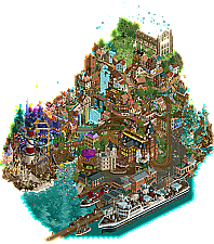
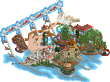
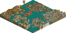
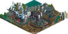
The Dambusters venture into fantastical boozy dreamscapes against the Soda Jerks who have more builders on the map than you might think.
A young sailor goes on an odyssean pubcrawl before leaving for war
concluded
Welcome to Yucca Desert Park, crown jewel of the Mojave. Our family-owned operation started with a simple dream: "If you build it, they will come."
Voting rules- The poll will stay open for ~72hrs.
- Do not vote unless you have viewed both parks in-game.
- Everyone may vote except members of either team. Any illegitimate votes will be ignored or removed.
- Anyone with an account that predates the start of H2HX, or who has been drafted onto a team, may vote in this
match. Anyone with a newer account must pass the admins' account integrity checks.
- Voting is monitored by the admins to improve fairness.
I lost my motivation to do full reviews like I did earlier, because of some members in the community, but I'll just say wonderful atmosphere, architecture and color scheme in The Sailor, and really loved the creative plugin and crunch all over the place in Yucca. Well done guys!
I will post reviews when voting is much more advanced, as I think that's a little fairer to the voting process! Also, got to let the MDs get their view in too! You should post yours too Six Frags. Always enjoy reading them, feel free to compare to my stuff I really don't mind at all!
Great job on the parks both teams, really enjoyed looking at both. This contest continues to push the game into new styles and techniques which is so wonderful to see. The game is 25 years old and we are still finding ways to push it! Amazing.
Sorry to hear that Six Frags! I always love reading your reviews; I think you have a nice rating system, too.
The Sailor:
So much to like here! It's really impressive how much content you all were able to put in this map. The story behind it is quite sweet, beautiful, and melancholy, too. I can imagine the young sailor letting his imagination wander one last time before being shipped off for war. It's really quite powerful, honestly. Some highlights of the map for me included the coaster's station and the set of smaller buildings below the crumbling church. They all just fit together so nicely. While I understand the map was going for a feeling of an imaginative bar crawl, I do think a bit more stylistic cohesion could have made viewing this map a little more pleasing to the eye. I must say I personally do enjoy the buildings with more “natural” colors to the more colorful ones. For example, the area around the lighthouse with the waterslide was a little tricky for my eye to follow. But overall, this was a great park, and you all should be proud of what you've put together.
Yucca Desert Park:
I've always wanted to do a park set in the American southwest, so this was already up my alley from the beginning. Even absent the effect from the plugin (which is awesome, but I don't want to spoil it!), this park still rules. It just has such a vibe honestly… from the landscaping of the southwestern buttes, to the music choice, to the motorcycle cage. It's all just purely fun, which I can really appreciate. I love the little alien guys with sombreros, too. The arrow layout is also really fun… I enjoy how the bow tie element was executed so gracefully. I also want to mention the interiors in this park... so well done, especially one of them. LOL! Great park here, Soda Jerks!
Yucca Desert Park:
Really fun and chill atmosphere, and the effects are interesting and add to the story and setting. Tons of interesting scenes and fun references and a nice variety in the buildings add a lot of fun to exploring. Ride/attraction design is fun and creative, from the cool motorcylce dome, to the shooting gallery to the main coaster that works with the terrain and captures the classic Arrow coaster feel well.
The Sailor:
Love the dreamlike feel of this. Strong storytelling through the park itself, minimal text, named staff and not even a intro message needed to get the story accross (I'm not great at picking up on things in genral but got this park pretty easily). Also love the density and variety of the architecture, and the elevation that gives this an extra grand scale and feel. Also, love the ships, really cleanly done and a great level of detail.
The Sailor
Impressive architecture to find in this one. It already starts with that ruins of a church, but my favorite is the woodies station, that building is really impressive. Great use of height here, working from up to bottom, getting more realistic/real as further you go in the map.
I'd say composition is this parks strongest plus, how the paths and coaster are all interweaved with eachother is great parkmaking. The woodie was fun. Not gonna lie, the fantasy part was not really my cup of tea and didn't appeal to me as much as it's gonna do to others.
My favorite part of the map was the harbor, with the ship as star of the show. Cranes also very well done. Love the swinging sea, great that is a reusable object and I'll think we are gonna see it used almost everywhere from now on. Music also elevated this map a lot, good choice.
Yucca Desert Park
Knowing how this park started, still amazed how it became! Crunch level over 9000 here, that and the half diagonals makes this park has everything the new meta asks for these days.
I like how the park is quite open, yet full of details and life. Things I really loved: cactus maze, cage of death, the old shacks in the back, the meat smoker, the awesome locomotive near the station, all the clean signs and graffiti, me dancing with aliens...
The coaster is nice and really fitting for such a park. And located in amazing looking rockwork. The special effects were amazing and really elevated the map. I really would like to know how that works... Very cool park, love it!
The Sailor
I'm not sure how to start my review, there’s so much (so much) content, maybe a little too much sometimes, but god what a job! So I'm going to start from the top of the map to the bottom:
The upper part from the ruin to the bottom of the waterfall is stunning, the use of this green color is refreshing and brings a real breath of fresh air into to this park, this ruin is beautiful with this lovely vegetation around it, very very well planned and executed. Then come these little houses, full of charm and poetry with the snaking paths. Fuck it's a really beautiful rct here !
Then comes the second part of the map, on the left these little houses which smell Italy with their pretty colors, good transition with the bridge and the waterfall. This purple and blue castle/manor house is splendid even if a little chaotic sometimes. Not a fan of the brown cliffs, which seems a bit careless, but these mansions are superb! I have my doubts about the lighthouse too, which hides the view a little, and also with the transition from castle ==> cliff ==> mansions, particularly with the colors choice but that's a detail.
I'm less impressed by the right side of the map, which looks emptier and sloppier than the whole, especially that big central alley. On the other hand, the part with the mansion and the dancing people is great, once again a lot of poetry and sensitivity here. Finally, this boat is the « Wow » effect of this park, it's awesome and realistic. I found the conclusion of this park with the pier ending very beautiful and poetic.
There are lots of cool details too, the list would be long here: the clouds here and there in perfect balance, the little touches of color with these objects, these little scenes that bring so much life and personality to the park <3
Despite the apparent mess, this park is « clear » in a way with a simple but perfectly executed story, completely immersive. It's a sweet dream, full of tenderness and poetry, and I really (really!) enjoyed immersing myself. Imo it’s one of the most beautiful parks I've seen in this H2H.
Yucca Desert Park
First, I think the theme is a great idea!
I really like the abandoned village, there’s a real flow here and blends in perfectly with the environment, same for the cliffs around it with that pretty beige color! Great little scene with the astronomy students and the shooting stand below! I'm not going to hide my skepticism about the cliffs on the left, I personally find that these 3 colors don't fit together, the transition between the beige and the light brown is too “rough” and lacks subtlety. In fact, I wouldn't have included any browns and perhaps keep a palette of beiges instead. But that's a very personal opinion here and I'm not a cliff expert!
Globe of Death is totally cool and Crater Karts totally wtf haha, a few more stands around it would have been cool for a more immersive rendering. The UFO on the wagon is incredible as is the locomotive at the entrance (in fact, all your trains are great!). The same goes for the clouds above Atomic Rodeo! There's also some really good work on the crunch. The integration and the coaster station work really well!
I'm not going to hide it but the big negative point of this park is that it still seems pretty empty in some places, most critical point for me is the entrance. However, it has a very good theme, some very good ideas here and there and a certain attention to detail in the landscape work!
Edit
Ok, small edit but I had paused my game when I opened Yucca, so I've just discovered this wonderful plugin, it's a really cool effect, it adds a LOT to the atmosphere of the park !!
The Sailor
Talk about unexpected turn of events! Thought this would be a really pretty, calm and serene park when looking at the opening view but scrolling down kinda shocked me haha. Interesting aesthetic for sure! Music is hot af. On micro level this park is filled to the brim with details, hats off for that. There's some really well-crafted buildings in the lower levels, especially near the dock.
I will say the quality of the buildings did feel mixed throughout the park. Comparing the above buildings to the ones below for example, seems like some just had more time to cook on the stove than others. Same with the lighthouse and the almost sandcastle-esque buildings below (which are gorgeoussssssss btw!).
Ships are looking really nice and I absolutely love the send-off scene! Besides that, the composition of the Sundowner building is breathtaking imo, just really nice usage of height, colors, objects and movement. Solid work Dambusters!
Yucca Desert Park
The crunchhhhhh I mean c'mon now... look at this beauty:
Josh really killing it with the new objects for you guys, kinda jealous, I had a good laugh about the dancing aliens scene haha. In general, there's a tonnnnn of detail put into this park, just to name some scenes:
- the rodeo bull (Yak works really well here!)
- the stargazing scene
- the peeps swimming/canoeing in the (pretty filthy) lake
- loved the lil' spaceship vehicle ride, just like those coin-operated ones irl!
- all the vehicles in this park, especially the yellow bus which looks sickkk
- the gold panning ride
- the shooting gallery
The plugin is such a neat addition to this park! I loved seeing it all play-out in-game and the effects created are awesome. If it wasn't clear enough already, I'm a big fan of this park. The right amount of gimmicks/wow effects combined with clean aesthetics and great execution. Well done Jerks!
Yucca Action Park – Soda Jerks
Strong opening with that beautiful locomotive and the nod at Breaking Bad. That groundwork is extra crispy crunch. Beautiful. Those UFO scenes are fun! Brilliant scenes with the Globe of Death, the shooting range and that cacti maze. Strong archy throughout. Though I love another take on a circus, I don´t really understand the giant mushroom cloud above it. Imo it clashes with the realistic take on the rest of the park (you know, apart from the giant UFO’s flying around). A case of ‘Less is More’, but that’s the only nitpick I have. Very strong park that succeeds really well in selling the UFO/hippy/Conspiracy – Family Park theme.
The Sailor – Dambusters
Beautiful opening scene with the church-ruins, starry skies and waterfall. Feels dream-like. The music adds a lot to the dreamy atmosphere. The busy town looks pretty with those coloured stairs. Very lively with the singing and drinking peeps. SpaceK’s dancing peeps are getting the love they deserve. Why are those people acting epileptic in the plaza? Oh, it’s a brawl. Right. Is that piss being dumped in the river? That doesn’t look so dream-like to me . . . Wait, is it meaned to be moonshine? Why do they throw it in the river? There is an elephant called hangover? I don’t think I’m completely getting this narrative. Anyway, that ship is amazing. And no trackitecture! Look how far we’ve come. Well, you guys have come. The archy varies in quality a bit. Many buildings are perfect, some look a bit crude or rushed. But in total it’s a really beautiful lively dream-like park.
Conclusion:
Really liking both parks. I’m more a fan of fantasy than of realism and The Sailor is really packed with content, but I love the crunchy textures and how Yucca really sells it’s theme . . . So in the end I went with Yucca.
Yucca park : Another cool desert park from the soda jerks. Couldnt find any giant skulls but there was lots of nice sculptures around. The trains and tractors were really nice. Some of the archy felt a bit huge or out of scale. The little ghost town I thought was perfect and fitting. Very cool details throughout the park. Landscaping was pretty perfect. The grateful dead song i thought was in my playlist was surprised to hear this playing rct lol. This screams a certain builder to me who I know would cream us but oh well luck of the draw.
The Sailor : Our park was pretty fun. Its moreso out of left field I can understand why its losing traction. Lots of great moments and was really fun to get on discord and see what people came up with. Also amazed it got done even though there's still a bit of messiness. I think the narrative was fun but its not a very traditional theme park setting. Was fun to explore this type of story telling at the least.
Nice job with both of these parks, I'm kinda sad one has to lose because they're both really great for completely different reasons!
The Sailor: A really nice, quirky, dream sequence illustrating some pretty complex themes. The opening is gorgeous, and the debauchery (generally) increasing as you move down towards the harbor is a nice way of physical storytelling. Good archy, great use of colors to add whimsy. While the story is fairly evident from the ride names, map structure, etc., I wish there were some peep scenes to help sell the story and add more detail. Woodie seemed a bit fast paced, but that seems to be a theme this H2H. It also seemed like there was some unfinished-ness, like default staff names and some seemingly peepable rides not being open. All in all, a great map loaded with content that works pretty well together imo. Good job DB squad!
Yucca: I guessed the theme before I even opened the park, thanks to posix's announcement in the Discord. And yet, I was still pleasantly surprised by the plugin shenanigans and how well they fed into the theme. Decent arrow layout, and fitting archy for the theme. While this map is a bit lower on content than its opponent, it more than makes up for it in execution, almost everything is impeccably done. Also, the music had me jamming out, so good choice there!
This was a tough choice for me in the end, because I liked both maps a bunch. Ultimately went with Yucca based on the almost flawless execution of the theme, but I could've easily voted the other way based on the content and story in The Sailor.
Two good parks, but had to go with Yucca. Micro-focused maximalism has never been my thing. The Dambusters park is full of good ideas, hundreds of little touches that go mostly to waste because the whole thing is sadly a mess. I'm sorry for the harsh way of putting this, but I urge you to present your ideas better, and reduce their density, to give an actual RCT experience rather than a potpourri.
The SJ park was an enjoyable organic scene, very reminiscent of EG's Cirque for me, with good design and a very modern object choice to do this kind of theme. The ufos were fun, but ultimately could've been less technical for me. The big animated wow effect is impressive, but it's also taking away from the dignity of the RCT that's there.
two more amazing parks... for me these are 2 of the best ones so far. there is a slightly strange juxtaposition here between realistic and cartoon-y, almost.
The Sailor is exactly the kind of fantastical whimsy that i love. a whole map of stories, secrets, scenes and things to find. i read someone say it's like a Where's Wally book, which is a great comparison imo. i really appreciate the many different areas and settings that are all shown, and the fact they're all smushed together and overlapping is a really nice stylistic choice that's hard to do.
this really smacks of a strong vision / concept that you followed through to its conclusion, however ridiculous. this is a really hard thing to build in RCT, to capture a feeling. i hope i'm not being too arrogant to compare this to Le Reve Parapluie, which had a similar pretty abstract concept and just sort of.... built itself.
pretty much everywhere i look there is something strange to see. i'm not totally sure what's going on at any one spot, but that's not the point. it's all blended so well that it's just a joy to explore. i don't know.. this one just resonated with me honestly. so fun and interesting. it got my vote.
Yucca
this contrasts pretty strongly with the sailor, which is probably a good thing for an h2h matchup. the first time i viewed it i didn't notice the plugin, so i viewed without. still amazing. then second time round i did use the plugin, and damn that is a great effect. VERY tastefully pulled off, feels native to RCT (well made!). adds to the park without being too awkward. loved it.
i've lived in vegas for 11 years now so i'm very familiar with this area of the world. and you've captured it so well. the landscaping is so good, everything feels pretty spot on. the seven (5) magic mountains at the entrance was a great touch. honestly there's great touches all over the park - you have a talent for taking something relatively low key and making it interesting and unique.
there was tons i liked all over the park, favorite parts were: globe of death (seriously what the fuck), shooting gallery, the real grimy ruined ghost town in the corner, the tumbleweed, the 2 other magic mountains turning up later, the atomic tent with the mushroom cloud (best sculpture for me). i think aesthetically the level of "crunch" is very on-brand, but something that doesn't always land personally. it ends up making the whole map feel gritty, almost, and i can't quite put my finger on it.
i'm sure i'm in the minority so i wouldn't take this too seriously, honestly. two amazing parks, again. both teams crushed what they were going for. the standard keeps improving, which is crazy. it's especially cool to see scenery objects turning up in parks a week after they were released, and used in new ways... really makes this whole contest feel exciting and trail-blazing.
Probably don't need to post pictures for this one. These parks are so different.
I'll say upfront, The Sailor is not my favorite, however, the idea is fantastic. I just don't think the execution is there. The story is really hard to follow. I wish there was a more clear path to follow for that the sailor takes. I tried figuring it out but I just can't tell where it is supposed to start or end? Like I'm guessing it starts at the top and ends at the pier but the path to get there is confusing, if that is even correct. I wish that the fantastic "drunk" (and probably high) imagery was more contained to the bars themeselves. It seems like they just get really out of control. Its too much. And so is the piss(?) waterfalls everywhere. Like I feel the tone of this park is confusing. But it does make me feel more emotional than any other park I've seen which is a huge plus. I love the more realistic areas like the ship and hilltop. The music is great, I only wish you could hear it in more of the park. The park has some beauty to it but it is just too messy. It needs a clearer vision I think. Maybe there is one but it is not clear to the viewer. I like this park alot. I wanted to love it, but it just doesn't quite get there for me.
Yucca is just really cool. There is a lot less content but I think it is more focused. Almost everything is fantastic and you gave those moments room to breath. The coaster is also very unique and good which is hard to pull off. The landscape and crunch are amazing. Lots of fun scenes. The music sets the vibe and is great. The plug-in details are just the cherry on top and I honestly don't think you guys need it to have the park be successful. This is a top tier park IMO. Very polished and just good h2h content.
The sailor was...a lot. There's some moments of great vision and a lot of excellent pieces, but for me it was a macro mess. For all the fun or whimsy ideas, it just failed to come together in places. Some parts of the map feel light hearted where others felt somewhat dark, some parts felt expertly crafted while others seemed rushed or poorly executed. I think if half these ideas were cut and the other half given that much more love, this would be a masterpiece. As it, it just isn't coming together for me. My favorite parts where the docks and cruise ship, the coaster's station, and the big of ruins at the top of the hill.
Yucca feels very well crafted and carefully thought out. I think it's interesting that it appears to have 'less content' but I'd say the content is just more subtle. There are dozens of carefully constructed scenes, little details, but because the macro allows them to breathe they feel less intense. I wouldn't say there is less to explore though, in fact, the way they've been composed invited me to spend more time exploring. The crunch is very well constructed and probably the best we've seen this contest. I loved the coaster but couldn't stand the clearly-floating mini-golf trail where peeps just walked thru rocks. This got my vote.
Overall, I can't help but have some bitterness about the plugin this round. I think it was very well employed and added to the park, but I wouldn't consider it so successful to have entirely sidestepped the incredible negativity we've faced in the past two rounds, including from members of both of these teams. Having seen Deano work so hard on the plugins and receive such backlash for trying to bring something new to the community was disappointing. But I respect the work of these builders and I respect the intent to innovate and build more immersive experiences. I hope the community can move forward in this competition with greater respect for that as well.
Congrats to both teams
"Aliens built the pyramids, man" -- I died laughing. So much substance! Excellent job on both parks.
Dambusters - The Sailor
Great music selection, though I much prefer the recording of the Philadelphia Orchestra with Richard Woodhams playing the oboe solo. I probably spent a fair chunk of my time trying to figure out what recording you used
I also spent a fair chunk of my time scanning through this park. This thing is packed. At least the hillside is. As others have mentioned, some of the buildings look slightly unpolished, others look fantastic. For obvious reasons, the coaster station is exceptional. The vertical dynamic is impressive. The scene around the lighthouse in particular is whimsically imaginative, even if a bit difficult to read at times.
Thematically, this park is right up my alley. Still, I sincerely wish there was even more atmosphere than what’s present. Even more stars, atmospheric crunch, things to really help solidify the overwhelming sensory awe.
Soda Jerks - Yucca Desert Park
Another great music selection! In general, another polar opposite park to vote on this contest. The saloon style buildings are some of the best looking of that style I’ve seen. I’d also like to pay close attention to the mine shack buildings towards the back of the map. In particular, the one with a half-diagonal section. Outstandingly simple and idiomatic.
There’s a ton of texture and gradual landscaping that looks well-executed. Fire on the Mountain is a much simpler coaster than The Hangover, but I think it does a better job carrying out its intentions and character than its competitor.
Nothing in this park feels rushed or unpolished. Yet, it lacks that gripping sense of scale The Sailor has.
Final Verdict: This is probably the toughest vote of the contest for me. But I’m going to go with The Sailor. Conceptually, a risk taking park that ultimately doesn't succeed in every endeavor, but the inspiring qualities are all there for me.
Due to the site's brief downtime the polls will remain open for a bit longer.