Park / Brins Wulf Hollow
-
 27-June 24
- Views 1,311
- Downloads 124
- Fans 3
- Comments 9
-
 73.00%(required: 65%)
 Design

Cocoa 80% In:Cities 75% Milo 75% pants 75% RobDedede 75% Terry Inferno 75% Xtreme97 75% chorkiel 70% posix 70% RWE 70% Scoop 70% Turtle 65% 73.00% -
 Description
Runner up in the 2022 DKMP Next Gen Vekoma monthly contest.
-
3 fans
 Fans of this park
-
 Full-Size Map
-
 Download Park
124
-
 Objects
1
-
 Tags
Tags
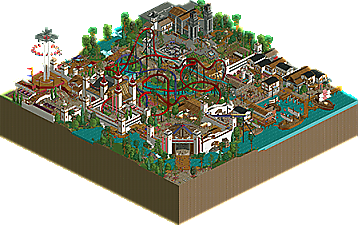
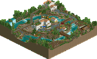
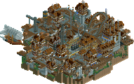
This still holds up well even with all the developments to OpenRCT in the two years since. It's still probably a strong as a top two to a contest as I can think of off the top of my head; i remember the similarities between this and the Swag/Hex making the choice very difficult to choose.
Strong layout with good supports and interaction with the family boomerang. Loved the flythrough station element. Plenty of good supporting rides, although with the sheer amount of content on here parts of this are a bit hard to read. Great structures as well; the church in back, the castle gate in front, and coaster station are standouts.
I agree with everything said by 94. Even though I wasn't a participant yet, I distinctly remember being so excited by the line of New Gen Vekoma creations coming out of the contest. I too was most impressed with this one and Swag/Hex's, though I was also quite partial to otsdarva's tilt coaster.
I'd like to add that having the queuing line laid out that way adds so much to the experience and integration with the ride itself. You both treated the expansion objects like a tuxedo - small amounts, but with good taste.
The way the thrill and family coaster interact is awesome, Layouts are excellent too and the support work is really clean. Park design is great all around with the support rides and clean style, it definitely feels like a park that'd be a lot of fun in real life.
this is really great, easily one of (or even the?) best of the many iterations of ncso medieval town. great layouts, quality landscaping and really smooth and thoughtful composition. I love the abbey in the back too, it feels well-proportioned in a way which makes it stand out from the crop. i also like that this could conceivably be a real area in a high effort extension of parks like plopsa or legendia
Enjoyable design, well done both! Coaster is quite charming, dominant colour scheme and solid ride interaction with the boomerang and courtyard. The architecture is cool, quite airy and bright with the lighter castle colour. Also liked the splash battle ride and how it's fenced in by the docks and ship, which is really cute too - haven't seen corkscrew track look so natural as trackitecture before. Also a nice detail I noticed was the use of the geometric sculptures as chains on the draw-bridge.
Loved viewing this back when it first dropped in the contest. I'd actually sent CP6 our layout to see what he thought, not knowing that he'd join the contest himself!
Love this park you guys! Some super clean, well thought out ideas with excellent execution. I'd love to see you two collaborate again. I think you each brought the best out of each other out and made a lethal combo.
Much love
As others have said, this is an excellent example of newer-age NCSO with a couple of nice DKMP tricks mixed in. Highlights for me here are ride design especially, with the coaster layout in particular being supremely well-designed. I also adored the diagonal castle wall entrance, which was quite cleanly executed. I think the way to have taken this design to the next step would have been the overall macro composure, with some paths appearing a little meandering perhaps, especially the small dirt one in the center of the map. Overall, though, this park is quality RCT and a joy to view. Nice job!
Hadn't had a chance to respond to comments here just yet-- thanks everyone for the kind words.
This is a late upload since this park was finished in 2022, but I'd simply forgotten to put it up. Certainly the approach would be different now given the new track pieces available but I'm still pretty happy with the layout.
This was entirely Ulvenwood. Credit to him for teaching me quite a lot of NCSO tricks!
I'd meant to keep the entry secret and I guess we did! But always like seeing the stuff others put together. You guys had an incredible map and it really turned out very well. Loved how flowy the paths were.
The meandering path was actually fully intentional! Taking a page from parks like IOA where there are little nature type trails off the main path that kind of wind their way through stuff. We had more than enough main circulation path, so the little ones were intended as a way to fill in some of the space with some quieter, scenic spaces.
Thanks all for the comments!
Late Review #3: Brins Wulf Hollow
You should be happy with the layouts still, Brian. I love it. You can instantly tell what coaster type this is, and what inspired you, despite it clearly being its own thing. Supporting rides are great too, I especially enjoy the Harbor Hijinks and the hacked carousel with the wagons. Architecture is much cleaner and more cohesive than I'm used to in NCSO, and I love the amount of little things to discover on this map, without it being overwhelming. Some borrowed (the chess piece horse), some original (the mini theater). There are little things to like almost everywhere I look. This map is too good to be a semi-forgotten side project. Would love to see a full scale park like this. Good job both.
double post, please delete