Park / Jostler
-
 30-May 24
- Views 1,368
- Downloads 251
- Fans 0
- Comments 5
-
Description
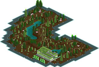
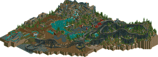
This is a design submission by Ge-Ride. It's sort of a prototype of a style of coaster that I was inspired to make. It was supposed to be realistic but ran into some insurmountable barriers as I explained in the readme. I don't expect it's good enough to reach design. I'm releasing it for two reasons. One that some people will like it for what it is and two that the feedback will help me create a better coaster in the near future.
-
No fans of this park
-
Full-Size Map
-
Download Park
251
-
Objects
2
-
Tags
Similar Parks
-
windsweep
-
x2 [WORKING TITLE]
![park_2498 x2 [WORKING TITLE]](https://www.nedesigns.com/uploads/parks/2498/aerialt2254.png)
-
[H2H7 R3] Lotte World
![park_3345 [H2H7 R3] Lotte World](https://www.nedesigns.com/uploads/parks/3345/aerialt3036.png)
-
Attractiepark Groezelen (2006)
-
The Duck Festival of Trifouilly-les-Oies
-
Mineral Basin
This is a hard one to describe. If I had to, I’d say your approach to art is more minimalistic. Which can be a cool thing if it’s supported by a compelling atmosphere, more intriguing shapes, and perhaps a different pair of colors.
Going to the coaster, I think it needs more variation in height. I do like the approach of teasing the rider with smaller elements before graduating to more impressive ones. But I think you can do this with more banked hills, cutbacks, interaction with the peeps, and interaction with the ride itself. The sudden banked transitions are a miss for me.
You do a great job with most of the building challenges on the NE discord. I’d like to see more of that carried over to a full-fledged design in the future.
Some feedback on this submission that I hope is helpful!
- hide the path coming into the path by toggling its visibility in TI or using the corruption manager plugin
- try to work in some path interaction for the ride
- add peeps for when the save is loaded, rather than the viewer waiting for them to come in
Some good things:
- the supports are very capably done
- the green sign is pretty cool
I would have replied sooner but I was expecting a comment from Robdedede that never came.
I guess that the colors are a hit or miss. I didn't get much criticism when I was building it but I've gotten quite a bit since. I'm not sure what you mean exactly by the sudden banked transitions. That could be either the sudden banks out of the station or the quick transitions into the turns. As for many of the other issues you have, a lot of it boils down to picking the wrong coaster type. The LIM coaster has very high intensity which kept me from doing many things that I might have otherwise tried. One thing which I had to eliminate was some of the bigger hills. I'd explain what some of the other things are but it might spoil the next version should I decide to make one. As for the colors, I based them off of some Japanese family coasters in a sort of loose way. I chose to blend in the track with the mulch whereas the originals were green to blend in with the grass.
For deano's criticisms, I'll do that with the path and add some more path interaction. I had trouble getting the peeps to come into the park. If they came in for you, that says something is wrong about my version of Open apparently. Glad to know I at least got the supports right.
If I make another one I'll use the giga coaster instead of the LIM so I can make a better layout that's not so limited by the stats.
There is a flaw that I didn't know how to edit earlier. The coaster is just a little bit out of sync height-wise. I wasn't used to having the new height adjusting where you can make a coaster that doesn't align with the paths and noticed it too late.
Well, I should have responded earlier. I would have responded Sunday but I wasn't expecting the first matchup of the round to come out so quickly. I'd say it's better to distract from one match than two so there's my response.
Sorry, just read this now. Here is my comment/feedback:
I think you can start by making the coaster more realistic. Honestly, for me that's come with lots of practice and looking how others approach making coasters in this game… and I'm still not very good at it!
I think you also might want to check out dr dirt's foliage tutorial on YouTube. I'm sure it's linked somewhere. He lays out a lot of really excellent baseline principles for making your foliage look nicer, more complex, and more natural.
As for the station, you have a cool idea with the ride sign, but I think you can push the detail on the station's shape and overall decorations on the side.
The supports look pretty good, but I think both them and the coaster could have been different colors, as well!
Thanks for the comment, Rob. I feel like most of the stuff you've said is helpful. I would use a different coaster type, probably a giga coaster with extra unlocked track pieces so I could experiment more with the layout. I watched dr dirt's tutorial and see how I could improve the foliage. I based it on some tips I got from somebody on Discord when I should have used a more visual sort of reference. I would definitely figure out a new look for the station if I did this over. And you're right about having more overall decorations. I'll have to look at more real life coasters and base them on that.
The only less helpful bit of criticism is the colors. I've had people say that the colors work fine and that they're just strange. I don't know who to believe but if you don't like them, that's fine. I looked at Mindbender at Six Flags over Georgia and a family coaster in Japan and sort of based them on that. Thanks for your reply and I hope that with yours and their criticism I can make a design that's good enough to trigger an accolade panel vote.