Park / The Gray Mountain
-
 30-May 24
- Views 1,100
- Downloads 138
- Fans 0
- Comments 7
-
 59.00%(required: 50%)
 Bronze

Babar Tapie 65% Turtle 65% G Force 60% Milo 60% Mulpje 60% posix 60% RobDedede 60% Terry Inferno 60% Recurious 55% RWE 55% Scoop 55% CoasterCreator9 50% 59.00% -
 Description
The amusement park is located in a valley across the grey mountains and was inspired by Minastris and the Lonely Mountains of the Lord of the Rings
I still felt that I lacked a lot of details, roller coaster skills, and on the other hand, I'm excited that I still have more to learn
Lastly, I would like to express my infinite gratitude to the parks of others who have had a positive impact on me -
 No fans of this park
-
 Full-Size Map
-
 Download Park
138
-
 Objects
1
-
 Tags
Tags
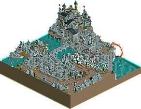
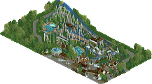
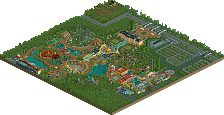
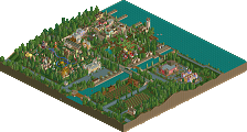
I really enjoyed the tower in the corner. It's amazing how much the extra bigger splashes of a second colour - even it being black - draw out the details of the rest of the features. There's a better colour balance here with more wood and foliage and I really like this area. It's oozing with atmosphere and you definitely know your way around the game with half diagonals, RVE use and a whole lot more. There are some really impressive things here!
The grey area opposite with the courtyard fades into itself in comparison - there's a lot of 1x1 buildings taht are all too similar to one another.
I'm not personally a fan of the minas tirith rocks, they look a little like cellulite to me. And I think mixing them with fisch rocks is a really tough thing to do well too. I get the park is supposed to look carved out of the mountain; just the texture is. little much for me - both noisy and a little boring.
There's a lot of promise here and I hope you build again!
Hey REZZ, you put a lot of heart, imagination, fantasy, and soul into this map. It's always great to see an inspired creation like this.
I wish you would've added a bit more variation to the colors and textures, so it's easier to visually understand the different surfaces.
But at the same time you did call it gray mountain and the map definitely succeeds at being gray. The stone and wood textures work well in combination and the water is a cool feature to form a good combination of colors in the end.
I'm looking forward to seeing your next creation with an even more fleshed out macro layout for the map.
I like it. Not much new to say from me but is there a palette with more grays? With so much gray usage here I think it really could have used another gradation or two.
I really like the castles and stonework, a lot of the walkway surfaces could maybe have used some more texture, the like ones that had path textures around the castle, but overall some interesting and fun stuff.
Also some nice use of elevation to make the map more dramatic and make it feel larger than it actually is.
It was very good, I liked the castles and stoneworks fit well into the scene
the horse-drawn carriage was charming
This park is really cool, my friend. Right off the bat, I want to point something out: where Fisch rocks are used, the rock work tends to be brilliant. Where the LOTR rocks are used, it tends to not be as much up my alley. I think this park could have been pushed further if you committed to Fisch rocks. Maybe something to think about for next time!
In terms of shape and form, especially on the castle, I think you're doing great. The castle as a set piece is really lovely and to me is probably 75% level work. I think where you might consider elevating your work is with your use of color. One of my favorite tricks is to pick three or four colors and continue using them as a motif around the map, with some colors being more dominant than others. It helps your work pop more than a sea of grey!
As for the coaster, I loved the diagonal moment where it comes right under the castle. Superb! I think the coaster could have done one of two things:
If you wanted to stick with a B&M, possibly have it be above ground more. Right now, it's a little hard to follow! Or, if you wanted a more “underground” coaster, maybe consider another coaster type, like Mystery Mine at Dollywood!
In general, you should be proud of this map. Please keep submitting your parks to the site!
i liked this park, there was some obvious level of skill on show and i thought it was worthy of an accolade for sure. i think the main drawbacks were that the grey is pretty overwhelming, but for a park named grey mountain i get it!
would be very interested to see you tackle more themes, with potentially some more variation within the theme itself - if some of the other areas of the map felt more distinct with other building materials/ color pops etc. i think that would elevate it a ton. with a more developed theme in terms of thinking a bit deeper about other things you can add to the same area, you could easily get up to gold level work as the skill level seems to be there.
good stuff, looking forward to seeing what you come up with next!