Park / Naam Chalong Suu Oom
-
 18-May 24
- Views 8,852
- Downloads 263
- Fans 1
- Comments 35
-

-
 74.00%(required: 70%)
 Gold
Gold

chorkiel 80% CoasterCreator9 80% Terry Inferno 80% wheres_walto 80% G Force 75% Mulpje 75% pants 75% Babar Tapie 70% Cocoa 70% Scoop 70% Liampie 65% RWE 65% 74.00% -
 Description
Life shrinks or expands in proportion to one's courage.
-
1 fan
 Fans of this park
-
 Full-Size Map
-
 Download Park
263
-
 Objects
1
-
 Tags
Tags
![park_3345 [H2H7 R3] Lotte World](https://www.nedesigns.com/uploads/parks/3345/aerialt3036.png)
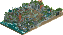
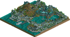
I really enjoyed both maps. On first sight I didn't know what to expect but I was pleasantly surprised by the cool little details and ideas in both. They also both have some great macro, and while one may be almost a recreation, it still takes macro skill to translate it into rct.
Wawel Castle:
Architecturally it's a stunning map. Beautifully crafted with some great interpretation of forms and textures. I don't love the bright orange you went for on the rooves, I think you could've found a better color via adjusting the palette a little bit. I especially like the attention to realistic detail with the tiny courtyards for the largest buildings of the castle. The balloon and that little flea market are great. I love the way you did the lamps in the underground cutout and added dripping water. Cool idea overall. The layout was nice, but didn't do all that much to hold my interest for too long. The overall idea of something like the coaster inside the castle as a tourist attraction is great. But I also think it's not exactly realistic for a historic monument to be interefered with like this in Central Europe. At the same time this is an RCT contest, I like the little bit of vision and fantasy to go for this concept. Overall it's a very pretty map, that is lacking for me a bit in terms of bustling street life. The city feels very tame and a bit too quiet to me. Maybe it's a deadline issue. But if it wasn't and if it's all intentionally so tame then I think you should've just made the castle and it's gardens tame with the actual city streets with shops being full of life and noise and more little scenes. I usually also prefer somewhat more flashed out or elaborate concepts, but it's also good that you went for a recreation and tried to do something justice that already exists. It's great to have a bit of variation across H2H parks. Great job guys!
Naam Chalong Suu Oom:
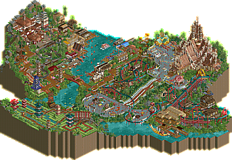
I found the concept for this to be really intriguing while still being really simple to understand. The names of the rides basically explained all I needed to know and I loved the setting and immersion that you created with such a theoretically simple, yet really creative concept. It fits very well and there are lots of moments of great polishing, cool compositional ideas, and interesting depictions of the concept. I think the cutouts of this one were worse than the cutaway of the competitor. But the concept just made me want to find more things on the map. It turned out there were a lot of really well done details and little things to explore. Lots of movement, yet also quiet bits. That aspect was in better balance to how Wawel did it, which made both the quiet as well as the bustling bits stand out more in my view. I really enjoyed the large stairs and the sanctuary building. Love some of the shoestringed synchronized vehicle hacks, like on the paths, and for Test of Faith. The floating market and Test of Patience were fun. I didn't find the underground water canal to be all that believable in such a natural area, but it was just a slight blip in the immersion for me, and was otherwise well done. The architectural shapes and the representation of culture and theme are superb. I think you guys did yourselves proud. This is the map I voted for.
Congrats to both teams for 2 more wonderful and inspirational parks!
Very cool map
The poll is now closed. The final voting score was:
Well played Hurricanes on taking home a win against R1's top placing team with a group of late draftees who pack a punch.
I thought I’d take the reins on this park’s write-up! First of all, thank you to all who took the time to thoroughly explore Naam Chalong suu Oom. Even before the beginning of H2H, there was chatter about the possibility of doing NCSO. Even the chance of a DKSO build! The fact that Ballpit, Congoy, and myself all ended up on the same team was so happenstance, the opportunity couldn’t be passed up.
Seeing what Alex did with the workbench employed on Age of Sail, the three of us immediately concluded our park needed a few stipulations. For starters, no recolorable scenery pieces. In addition, no expansion objects, no palettes. Just RCT2 and the Open assets. There’s something both iconic and visually beautiful about the purity of an NCSO build. Simply put, the original RCT2 devs crafted objects that are practically perfect in detail, texture, and shading. It’s just a matter of rearranging these pieces into larger, more crafty structures.
Now, our original park started off quite shaky. We began with a more fantasy-driven concept of a central island in the South Pacific, surrounded by floating islands in the sky. I was leaning towards Thailand, so I built the first structure in our park - The Sanctuary of Truth. It was a success. The rest of the park? Not so much.
We were drafting B&M invert layouts that felt way too large, sprawling around a macro that just didn’t make any sense. Things weren’t sticking. It was to the point where every time I built something, I felt like I was insulting Kumba with regret for picking me. We knew things had to change and fast.
Congoy suggested redrafting the entire map into a much more conventional setting, one with less water, and shallower hills. Immediately, it felt like we could breathe again. But we still had one big problem - this damn coaster. It still felt way too large, and no matter what, it didn’t work with The Sanctuary of Truth.
Once again, Congoy saved the day, this time by suggesting an unusual solution:
“How about we make this invert much smaller? Almost like a nod to Nemesis.”
At first, we weren’t so sure, but considering how much larger layouts clashed with the temple, we had to give it a shot. After passing the baton back and forth a few times, we settled on a final layout. At last, we could start the real building.
For our theme, we wanted to lean as far into the monk philosophies of Thailand. Each of our rides would give a little hint, like “Test of Patience” or "Test of Fear." With this comes the dharma of the country, which was paramount to the rice fields and the floating market.
Congoy got to work on the Dragon Steps, something our teammates were enthusiastically insisting upon hearing the idea. Ballpit, the grand master of inventive rides, made an obstacle rope course that rivaled what was possible - even with CSO. While both gents hammered out the shape of our central plaza, I got to work making the rice field and its pagodas. We were cooking.
Next came theming our invert. A lost jungle buried beneath the cliffside felt most appropriate. Ballpit did some outstanding sculpture work with its entrance sign, and Congoy’s festive golden boat sat perfectly by the shore. After this, Ballpit started to plan the opposing hillside, and Congoy initiated his work with the ‘floating market’.
I still don’t know how these guys do it with their inventive ride creations. Perhaps I should pay attention for a change instead of making all this scenery. Because the splashdown ride was exactly what the rice fields needed. Just when it couldn’t get any better, Congoy somehow got the waves synchronized.
Going towards the floating market, Congoy got the all the boats operating, started 1 or 2 buildings, I then finished the rest of the area.
Ballpit came in clutch with the final section of our map. The initial coaster of this area was a Vekoma family boomerang, but it just wasn’t sitting right with the team.
After scathing through every idea we had, Ballpit made one of the best calls of the contest. Now in IRL, one of the most inventive coaster reveals of 2024 is the Donkey Kong coaster, which set to be in Universal Studios in Japan. Why not give it a go in NCSO? After synching the lower and upper tracks together, we had a winner. Put this together with an epic palace, and this area took on a height of its own.
I won’t go into much detail with what I did, but my proudest creation in Naam Chalong Suu Oom was this indigo pagoda made of log flume cars. Holy mother of God, this took way longer than I wanted. But I think the end result was worth the suffering.
Taking any park from 95% to 100% is always the toughest part of a build for me. That last 5% is so unbelievably tedious, but it’s necessary for tying all your components together. But having 2 other builders by your side makes the process so much more bearable. Moving forward to the finish line, the biggest thing we needed was vibrancy. Celebratory vibrancy. All the scenes we could muster. BGS was of huge help pulling some of this off.
We wanted to include dragons without the park nosediving into fantasy. So I took a page from the playbook of Ballpit and made a dragon celebration float on our upper plaza. Interestingly, Chinese New Year is one of the most celebrated holidays in Thailand, since so many Chinese people reside in the country. With a few “sneaky dragon” hacks employed by Congoy and one last wrapping around a watch tower, the atmosphere was building.
Congoy, Ballpit, and BGS decked out both plazas with a plethora of fine additions, ranging from shops to peep scenes. The last contribution by me was the monk scene in the Sanctuary of Truth, with orange robed monks reciting philosophies of wisdom. At last, this park was done.
Big thanks to Kumba for checking in on us every time we’d VC, your enthusiasm and guidance with this park was appreciated. Most of all, thanks for letting us build NCSO. And to others in our time for small suggestions and reassessments. I don’t think it would have turned out the way it did otherwise. Looking back, this park was well on its way to being barely above average. Then, it ended up as a triumphant success. We all live in a post-Age of Sail world now. But this allowed us to embrace NCSO in a way we never could before.
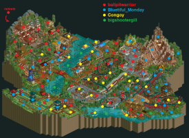
It was great to work with the team on Naam Chalong Suu Oom. Here's the dot map:
Fantastic Work guys one of the best parks I've seen in a long time
Sorry it's taken a minute to leave a few comments!
Wawel Castle
I think this park perhaps plays it a bit too safe. Architecture is quite nice. Love the castle. Strong macro too. But it all feels a bit too quiet or sleepy. There's some odd design choices like having the coaster station be completely hidden along with the lift. But, the pre-lift section by the dinosaur fossil is pretty neat. Kudos for that fun detail and area. There's some moments that are begging for a CTR or at least an invisible ride like the restaurant barge thing. There's some cool little vignettes that litter the map that are fun to explore. Perhaps if you had more time to complete the park you could've really elevated moments like the various plaques and signs to give a sense of what we are looking at. For example, what is this sign saying? The little officer and flag made me think there would be something there..
NCSO: The Park
Really impressive guys, truly. I'll be quite honest in that for most of this building I was worried about how it would fare against the H2H CSO meta, but I think the density of cool ideas and hacks helped win this in the end. Some highlights for me were the Dragon Celebration float things, the chairlift lanterns, and the Test of Courage. Main thing I wish I noticed sooner was the lack of restaurants or shops in the waterside village to add even more busy-ness.
It's been great seeing your guys' creative process and I've enjoyed having the chance to be on your team during your first H2H. Hope you guys stick around NE for a long time.
While this match-up was not my favorite for many reasons, there were still inspired moments throughout that deserve praise.
Wawel had some really beautiful architecture. I particularly liked the curved courtyard made of half diagonals, very very clean and created a nice unique and memorable scene. The streetscape was also well done and of course the castle itself had moments of brilliance. Conceptually, however, the park fell really flat - this isn’t Grand Tour - so a European city without any major conceptual twist or narrative didn’t really inspire much interest. I was also not a fan of the coaster (there were multiple missed opportunities to create better flow and interaction), and the cutaway felt very very unfinished. My hunch is that Liam stepped in to create a R2 park so the original R2 park can have more time to be fully completed for R3... whether or not that’s correct, I wish there would have been an additional layer here; in the same vein as Tomatina with an event, or something a little deeper would have elevated this beyond what it is. As it stands, it is a nice, clean park that does a decent job at recreating its Polish reference material, but not much else. It won my vote in this matchup.
As for NCSO - a chaotic mess with many many brilliant moments. I definitely remember a similar theme from last H2H that was shelved, so I am glad to see it brought back to the table. The synchronized splash boats and the dragon dancers stood out as “wow” moments, and the two-tiered mine train also featured a unique trick. There were so many good ideas strewn about the park, but that was exactly what irked me the most: both the macro and the micro seemed completely missing a layer polish, everything seemed haphazard and without deeper consideration of sightlines, composition, balance, and overall aesthetics. While the ingenuity of the ideas were definitely there, there lacked the refinement I expect out of a NCSO park given you’re already at a handicap in a contest like H2H. On the micro side, there were some really big misses for me - the log flume pagoda, the main temple, the color selection, the giant station made of t-shirt stalls… where was the polish and finesse that we’ve come to expect with NCSO at NE, as found in Age of Sails and SG? Imagine if all the brilliant and unique ideas in this park was integrated into a beautiful, swooping landscape with top notch macro landscaping and a killer layout; that would be a NCSO park that would win my vote in a heartbeat. But regardless of my opinion, I applaud and congratulate the builders and the Hurricanes for the win.
wanted to give some love to Wawel Castle, as i think this matchup should probably have been closer and it was my personal favorite.
i think this park suffered from the idea of H2H, which is understandable. i agree with AVC above that this almost needed an event on top of the setting to give it a little more of an identity. for an H2H matchup, it really seems to be the gimmicks / differences / new stuff that stands out and wins matches, for better or for worse. however what this park is, is an absolutely spot on (re)creation of a real work setting, which is technically incredibly hard and should be celebrated.
the more i look at this park, the more i appreciate the intricacy of the architecture. of course, the macro is pretty spot on to the real life thing, which is an achievement in itself. the castle itself is spectacular, the surroundings are great, it really feels like a slice of Krakow. a living, breathing European city. but what really impresses me on an RCT level is the object usage, when you drill down into each specific building.
it's hard to use a wide variety of small objects and have them come together seamlessly, and Liam is up there with the few people who do it very well. Leon, Xtreme, Ethan from that Russian screenshot, AVC are the people who come to mind also. i'm sure i'm missing some, sorry. but damn, the intricacy here is amazing.
my favorite part, and probably the most detailed of the whole map imo. the trims are spot on. the different colors and textures could easily not work but they're blended perfectly. no one does 3x3 towers/buildings like Liam, because it's hard to build with only quarter tiles and no walls. but damn this bit is so great.
this building caught my eye - great shape, love the roof, and the whole thing feels so real.
the other building that really caught me was this one - love the checkerboard floor and the trim and detailing is so great. the sheer volume of tiny objects baffles me
wanted to highlight the natural blending of textures into each other here. some pretty harsh color/texture transitions but every one feels natural, like buildings built onto older buildings, i'm sure just like the real thing.
my read on this is that unless you've seen this castle in person, or checked out lots of pics on the internet, the accuracy with which this was built will be almost lost on people. it's easy to feel like "oh it's a castle, with not much else going on. i've seen castles before." this is understandable, and like i said at the start, for H2H you do need to cater to people just understanding what's going on and thinking "cool!". but i'm sure this is something that will age really well and become a benchmark for intricate European architecture, and for me the skill level involved should be celebrated.
Congrats to the Hurricanes for the win. NCSO too, that’s a unique accomplishment in H2H. I didn’t have time to dive into these parks when the vote was up, but that doesn’t mean I’m any less interested in finding out more about these parks. So let's dive in.
Wawel Castle - Dambusters
Alright, let’s go Poland! The castle looks beautiful. A lot of interesting shapes and forms. I think you really nailed the look of the real-life counterpart. Some Gregorian keys slamming in the background. Neat! Are those metal roof-panels new? Never seen them before. They are awesome. Going to be used a lot in Euro-parks I think. Archy around the castle is top notch as well. That walkway along the river, with the castle walls on the other side, really feels like a lot of places I’ve visited in Europe. The museum underneath the castle is nice. Greyish water dripping from electrical wires is a nice touch to really sell that Polish handyman-vibe. This is a really pretty park, but . . . imo for a H2H-park it misses another layer. Something spectacular or innovative, or just plain fun. It feels more like a (really great) Grand Tour park than a H2H-park. Where’s the pizzazz? No-one shouting Kurwa at eachother? No annual cabbage soup festival? So much unused potential to really make this park twerk in stead of shuffling.
Namm Chalong Suu Oom - Hurricanes
Disclaimer, I’m not good at NCSO or all the other forms of non-CSO. Not good and to be honest, in most cases, just not as interested. On first glance, I didn’t really understand why this park won. Especially because it won by almost 20 votes. I did like the corkscrew over the lift at opening. That was a nice layout. Than I saw that Test of Faith was a take on the Donkey Kong-coaster. Loved that. It’s brilliantly done. Also, the smaller Temple, ricefields and the river market are really cool. The park kinda grew on me. There were some aspects that just didn’t do it for me though. Like the sanctuary covered in candy sticks and the log boat pagoda. Not my cup of tea I guess. But there are a lot of fun and creative ideas here.
Conclusion
In the end, I think both parks have some really strong aspects and some underwhelming aspects as well. I personally would have gone with Wawel Castle, because I think the overall quality is just better, but I can understand why a lot of people went with the liveliness and fun of Namm Chalong Suu Oom. Though the whole NCSO/DKSO-style isn’t my jam, I am really excited to see how these styles will combine with the NE-meta.
Thanks for the reviews everyone. I think most of what has been said has been nice to read, or fair criticism that I can agree with. Time to address this match from my perspective, with background information about why the park is the way it is.
The concept
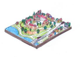
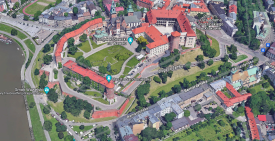
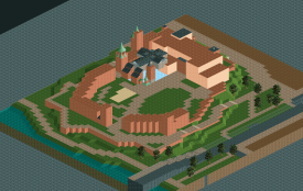
If you consider historical European architecture my comfort one, I haven't been building in my comfort zone in a long long time. I haven't been in an RCT flow in a long long time. Perhaps I need to go back to that in H2H? I proposed that we do a 'citadel park', and Wawel Castle was a candidate, having been there quite recently. I thought it'd be a suitable choice (when picking from life places) because of the super varied architecture and because the setting hasn't really been done before, though not so exotic that the setting itself could be a significant plus. I drew a sketch to determine what area of Krakow should be cropped. Initially I envisioned a bridge over the river leading off the map, but the team mostly disagreed and I eventually also thought we could use the space better. You can see there were no rides planned yet, or at least not incorporated in the artist impression.
The main idea was to center the map on this cool citadel, show a little bit of the old town on one side, and a little bit of the less old town on the other side. The castle would be surrounded by green spaces like the real thing, and I intended to really put some focus on the greenery, making cool custom trees and all. Like I pointed out in my stream, it is a missed opportunity that we tend to spend so much time crafting individual buildings with their own character and stories, and foliage we just plop down in whatever we arrangement we think is good looking. I wanted to challenge myself to create trees that looked as old as the buildings, trees that you can imagine were also there 200 or 300 years ago. Gnarly roots, dead branches, leaning trunks and heavy branches... Trees with character. True companions to this ancient castle. In the end I did make some custom composite trees, but neither ACE nor me managed to produce a new custom tree with this profile.
Who did what
The practical plan was for me to lead the way and do most of the castle itself. Trav would do most of the archy on the old side of town (the shopping strees), and TheThrillMan the archy on the other side along the tramway. In the end, I did most of the latter, and TheThrillMan did a few buildings on trav's side. I did the white and orange building there as well as a few details, but otherwise this area is mostly trav. I think they both did great and it allowed me to focus on the castle itself. Trav and TheThrillMan by the way also did some finishing touches on the castle itself, in select places.
The coaster
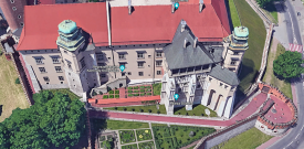
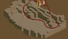
Coming up with a coaster was a pain in the butt. The idea to do a Krakow version of The Dungeon came up, I think trav said it first? Though placing a coaster inside a historical castle is obviously not very likely (or sympathetic), it's a pretty good excuse to include a coaster and still present the map as a fully realistic slice of life. Initially I thought it'd be some kind of Intamin hyper or Gerstlauer whatever around the perimeter of the castle, in and around the ramparts and putting the ancient trees in focus. Couldn't get a satisfying result, and it would typically just obscure the castle facades behind, or make it harder to create a credible park like environment below. I also didn't want to sacrifice the interior courtyard because in my mind that's an integral part of the castle's identity. I'm difficult like that. The side of the castle where the coaster actually ended up is a varied, interesting facade that you wouldn't want to obscure. However, this weird appendix like tower that exists on the real castle begged to have the coaster pop out from there, and then I came up with this layout pretty quickly. I'm surprised at how non-intrusive it is, and the garden-like ramparts below were a much better element for the coaster to interact with that large tree filled ramparts.
The cave
I actually wasn't aware that the real Wawel Castle has a cave below it - the dragon's den. Adding a cut-away cave below the coaster could be a good element to add something extra, a minor wow-factor, to an otherwise pretty simple to the point map. Close to Krakow are the Wieliczka Salt Mines and the idea to combine the salt mines and the castle briefly came up, but I wanted to stay true to the real place and my memory of it. If you need to prop up the location with a bunch of fake stuff, perhaps the location was not suitable after all. We did prop up the cave a bit of course, and I did draw some inspiration from the salt mines, but not in an explicit way. Proposals to include an actual dragon were rejected, instead I opted to add a sculpture of a dragon in one of the cave walls. It can also be interpreted as a fossil of course - either works. I like to think that a lot of mythology (such as dragons) originated as explanations for things like fossils. If we had more time, I would've liked to expand on the cave and make a full, multi-level labyrinthine cave system with a properly executed dragon sculpture instead of just a plopped down dinosaur object. I'm really satisfied with the cave considering I postponed adding it, and then did it on deadline day in virtually three hours. What a rush that was.
Draft around 00:35
Started sculpting; 01:20
Status around 03:30
I will dedicate another post to the making of the cave here, I applied some scenery manager tricks that others might find useful.
Example of a dragon like cave carving in I think The Netherlands
The deadline
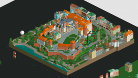
So, regarding the finishing... I'd been traveling for almost two weeks prior to the deadline. There was a lot of hostel building, which I anticipated while planning my trip. I was going to take a bit slower than my usual traveling and I was looking forward to just chill in exotic places and play some RCT undisturbed. Also had some long train trips to fill. Still, traveling is unpredictable, and my building pace is just not what it has been in the past. I always prided myself on being able to carry any park to the finish line, and that's not fully true anymore. My availability varied heavily, and of course some plot twists made me alter my itinerary after all. The map could've been finished on Sunday, but it would be rushed, and not really living up to the vision I had for this map. I was very unsure about using the extension and I made the decision on deadline day. Then I barely built for the next 24 hours, but my motivation to do some marathoning was very high. I cannot explain activating the extension and not using it to my team. I came home, prepped some work shit, and then I spent nearly every hour I had on polishing the map. I even played RCT in class - I was a (for my standards) unusually passive teacher for a day or two. Tuesday on Wednesday I slept for 3/4 hours, and I was more productive than I'd been in at least decade - wow. I squeezed out a cave in three hours like I said, and I used every minute to knock things off the to-do list, and to straighten imperfections and add new content. I had a somewhat finished map three minutes before the deadline. Instead of submitting, I decided to add some bike racks around the map at record speed. I still submitted on time. It felt like I was playing multiplayer, but by myself. I submitted the map and I just collapsed in relief, and satisfaction.
Wawel a few hours before the Sunday deadline

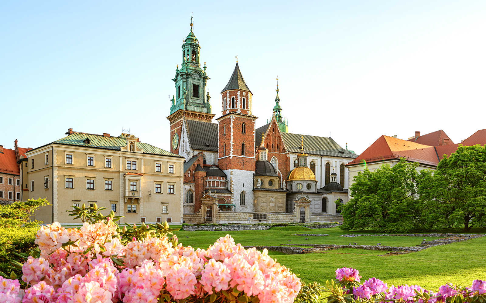
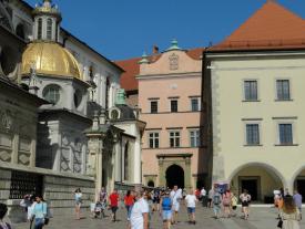
Wawel vs NCSO
In the end, obviously the match didn't go as we wanted. I thought we stood a real good chance when I saw the Canes map, but I misjudged. The way the vote went surprised me, especially with this vote margin, but I understand why people preferred the other map. It was more lively and filled with rides, and they had a good collection of tricks new (dragon celebration, king kong coaster, firewalking) and old (splash animation, but this is the best execution I've seen). I think we have the better coaster, but I really like theirs too and it's just up to personal preference. This is the kind of stuff that does well in H2H, evidently, so fair play. I think the Canes were a bit lucky coming against our map, playing into our weaknesses. I found their park to be quite messy aesthetically, and the architecture very hit or miss. It seems like a pretty run of the mill DKSO-styled map and it's no secret that it's not a style that resonates with me very much. Another criticism that I have is on conceptual level: there's not much Thai about this map, including the name. I think as a community we've moved past generic adaptations of places and themes, and we should make an effort to portray these themes with a degree of authenticity. Again, this is a personal preference and NCSO (the park) just happens to be completely at odds with the approach that I had with Wawel. In any case, NCSO is a cool and really fun map at its low point, and on top of that solid base layer it has some excellent wow-moments. Fair play, Canes. The community has spoken.
Accolade score
It's a real risk to build a non-park so heavy on architecture in H2H, as illustrated by Christchurch in H2H9. The architecture and urban scenes had to be really good, and I enjoyed the challenge to try and catch up on the meta a little bit. I feel like I peaked in the 2010s and I'm kind of stuck in 2018. I was aiming for Wrigley Field level of execution. Not that I thought that I could be as good as the combined forces of FK and hydroportal, but because it's the gold standard for non-park maps. I'm really happy with how some of it came out, and I think I successfully pushed my boundaries. However, not consistently so. Some parts of the map weren't where I wanted them to be, usually simply because of time limitations - more on that later. Despite being happy myself with the final product, I must say I was a little disappointed by the accolade score. Wrigley Field got a 89%, Wawel got 72%, barely gold. How should this map be a better version of itself in order to score higher? I can think of a view things, but those shouldn't add up to close the 17% gap to Wrigley. I'm looking for feedback here, not trying to imply that the panel didn't do its job.
Lastly, a few more screens/pics from the real place.
Liam, I’m not on the panel anymore, but I think I would’ve landed on a 70 for this map. I think there are a few things that could have elevated it to the next level.
Recreations are hard, because you’re not only balancing what’s going on in real life with what’s possible or looks good in RCT, you’re also contending with the site’s meta at the same time. If the site’s meta doesn’t match up with what you’re recreating in terms of level of detail, it’s just not gonna score as well. The archy on this map was absolutely true to the real thing based on some of the images you shared, but only the main cathedral and a few other buildings were up to the current level of meta detailing that you see in other parks. For the more typical buildings, I think flourishes and interpretations could have been added to bridge the gap between reality and what the meta expects. This would maintain the recreational aspect while also giving the community what they want.
Another thing is that the map seemed pretty rushed. I remember saying in the JC Discord that it was clearly a Liam map that was finished really quickly, which turned out to be completely true. Things like having big blank walls on the backsides of buildings on the map edge made this fairly obvious, where it looks like you intended to add more life details and scenes through cutouts that you probably just didn’t have time for. Mostly everything could have probably used another pass or two of polish and revisions.
Finally, I think the park just lacked a level of engagement for the viewer that the community has come to expect, probably likely to the above two points. There unfortunately wasn’t much that kept me wanting to explore the park past surface level.
I don’t think you’re washed up (as you yourself said in the Discord) at all. It takes a lot of time and effort to build, keep an eye on the meta, and constantly improve/evolve to keep up with everyone. Might just be that you’re in a season of life where you don’t have the motivation for that? I'm sure you'll get back into it with everyone else at some point.
Also, I tried to post this review like 6 times in the past three days, happy to see I finally got it.
Missed the vote on this map but it would've been a tough one.
NCSO is a really atmospheric and inventive map. Didn't even strike me as NCSO at first because of how clean everything was. The bone building didn't work for me. I think the roof texture in itself was already messy but doable, but the bones and the carriage just made it look messy. Another minor quip from me was that the park was difficult to place. Is it a piece of a park, is it a theme park set somewhere? There's not really an entrance to it either.
Wawel was a gorgeous slice of city. Without having been there or knowing much about the place it gives a very real vibe. I liked the comparison pictures you shared in discord showing how well you adapated the real place to RCT's metric. The coaster was elegantly fitted. I think my main issue with this was that it's a bit boring. Especially for H2H. I know you were reaching for the deadline, but another layer could have made this a clear winner to me. As for an accolade submission I think it would be nice if it at least felt more lived in.
Wawel Castle:
No second guesses who made this park. Obscure European theme? Yes, this is a Liam park. And part of that is immaculate European archy, that is spot on in trying to represent the area it wants to be. I adore all the little details on this map like the market, the round advertisement towers and the catenary posts for the tram. It all adds to the location and I can see myself walking here. But there seems to be lacking a big mayor draw here. Yes, there is a coaster but it is a large part underground and not much else. IMO going the Budapleasure city park way would've worked better here.
Naam Chalong
Ride design highlight of the contest so far. Fun macro concepts play to the advantages of the base game style. This map is also particularly strong in NCSO micro, the CTR hacks are excellent. Something as simple as this splash boat and then seeing what it actually does is so much creativity and resourcefulness to bring it to life. This is one of my favourite aspects of the game. NCSO boatcraft also continues to win here. I didn’t necessarily desire to outline that it is NCSO like it matters because it is a very complete and conceptually competitive park. It is an excellent entry with great theming, rides, and fun conceptual aspects that give it memorable iconography.
Wawel Castle
The park is executed excellently. The coaster was particularly good here too, I enjoy the way it plays off the castle geometry. I liked how the spread of peep activity seems fairly consistent with a typical day in the life of this town area. I really enjoy the attention to detail like, of course, the trees. It’s a park I will return to and find cool techniques and structural ideas. Perhaps if Poland were a GT round, in which the three objectives included setting, a historical landmark, and including trees native to Poland it would’ve hit the nail on the head. Still, it won my vote for the overall enjoyment of exploring and meticulous execution.
Reviews!
Wawel Castle:
https://youtu.be/VWVVA-ZnfBQ
Naam Chalong Suu Oom:
https://youtu.be/ApugATYA1kY
This was a tough match. I voted Wawel, but I definitely appreciated all the clever uses of vehicles and scenery the more I looked at NCSO.