Park / Castello Altovento
-
 15-May 24
- Views 10,139
- Downloads 252
- Fans 0
- Comments 44
-
-
 77.50%(required: 70%)
 Gold
Gold

In:Cities 85% G Force 80% ottersalad 80% pants 80% Scoop 80% Terry Inferno 80% Babar Tapie 75% Liampie 75% Recurious 75% RWE 75% wheres_walto 75% Cocoa 70% 77.50% -
 Description
Welcome to the Altovento Annual Harvestival — “Salut, I força al canut”
-
 No fans of this park
-
 Full-Size Map
-
 Download Park
252
-
 Objects
3
-
 Tags
Tags
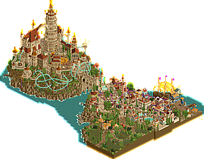
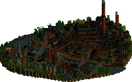
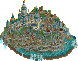
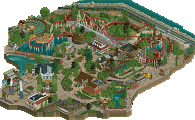
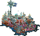
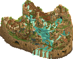
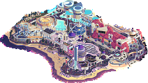
Grand Tour esque prowess against outer space conceptionalism, in a match that needs you to look at both parks twice, at least.
Welcome to the Altovento Annual Harvestival — “Salut, I força al canut”
concluded
Rover depot and weather module, Gamma Station; Mission Bravo archeological and scientific expedition.
Voting rules- The poll will stay open for ~72hrs.
- Do not vote unless you have viewed both parks in-game.
- Everyone may vote except members of either team. Any illegitimate votes will be ignored or removed.
- Anyone with an account that predates the start of H2HX, or who has been drafted onto a team, may vote in this
match. Anyone with a newer account must pass the admins' account integrity checks.
- Voting is monitored by the admins to improve fairness.
Please bear with me, this is my first review I have ever written on NE! I don't usually write reviews because I know how hard everyone works on releasing a park, and I am a people pleaser—I hate making anyone feel bad! However, I loved both of these parks so much, and for completely different reasons. Since I loved both so much, I felt it warranted my first ever review.
Valley of the Kings started off as a slow burner for me, but it quickly won me over. The theme is captivating, and the amazing soundtrack sets the perfect tone for the map. As I delved deeper, the story began to unfold, revealing great hidden scenes beneath the surface.
One of my favorite aspects of the map is the hidden audio files. This innovative feature encourages viewers to thoroughly explore the park, while simultaneously advancing the narrative. It's my favorite detail I've seen in the contest so far.
The only downside in my eyes is that the map feels a bit small, despite the inclusion of both above and below surface scenes. Nevertheless, Valley of the Kings is a fun and engaging map that truly grew on me. Truly amazing!
Castello Altovento was an instant favorite for me. It is brimming with realistic scenes, amazing custom scenery objects, and an overall jaw-dropping atmosphere. The attention to detail is spectacular, with great architecture and a vast map that invites endless exploration.
However, I struggled with the soundtrack. While the waves, classical waltzing music, and village atmospheric noise aimed to set the mood, I found it overly distracting. An interior scene or two within the castle would have been a fantastic addition and seems like a missed opportunity. Additionally, the rock and cliff work along the water's edge didn't quite resonate with me.
Despite these minor drawbacks, Castello Altovento is an amazing map with top-notch custom scenery objects. It's truly memorable and was a joy to explore.
This was the hardest vote for me so far. I love each map for entirely different reasons. Castello Altovento is a realism fan's delight, full of amazing custom scenery objects that will be used by many! Valley of the Kings, on the other hand, feels like a complete story from start to finish. The soundtrack truly sets the tone, and the hidden scenes make you want to explore what lies beneath. The hidden audio files take you on an exploration, completing this awesome story.
This is a VERY close vote for me, but in the end, I have chosen to go with Castello Altovento. The animated custom scenery objects and attention to detail are absolutely amazing. It's a map I will never forget!
fun match up
Two quite cool parks here. Tough vote for me.
Castello has some really unique and fun ride design as well as some very impressive architecture. I was less a fan of the port scene, seemed a little undercooked in places - missing fences, just not fully executed maybe? Love the scale of things as well as the fact that I just kept finding stuff. Map shape is perhaps a bit restricting and I wish the wave effect was a little less limited by the full-tile nature of the objects, but in general I'm a fan of this.
Valley of the Kings is quite impressive indeed. I love the underground nature of everything. Really unique ride design, though it seemed the mine train was a bit underwhelming. LOVE the big skeletal features. The dust and dirt blowing around was either really nice or just sort of poorly executed depending on the particular map feature. Music was great, very Risk of Rain which I love.
Really difficult decision for me. I loved exploring everything both maps had to offer, but ultimately Castello held my attention longer and was executed ever so slightly to a higher standard. I mean it when I say it really came down to splitting hairs to make this decision; excellent work by both teams.
EDIT: Oh, those diagonal windmills are FABULOUS.
Once again I think I may be on the losing side. Cest la vis. Liampie writing the Histories in 2034 will remember me as being on the right side of history!
castello---no doubt a good park, a very solid entry. theres some awesome new objects here---the bobbing boat, the waves that make me slightly queasy, windmills, probably more I missed. the town is easily the highlight, and I particularly love the design of grapevine and its integration. very bustling, lively, and some great white-trimmed buildings, scattered in with a good few buildings that are just good. maybe a bit flat? I like the custom flat, is that the first one we've seen in RCT? i'm less sold on the castle, as we move over to that side of the map. it feels like the walls are thin, or its extra hollow, or something. i think it might have just needed a bit more love, and maybe some more macro, since I'm not exactly sure what its meant to 'be'. But i like the courtyard with the concert. good work all up! nothing particularly blew me away, but often that is enough to win a match. and at the end of the day we are here to win matches.
valley of the kings---now here's something I can really sink my teeth into. I love this park so much---abundantly creative, beautiful, resourceful, and most importantly, it feels completely novel to me. On the surface level, its a wonderfully done scifi scene---extremely smoothly flowing landscaping (wow!), with sand creeping over everything and even rolling across the map. I love all the rounded glass and science greebling. IMO the giant skulls are masterfully crafted and they just look so good contrasted against the blue trees in that central canyon. Really a memorable piece of composition to me, something I'll look back on for sure. the tracked rides are a bit unfollowable but they give me that nostalgic sensation of runaway mine cars, and I love that sensation---so it gets a thumbs up from me. then we have two honestly genius ideas that I hope are not overlooked by the audience. 1) using scenery blocks to build most of the surface, so that pressing the h+v keys immediately reveals interiors. this works so flawlessly I'm honestly floored, and the cutouts are perfectly prepared and flawlessly interwoven. then 2) the audio logs are a really fun (and funny) way to integrate story for those who want to linger a little longer. the extra layer here goes a long way. Finally, the music is awesome and really sets the mood perfectly, somewhere between campy and 'deep' explorative sci fi. (metroid prime maybe?) This park, above all else, gives me the immediately panic-filled feeling of "I could not have done this". And that's how you know you've really done something awesome.
Anyway, I think its highly possible that my clear favorite of the two here doesn't win. I hope the builders are still proud of it though and don't take it too rough. because obviously the most important thing on NE is to impress me specifically, and unluckily for the rest of you i can only cast one vote XD
Soda Jerks: This park introduction with audio is simply brilliant. The music that follows is very kitschy and made me laugh a lot. Thanks for teaching me the h+v combination btw. Overall, it's a great introduction: it's didactic and we're completely immersed into the theme.
This park is quite innovative, this way of fully involving the viewer makes it a truly interactive park which is unique imo. The design is almost secondary, lacking a little detail sometimes and seeming a bit empty in some parts, but there's a lot of quality too (for example the stunning skull sculptures, what shapes!). Further I got into the park and more I was hooked. It's really fresh and a great achievement here.
Jazzcats : Mama this park entrance, such a beauty… That winding ascent with those vineyard curves, concluded by this tower and these half-diagonal buildings, just stunning… High aesthetic quality here, the park is splendid and the architecture speaks for itself, same for the landscape, everything is perfect (and the sea's movement is a real bonus) ! The small harbour area brings a lot of freshness, concluded in beauty by this diagonal boat. My main criticism is going to be a little bit ambivalent: this park is almost too "nice" and too clean. It's visually gorgeous, and I don't think there's any debate about that, but I feel like it's missing that little touch of madness, that little something…
Conclusion : It's a bit strange here, seeing the two screenshots I thought the Jazzcats park would be my favorite, then finally I let myself get totally involved in the Soda Jerks' one. It was still a high-quality match, but Valley of the Kings is more what I like and look for in an H2H park.
Valley of the Kings by the Soda Jerks
-Concept: **
For people that re-binded their hotkeys and didn't hear the audio message correctly (like me ), it's a risky concept, but once you explore all hidden stuff, the concept really becomes alive and it's actually a really refreshing take on doing interiors and audio messages to tell a story. I just wish you did a bit more with it, as the stuff that is uncovered is nice, but nothing really 'wow' imo.
-Content: **
There is quite some content in the form of storytelling and all the structures throughout the map, but I was missing some variation in this department.
-Quality: **
Although the 'architecture' is a bit monotonous, it has great quality and polish to it. Especially the skulls and digging machine are delicious.
Overall;
When I opened this, I was like 'I must be missing something'. Somehow I missed the message saying to use the 'h+v' keys and also didn't hear it in the audio message. Gladly I took a bit more time and was glad cocoa said something about it, so I found out I had re-binded those keys previously, so when I made those vertical faces and base land invisible I was like 'wow, so clever!', and the park became like 10x better. The audio messages also made more sense and were better to track down, so the park became a ton more fun to explore than I initially thought.
The rides were a bit hard to follow, but when they popped out of the landscape it was a nice visual to watch.
Color scheme/palette was great and really fitting the theme. That red/brown tone is just so nice in combination with the sand and I especially liked it when you used it on the Liam rock texture to create gradients with. Also on the 'lat Roof crunch' Ethan object it's so nice into the sand. I wasn't so sure about the cyan on the trees though.
All in all a great inventive park, just unfortunate to face another great park for you guys again.
====================
Castello Altovento by the Jazzcats
-Concept: *
Another Italian theme.. That was what I was thinking when opening the park, and while that's still what I'm thinking, you did include some original concepts, such as the grapevine stuff (Tomatina flashbacks though) and the giant architecture stuff in the back of the park, as well as some original support ride theming.
-Content: ***
Here's where the park shines imo. Lots of things to explore, little scenes here and there, a port, and when you turn the view there is some new content to discover (kind of like in a particular person's MM entries)
-Quality: **
A bit imbalanced, as some spots have higher quality than others, for example the coastline is a bit rough and monotonous, and some of the super high buildings miss some extra polish on them.
Overall;
This map had it's ups and downs for me. From the awesome new objects and ctr, to the somewhat disappointing unoriginal concept, and the great detailed polished architecture at the front, to the the insanely large somewhat unpolished architecture in the back. The grapevine coaster lagged a bit for me, and meandered a bit too much through the city, could do without it I feel.
Zephyrus also lagged, I think because of the overload of animated objects on the map, such as the waves, the splashes and the 'white water' objects. Maybe just had to cut down a bit on all the animated objects to find a better balance which is also easier on the eyes. A few will bring the point across as well and make the game run smooth again!
Anyways, Zephyrus had some great interaction with the landscape and architecture. The Cellar Tour going through and around that mountain in the back of the park was also great to watch, and creates that typical particular person's style with lots of vertical interactions, which I loved so much in MM (I hope this doesn't exceed the speculation of builder line ).
).
But yeah, the cellar tour is probably my favourite thing on the whole map. Following that one around is so much fun and I can imagine riding that would be a blast to see all the scenes you pass through. Little things like the vineyard tour are also great to watch, and the big ship in the port is just very well crafted. Supporting rides like 'Corked!' and 'Rose and Fall' fit very well and are awesomely themed. Tempest was a bit of a weird one for me swinging so high up in the air, but at the same time it fit the waltz atmosphere greatly there. Speaking of which I love that scene there with all those dancing peeps (thx for all the new cso/ctr spacek btw ), and I play the alt-sax, so hearing that second waltz solo was great, as I played it quite a lot of times myself
====================
All in all, 2 great parks again, but content wise Castello wins this one for me.
Castello
Beautiful opening scene with the curvy vineyard (that’s such a cool use of the flower CTR) and the little winery is very tastefully made - it might be the best architecture on the map actually. I’m liking the lively atmosphere in the town with all the different markets, water features and foliage. It’s cramped but appropriately so.
Great coasters in this map - nice to see a less common type in the vekoma family-suspended (I’m assuming?) style one, and you managed to fit some cool interactions into an already busy scene without it feeling forced so great job. The turquoise one was awesome - great moment watching both trains duel through that pretzel element, very clever ride design.
I enjoyed looking around the map at all the small details tucked away in the edges and I really love the small windmills - so cool and user-friendly that this is just an animated object rather than CTR. I can imagine they will be used loads in the future.
I think what held this back for me a bit was the technical quality of the architecture in the town and the castle itself. With the castle I found it looked a bit too clean and fake: a plastic, dolls-house-like quality. I think it’s the choice of surface textures and the lack of imperfections and the rugged, lived-in feeling that the rest of the map has. The structures in the town are slightly formulaic, a lot of 2x2 buildings in different colours with the same chunky (too chunky, really) beige trims. However, it’s not a huge issue as a general atmosphere of the scene was much greater than the some of its individual parts.
In any other match It's likely this park would have got my vote - it's a great theme charmingly executed with loads of fun details.
Kings Valley
It’s unfortunate for Jazz Cats that this is my favourite park of the contest so far. I just love the aesthetics - the way you’ve used colour and texture contrast and negative space to carve out silhouettes and depth is really clever. It feels like the civilisation is erupting out of the land - causing it to crack and tear open. It’s the first time I’ve seen a ‘space’ park that genuinely feels otherworldly.
The monochrome indigenous architecture is visually striking and at the same time has a wonderfully serene atmosphere, especially on the fringes of the map where you just see one or two turrets poking out of the sand. Similarly I enjoy the cohesive colours across the colony structures and how their lightweight quality of glass and metal panels and elevated walkways contrasts with the sturdy indigenous stuff.
I didn’t even need the underground scenes for this to get my vote, I love it enough as is, but you’ve found the most elegant and novel way to show interiors yet which is impressive after however long this game has been going.
Castello Altovento
+ I fell in love with the village and the port. It's so cozy, vibrant and busting with life. Fantastic atmosphere.
+ Grapevine is great. It's amazing how you fit such a long coaster in a packed village and without looking forced in.
+ I love the fountains and stairs and the way they flow through the village.
+ The vineyard area is very quaint and well crafted. I like the little scenes here.
+ The wave objects are very cool. I especially like them on the windmill side. I'm not sure yet if I like how you used them in the port. All the other new objects are amazing too. It's great to see more useful animated objects.
+ The waltz scene is incredible. Such a great moment.
- The castle is not bad but it feels unpolished and unrefined compared to the architecture in the village. The same goes for the landscaping around the castle.
- I would have chosen a different color for the parachute ride, because it blends in too much with the background right now. I like how the peeps are dancing on top of the tower though.
- The custom music in the village was a little bit noisy. My ears couldn't figure out what was going on besides barking dogs.
- The floating Tempest flat ride killed a bit of immersion and reality for me.
Valley of the Kings
+ This park is fresh! It's great to see some innovation in terms of storytelling and cut away views. It's fun to explore the audio logs and listen to what German Liam has to say.
+ I really like how you made a new world that's very faraway and alien yet believable and familiar. The combination of sand, red architecture and blue foliage works really well.
+ I love the blue, yellow and grey architecture. I like the digger too. The eye for detail is great in these areas.
+ The skulls and the citadel chains are executed flawlessly and are very cool.
- The strings of peeps on top of the black tiles walking up to the park damage some of the immersion. There are better ways to do that.
- The rides were not bad at all and I like how you integrated them with the rest of the park, but I missed some rides that are truly memorable.
This is a very hard decision. I don't want any of these parks to lose this matchup.
Neither of these parks deserve to lose.
Castle Park
I opened this park first. Best opening scene of any park this contest. Hell, maybe my favorite little piece of RCT ever. Definitely for a long time. The vineyard, the thatch, the tower, the waves lapping the coastline... this is just a special, special theme. I was almost sad to see a town when I scrolled over, i was enjoying the setting so much. however, wow what a town. the colors, architecture, pallette, curved pathing... this is such a great theme. no two buildings are alike, but there's enough common thread between them to feel organic and natural and serene and regal all at the same time.
scrolling over to the dock area, another great setting that fits perfectly. diagonal ship is such a flex but it's perfect. the blues and greens and yellows in the archy make this feel a little Curacao, a little Mediterranean, really hard to pin down but so believable. I could wax lyrical about this area for a while. The coaster is nice but almost unneeded for me.. i just want to look at the town. but if there wasn't a ride here it might feel empty, so hey. the coastline rockwork is great, and the windmills and waves work so well. although the waves do make me feel slightly nauseous in my peripheral ha.
in a weird way, i was enjoying the town so much that when i discovered the massive almost fantasy castle it kinda threw me off. it's impressive in scale but feels a level below the rest of the map in terms of detail, and somehow stylistically different. there are still great things to see and follow, but it left me a little underwhelmed compared to the opening scene and the town. feels harsh to criticize though. overall still a fantastic map, with one of my favorite theme sections for a LONG time.
Valley of the Kings
This is a BALLSY build. First of all, a completely novel (as far as i know) theme idea with crazy foliage colors and a potentially jarring landscape. Second, a map that requires people to go hunting for context, and press the right buttons to reveal a lot of the work. Third, a lot of the map is RCT sand, and the content that is there is hard to see, multiple angles blocking other things.
I love it.
First time i looked at both parks yesterday, I thought i'd be voting for the vineyard park pretty comfortably, the skill level on that entrance part is just too high. but today, finding all the audio rides, drinking in the atmosphere, this really feels like a remote mysterious map with stories and history. the aesthetic of dark red rock, bright sand, and purple and yellow space theming is so nice. the blue trees. the dark local monoliths. the massive half-uncovered skulls. the excavator.
overall it's a riskier park. it's definitely a messier park. but i think i just like it better.
it's so hard to judge these... skill level and execution should be rewarded, and are usually where my vote would go, but i also think novelty and vision should be appreciated. both worthy winners.
Opened the parks twice today and am blown away again. Such a great matchup again, this H2H is insane.
Little time to go in depth so I'm just gonna mention some of my favorite things on the map. Not even gonna try to find something negative
Kings valley:
+ clever to make the park legible using by hiding base land and vertical faces
+ both architecture and landscaping had really nice aesthetics
Castello:
+ some of the best architecture in the contest so far, my favorite part was the little harbor
+ that coaster interaction was splendid
What a great matchup. Congrats to both teams for bringing two fleshed out maps to the table.
Castello d'Italia:
-Quaint and beautiful opening scene. The winery building is my favourite piece of architecture on this map, it just looks so lovely and .. REAL. The way it is nestled on top of the hill surrounded by trees is just wonderful. Great stuff. I like the hustling and bustling in the city/village, with the coaster carefully wrapping around all the different casas and palazzos. The further up the map I go, the more rushed it seems though. As others have pointed out, the contrast is there between upper and bottom half, however brigning this much content to a map is truly commendable.
Valley of the Jerks:
Opening audio, love it. I think it is quite hilarious to include Leon here too (dont know if it comes close to his voice IRL tbh). And damn, I love the aesthetic here. I am going to sound like a parrot, but the monochrome bordeaux against the sand works so well. The yellow/purple on the base looks good too, and the old towers are so well crafted. If I have anything to critique I would have loved a dive coaster in here, and it may have benefited from an irregular shaped map instead of a square.
Eyes wide shut song in castello almost got my vote but valley of the kings was too powerful. One of the best things Ive seen in this game in a long time. So impressed
Castello:
Wow, there's a lot to like here. As everyone else pointed out, that opening shot on the vineyard is so beautiful. That and the village are highlights for me. Really enjoyed a lot of the finer details like the cascading waterfalls in the three pools:
Really impressive sense of scale here. Also, the harbor area is neat - really feels like a lived in location and to me it makes sense. Got to have everything if you're going for immersion and world building. There is some consistency issues though between the village and the harbor in terms of scale. Funnily though, this village would be blowing us all away in H2H8 or 9. It's quite good.
The castle as others pointed out is a bit of a clash. It feels.. plastic? The textures seem off, namely the bare wall where the pendulum is. Overall, that island and it's detailing underneath the castle is top notch. It's also quite contrasting with the cliffs near the diagonal windmills that are very repetitive.
Zephyrus is a great coaster no doubt. Good interaction and enjoyed watching when trains would pass each other. Very thoughtful layout. Some insane elements like an upside down lift? You guys are wild.
Valley of the Kings:
I'll be honest in that I really didn't appreciate this map fully until the 2nd viewing. It truly is a slow burn. There's a lot of things that people probably need hand-holding with (like myself!). Namely, repairing the cable. I had no clue! Big risk in making a concept like this, but it really pays off. The opening audio sets such a great tone and vibe to the park. There's so much to reveal and explore in this park. It rewards you for spending time with it and that is quite cool.
The coasters are neat - the Expedition Everest-esque mine train is neat. The zipline is cool too. I get almost a Starfield or No Man's Sky meets RCT vibe from this. The landscape feels hostile and alien. Really good terrain with the transitions from sand to red rock. I want to see all your parks set in this universe.
This park took risks, it's unique, novel, creative. I think the only major drawback for me is that the storytelling could use a bit more tightening up. The shoutouts to the Jazzcats and our bald savior Terry are cool, but you could've really pushed the world building up another notch.
Another great matchup, both parks with great details thruout.
Grapevine coaster is an even better take than the RCT scenario original by the same name. The wine spilling into the wavy water is my favorite detail, out of many.
Meanwhile, those are some king-sized skulls in the valley. The audio accompanying the crashed ship is awesome presentation. The little sand wisps are cool contrast to the waves in the other park. Color and negative space stand out as strong suits here.
Good luck tycoons! ~B-]
Minideanos took a turn to negative town for these reviews. I'm sorry, I can only type what I hear!!!
Castello Altovento, Jazzcats
This is a journey of incredible highs balanced out with some mediocre sections where I'm guessing you guys got right up to the deadline.
The opening scene is so wonderful. A calm vineyard, lovely angled buildings, flip around and see the great new diagonal windmills, and the incredibly simple yet effective waves... moving over to the town, this is so incredibly dense and rich. I don't get the Witcher base material personally, I just haven't played the games, but I don't care. The little town seems to have it all - wonderfully detailed buildings, the greece tents forming a wonderful market, with flowing water, sparse trees. It is just so... pretty. I like it the same way I really liked Villerouge. This section, I think, is my favourite part of any H2HX map so far.
I wasn't totally sold on how Grapevine integrated with the town. The supports seem to be mostly attached to buildings and being a different color from the track it feels like the coaster is hanging a little too much. I'd have liked to have seen a bit more integration. As it is, if you deleted it, you wouldn't really think anything was missing from the map.
The ship in the harbor - another high point. The animated penants in the sail are so good. These new simple objects bring so much life to the map (no framerate issues here). The suspended barrel over the ship plays into the theme so nicely.
The harbor next to it could have used a little more time. Some of the roof overhangs near the ship look frail. I can buy the straw ones but the black roof over the crane feels strange.
One thing I've learned this H2H is rockwork is strangely subjective. I feel like this is good, but lacking a few more of the underhang rocks to obfuscate the base of the 2x2/1x2 objects. Looking back at this section of the map from pretty much any angle, I get that warm "you know you could never do this, so just enjoy it" feeling.
The other side of the map sells the theme really well with rides and activities in the town square. The larger scale buildings to me fall short. These are really difficult to do because they dominate the map and drown out everything below. I think the main tower is one colour short, although the texturing work is solid. The building that the tower bridges over to is just a little too angular for my tastes. It feels like this section was just done separately from the town and it needed a little more cross-pollination to get them to jibe together.
I really enjoyed this map. The Cellar Tour ride is a great way to have a ride show off all the elements of the map and the theme you guys wanted us to look at. It was a good, straight up honest piece of RCT, with some really impressive elements and some that, to my eyes, needed a little more time to get fully cohesive with the great little town.
Minideano comments: "why is the beer purple?"
"dad, that's a lot better than the grape vines you made in your greece park"
"that man pumping that mine cart must be about to DIE"
"8/10. It was good. The ship was AWESOME"
Valley of the Kings
I had a lot of problems with this map getting the theme. "Valley of the Kings" to me, personally, so strongly means "ancient egypt/temples" that I found it really tough to get past that. Eventually I just realised it was a reference in passing, I guess?
I think when you go for a really strong theme like this, you're going to get a lot of people absolutely loving the park. That's definitely the case, so mission achieved!
You're also going to get some people who are more on the slow end of the spectrum who don't totally get what you guys were going for. One of them is me. I would have liked for the map's title and description next to the screenshot to sell the theme to me a little better so I knew what you were going for.
But there's plenty I really liked here. The audio throughout is designed wonderfully, audio log 169 in particular, "before slapping himself on the ass and jumping out my office window. What am I still doing here?" Brilliant!
The sandstorms moving over the sand are a great effect done just right. I love the spacestation on the edge of the map and the excavation digger. The solar panels are one of many great little touches to add context. I did really struggle to find a ride I enjoyed. Ancient Valley Mining was a miss for me, the lift hill was selling two duelers which the rest of the layout, largely hidden and difficult to follow, didn't deliver on.
Minideano comments:
"That looks like zonaite, can you mine it?" (been playing too much zelda)
"where has the roller coaster gone?"
"7/10. The skulls were nice but I couldn't really see anything" (I did press V and H for them!)
Valley of Kings, by the Soda Jerks
The most unusual approach thus far in the contest, nearly half of this park is set underground. I have to say, the immersion is quite convincing. Building the monochrome architecture into the sandy dunes helps tremendously, and the blue hues underneath the sand help provide that essential contrast. Asking the viewer to use the V and H toggle is a bit of a risky move (in the event people don’t read the opening messages), but the effect is cool, quick, and precise. The architecture looks what I’d expect from us if we were to discover and colonize a new planet. The hidden audio logs are an absolute must listen, and actually elevate this park. The animated sand breezes are a nice finishing touch.
What I would have appreciated more from this park would be better readability. At times, it feels a bit twisted and lopsided. Having a more concrete, easy to follow coaster would have done this park wonders (though, not at the expense of the mine train, it fits the theme well). But say, a launched wing coaster with a small underground section or two would have been the direction I went. All things considered, this is a great effort.
Castello Altovento, by the Jazzcats
The opening island is soothingly good. Swirling vineyards, vibrant architecture, and a great coaster. Are the Giovanola trains brand new? I haven’t seen these before in RCT. Either way, I can’t wait to put them to use, because I love Anaconda. A perfectly fitting addition. Track layering is also outstanding. Overall, the seaside breeze is captured beautifully throughout this park. The waves and windmills provide a much desired sense of visual motion. Moving towards the upper island, the big scale of architecture is certainly appreciated. Awesome terrain coaster to boast, too. The timing is too good.
While I love the big scale, the central circular tower is too repetitive in construction. Probably too many windows, which need broken up with either outward spires or just brick. The coaster looks somewhat undersupported. It goes without saying, but it’s the more simple theme of the two, for obvious reasons. That doesn’t detract away from the excellent qualities present. A lovely creation.
Final Verdict: I ended up giving both parks the same percentage score. That said, there is one park I would come back to more often. And that would be Castello Altovento by the Jazzcats.
Valley of the Kings
+ Such an intriguing map at first look (and listen)! Alien landscape, extremely cool-looking buildings, things moving, voiceovers talking... what is happening? Very immersive and really draws you in
+ Love the flying sand effect
+ The valley! I am still not sure exactly what is going on, but this is some cool shit. The Good Death meets Atama Yama meets Extraction meets Dig Site 4?
+ The audio logs are really a nice and entertaining layer to the park! It does make it feel like you are watching the opening scene of a cool sci-fi movie
Neutral - The sparseness. I really want to applaud taking the bold decision to let like 40% of the map simply be land tiles, but at the same time, it maybe is just a bit too sparse, or maybe you could have somehow refined the shapes of the featureless landscape portions. So it ends up as a neutral point for me.
- Peeps entering and leaving the map are not hidden! Feels lazy. You can just raise land around the paths and give them void walls and surfaces, done.
- Although a very large coaster might have been too imposing, it does also feel like it could have used a more impressive main ride
Castello Altovento
+ The Italian vibe is hard to nail better than this
+ Two very fun coasters! Zephyrus' heart pretzel around the bridge is objectively awesome.
+ Some great details, love the boat in the harbor, the windmills, and the vineyard area
+ The billowing water effect looks great, really sells it. I can see that object being used *a lot* going forward
+ The main castle is very impressive
- While the concept of basing it around wine and harvesting is fun, it seems a little thin for H2H. I'd compare it in spirit to La Tomatina, but I feel like La Tomatina had the more unique idea. Just by a hair, but just a hair can be the difference between what feels like a kind of bland concept and something you haven't seen or thought of before.
- The rockwork and landscaping is ambitious, but I feel like it doesn't really come off, and it feels a little undercooked in some areas. I'm not sure the transition from rough rocks by the water to smoother rocks (dirt?) works that well
- I didn't quite get the swinger ride under the arch on the big castle. Why isn't there any indication of arms attaching the cars? Really just looks like they're flying around
In the end I went for Valley of the Kings. Both parks can compete in terms of "build quality" but there just was something that felt very fresh and compelling about Valley of the Kings. Great work both teams!
Going to try and knock out a quick review while sitting in a work meeting that doesn't have a lot to do with me specifically.
I really want to highlight how much finesse this Jazzcat map has throughout. From the opening scene leading all the way to the castle - it's beautifully rendered. I'm a sucker for narrative and worldbuilding, and this park starts that off very strongly with the opening scene. The vineyard tour is such a brilliant little detail that I hope doesn't go overlooked. The half diagonal architecture for the little thatch roof structure is very well done, and serves as a welcome entry point for the map to come. The transition over to the seaside city is expertly done. The contrast between the two areas is seamless and feels believable.
The city itself is home to my favorite coaster of the contest so far. It's unique, its flowy, it has awesome interaction, and it's beautifully colored. Well done to whoever built this masterpiece. I think my favorite thing about this map is just how vibrant it all is. For the amount of tan color used, the vibrancy really shines throughout. Excellent color combinations all around. The double layered bridge is another one of my favorite features here - the arches and pretzel loop frame it beautifully.
The castle area is super well done to me. I think we've all just been so spoiled with textures over the years, because the overall aethetic here is appropriate and believable. I particularly love the minimalist style detail of the wall next to the pendulum. It's not too busy and is just the right amount of detail I think. A big highlight for this area is the layered levels of path. There's clearly a lot of effort that went into laying this whole area out to be not only visually interesting, but functional as well - which I appreciate.
The underlying wine theme is such a fun layer to this park, and I'm glad there was a strong focus put on it. I really like the tall winding ladder that leads down from the back of the castle to the wine cellar below. Also nice mermaid. The connections to The Witcher were very evident to me from the start, and I think thats another really great layer to this map. While it feels italian, I see a lot of significant eastern european influence throughout the architecture as well.
All in all, this is one of my favorite maps of this entire contest thus far - second only to Medieval action park. You guys have a lot to be proud of with this one.
Josh