Park / Castello Altovento
-
 15-May 24
- Views 10,139
- Downloads 252
- Fans 0
- Comments 44
-
-
 77.50%(required: 70%)
 Gold
Gold

In:Cities 85% G Force 80% ottersalad 80% pants 80% Scoop 80% Terry Inferno 80% Babar Tapie 75% Liampie 75% Recurious 75% RWE 75% wheres_walto 75% Cocoa 70% 77.50% -
 Description
Welcome to the Altovento Annual Harvestival — “Salut, I força al canut”
-
 No fans of this park
-
 Full-Size Map
-
 Download Park
252
-
 Objects
3
-
 Tags
Tags
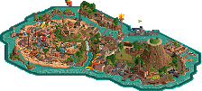
Two beautiful maps, I'm a fan of both. The matchup kind of reminds me of Troubadours vs Lostileth, really believable medieval castle+picturesque town with good landscaping vs sci fi mystical built into rocks stuff with canyons and great technical rct landscaping.
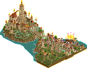
Castello Altovento's solution for doing the waves is simply genius. Some of the new animated cso is so masterfully done. I like the overall composition and many of the ideas. The colors are great. The wine cellar themeing and the organic vineyard on that hillside are done really well. The town is beautiful and has a lot of life as well as a lot of content. The dancing is shown very well in a lot of spots and works well with the music. The foliage is wonderful and together with the landscaping makes for a lot of very picturesque spots. The market stalls and moments of interaction with water/the fountains add a lot to the town. I love Corked!, really quirky and fun idea. The Cellar Tour also has a lot of great interaction. If we zoom out the position of the palace is a big macro statement sitting off the coast and towering over both the ocean and the town.
Sadly when zooming in though, the palace doesn't really deliver enough in my opinion. It sits on that rock amazingly and you anticipate it to wow you already before really seeing it. But the composition of the castle/palace structures themselves is not on par, I feel. I realize, that a lot of thought was probably put into the palace as well, the giant arch shows a lot of purpose, as does the bridge. Talking about those two and the map as a whole, the Toussaint references are obvious, and I'm a huge The Witcher fan. So I appreciate that you brought this to RCT. But maybe, like for the one in Toussaint, the palace needed a bit more building up to it on its island still for it to feel like a singular structure. Spiral up to the main square and have buildings already act as a visual foundation around the bigger stuff. Have the palace be more like Mont Saint-Michel, where the main structure acts as one and is less disjointed. I see that you really wanted to emphasize the arch. But it seems to me that as a result you didn't know what to do with the facades around the arch and that you ended up with a disjointed palace because you didn't want the huge space below the arch to be interfered with by adjacent structures. I think this is where some different solutions for the palace layout or even just some additions to make it come together better would've really helped. The way it is I feel like the map has some incredible spots, some great spots, and some spots where I think you could've or should've got more out of them.
Overall it is an amazing map and it follows the overall level and great execution of this H2H though. I like it a lot and see a lot of skill and creative vision in it, but sadly I just did not love it as much as I wanted to.
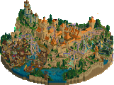
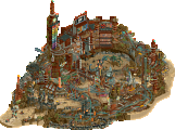
Valley of the Kings is a very mysterious map and I'm a big fan of that. I also think it has an amazing aesthetic and visual design to it. It feels quite different to rct convention to me as well. The fade between the sand and the red rock architecture is amazing. The colors and life in the excavation canyon are great, although I think there could've still been a bit more life down there. That's just from an rct point really, it makes perfect sense the way it is, too. The map came dangerously close for me to how Esoterra appeared to have a narrative but then just never really allowed me to understand what was happening. This one though definitely still sits far enough on the good side of that border between too mysterious to understand and having enough of a narrative to take it in. I love the skulls, the verticality, the ideas, the machinery, the astronaut stuff, the base camp in the front and the few rides there are (including the Rovers). The way some of the machinery is fit so tightly deep into the excavation I didn't quite get. But overall the deeper parts of the map are just awesome. The wind effects, and the dust by the excavator are amazing as well. Props also for the soundtrack and the opening audio. I think this park came together really well even though it appears to have less content than the other one. It's just very consistent, it's intriguing, and it's beautiful. After a lot of thinking, I had to go with my gut feeling and gave Valley of the Kings my vote. It's a very daring map and has a lot of technical skill to it as well as an awesome composition.
Great job to both teams.
Valley of the Kings:
Some great sci-fi, the modern spaceships and equipment exploring ancients ruins adds some variety and an interesting story. And probably my favorite way I've ever seen cut-outs done, love being able to toggle them like that. Really nice use of negative space up top, and the interiors are fun to explore, especially with the interactive audio logs. Overall, this feels like a very complete experience, a lot of well thought out and technical tricks and design choices.
Castello Altovento:
A very pleasant opening scnene before heading into the town with excellent architecture and trim work. Ride design is great, two coasters that weave through the surroundings and have a ton of good interaction moments, the cellar tour was also a lot of fun to follow around. The castle itself is an impressive structure, the dance scene is a nice touch, though I felt like I could see a little too much empty floor through the windows. Lastly there's some really nice objects, love those windmills and that water effect is a simple and effective solution to have waves.
Castello Altovento: loving the warm colourful and lively atmosphere of this map. I understood that the architecture is based on a city in a game, which looks to be inspired by Polish architecture. Transposing it to a Mediterranean environment is a pretty cool move (by the game), and I get the idea that this eclectic approach also extends to the language used. Personally I would've emphasised this aspect even more. In any case, it's nice to have more Polish influences on NE, it's a cool country I want to see more of. The execution isn't always amazing, some buildings are rather crude, and the rockwork is a bit spammy. But it's alright, as this area of the park is greated than the sum of its parts. The second half of the park similarly ranges from just lovely to 'could've been better'. But this is H2H, and time constraints and other factors result in these imperfections, and us viewers become overly critic. Even the weakest parts of the map are still lovely. The castle despite its questionable macro has some strong detailing, and I love how each angle exposes new details and ride interactions. The wine cellar cave is a standout detail, perhaps second to only the waltz scene. Amazing. Last shoutout to the new animated objects, that will surely see a lot of use.
Valley of the Kings: the hiding land trick was not obvioust to me on first viewing, so I explored a but using cutaway, which I found messy and confusing. All forgivable, because I know what you did now. It's a smart idea, well executed. That goes for the entire map: it's so well executed... Clean, yet detailed The skulls are some of the best sculptures ever done in RCT. The audio messages are another great idea. I'm not sure I like the 'funny' approach you took here. The map looks pretty mature and artistic at first, but them I'm listening to ass slapping jokes. I laughed, but not everything has to be farcical. I would like to explore and figure out what kind of alien society we've uncovered here, but it seems like the jokes are as deep as the lore goes.
It's a tough choice in the end. Do I go with the technically perfect and aesthetically stronger VotK, or the more pleasant feeling map with stronger rides? Will think about it for a few more hours.
edit: Thought about it for five more minutes. Will go with the Soda Jerks, as I find their park to be a more well rounded cohesive concept.
Two clearly very impressive parks. JC with a lot of beautiful design, beautiful scenes, beautiful ideas, but macro wise falling into unexpected holes every now that created chaos, which sadly brought the map down for me.
SJ pushing it farther than far, and intentionally so to jokingly annoy you. Successfully. I think you're asking too much of an audience to do and follow the "script" you want for the park. But because the script is very good, you get away with it. Despite all the shenanigans, the park itself is stylistically excellent, and the idea to hack in a custom cutaway view on button press is genius. I'd be happy if it remains a one-time use though to be frank.
Castello Altovento
That opening scene with the swirly gardens and all the little grape picking details is just straight up art. So gorgeous!
Moving away from that, I had to blink a couple of times and realize I was not hallucinating. The moving water, how? That's when I realized this park had more in store than on first glance. All the animated objects like the swinging lanterns, Waltzing peeps, waving flags and of course the freaking diagonal windmills cuz why not. Way to rub it in that you guys managed to get spacek on the team haha. Awesome stuff, some of the best objects to have ever been created. They were especially well-used in the scene with the diagonal windmills where I was also a big fan of the tons of seagulls sitting on those pooped under rocks lol
The big ship is also brilliant. I also loved all the grape signatures in the back half of the map, great work Jazzcats! I will say, in any other matchup, I would have voted for this park in an instant, it's just a shame it had to go up against one of my all-time favorite H2H parks...
Valley of the Kings
Wow, what a phenomenal park! Upon opening this park, I immediately said: "this feels small, they must be hiding something" and, ya guessed it, you guys definitely did haha. Making cutouts work with a simple trick of hiding the base land and vertical faces is brilliant. The opening audio is so intriguing and really sets you up for exploring the rest of your park through interactive audio. So much to see underground.
Big hats off to whoever made the skull sculptures, these are the best to have ever been build imo. The rockwork is integrated really nicely into the sandy landscaping and the same-color architecture.
Ethan, I hope you have the best day ever for blessing rock enthusiasts like me with even more new Fisch rocks. To the rest of the Soda Jerks, well done! I'm very impressed to say the least.
Castello -
I found this park somewhat frustrating because while the high points (wine gardens, new objects, waltzing peeps) are truly exceptional, I didn't feel the quality was consistent throughout. A lot has been said about the village textures being flat and the castle design feeling hollow. I thought the landscaping was also a soft spot, particularly the jagged white water along the rocky shore. It just feels unfinished and lessens the impact of the waves for me. As far as the rocks, I thought the flat surfaces used on the castle side were more effective than the roughly textured fisch rocks on the village side.
On the positive, the waltzing scene was truly captivating, I stared and admired for a while just enjoying the vision and mood you managed to capture. The curvy wine gardens are excellent and tie in nicely with your R1 park. I loved the little details hidden throughout, there is a lot to find here! I loved the grape murals, cove with hobbit doors, seagull shit on the rocks, the reverse walking tour guide shows a keen attention to detail, and the animated objects are both effective and novel.
All in all, this park is deserving of a victory and the builders and team should feel proud. While it might not be an ideal result, parks like this make me excited for what's yet to come
Episode 2, Part 2: gamma is losing steam
Well, our second matchup is here, and I think I'm starting to remember why I'm typically not a reviewer. I'm starting to struggle here, and my teammates are probably starting to get mad at me for spending time on these reviews and not on team duties. Nevertheless, I must continue on, since these parks all deserve it.
Castello Altovento
Well, we start off with what is probably the best opening scene in this contest so far. I'm generally not the biggest fan of the hedge CTR and its cousins, due to how often they get used haphazardly or in a forced manner, but all of that goes out the window here, because this might just be the perfect use for it. Lovely bit of RCT.
And then we get to the rest of the map. It's honestly just as beautiful, and wow is it impressive. Love the town, and Grapevine is such a cool coaster concept, one of my current favorites. The bridge is downright sensual, and what's across it is ambitious and awesome. The island's overall shapes are great, and Zephyrus is yet another great coaster to add to the contest's Hall of Fame. I especially love when the trains meet at the double Immelmann/Dive Loop element. Fantastic.
But perhaps, the coolest stuff in this park is what lies on the lower levels. The cellars, tunnels, piers and all the little details (and Ariel) make the park's concept so strong. If I have any criticism to offer, it's that there might be some level of inconsistency in the park's overall granularity (micro-wise), but that's really just the tiniest of nitpicks. We've really gotten to the point where someone like me struggles to find flaw in anything produced by the highly skilled competitor pool we have today; the level of quality is so consistently high.
Oh, and the water fucking moves. What the hell. In all seriousness, congratulations to the builders for getting this ambitious park done in time, and thank you for contributing to another heater of a matchup!
TL;DR: quaint, impressive, great rides.
I truly hope we can keep this level of quality going for the entire contest. I don't know how probable or viable that is, but it would easily cement H2HX as the best we've ever had, and I would love to be here for it.
The poll is now closed. The final voting score was:
A map enabling new levels of storytelling comes out on top against new heights in European theming. Congratulations Soda Jerks, looks like that extension was worth it.
Enjoyed working with these fine folks on this map, and congrats to the Soda Jerks on the W
Valley of the kings has been a real standout for me from this contest, very impressed.
Castello had great moments but on a macro level it kinda fell apart for me. If this was not as disjointed I probably would vote for it.
Working on this park was a labor, but I think it's one that I love now. I think Sax originally came up with idea of Toussaint from The Witcher 3, but Jene ran with it. Supreme94 and I joined in to support Jene as the technical lead, however, outside of the general set-up of the map, Jene stuck to the castle side while I focused almost entirely on the town and 94 on the vineyard and helping at the docks. At the start, getting 2 great coasters was 94 and mine's goal while Jene started castle work. This was the park 1 week in:
94 and I worked on loads of layouts but in the end, we went for unique coasters types, and heavy interaction with the surroundings, which ended up with 2 of my layouts, and sadly none of 94's made the cut even though he had some strong ones. After getting the coasters settled, we had started building all around the map. Jene was blazing through the castle. 94 had a steep learning curve with it basically being his first CSO build ever. In the end, he had some really strong building that did make the cut, my favorite being his dock crane building which really brought the docks area all together in the end. Alot of the buildings down there were actually a collab. He did the ground work, and at the very end I came through and upgraded them a bit. Getting the town going was a bit of a struggle as the macro needed adjustments a few times. For me, the challenge was building in a fantasy style. While some people thought the park was realism, or semi-realism, that just wasn't the case. Almost everything ended up being inspired by the witcher so I would call the park a grounded fantasy style. Either way, the town was much different than I had ever worked on before and I also, I am unfamiliar with the source material (a debate on whether or not to be direct on the game's inspiration went on until the very end) Halfway to the deadline, I was making decent progress in the town, but you can see some of the macro before here:
4 weeks in the park was on a good track but there was still alot to do. Once round 1 ended, Steve was added to our line up to help with paths and macro work, mostly on the town and vineyard side while Jene chugged along on the castle. You can see the major changes Steve made to the macro here:
And at the time Jene was mostly done with the castle and had started working around the base to get rockwork down and the integrate the coaster into it. Here there was alot to still be done:
While Jene continued to work the island's rocks, and I on the buildings in the town, Steve was now able to help guide 94 on the vineyard, and 94 also was getting finishing touches done on all the ride hacks. He was a good sport about all the times the rides had been closed on accident, but he became a pro at it (which came in clutch when a ride had to be re-shoestrung 15 minutes before the deadline!) But what is perhaps most important in this match, is what you do with your last 3 days of building. Alot of the park was complete 3 days before the deadline, but there were still some areas that were virtually untouched outside of inital macro over 5 weeks earlier. This is what 3 days before the deadline looked like for us:
The scary thing was how little the availabitliy was for the last weeked. Steve had his last session before these screens, and Jene's last major session was the next day. The last day was 94 and I passing the save back and forth to keep progress and consistant as possible as we planned what we would do each time we had the park. Getting in the little scenes around the map was also extremely last minute. 94 guided me through our checklists of things to do for the whole last day and up until the last 15 minutes. There was a lot more we wish we had time to do but sadly the deadline will almost always cut those plans short. We had wanted to add some interiors to the castle, an underground cellar scene at the coaster's brake run, a lighthouse near the waves, and of course more details everywhere. But what we finished with, we were overall feeling good about.
The work done on the park may not have been worth all the stress in the end, but I think we did make some good RCT and I hope people will come back to the park every now and then. Shoutout to Jene and 94 for sticking it out through the whole thing. Steve for really taking this park to the next level. Tols for the objects he made, and SpaceK for all the amazing objects and CTR that the park needed to really sell the ideas. Sadly, they will surely be used against us. Thanks to the other Jazzcats for all the feedback... And of course thanks to Leon for putting us goobers together to make Castello AltoVento happen.
And congrats to the Jerks for their great park and their win! You put up a fight for sure.
Bingo cards out, fellas. It's goblin time.
Castello Altovento: What a beautiful beautiful park, probably my favorite of the contest along with Constellations. Not something I was happy to admit when I found out this is what we'd be going against. I'm absolutely shocked at the builder lineup; this is some of you four's best work ever. I legitimately thought AVC or Leon was on this park, and funnily enough I later thought all of Brightside's work was Leon. Says a lot about how damn good that dude is.Grapevine and Zephyrus are two of my three favorite coasters of the contest along with the flyer from Lostileth. The main city is so lively and gorgeous, and that scene with the diagonal windmills is one of my favorite moments of the whole contest. I can't believe the vineyard is mostly by a player with no prior CSO experience, even if Steve had to step in. That is absolutely bonkers. The castle, while a bit bulky and flat at times, is a real statement piece; the tallest tower especially. Absolutely adore the scene with the waltzing peeps. I'm also such a huge fan of the wine motif throughout, from the vineyards to the leaking barrels to the grapes painted on the walls. Really does give it that whimsical Leon/AVC feel. The new objects throughout are beautiful, and the moving water looks perfect when grouped together. Not as perfect when individually placed unfortunately. Either way I knew SpaceK was an absolutely lethal pickup for the Jazzcats and he definitely delivered here.
I'd say my biggest gripe with this map is the sound design. Honestly it feels like there's no such thing as distance and everything is the same volume no matter where it is, like it's all being compressed against your ears. Love the Shostakovich inclusion though; one of the little touches that made me think Leon was on this map. Visually? Very hard for me to find much wrong. Maybe one or two crusty buildings, but y'all put out a hell of a park here. This is the kind of park I would absolutely die to be on, and I think there's only one this contest I'd rather have been part of...
Valley of the Kings: How the hell did we just do that?!
I really didn't have any concrete or well planned-out ideas for H2HX, mostly just a bunch of aesthetics I wanted to model. One of these was Oasis by Bill Jonas, which I wanted to do something in the vein of since Head-2-Head Classic and attempted during Grand Tour 2023. My take on this idea for H2H was a psychedelic oasis with a trippy atmosphere.
Just so happens dr dirt's pitch for this park was very close to that and I immediately hopped on. dr dirt was very high on the list of players I wanted to build with in H2HX, as I've always admired his macro composition and really wanted to play off that while seeing how he does it. Also a concept machine too which is a huge plus. Dirt and I decided the aesthetic with the vanilla sand, red cliffs, and teal foliage very quickly. Hobeon hopped on a few days later after wanting to build a landscape-heavy park.
This build started off absurdly chill. It's so weird; I wait three years for H2HX and enter every NE contest to build myself up and once it hits it just feels like I'm building a cool park with my buddies. Honestly the whole thing was pretty straightforward and honestly kind of a blur, so much that I forgot a lot of what even happened. I found myself alternating between rock-cut architecture and space base stuff early on, the latter of which Josh generated a lot of concept art I used as inspiration. Took me a few tries to nail the look. I particularly wanted the space base stuff to look like cans of soda, and I also drew from household items like a vacuum cleaner and a coffee machine.
The architecture was initially a lot more detailed and more Egyptian or Middle Eastern-looking. I nudged the idea of having it look like medieval castles early on, as the initial idea had crowns on the skulls and giant jewelry and skeletal hands sticking out of the sand (hence the name). I think it did well for the theme and was simple to execute, but I am missing some of these hyper-detailed facades.
One week into the build, disaster struck.
We toyed with new names for a bit, but we couldn't part with Valley of the Kings (although we ditched the "the" for a long while). dr dirt eventually sculpted one of his fantastic skulls and plopped that bitch on the map. Instant hell yeah moment for every one of us. He made them by getting voxel models from Scoop and Josh, recreating them ingame, and then smoothing them out. Come a month in, we had a consistent plan and Scoop had joined to support us. I was hovering around detailing the valley buildings and working on space stuff. I also laid down a rover layout which Hobeon refined as well as getting Gold Digger (which Scoop fittingly themed) and Pneumatic Blast into place. A little behind, but nothing too terrible yet. We just kinda plugged away, although I did struggle to integrate myself into the map at times and mostly built off-map.
The audio logs weren't part of the initial concept and took a few drafts. It started off as a copy of the Dragon Ball minigame from Realms of Dragon Ball, where you'd open missing gems that would move into place and open a door revealing a treasure horde. They would have all had symbols for names, and we planned to include a decoder which would translate the names of all the gems into a teaser for our next park. Later on, Josh planned to include fractions of audio logs from researchers in the background audio. The logs would have been represented by frozen staff with hats sunken into the ground to look like books. The game would be to listen closely and match the audio to the frozen staff. Another idea we had planned but later scrapped due to time was interactive traps you could open, such as a door that released a swarm of bats or a pressure plate revealing a snake pit. I realized we could have the audio logs tied to these traps as music that would play when opening them, and Josh later had a similar idea where you could scope out each audio log itself on the map and listen to it before closing it to unveil a new part of the map. In short, Josh had the initial idea to include audio logs from researchers and created the audio files, but I was the one who settled on how we would implement them and actually got them into the park.
When implementing the logs, I treated them less like making a RCT park and more like making a game. How do we make the logs stick out? How do we encourage players to open them? With little time left to actually implement them, I decided to treat it like a video game would and made them big red exclamation marks. I feel like I didn't convey some of them well enough, though; how many of you actually opened Fix the Radio Tower or restarted the weather balloon? I really wanted to take advantage of the audio logs to form a deep, compelling worldbuilding narrative where the researchers discover how the people of this city settled after discovering the skulls and attempted to discover how they may have come to be. However, I was so engrossed in Just Building that Josh ended up doing most of the audio logs and now they're about Posix's ass and bald Terry worshippers. Beautiful.
And speaking of audio, I GOT TO WRITE AN ORIGINAL SONG FOR HEAD-2-HEAD YAYAYSFHASHFASFYAS!!!!!!! I've been writing music for about 17-ish years now, and it was a crazy bucket list goal to do an original tune for H2H after watching Terry do that last time. I asked Dirt what vibe he was feeling for this park and then just went on complete autopilot from there. My idea was a heavy '60s analog synth vibe a la Mort Garson (Plantasia), but I also drew on some of my favorite ambient video game soundtracks like Donkey Kong Country, Celeste, and the shockingly good soundtracks for Ocean's terrible licensed games by Dean Evans. I drafted the song in JummBox with the intent to export to MIDI and master it in Reaper with some fancy new VSTs. However, Josh extended an offer to master it himself, which would take a ton of stress off my back. I gave him a lot of direction for the vibe I wanted but also let him have some creative freedom. He used Massive and lot of Kontakt VSTs to really make it shine. As someone who never really learned how to master or use fancy VSTs, it was inspiring hearing Josh's versions and realizing how damn good my music could sound with some extra TLC. He also added the slower ambient part with the different chord progression near the end, which honest to god may be my favorite part of the song. So much extra emotion behind it. Real one.
Most of the build was chill, a lot more chill than usual. The funny thing is I was so engaged in just making the park I did not even have time or space to feel any kind of anxiety. I almost felt numb throughout the whole thing. The build had its fair share of annoyances though, such as the underground layers complicating building over ground. There was also a power outage jumpscare that never happened and I troubleshot internet issues for days before finding out dumbass AVG was causing it. Good riddance. We also needed a multiplayer server for this map, but dr dirt, ITM, and Maverix all couldn't get it to happen. Had to pass it around like a hot potato like our ancestors once did.
It almost felt inevitable that something disastrous would eventually happen, and happen it did. Even with Scoop hopping on the map later, we came up against the deadline in a major way. The park was embarrassingly unfinished. There were only two audio logs in place. Dr Dirt went from having a plan at every twist and turn to begging me to spam random peeps in the base and pray. It felt like we were on the Jazzcat 1. Somehow I was the least anxious about this, although it was probably because I was too tired to feel it. Debates erupted over whether we should pull out our deadline extension or sacrifice Kings and save it for another park. Minutes to the deadline, Scoop relented and messaged the admins. Three days to redeem Valley of the Kings.
We were all a little gassed, and I tried my best to formulate a new gameplan while Dirt and Scoop were taking a much-needed rest. Thankfully, we were all able to get back on track and use all the fuel in the tank to focus exclusively on polishing and adding audio logs. I stayed up until near 3 in the morning before the extended deadline, knowing damn well I had to be up at 8 that day and not caring. Even with not everything we wanted in place, we were able to submit a finished map Wednesday morning. Thank Iris. I cannot tell you how humiliated I would have been to submit an unfinished map after wanting to be part of H2H for years. Honest to god I would have just bailed out of the community and uninstalled ORCT2 or at least gotten laughed out of NE by people I thought genuinely liked and respected me. But that's not worth thinking about.
As Brightside mentioned, the saddest part of any H2H park is knowing what could have been. There's a lot that we wanted to implement but just couldn't. Alongside the already mentioned skulls, jewelry, traps, and lore, we also had planned...
- Way more frozen staff scenes, including one with a researcher dangling a crystal on a fishing line in front of another who remarks on the sorcery he's beholding. Little jab at floating crystals.
- Way more cave art.
- Way more hieroglyphs, so much that they would tell their own story instead of being a few hidden in-jokes I added nine hours before the deadline. Was particularly fond of the idea of using hiragana and having the player "translate" it by hovering so this is especially sad. I hope "THE BETTER DEATH" made it in, especially in hindsight considering we beat Steve and Jene.
- A huge skeletal hand reaching from the water in the amethyst room and up through the sand, breaking the negative space. Would not have worked with the scenery land faces though.
- A bigass Fisch rock statue like in Time's Arrow or Memnon. This eventually became the golden goblin idol in one of the cutaways.
- The lander would have landed vertically using Advanced Track, but the plugin was giving us a lot of trouble and we had to nix it in the last day.


- I had the thought of using sci-fi laser guns to drill holes in the rock.
- A big face carved into one of the cliffs.
I can complain so much about all this, as I really am that kind of guy who always wants more. At the end of the day, though, we somehow pulled it out. Between actually making a team, helping creatively drive a concept I jived with and implementing unique ideas to push it over the line, managing to fit in an original tune, making a genuinely positive impression with my work, and winning my H2H debut, it almost feels too good to be true. Like I can retire now and just dick around with LL without worrying about proving myself anymore. Master has given Gustav a dub! Gustav is free!
Honestly my big goal wasn't even to win a H2H match; it was just to be on a team. The vibes, the collaboration, the camaraderie, the ideation; I just really wanted to experience that. And I love being a Soda Jerk so much. I would have said this even if we lost. I loved the spirit of the Adventurers Club and I can definitely feel it in the Soda Jerks. We're mostly zoomers so it feels more like a cool group of friends than a bunch of coworkers. Honest to god I would have been as sad if I weren't with players who I see myself in like Gamma as I would be without my RCT heroes like Josh, AVC, Leon, or Walto. Shoutout to all my co-builders of course. dr dirt banked on a banger idea and took a ton of risks like vanilla textures, empty space, and a square map which I was concerned about but definitely paid off. Hobeon took to CSO so well and genuinely liked his landscaping and support bitchwork which practically makes him superhuman. Scoop, outside of being a fantastic captain, made a big sacrifice jumping on Kings and letting us extend the deadline and I cannot be more thankful for that. Soda Jerks on the board and we're just getting started babey!
Congrats Soda Jerks on the win! You guys made a beautiful and innovative map. I'm a fan of the cut-away scenes and the brilliantly executed skulls. The audio was a fun addition. Really a park that seduces you to spend loads of time on to find all the details.
I had a lot of fun building on Altovento with MrB, Noah and Steve. Last weekend was an intense experience, but with a lot of humor and positive energy.
Like MrB already said, we would've wanted to add a lot more interior scenes and a wine-cellar to the castle island. So I can understand a lot of the feedback on it. Time restraints are part of the H2H deal. Porto Encanto took me 3,5 years, so I'm very proud of what we 'cranked' out in 3.5 weeks (did I use that correct Tols?).
could have sworn Leon worked on the Jazzcats park, absolutely amazing stuff in there. congrats to everyone involved in both parks, thanks for the behind the scenes look.
it's always crazy from the outside that a park just feels finished (most of the time) - if it's good looking enough, no one really picks up on the crazy rush to the end that so many H2H parks have.
Congrats to the Soda Jerks on the win and both teams on a great parks. A lot of really fun and interesting rct throughout which is great to see. For me, it felt like both parks had areas of incredible execution and some areas that felt a little underbaked or not quiet there yet. I wouldn't call either perfect in terms of execution but both had some great moments of parkmaking, so it came down to other factors for me. Ultimately, what swayed me was the macro and aesthetics of Valley of the Kings. Costello felt like different pieces made by different builders kinda smooshed together, and the theme despite its origins ended up feeling well worn in terms of Italian seaside builds. Valley of the Kings was perhaps more macro than micro, but had a smart balance in both and some incredible construction on a macro level in terms of how pieces fit together. The more unique theme coupled with a very unique way to explore it spoke to me more. A solid case for how macro-focused builds can do well in H2H. Congrats again to everyone involved on a great match.
Castello Altovento:
I love Shostakovich, so the music choice was a great choice here, haha. Great new objects, too. I will be using them! My biggest takeaway from this map is twofold: one, I wish you all had leaned into the wine theme a little more heavily. Wine spilling everywhere, wine waves, IDK... something. I know that this map was a victim of the deadline a little, but I think a little extra push could've helped it stick out just a little more, you know? The second was that when zoomed in, nearly every screen from this map is excellent. Awesome execution all around with all the little scenes. The problem for me came from a macro standpoint. I know it has been said by many people, but the two islands macro choice felt a little tricky to me because each side of the map felt really disconnected from the other. Maybe that's me being picky, though, and just searching for something to criticize, since on the whole this was a really cool map and y'all should be proud of yourselves. One moment I really enjoyed was the curving vineyards and diagonal windmills.
Valley of the Kings:
I knew this was dr. dirt almost immediately. I think what sold this park to me and what won my vote was how fresh and clean it felt, and how clearly it stuck to its narrative. The landscaping, the sound files, and the skulls were just such awesome "H2H" moments. Gustav's custom music was also awesome, and really helped tie the map together. The excavator was awesome, as was all the architecture build into the canyon. The space base also reminds me a little of Point Nemo, so bonus points there hahaha. You all should be proud of this map; I think you simply scratched an itch that a lot of people were looking for. Nice work.
Castello Altovento
Not gonna lie, you guys had me with the first half of the map. Thought that that was it... but then I saw the second part on the left! Holy moly. Great start with the wine ranks near the village center. The village is so good, feels so vibrant, full of great archy and so much nice colours! Pleasure for the eye. Also really love the suspended coaster here.
Also cool to see a Zamperla Nebulaz featured, never saw one done in rct. The castle is hugely impressive! Building something that large and making it look good is a challenge... which you guys succeeded with honor. Love the bridge to it and Zephyrus is implemented so well in and around the whole building.
Also big up for the great music. Really loved this park.
Valley of the Kings
Having the honor to follow this park from the start, it's amazing to see how it ended up. Always thrust the doctor! Love the desert landscape with the red touches and of course, the blue coloured trees/foliage. Works so good! The best thing about this park is that also holds up even without the shortkeys...
But ofc much more details and stuff to see undeground. Love all the orange space colonoisation buildings and stuff, so cool. The rides fit in the theme so well here. It all makes for such a strong and cohesive map.
Also love you guys for the tribute <3
i just wrote a reply in the Biota thread, and one thing that stuck out was the use of color - so good. a similar theme here, as areas of Castle had some of the best work i've seen in a while. wanted to highlight a few bits i loved.
this opening scene is up there with favorite bits of RCT ever. so perfect. the colors, the building itself with super intricate parts of half diagonals all blended together... spot on. what an atmosphere.
there are a bunch of these little mini plazas around, i could have highlighted any of them. but wow. having just finished a very tents-heavy theme myself, i know how much effort it is to sort these out, and the end product is just so real to me.
it's incredibly difficult in RCT to build flowy, organically curved architecture. shoutout to a few buildings on this map, all the rooves are different as well. also the building colors, you've managed to make a dense area of buildings, all intricately-trimmed, all different colors, and somehow all feeling natural with everything working together in harmony. HIGH skill level stuff.
this tower stood out to me in a good way - again, really great use of color.
i feel like if i'd have done this same map/theme, i'd have played it safe color-wise and used a lot more brown as a base color to tie the theme together. and it wouldn't have been as good. it's hard to mix and match a lot of colors and make it cohesive, so good.