Park / Herakleia
-
 30-May 24
- Views 1,857
- Downloads 183
- Fans 4
- Comments 15
-

-
 85.00%(required: 65%)
 Design

RWE 95% Babar Tapie 85% G Force 85% In:Cities 85% Milo 85% pants 85% posix 85% Recurious 85% Scoop 85% Terry Inferno 85% wheres_walto 85% chorkiel 80% 85.00% -
 Description
The bustling port of Herakleia is nestled along the serene shores of the Mediterranean. A hub of trade, culture and naval activity, there's lots to see and even more to discover.
-
4 fans
 Fans of this park
-
 Full-Size Map
-
 Download Park
183
-
 Objects
3
-
 Tags
Tags
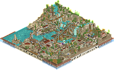
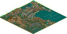
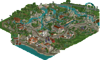
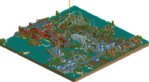
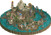
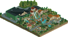
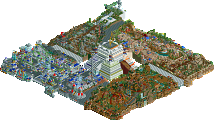
Wow, easily one of the best design submissions we've seen in recent times! Such a fun layout, just felt so natural in terms of flow and interaction with the terrain. Great supports too, especially on the lift. I enjoyed peaking through all the archy and other details too, lots of life and a nice amount of crunchiness without it being too overbearing. Feels very lived in a way I think an ancient city like this would be, it's all just so purposeful. Got to give a shoutout to the landscape and foliage too, expertly done. Really liked the murals on the map edge too, solidifying the theme and making the whole package feel super unique.
Only one demerit, and it's miniscule, the wrong RMC trains are used so some of the sprites are missing. Unfortunate but understandable since it's so minor. But man, it's just so fun to watch the coaster. Gonna roll with an 85% here right now, I really think it's that good!
Holy moly, this is gorgeous. I’d like to start this off by saying how “good” RMC’s typically look in this game. It’s a coaster type that looks so natural in RCT, it’s tough to make a layout look bad. The track type, supports, and transitions tend to fix any issues. At the same time, it’s tough to make an RMC that truly stands out, something exceptional. To do this, you need a lot of brains and skill to create an impressive looking coaster.
I think you guys did just that with this design (this is a design submission, yes?). The flow is so smooth, and the placement against the backdrop of rocks and waterfalls is so pleasing to look at. The interactive moments are possibly the best I’ve seen on any recent coaster. The diagonals, cutbacks, and crossover interactions with itself are inspiring.
As G-Force pointed out, I noticed these were the old trains just by glancing at the extreme excitement rating and hearing the RCT1 wooden train sounds. Doesn’t bother me too much. I just wish the trains didn’t slam into the brakes at the end.
The rest of the park is just brilliant. I like how true to the spirit of the theme you guys kept it, by nestling the architecture into the terrain. The docks and the mountainside with the sculpture are probably my favorite looking pieces of the plot.
Not sure if I’d say this is my all-time favorite design, but it’s really close to being so. Easily sits in my top 5. A near-perfect coaster.
The one that no one saw coming (or did they?), otherwise deano would've been a much earlier pick in H2H. Turtle and atmosphere are basically synonyms by dictionary definition at this point.
I love the elevation, the architecture, the use of landscape, foliage, and water. Water is seemingly everywhere on this map. You brought in some great depictions of ancient Greek life and culture. Really cool port with a great defensive structure. Also an awesome ancient Greek theatre. It shows you took your time to study the source material. Also that giant statue is stellar.
The map edge by itself is awesome although I do think it's a bit detracting that it's on the same height as the water. Maybe the whole map should've been a bit higher up so the map edge detail is either all the way below it or alternatively maybe it could've somehow followed the landscaping a bit (probably not the way to go).
I keep telling people to not be afraid of sticking to 1 or 2 roof color tones. This is a great example for how cohesive areas with supposedly samey buildings can be. It's not at all too samey, it's just authentic historic architecture with authentic materials, colors, and textures that were gained through regional/local workshops or trade.
Finally the coaster layout is wonderful as well. Wonderful swooping turns, great interaction, and very picturesque set pieces. Overall it's an amazing map. Great job to both of you!
I had fun looking through it. It's so dense that it's hard to remember all the details. Posseidon is a good coaster, though it could use some sort of signature element in my opinion to make it stand out more. The bath house river boats were well themed with the sharp corners and all. In real life maybe too sharp, but I'm willing to overlook that since this is a more fantasy oriented park. The murals on the edges were nice to look at. The boats, temples, and theater were all well made in a distinct sort of way. I liked the Premetheus element, gruesome but accurate. Good job on making a well landscaped dense park that portrays a common theme without being mundane.
Incredible work Turtle and Deano, truly. I absolutely adore this setting and how stupid good this is. Knew from the screens that this would be AC: Odyssey inspired, and that music just is *chef's kiss*. Amazing how immersive this is. As G Force said, this feels very lived in.
The coaster layout is wonderful. Carries a lot of speed, has great interaction with the cliffs, buildings, landscape, etc. Really well done. The Cretian Bathhouse is a nice support ride too.
Beyond that, it's a bummer for me personally because I tried this theme a while back after H2H9 with The Histories and then another project that went unfinished and you guys blew my stuff out of the water!! Gosh dang it. But seriously, great work. I'm jealous.
This is without a doubt one of my favorite releases here on NE. Not gonna lie, I'm jealous because this map is everything I'd like to build myself! As a history lover, especially the Classical Antiquity, this park is just heaven.
Archy is great and together with all the many details, this maps feels buzzing and alive. Love the market stalls, the port and the ships. The Bathouse water ride is great, integrated so well in its surroundings. The splashzone should be a bit longer though.
RMC was also great, good fast and consistent pacing. Love the dive loop around the station and the turn around with the outer banked mini airtime hill near the bridge/cave/waterfall. Also great custom supports, that trident is a neat detail.
And foliage and landscaping are also topnotch. Really this park has everything to love! Big, big fan!
Love how lively this is, and especially like the contrast between the bustling market and port and the calm and peafeful areas towards the back of the map. Color choices are great here too, a good palette with nice natural tones and just the right pops of color in the right places.
Main coaster has some absolutely sweet interaction and looks like it'd be so much fun to ride, bathhouse water coaster was creative and fun alhtough the splashdown was a bit short.
Also, that map edges, those are awesome and wrap up the whole package like a diorama, which is a presentation thing I really like in RCT.
Really lovely submission from you both. Best parts for me were the map edge (very effective!), warrior rock sculpture atop the hill, water passage with underwater chain, and the entrance gate. Congrats!
duplicate
sorry double post, see below
Time for a little behind the scenes...
first of all, deano is a pleasure to work with, of course. We're both older with kids and jobs and all that good stuff, so after the rush to finish our GT finals park, i wasn't sure i wanted to get back into anything RCT for a while. but a chilled out duo design sounded way more manageable, with no deadline. in the end, this got built pretty fast for a 70x70 park. honestly i just deleted everything on the japanese map and started from there.
deano suggested the ancient greek theme with assassins creed odyssey vibes. ancient civilizations is a pretty good spot for me, RCT-wise, and i remembered liking that game, so we went with it. the coaster came first with some rough layouts and landscaping. really only took a couple of tries and some feedback until we had the layout we stuck with. i actually really like it, definitely one of the better layouts i've ever made.
first try
much better. we've got a rough pathing layout, a rough landscape and the start of some stuff down in the harbor area near the coaster station. also the beginning of a couple of temples that would get moved later. fun fact, the coaster was this darker blue for a lot of the build, we went back and forth.
the first area that's taking shape - the coaster station and the harbor area, with diagonal temple. also the start of some foliage - trying to merge the yellow and pink trees without making it look cartoony was interesting. we've also got the start of some baths, which would later get moved and integrated into a water ride.
now we've got the makings of a proper landscape - more imposing, more variation and more scope for cool shit. we're also pretty close to the final path layout and ride setup, and have most of the sections of the map at least planned out. i remember asking some people for examples of the best waterfalls done in RCT, but honestly nothing really fit exactly what i was imagining.. same with the landscaping itself. we knew we wanted to stick pretty hard to the accuracy of LOTS of beige rocks, but that proved challenging to make look good, especially with the architecture and to some extent the pathing being super similar color-wise. in the end i'd say we achieved about 70% as good as i was imagining in terms of the natural setting... definitely some other things i wanted to have but couldn't work out how to make them look good.
the harbor areas are really kicking now, and we're starting to build an old fort up on the top middle cliff. i'd been messing around with underwater theming and realized that the only way to have it look like i wanted was to go balls out and landscape/theme the whole thing. again i'd say we got it 70% of the way to how i'd imagined it, but happy with the results. at this point we are only really missing the baths, the fort and the outsides of the walls, but we knew roughly where we were going with them.
i'd been putting off the outsides of the gate at the top left, because everything i tried looked shit. then one day, i got the file back and it was just... done. perfectly. like, way better than i'd imagined. cheers deano, i owe you one. still my favorite area of the map i think. baths are now pretty much done, as well as a vineyard from deano that i love. still got a lot of the fort to go as well as a market area to fill in. plus all the underwater stuff, but that could come last.
fast-forward a week or so and the fort is there or thereabouts, the market area has been filled in, we're adding tons of little details to the map for people to find. there's basically no limit to the amount of CTR ships and market stalls we wanted at this point, so lots of tedious ride vehicle editing to fill in areas and make them feel more alive. this really gave me more appreciation for other maps that do this - it's so easy to just see it as scenery, but it takes more planning and execution to really make stuff work. speaking of tedious, i knew we had to finish off the underwater stuff. it's tough to do something so repetitive without having it end up feeling inorganic, so it was an interesting exercise in checking in every few minutes to analyze and tweak. proud of where it ended up.
then h2h started, and you guys all went ham sandwiches. first park i opened was Biota. and fuck me, the map edge was so amazing. i knew i wanted to completely steal that idea (sorry) to make this feel like a historical diorama. we tried quite a few options at this point to "finish" off the park, but nothing was sticking. then we had an idea to shortcut it with new objects (something i've honestly never done in any park i've made), and luckily roomie offered to help out (cheers man!). combine that with some pillars and stuff, and i really like where we ended up. nowhere near as classy as Biota, but you guys are classy bastards.
one more post with closeups of my fave spots in the park:
first building completed in the park, and set my personal tone for the theme. really happy with how it ended up. CTR statues really putting in work all over the park.
ships have never really been my thing, but i like this one. bonus working crane, bustling market and underwater shit.
i really love this bit. waterfalls feel substantial to me, sick bridges too from deano. also a good part to see the subtle variations in the rock coloring that make it feel a little more natural imo.
my favorite area of the park. like i said above, one day this was just... done. feels so natural and the brick retaining wall is awesome.
these CTR ships were a ballache to make but fit in pretty seamlessly. i really like having different sized ship options.
another fantastic part from deano, the curved vineyard. unfortunately the jazzcats released an even better vineyard just before this got released, which was annoying.
one of the last areas tackled, but i like how it ended up. this was one of the more intricate areas in terms of content, lots smushed in there but feels pretty natural to me.
wow awesome park, this in a h2h match would be so fun
Absolutely beautiful park from two of my favourite UK builders. Touches throughout were insane and the use of CTRs to add to the storytelling were amazing. The coaster was awesome and I equally enjoyed the support work. This really reminds me of Jens J's design where it was just too solid, that you could not deny it's sheer quality across the entire map.
+ Floating barrel down the river was a 'wow, oh shit moment'
+ Coaster and supports, insane
+ Detail packed throughout the park, every angle looked good
+ The greek baths
+ Frozen staff and storytelling through them
Great effort gents, well deserved score. Can Deano get PM yet please?
I just wanted to pop in here and thank everyone for the comments. Hopefully, this can be something like Jene's spotlight that people round back to after H2H too.
I meant to make time to put together a time lapse, but @Turtle's walk through of the build process is so much better. The only thing I'll add to it is we are both a little old-school in that we didn't really build much off map at all. The statue, the station for the coaster, and some test buildings - that's pretty much it. Everything else went straight on map.
I'm going to start to become known for this I guess, but here's my predictable rant.
I think we both just had so much fun on this map. While we were building I was so excited to get to the map and get going on it. A big part of that was no deadlines, something we were always firm on, so while it would have been better in lots of ways to finish this before H2H, it didn't work out and it was more chill this way.
Constellations took me off this map when it was very close to finished for 4 weeks, and then during those 2 weeks between rounds 1 and 2 we managed to get this one pretty much done.
We were just building what we think looked cool, without a huge amount of planning. I think this works well for this theme as towns in the ancient world would have typically sprung up through similar thought processes. We didn't really ever think about how the park would be perceived or what score it would get. And that was really nice. I don't think I'll ever have this much fun on the game again - Turtle is a great build partner who builds swatches of stuff on the side, and has IMO one of the best eyes the game has seen for colours and the right level of detail.
I just think that building with fun first, and with little care to how something will be perceived, is the best way to play this game, at least for me.
Let me just say too, that the layout is so good and was all Turtle. Such a great start to the map. The sculpture was mostly me but I think you guys are too kind there, it's way short of what I see a lot of H2H team mates doing effortlessly!