Park / Cirque Macabre
-
 12-May 24
- Views 14,465
- Downloads 397
- Fans 2
- Comments 64
-
-
 79.00%(required: 70%)
 Gold
Gold

bigshootergill 85% Cocoa 80% Liampie 80% pants 80% posix 80% Scoop 80% Terry Inferno 80% wheres_walto 80% Xtreme97 80% ottersalad 75% Recurious 75% WhosLeon 70% 79.00% -
 Description
Welcome dead and decayed to the marvelous mysteries of Cirque Macabre! Prepare to be dazzled, shocked, horrified and brought to the edge of your seat! Now, let the show begin! ~Lord Charlatan
-
2 fans
 Fans of this park
-
 Full-Size Map
-
 Download Park
397
-
 Objects
1
-
 Tags
Tags
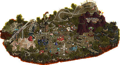
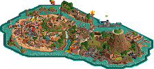
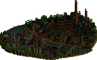

Surprise! I know a lot of you guys probably didn't expect me on this with a 45% share, myself included
So our initial park for r2 was changed 2 times before we decided to go with this idea, which I came up with after the 2nd park idea didn't really go anywhere, and the whole team loved the pitch I did for Cirque Macabre. The idea to do a circus themed park with horror elements actually already existed when I was creating my 2023 workbench, as I found there were so many interesting canvas/circus objects in the game that never have really been used to its full potential, except for La Rêve Parapluie (which was an inspiration for the circus tent later on). So that idea came back to me when our r2 park didn't really advance the way we wanted to, and started digging more into the theme, which led to my old IT parks I created for the Pro Tour and Road Rally back in the day. That combined the dark/horror elements and the more colorful clownesque elements which clicked for me to tie to the circus theme and create a whole fairground next to it in that theme.
When it was decided to go with the Cirque Macabre idea instead of the other idea, I created some initial map setups, but BG didn't really like them and wanted to take the lead on the macro for it, which I was fine with. He created Bone Shaker and that coaster basically dictated the map shape. Unfortunately due to RWE and BG had to deal with irl stuff and sickness, the park sat for a long time without any progression. Babar was brought in, because he loved the theme so much and wanted to contribute with small buildings/structures which could be SM'd in (and is of course a content machine ).
).
I did want to start with a good palette to set the atmosphere correctly. BG started the park with the Lost World palette though, and some tents and pieces where already created with that palette. As you can see in the palette name it's called "Cirque Macabre 9", so I've been trying all sorts of variants for it for days. Because we were so short on time at that point already I just decided to go with the Lost World palette and get the colors I really wanted to use replaced in instead of colors we didn't use yet or don't really need in the future (the peep pink was replaced with a more pale color to make the peeps look like skeletons, a more saturated purple was added and I really wanted the normal yellow shades in for the lights). Next I came up with songs that really set a nice atmosphere, which I thought was essential to set that eerie, old circus atmosphere. Especially when I found the first song of the 3, that plays when you open the park, fittingly called Circus Macabre by Marcus Jungermann, I was really excited and that one hit the nail on the head I thought. Later on BG created that awesome creepy voiceline bit for when you open the map. There were many inspirations along the way which shaped the theme more, and the Circus Balancé project from the Efteling was a major one. The cannon launch idea came from there as well as the public viewing a coaster element inside a circus tent. The whole inside of the tent show is also based on the concept art.
So with 2 weeks to go the park wasn't anywhere close to being finished, because the week prior I was on a trip with the family, and for other reasons BG and RWE couldn't get the hours in. This was what it looked like then:
We were struggling a bit with who took the lead at that point, as BG couldn't put in the hours, RWE wasn't really feeling it at that point, and I was unsure I could do it, because I was telling myself to take a more supportive role this H2H and follow the lead instead of being one due to the low pick I was.
A week before the deadline the park looked like this:
At this point I was really worried we wouldn't get this to a finished state, and after some chats here and there decided to take the glove and basically hold marathon sessions each day until the deadline, with a planning of which part of the map I wanted to complete that day. The park really became rolling for me when I figured out a nice way to do the landscaping at the map edge with the gradient kryp rocks combined with Fisch rocks and some new trees I recolored. Streaming the building sessions helped a lot in getting direct advice and direction, and the constant awesome Babar structures which I could copy in also was a major motivation. RWE came up what in my eyes is still an awesome path crunch, and that spiced up the middle fair ground a lot imo. BG made the awesome cannon structure + skull and all the rides were great to watch. We also touched up each other's work at this point, where RWE added heads on spikes in my landscaping for example and I recolord his wagon and arcade tub game. In the end we had some great team chemistry going, where for example Babar made that awesome creepy diagonal clown head at the side of the map, and I copied it in onto the tent entrance, changing the hair and lip color and adding the dripping blood into the skull pit. I'm also really fond of the entrance sign, which was made like 2 days before the deadline, where I made the letters and background, but wanted to do more pressing matters on the map and asked Babar if he could theme it, which he did in an awesome way.
At the day before the deadline we did a tile count and we were 9 tiles over, so I had to do some cutting somewhere and looked around the edge of the map where some full tiles could be cut. While cutting them I wanted to make the transition better looking, and had this fading-map-edge idea from the start, which I thought was a nice way to do the whole map edge (I did this while watching the Eurovision results )
)
Anyway, I know I'm rambling, but in the end I'm really proud of this park, which came together in the end, and without all the objects from MK, the advice from every team member (especially Fisch), the counting of the tiles from Lurker and all the encouragements this wouldn't be what it became. Of course there are things that are rushed and could've been a lot better, such as the somewhat bulky circus tent (tried many iterations though) and the haunted manor. I knew I was taking a risk with that big manor, but I really thought we needed more architecture in. The mistake I made I think was the amount of time that was left, which led to some basic shapes of the buildings which don't really match well with the rest of the map. I do like all the see-through scenes which you can see through the broken windows/walls..
And finally, a dotmap, although I must add there is a lot of overlap, where we touched each others stuff a lot.
Basically:
BG: Rides (except Tunnel of Love), big skull, cannon
RWE: Bone Shaker station tents, all the path crunch, gallows, wagons, organ pipes, tent backstage stuff, head on spikes
Babar: All the typical Babar structures/heads , Tunnel of Love, most of the games and little shops
SF: Everything else
It's probably clearer and more complete on the dotmap though:
If you've been reading this far, thanks and I'll not swallow up more of your time!
Sambhava's Rest by The Lonely Hearts Club
-Concept: **
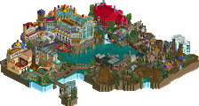
A little bit tricky going for a concept like this, with 2 halves so to say. While the Asian temples have been done a lot on the past I thought this concept with the elaborate terraforming and all the bridges/flags was a fresh take on it.
-Content: ***
I thought when opening the park that your park park was like 2x as big than ours and had so much more content. All the little caves and scenes are fun content to explore and experiencing the whole macro is just content itself!
-Quality: ***
Super high and consistent quality throughout the whole map. I'm just a sucker for the high polish Jens landscaping, and a funny fact is we used your Fisch rock work as inspiration for our park (blame Fisch )
)
Overall;
When opening the park and letting the fog clear (very cool effect), I was really worried and 100% sure we were going to lose the match. Like I said, the map seems twice as big and the diagonal way of the map shape gave you so many opportunities for interesting fresh visuals. I absolutely love the relaxing starting area with that FK temple sitting there into the mountainside. Stunning work and the highlight of the park for me. The coaster, while it had its moments, like the loop under the bridge, lagged a bit for me and therefore was a bit hard to watch. It does have stellar interaction with the landscape though, and how it hovers over those bridges is just awesome to watch.
The town area was also great and that little yak-go-round very nice. In fact all the custom rides are very fitting and well made.
The caves+scenes were also visually great and fun to explore.
All in all, it was just a shame one park had to lose as this is one of my favorite parks so far. You guys can be really proud of this and it was fun doing the refresh battle with you Jens
And some concept arts we used:
Apparently Morgan Fan must've voted whilst I had the poll closure dialog open, and it didn't count his vote for me after. I've now updated the conclusion to the correct 29-34 as the final result.
Congrats on the win and thanks for the behind the scenes looks guys! I personally voted the other way, but there's something special about scraping a win with a park that was like 30% done a week before the deadline isn't there? That's peak H2H memories for me.
Babar already putting in WORK and nice to see him contribute to a win so soon after an unlucky loss.
Congrats guys. I agree with Turtle - nothing like the rush of completing a park like this in such a short amount of time. It's really what makes H2H fun (and hella stressful)
Damn SF, insane you managed to finish that and grab a W in such a short timeframe. I hope this forces your chin up and makes you look at yourself as the steal of the century rather than a supporting player. You're still really damn good at this game after two decades. The contributions from the other players really led to a memorable park with a theme I'm shocked I haven't seen done in RCT before. Did Belgian actually voice act the intro narration or did he get it from somewhere else?
Reviews for both parks coming in due time.
Thanks guys, and @Gustav, yeah, BG did actually voice act the intro narration himself and then post-processed the audio to make it sound scary. Really loved how he did it, made for a great opening atmosphere imo! I then tried to time it that way, that it nicely faded into the 'Circus Macabre' themesong, to create a memorable 1st viewing experience, which worked out pretty well I thought. Only the fact the ride crashed and you got that popup window annoyed me, but there was no other way around unfortunately to have it only play once and not get that popup..
Perhaps you could've made the explosion part of the narrative. For example, the voice-over could announce the next act, which would be the cannon firing. The explosion would be timed with the coaster coming out of the cannon. As viewer it probably wouldn't even cross my mind that the explosion would also serve a purpose to end the voice-over.
Haha, that was exactly the idea I think BG proposed! In the end I think we didn't do it because of time constraints, and an easy way out to get it done in time. But in hindsight, if I had more time, that was definitely the way to go with it, ah well..
Yeah, I can imagine that with the incredibly speed at which this park was built, you could not pursue every idea or the best version of an idea. The fact it came together like this is rather incredible, so it would be too harsh to label this a missed opportunity.
In any case this is the true H2H Six Frags special: building a park in a week. But you've come such a long way since parks like South Park Studios. You earned your place in the H2H pantheon
Yeah, no H2H for me without some speedbuilding I must add I really enjoyed working with the new tools Open offers nowadays, which makes speedbuilding so much more enjoyable, user friendly and faster. Things like the scenery manager, the scenery picker, tile inspector with hotkeys, Tols' object creator, Gymnasiast's site to create sound files and palettes with, the make-everything-invisible viewing option, invisible color, my new workbench of course
  I couldn't have made all this progress in a week's time without all the new tools we have for sure, and would've liked to have have them back in those days as well
I also learned a lot from my mistakes in the past and put the concept first (so no more lame butt mountains or parks with a hole in the middle )..
)..
Also, practising some speedbuilding with my Abu Simbel design prepared me quite well for this, and in hindsight I'm very happy I did it the week prior to the draft as it gave me the confidence I could make so much progress with speedbuilding in a week's time for Cirque.
Sambhava's Rest:
Feels massive, somehow. The clouds didn't move for me... didn't install the plugin. My fault? Maybe. Didn't affect much, cutaway worked well enough. Hanging bridge scene at start was nice. Good swoop there. Landscaping was good overall, a little bit teepee like, maybe. Maybe some refinement in form's needed, but hey, it works. Spacious, open, the elevation comes through... feels like I'm high in the mountains. Yaks are great; yaks are conceptually strong at the moment. Nice bits about the map; quaint, subdued. I appreciate that. Swirling clouds are fantastic, brilliant. Love to see that.
Cirque Macabre:
Fun, but disconcerting. Tents're pretty good, maybe a bit cleaner form on those? Grim reaper is amazing. Clown dripping blood is amazing. Cannon is cool. Colors are nice. Creepy atmosphere... which is the idea. Feels so much smaller somehow. I don't know why. The atmosphere sold it for me. Creepy, but in a clownish way. Always like horror-ish stuff. Coaster was fun. Like some of the signage. Great theme, I'd have liked to see more attention to the environment: a clear bayou or swamp, a stranger forest, a desolate place... for such a fun theme deserves a good treatment in environment and context. Good H2H park here.
Some of the cutouts on the map edge are very fun. I'm usually not a huge fan of (often thoughtless) cutouts on the map edge (which so often exist just for additional content, not because they fit) while the rest of the map edge is just the usual rct map border. But your map edge looks great and has a lot of thought to it and all of the cutouts belong to the park's setting and story and make sense in where they're located. You included a lot of things that are related to the map's theme and to Bhutanese culture. That's great. Probably some of it is lost on me as I don't know all that much about Bhutan but the whole theme and underlying idea was of course instantly recognizable.
The vastness and openness of the land together with the towering mountains was captured really well. In RCT's isometric view it's perhaps tough to have some stuff hidden away so much behind mountains or below those mist clouds, but it makes perfect sense and fits to all the videos I've ever seen of Himalaya hikes where there's also often stuff you'll only see after getting across another ridge or through another dense cloud before reaching and finally seeing your intended destination. I almost wish, that the town and its rides were even denser inside the town so that more of the vastness of the land was kept intact. But I don't know, whether that would've been good for the park or the votes. It's just a thought.
Overall I think your park is amazing and I know that Six Frags in particular also absolutely loved it when he first saw it. I think the reason why we won is that our theme was more accessible and fun somehow. I'm mentioning this only because I feel like you might be wondering what else you should've done to get that win. I don't think you should have or could have done more. I think you were unlucky that our theme and atmosphere hit some kind of sweet spot that appealed to voters while there was again some controversy around that plugin (great idea). It's a really good r2 park and something to be proud of. I hope you guys bounce back and don't feel hard done by for too long. Keep creating, I can't wait to see what you guys come up with. I can also say that our guys really gave it their all in the last week to bring out something that could potentially compete with what you created. We expected a lot from you guys and that pushed us to work hard and make something memorable, so that we'd have a chance. Big shoutout to Six Frags on our side, and it's amazing that Babar could still come in last minute to add some of his flavor to our map. Obviously I'm super happy our 4 builders got us that much needed first win. Good luck to everyone in the next round.
Sambhava's Rest:
+ I LOVE Indian/Nepalese/Tibetan themes. Why are all the prettiest themes the most overdone? Maybe they're the most overdone because they're the prettiest.
+ I'm always a sucker for a slow, cinematic progression through a park. The frozen peeps spelling out the narrative really helped me take my time and soak in the details which can be easy to miss when just scrubbing through. Was very easy to recognize Jens' involvement on this park between this and...
+ The landscaping. Rocks, grass, water, all of it. Top notch. I am so happy Jens got to flex his landscaping skills in H2HX.
+ FK's archi is fantastic. Was struggling to figure out who could have done it and soon had the hunch to see how it compared with Tectonic Plates in Harmony. Jens/FK is a combo I was very excited to see this contest and I think you two settled on a great theme to show your stuff.
+ Speaking of great players showing their stuff, Hexyman did another RMC with custom supports! Love the little cutaway in the station.
+ Insane peep-level detailing in the village. I will be frank and admit I was kinda seething looking at it. Get me angry over your detailing and that's how you know you've put out a banger.
+ Sound design is crazy. Almost everything makes a sound. Super immersive.
+ I've always liked the concept of a park that slowly unveils itself, which you all did well here. It's also super cool how the mist only fades when you're looking at it. Unfortunately...
--- The Lonely Hearts Club's ace in the hole has backfired for round 2. I could hardly open this park. It just kept crashing, not only here but even in other parks that didn't use the Animator plugin. I had to downgrade to v0.4.11 from the latest development build just to take a look, and I only found out through word of mouth as soon as the vote was about to close. Because of this, I wasn't able to spend the time I wanted to with this park before the vote closed; I think it was like five minutes total. The kicker is I believe could have been done just as convincingly through garden objects, although it would have been far slower. It sucks because I really really enjoyed this park and ultimately voted for it based on the glimpses I caught. I really should not have voted at all considering this though. The plugin debate reminds me of the CTR debate from last H2H, but I think this one has more merit because of issues that can arise from altering the code of the game.
Cirque Macabre:
+ I am shocked we have never seen an evil circus attempted in this game. How have I never seen that before? Super fun take on the theme.
+ Love BG's little voiceover at the beginning. Forget plugin coders and CTR creators, your team needs voice actors.
+ The signs and faces everywhere. Instantly recognizable as Babar's work, although I was convinced the clown dripping blood was Evil Coasterbill.
+ One of the best map edges I've seen in a hot minute. The details like the skulls and heads on poles are over the big top.
+ Bone Shaker is a classic Belgian banger. Love how it feels like a classic woodie but has a strong RMC identity. The cannon sculpture is ridiculous too, like wow that's just perfect.
+ Custom ferris wheel structure is INSANE. Took me a bit to notice it.
+ Functional circus show with the skeletal horses (genius CTR choice btw) was cool, but it could have been crazy to have a fully synchronized show complete with audio. I know time got you, but this is a concept with a ton of potential.
+- Love Lord Charlatan's Haunted Manor, although the dark palette makes it look a bit blobby. Would've been cool to see a more fleshed out cutaway interior, but I can give it a pass knowing how little time you all had.
- I am unfortunately not a fan of the path crunch. The Tols crunch objects feel a little disconnected from the dirt path, and the grass cracks feel too horizontal and organized. I do appreciate the different base path textures throughout though; IMO that defines crunch more than what objects go on top. I just think in general a little more variation in crunch textures would have been great.
Cirque Macabre:
What a fun map, seriously. I am not going to lie, this map did not win because of flawless execution. There are definitely a few rougher spots, especially given how flat the map is. For example, the ground texturing, the massive tents (which could've used a little more texture perhaps), and the slight lack of movement in some spots. But you know what? That's what I love about this map. I can empathize with it a lot; it's often how a lot of MY parks go. It's a little rough around the edges, but the concept is there, and it was clearly built with love and passion. It also has some killer moments and set pieces. The RMC with the cannon, in particular, was awesome. Great work and great match, fair and square. Good luck to you guys in the next couple of rounds! Maybe we'll meet again in the playoffs.
Sambhava's Rest
This is a park that slowly grew on me. It kinda felt a bit underwhelming at first, but the more I kept looking through the park, the more I started to really like it. Foliage and landscaping are amazing and really make the map. I like the tranquil, calm opening plot with the village after the mountain range. I do think the village could've been a bit more dense since there's already so much tranquility in the first scene.
The caves were so fun. Also liked all the yaks and the Yakoussel. RMC was cool, props to the person doing those custum supports. Must've been terrible annoying work but it payed off.
I wasn't really a fan of the plug-in effect. It didn't do much for me and I wished the mist was gone faster because I wanted to see the park.
Cirque Macabre
Djeezes this park immediately took me. Such great music! And what a wonderfull idea, this parks sounds like it could be an AC park. So much clever and fun stuff in here to find. Sculptings were great, my favorite is that blood-dripping clown face. The one at Boneshakers station is also really good.
A lot of cool custom rides fitting in the theme. Boneshaker was also a great coaster, good mix between classic woodie and RMC elements. Great park, love it.
Sam's Rest: Love this park. It has a beautiful setting and landscape. As a huge fan of Uncharted 2 and also Expedition Everest, this park is so satisfying. It wasn't an easy vote though. I liked the plug-in but it was a bit too slow and again, not as fun on repeat viewings, though it was nice the first time. Here are my favorite things!
A fantastic entrance! I also love that the gate is closed and people just go in through the side.
The landscape and waterfalls are so pretty. This whole area is almost perfect!
This plaza is so well done. Like damn!
This building is my favorite thing on the map! And love the story making the mist!
I love the way the lift is made to go over the waterfalls. Great details here.
I'm not the biggest fan of this coaster, but the support work is undeniable! This helix on the cliff side is also really great.
I love how the loop was integrated with the bridge and temple. A fantastic focal point!
Overall this park is wonderful! I think there was alot of people who didn't appreciate the asian setting as much as I did, but I'm happy this park exists. A truely relaxing gem of a park, and great music! Good job Hearts Club!