Park / Sambhava's Rest
-
 12-May 24
- Views 10,551
- Downloads 209
- Fans 1
- Comments 64
-
-
 80.50%(required: 70%)
 Gold
Gold

pants 85% no Terry Inferno 85% no Xtreme97 85% no Babar Tapie 80% no Cocoa 80% no G Force 80% no Mulpje 80% no ottersalad 80% no RWE 80% no Scoop 80% no posix 75% no Recurious 75% no 80.50% 0.00% -
 Description
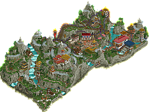
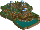
High above the Snying Valley, Sambhava’s Rest lies shrouded in mistery. One of the world’s highest elevation World Heritage Sites, the complex is only accessible via the 3.4 km Elko trail that cuts thru steep cliffs and misty forests. Believed to be constructed circa 1567, Sambhava’s Rest and the surrounding structures were abandoned sometime in the mid-1600s under unknown circumstances. The exact use and purpose of the site is undetermined, but tells the story of a lost civilization well regarded for their agriculture, artesian products, and ingenuity. Today, Sambhava’s Rest is a popular destination for hikers who are drawn to explore the misty landscape and the mystery of a civilization believed to be lost to time. What secrets lie beneath Shambhava’s Rest and its perpetual clouds of mist?
-
1 fan
 Fans of this park
-
 Full-Size Map
-
 Download Park
209
-
 Objects
1
-
 Tags
Tags
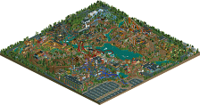
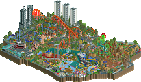
The first match-up of Round 2 will see the Evergreen Gardeners looking to claim their first win in the contest against the Lonely Hearts Club.
High above the Snying Valley, Sambhava’s Rest lies shrouded in mistery.
concluded
Welcome dead and decayed to the marvelous mysteries of Cirque Macabre! Prepare to be dazzled, shocked, horrified and brought to the edge of your seat! Now, let the show begin! ~Lord Charlatan
Voting rules- The poll will stay open for ~72hrs.
- Do not vote unless you have viewed both parks in-game.
- Everyone may vote except members of either team. Any illegitimate votes will be ignored or removed.
- Anyone with an account that predates the start of H2HX, or who has been drafted onto a team, may vote in this
match. Anyone with a newer account must pass the admins' account integrity checks.
- Voting is monitored by the admins to improve fairness.
It's about time we see some B&Ms! This one will be a match to the death I think.
Two wonderful parks. Sorry this isn't going to be a super lengthy review, but NE is taking enough time during H2H as is, so:
I thought the creepy clown horror theme was very well done on the EG park. Scary themes in RCT are hard to make interesting enough because you'd think they aren't the most versatile to expand on, but you've nuanced it very well here. I also loved how the whole thing felt like a park, despite the many fantastical elements. I loved how the main coaster sat on the map, just how it was positioned, and beautifully complimented by everything else. It made for a great moment. I also simply just enjoyed the layout itself a lot.
LHC's at first was a very beautiful and tastefully created landscaping experience, which I think would've wanted to be allowed to just be tranquil and pleasant to look at. But since this is H2H, that's not possible. I actually quite liked the plugin effect here. I've been interested in mist and similar natural "ephemera" in RCT for a long time. But I can understand if maybe there's a plugin saturation point that people feel. I like what was done with them both times, but I personally don't see them as meta changing because I care about looks and style 10x more than I care about technicalities. Apologies in advance if this comes off unappreciative. Looking at the style of the park, it keeps being beautiful, but also a bit unwieldy macro wise. The town had many moments of tireless efforts poured into it, which I was afraid couldn't really live because they were often at very low points in the terrain. So overall, this map, while certainly very impressive, didn't come together for me as much as EG's.
Sambhava's Rest
Initial reaction upon opening the park was that it's very serene and peaceful. The thin bridge over the waterfall between the two buildings was a wonderful set piece. It appears that guests have to walk along a cliff to reach a village hidden in the mist? The yaks, the temple tucked into a mountain valley, and the couple of shrines on the left side of the map are very vibey and atmospheric.
The village with the RMC was interesting. I think there's some really neat scenes throughout. We have a glassmaking shop, people harvesting honey, handymen painting carpets? Either way, it seems like a lived in place, not just a theme park village.
The one thing that holds this back for me overall is the macro. You have this wonderful mountainous river valley on one half the map, and a village on the other half and they don't connect! Seems like two separate parks that were squished together. I thought perhaps the path guests walk along the cliff that leads to a cave where a peep falls to his death would lead to the RMC village, but it doesn't appear that way. But again, that opening half the park is quite amazing. Really strong atmosphere, the architecture is amazing. Like give me more of this:
Also, this archery scene is really neat. Love the inclusion of the PotC piece there.
Cirque Macabre:
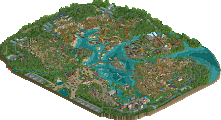
Really amazing sound design here - kudos guys. Really sets the tone and atmosphere nicely. Initial reaction is that this park feels half the size of Sambhava. This seems like a dark version of Cook County Fair and in the same vein at Riverview. Lot of really amazing details here too. The reddish tent along with the Haunted Mansion are both really well done too. La Reve but in 2024 over here. The sculptures are top notch... like this tent. Wow.
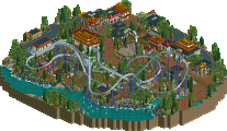
Between the two parks I'd give the edge to Cirque when it comes to the RMC layout. The cannon launch and then the roll out of the brake run is so good. Really well integrated into the landscape too.
One issue I have though with this park is the ridiculous amount of path crunch. It's very haphazard and I have to admit it just doesn't look good at all.
To end on a positive note because there is a lot to like here, the Tunnel of Love is great. Really solid work guys.
This is a strong matchup.. I really like the theme of Cirque Macabre, it's fun and lively, immersive. Parts feel a little underbaked, but the sculptures throughout are well done and you definitely capture the horror aesthetic you're going for. It's interesting that I can feel obvious inspiration from Ethan's parks, Hell, Lost World, and Riverview, with the circus element being the unique twist.
Sammy's Rest feels like a GT park to me. I found it stronger than your R1 park because it's less generic and more intentional. The landscaping is sublime, though it does feel very of its time. I wonder if Fisch rocks are starting to feel played out to me. For anyone wondering: this is what they're supposed to look like. I thought the clouds were effective, both as scenery and as CTRs, that's an effect I've yet to see executed this well.
I prefer the theme and setting of Cirque, but I think Rest is the more technically skilled park. They're both deserving of a win
Sambhava's Rest
+ Because of the verticality there are many nooks to discover. I like how you named and froze peeps to scatter around little scenes all over the map. When exploring the park, I got lost several times, just like some of these peeps, which adds to the adventurous experience.
+ I really like all the bridges over the river and walkways against the cliffs.
+ Love the yak carousel and the plaza around it and the area with the small market next to the waterfront. These were such atmospheric and immersive scenes. Well done!
+The architecture was great overall. Especially the temples on the natural side are wonderful. The way you made all these small ornaments are great. I would have liked to see some more of the more realistic, cheaper buildings with open rooftops like the ones that you've made in the village. I really like those!
- We've seen so many Nepalese parks throughout the years. I've become somewhat bored by them. Although this park is technically great, it doesn't have much new to offer.
- I didn't really like the way you did those mountain peaks. They look unnatural to me and the equal amount of snow on every peak doesn't help either. The rest of the rockwork was pretty good though.
- Not a fan of the map edges. The texturing is repetitive and they make the map look more grey than it actually is.
- I feel like the park is a bit short on rides. One or two extra main rides would have been nice.
Cirque Macabre
+ Love the theme, although I would have preferred a look with a bit less horror elements like blood etc.
+ All wagons were great. I especially liked the organ wagon.
+ The red and white circus tent and puppeteer are really cool.
+ All the small rides and stalls were fun to explore, although I didn't understand all of them. I really loved the head juggler! The freak show tent and exhibits next to it are also very nice.
- I didn't like the mansion with the haunted mansion dark ride. Being so big, it felt out of place and the birds flying above it made it glitch a lot.
- The paths have so much crunch that it makes it hard sometimes to figure out what's going on.
- The purple and red circus tent looks nice from the outside, but show didn't do much for me. I would have liked to see a more interesting ride inside.
- I didn't get what the skull gate (?) with blue flames and lightning was supposed to be.
Evergreen Gardeners
The theme is the most original of the two. Strangely nostalgic from a video game lens, reminds me of the Bad Magic Bayou from Banjo-Kazooie, Gruntilda’s Revenge and Carnival Night from Sonic the Hedgehog 3. I find the atmosphere more dazzling than scary, which is a good thing! The sound design is marvelous. Some of the biggest highlights for me are the massive carnival tents, the ghost musicians, as others have pointed out, the fine details like the dripping blood. The coaster being launched out of a cannon is a massive win in my book. The layout juxtaposes RMC elements with a traditional out-and-back style. There is a huge emphasis on texture with regards to the pathing, though I wish the texture was toned down a notch. I think if this park had something extra, like a more elaborate haunted mansion on a cliffside, it would have sealed the deal for me. That said, the small scale stuff is executed wonderfully, and leaves me wanting to explore every scene.
Lonely Hearts Club
Can’t say enough great things about the landscaping and the coaster. Man, this is cool. Is this the best rockwork we’ve seen in RCT? It’s certainly on the discussion table. The plug-in definitely helps with creating the Himalayan atmosphere. Strangely, I prefer the opening area to the actual park on the opposite side of the map. The grid breaking techniques feel much more naturally employed, and the sharp sense of scale here feels bigger by comparison. I think you guys nailed the coaster, I’d say it’s the stronger of the two in this match. While on the longer side, those interactive moments are so worth it. The architecture is solid, but the actual building placement is what sells. My personal favorites are the watermill steam building and the ones in the entrance opening section. Overall, this is a lovely park.
Final verdict: I’d say this is the closest match thus far in the contest, though this is definitely subject to change. But after careful consideration, my vote goes to the Lonely Hearts Club and their landscaping masterclass, Sambhava’s Rest.
Killer Clown Hellfest Park – Evergreen Gardeners
Wow, this is a fun and uplifting theme to start off Round 2. It is indeed macabre. I’m loving all the sculptures, faces, logo’s. The guy with the half open skull and a freckle is perfect. Who doesn’t love a well-placed freckle. A lot of beautifully crafted small scenes. Great coaster with the imposing canon. The custom music is nice. Could’ve been a little more eerie imo to sell the vibe even more. But maybe then it would get a PG-13 rating. Admins would have to do ID checks on everyone watching. It would be a total mess. Better to leave it like this. Though I’m a big fan of all the small scenes, the larger picture isn’t really coming together for me. There’s a mix of huge set pieces and small set pieces that don’t feel logically related to each other. Like you guys had a hugely creative and fun brainstorm session, but then decided to do it all. I think the whole should be more than the sum of it parts, but to me, I like the parts separately more than the whole.
Mist land – Lonely Heartsclub Band
Doing a 180 and coming to a park starting with serene views of waterfalls, mountains and grazing yaks. Don’t you just love the word yak. Ah, and yes, you might, hypothetically, miss the plugin file on the download and then continue to stare at a mist covered park for a solid five minutes, trying to figure out if something changed, because you've read that it will disappear by itself after some time, and I can’t remember if that roof was there before . . . purely hypothetical, you would feel like an ass. But a serene ass. I’m loving the fun scenes on the side, the archy, the subtle political statements, the coaster, the mountains and especially the crunchy wall textures. And the scenes with the bees just reminds me of so many horrible GIF's I've seen.
In short, I’m loving both parks, but I think the difference in macro design in the end pushed me to the Lonely Heartsclub Band.
Two really good parks, I enjoyed both a lot.
Highlights of the LHC park are the landscaping and interaction with said landscaping as well as the architecture. Lovely stuff. I'm also a sucker for a well done horror/spooky themed park and EG's work here is some of the best in recent memory. Love the sort of nightmare/dreamstate feel to it. Fun carnival vibe with a genuinely unsettling undertone to it.
Both parks aren't perfect, but both are really cool and fun. Great work.
The massive haunted mansion, the circus tents, Bone Shaker - great pre-drop. Awesome signage and sculptures. Atmosphere eerie.
Marvelous mountains, framerate-killing clouds, cool cutaway. Style of a painting. Sambhava felt larger than Circus.
I enjoy the RMC showdown in this matchup. Thank you to both teams, and good luck!
sorry in a slight rush so i'll be quick here
nepal: a great park, and I think a step up from r1 for you guys. very impressive. the entrance is the best part of the map---love the verticality and the adventurous climb, good atmosphere, very mysterious. the underfog area is perhaps not quite up to the same caliber, and I'm not sold on the RMC which feels more meandering than graceful to me. but there are small details in spades, which is always fun. the landscaping is... I'm sorry I can't give it a pass, although it is clearly trying very very hard. every single vertical surface is the same 4h fisch rock slope, and the mountains become coconut pyramid cakes as a result (google it). the only vertical faces are the map edge, and that one rock steve (?) pointed out with overhangs is far and away the best piece in the whole park. as for the fog effect, its a fun idea but was tbh slightly annoying when i opened the park the second time to write this review. I dont share walto's principled stance on reusability, but it would have been awesome to have some shiny new fog CTRs. Plus, the surprise of the reveal would be way more impactful without the spoiling of knowing theres a plugin. anyway, you made out big in r1 on the back of a fun plugin. live by the plugin, die by the plugin, perhaps!
cirque bloody: really awesome park, easily one of my favorite of the contest so far, even if it is a little rough around the edges. firstly, I adore the theme, which felt much more novel than its competitor. really fresh and atmospheric. the giant circus tent is astonishingly good for how gaudy it is, I could stare at that for longer. but the single detail that sealed the deal for me was the cannon that launched the coaster. as soon as i saw that, I was like this is a park with a clear vision, that is full of fun and great execution. I love the RMC layout, its great to see different 'styles' of layouts (eg, more old fashioned woodie composition) meshed with the RMC whackiness. so many good details to point out, and I dont even usually like sculptures. the absurdly good cloaked skull over the (again excellent) coaster tent, the pipe organ, the wagons everywhere, the morbid bloody surroundings. the giant cancerous haunted house pushes my goodwill a bit, but it has some fun details inside. in my eyes, this park won me over by feeling really novel---it felt like it was breaking new RCT ground aesthetically, while still maintaining a very high level of execution.
Loved the parks! Great stuff here. + and -
Sambhava's Rest
+ Loved the opening scene. Very much a great wow factor to see the map after!
+ Super fun RMC. It interacts with everything cleanly and is an excellent terrain coaster.
+ Cool selection of rides! I especially like the hammer bell tower and the arrow game.
+ The architecture overall is excellent and feels well placed. Every building has a distinct feel to it while still tying to its overall theme. Color choice is great.
- Some of the architecture I wasn't particularly fond of; mostly how its shaped in relation to scale.
Cirque Macabre
+ Sculpture heaven! Everything is so cleanly placed and fits well with the overall theme.
+ Amazing atmosphere
+ Great ride selection; love the haunted house and the dark scenes. The ghost section is real cool
+ "Loop"
+ Reaper sculpture is my favorite one here.
- Don't really like the RMC very much; it has very cool interactions with the foliage but felt squared off from the rest of the map.
I ended up casting my vote for Sambhava's Rest, but it was very hard to decide. I resonate a little more with the bustling landscape filled with architecture as well as the terrain RMC.
Sambhava's had some pretty convincing landscaping and such grandeur with the overall vision of the park. The best bits of architecture (I loved the little plaza and surrounding areas in the center of the map!) was all really well considered and I really enjoyed the commitment to the geographical reference!
Standout moments:
- The caves were really nicely done, and loved the map edge detailing. Overall the landscaping was just really clean and the textures and geometries were spot on.
- The architecture was nice and detailed while maintaining clarity of theme.
- The plaza in the center is DROOLWORTHY in how it was constructed... amazing job
- The river was perfectly placed and gave such a height and scale to the entire area surrounding the coaster. Really loved this
- Loved the rounded mist CTR that encircled the mountains
- the Gondolas were perfectly placed, some great interactive moments with landscape and the coaster here
- Detailing on some of these scenes left me bamboozled on how you constructed them... GREAT creative usage of objects, you build in ways I do not comprehend and it's fascinating. Kudos!
Detractors
- The mist plugin was a huge miss for me. Not only did it not fully load the first time, but the park crashed my game 2x in a row, which forced me to sit there for a minute waiting for the mist to clear on reload before I could explore the park. As I had already expressed in Discord, a CTR tracked ride of rolling fog that cleared out of the way upon the park opening would have had a much better "Wow" factor while achieving a better execution of fog dissipating from the mountains (real life fog moves like clouds!). I love the ambition to try new things, but this execution was not as clean as it could have been
- Macro-wise, the decision to split the park into two sections with a huge mountain in between was iffy to me - it blocked multiple views and made the park feel disjointed. Additionally, similar to Constellations, I am not a big fan of the way the buildings felt sprinkled on the map, and with the way the landscaping was done, you get the sense that some views were prioritized over others (similar to constellations again).
- Scale-wise, the mountain peaks vs. the buildings on the mountains felt off; most likely not much you can do here but it looked strange to see a building covering 60% of what appears to be a massive mountain
- I didn't understand the backstory, if there was one, of the little narrative scenes. Winne the Pooh? Kilns? Someone falling down a trap? I feel like I've missed something that ties together the little things or a narrative here, other than "Tibetan village"?
The RMC was OK - but the layout felt a little sprawly and while it had some lovely moments (such as the lift hill and first double down hill), overall it didn't hit home for me.
Cirque Macabre was super vibey and I loved the concept behind this! The dark and scary atmosphere was really well sold with a good palette and some great creative design choices. Overall I loved the commitment to a pretty unique theme and aesthetic, and the execution was very good overall with some really nice atmosphere, but it was the larger set pieces that shone for me.
Standouts
- The RMC here was really well done - a tad fast on pacing but the layout was smooth as butter and the boney aesthetic was really nicely done. Loved the brake into zero-g element, what a cool choice.
- the Cannon + Loop combo = super memorable setpiece, perfectly executed. What a wonderful corner of the map
- The smaller tent with the skeleton = my favorite piece of architecture on the map. Simple yet really cleanly done, aesthetically perfect.
- Loved how tucked away the swan boats were, perfectly blended with the foliage and dilapidated feel of the space
- The interior of the tent show was nicely done with some really good detailing with the CTR attractions.
- Sculptures galore! Loved the giant grim reaper for the coaster, so many creative sculptures throughout.
- The map edge had some very good landscaping and bloody details. Good crunch
Detractors
- The scale of the tents and overall smoothness of them felt strange. As it is, the scale of the two major tent elements swallows the rest of the map and creates a pretty noticeable macro imbalance between the flatness of the fairgrounds and the massiveness of the tent structures. This was my main issue with the map, as it felt much smaller than it actually was due to this scale imbalance. I think if you had created the base structure out of wood / steel framing and separated the larger tent from the side towers with just tent roofing, that could have helped break up the mass of striped smooth tent texture and helped balance out the scale issue here.
- the Haunted mansion felt rushed and like an afterthought - not at the same level as the rest of the park due to some pretty chunky / blocky massing
- Some generic flat rides tossed in there weren't bad at all, but also nothing special of note. Felt like missing a layer of narrative polish
- The pathing was extra crunchy, almost a little too crunchy.... some negative space would help balance it out.
I voted for Cirque Macabre as it had what felt like a fully fleshed out and unique theme and narrative, with great atmosphere and lovely setpieces that stood out to me. It also had the better coaster for me, and while LHC had some wonderful landscaping and grandeur to the park, it also didn't fully tie together for me as a theme. Both parks were really wonderful overall though, making the vote pretty challenging. Congrats to both teams on really great work this match!
Can we please review parks here and not plugins. Give feedback to the respected creators in a pm. Thanks.
I was about to say what amazing review from SpaceK in terms of how the team can look to improve our output for future rounds plus the community. For utility players that look to improve every release, that level of detailed feedback is greatly appreciated.