Park / Hell
-
 02-May 24
- Views 10,989
- Downloads 263
- Fans 0
- Comments 70
-

-
 77.50%(required: 70%)
 Gold
Gold

Cocoa 85% Camcorder22 80% CoasterCreator9 80% G Force 80% wheres_walto 80% Xtreme97 80% chorkiel 75% ottersalad 75% Recurious 75% RWE 75% Scoop 75% Terry Inferno 75% 77.50% -
 No fans of this park
-
 Full-Size Map
-
 Download Park
263
-
 Objects
3
-
 Tags
Tags
![park_3192 [MM2014 R2] The Inspiration Well](https://www.nedesigns.com/uploads/parks/3192/aerialt2803.png)

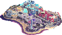
two more ridiculous parks, and this is definitely shaping up to be the best H2H ever. appreciate everyone involved giving up their free time, H2H always pushes the game forwards in amazing ways.
Constellations
let's address the elephant in the room. that is the coolest effect i've seen in RCT for years. one of those ".....how" moments, like Battlefield RCT, or Infestation at Outpost 23, or Gangland. just absolutely bananas, and the fact you hit us in round 1 with it is so impressive.
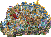
what's even more impressive, is that it's linked to a park that is really really good even without the main effect. the theme is obviously up my alley, whimsical historical fantasy with tons to explore and some interesting rides settled into the map. both coasters and the water ride held my attention and made me want to see where they went, with a special shout out to the spinning zodiac wheel that gets sped up when the coaster flies past. that effect by itself would be enough honestly, but then there's so much more to see.
the addition of the astrological angle makes the medieval theme much more nuanced, and i love the library in the big building. i feel like people are also kinda skipping the constellations themselves that are revealed in the eclipse.. they're genuinely great little pieces of art.
overall, loved it. so much to see on the map, it feels way bigger than an H2H park. add on one of the coolest effects we've seen, can't really argue with the end result.
Hell
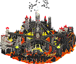
i LOVED the opening scene, and the way it makes you scroll down to reveal the actual park itself. that kind of storytelling always gets me in RCT, and it works really well here. the layout of the map is also really nice, made me feel like i needed to rotate the map and find everything in there.
the label in the download folder is brilliant, i design a lot of labels for a living so it was interesting seeing this. also loved the QR song, excellent stuff.
the pallette is aggressive, which makes sense with the theme i guess. however it makes it really hard to view the park, for me. which is a shame, because once i got past that, there is so much really excellent stuff going on. my personal favorite parts were the aesthetic of the glowing lava with black rocks at the bottom of the map - that's just really great RCT and was the main area where the pallette really helped the theme imo. the coaster with invisible colored rails looks just like a spine, that is a great idea.
there are some fantastic sculptures around the map too, the skulls being my favorite ones. i think ultimately though, the theme and the pallette just aren't my personal cup of tea. It's one of those maps where i can totally appreciate the workmanship and dedication, and there are parts that do work for me, but overall the viewing experience is a little difficult (makes sense with the theme!). Still, i feel like i'm being harsh - i could definitely see this park grabbing the win over some other parks this round.
Two absolute bangers lads. Thank you.
Constellations
Alright, first off - the showcase effect. Really cool idea. The color change alone was neat, but I was really more impressed by the appearing constellations and the change in music. Amazing way to set a scene. Loved the vertical nature of the park in general, and the theming combined with the music choices really pulled me in to the charming renaissance coastal town. I would have liked to see a bit more highlighting the layouts, which I found quite nice but a bit concealed, as well as tidying up the map border a bit - the varied textures among the water was a bit distracting.
Hell
Can't believe I got rick-rolled by a f--...anyway. Great theme, always love a good waterpark. Mick Gordon always makes everything better, too. Really loved the ride design and architectural work as a whole. Ultimately, I was a bit disappointed that some of the slides never seemed to run, and I found it challenging to get a good look at all the features of the park from all angles. That being said, this is an incredibly impressive piece of RCT and I feel like I'm splitting hairs here.
Talk about a crazy first round and a really challenging decision to cap it all off. I ultimately chose the park that I found to have the most appealing atmosphere to my tastes. I loved both, so it was really tough for me to really delve in and decide which I preferred.
ok review time
constellations---There is some cool stuff here but I have to admit I'm not quite sure I understand the park. Firstly the good---there's some nice buildings and some cool structures around the map, particularly the stuff relating to astrology or instruments are very well done, probably the highlight here. I love the coaster with the invisible struts, reminds me of gringotts. its a cool effect. the plugin is certainly an interesting implementation, and enjoyably topical given our recent eclipse in america. I really like the flat rides around the park, there's some awesome steampunk decoration here.
now for the stuff I don't really get. Firstly, the concept---so we have a kind of classic fantasy medieval village with some kind of additional magic/technology. Then we get an eclipse and some stuff gets colored black and we see some constellations. Am I missing something? I guess the effect is broadly cool but I don't actually understand what it has to do with the composition of the map otherwise. like if we're trying to tell a story about a fantasy city's celebration of an astronomical event, maybe there should have been a whole festival in the town square heralding it (just one quick idea, but this could really have been pushed to make it the actual focus of the map). What I'm saying is the map otherwise has almost nothing to do with the eclipse, besides some ride names I guess. someone could have made this whole park and then later put together the plugin as an afterthought to add a little whimsy, but it's not obvious to me that it was an essential part of the park from the beginning.
Generally the map composition is not my fancy either--- it ends up being a (somewhat) one-angle wonder of a tiered city with a bunch of stick-and-frame archy and a church at the top. I enjoyed the interiors but overall found this composition a little flat (metaphorically), particularly the overuse of the grey stone arches motif which give the park a kind of half-diagonal 'wedding cake' layout. And finally a real pet-peeve of mine is the selection of textures and colors. When you use multiple colors for the same roof texture, it loses its context to me and just becomes colorful mush. there are brown, green, red and blue shingles in this town.
Don't get me wrong, I like this park. I even like it a lot. It feels like really classic h2h rct, something like the apprenticeship, fun fantasy. I just think it's missing both the high-powered modern execution, and really cohesive narrative, to make it elite.
hell---in contrast, this is a park with a purpose and it hits a grand slam. I'm astounded by how clearly the park reads compositionally given its height, that is extremely difficult (try it yourselves!). It's filled to the brim with fun and whimsy, and I can't believe I got rick rolled in the year of our lord 1984. The magma feels hot (very clever layering of rock colors+textures) and overall Hell just seems like an awesome vacation. I love the invisible trick on mr bones wild coaster. there are a couple spots which feel undercooked---I like the nightclub interior but the white building on top is a bit rickety and flat, and there's a few cliffs around the park which need a touchup and some better slide construction. but oveall it doesn't diminish from the absolute joy of this park, with a wonderful and completely unique atmosphere. Excellent concept, excellent execution---extremely modern but more fun than 99% of other parks. perhaps the park of the round for me, and even if it doesn't win the crowd over these next few days, I suspect it will be well-remembered. (and isn't that preferable, anyway...?)
ok Discord (thanks link)
Constellations by The Lonely Hearts Club
-Concept: ***
Wow, what a concept! This is truly one of those epic parks that set a new mark in terms of concept creation. Everything about this concept, from the day-to-night to reveal the constellations, the almost Disney-like astronomer (medieval) village to the zodiac spinning signs work well together and doesn't feel gimmicky.
-Content: ***
Lots and lots of content to go through; From the architecture to the inside of the big building at the back of the park, all the rides and little scenes.
-Quality: **
Very high quality overall; The coasters, landscaping/terraforming, architecture, color scheme.. Not one aspect of the park creation fell behind and it all was nicely balanced and aesthetically pleasant to the eye.
Overall;
This to me felt like one these rare H2H 'wow' moments when opening a park. I was truly astonished by the plugin work deano did to achieve this amazing day-to-night effect when opening the park and revealing the constellations. After this initial wow moment there was so much content to explore and I still feel like I haven't seen it all. Apart from all the plugin shenanigans (didn't even mention the color changing windows and speeding up zodiac wheel when the coaster passes), I found the coasters to be very enjoyable to watch and well themed as well. Especially the support work on Stargazer is so stylish and fitting. The interaction with the architecture and landscape is tremendous as well. Lovely view points.
One tiny thing of improvement would be the sometimes bulky brick work, especially the battlements; I feel they stick out a bit too much at places.
Other than that, it's just all very pretty and all the little telescope structures, the stars on the ground and all the astronomer gatherings make for a fantastic atmosphere. Well done creating this in a few weeks and thanks for all the entertainment!
====================
Hell by The Soda Jerks
-Concept: ***
Great concept, reminded me of the action parks we've seen this past year.
-Content: ***
Lots of content, although I felt some spots were starting to feel a bit monotonous.
-Quality: **
While it's definitely a high quality piece overall, I felt some spots were a bit rough and chaotic, even for a hell theme.
Overall;
Another 'wow' moment when I opened this park; especially the palette makes this park pop. One of the best color schemes I've seen, although most of the architecture is black, white and red. Those shades of yellow/green/orange are just so nice.
The custom soundtrack immediately pulls you into this dark humor atmosphere, great job customizing it like that. The demons on top of the map and all those people being thrown into this hellish pit and drowning set the tone. All the Fisch rock work and lava streams are a great visual sight and it all blends so well.
Then all the structures throughout the park; the son of kumba himself (lol), the big skull with crown and the creepy devil face integrated into the mountain. Definitely one of the best features on the map. Those people in cages were also so clever; it made great use of the vertically in the park.
The coasters were also well themed and fitting to the theme. Great pace. The water slides where well integrated into the landscape. The wheels of time and the pendulum were also nice to watch and fitting to the theme, and somehow the swan in 'Circles of Hell' is so funny. Nice to see Atila the Hun making a guest appearance taking on Margaret Thatcher ( ). Also nice to see you did some interior work on the big white bone building (with Rick Astley doing his 'Never gonna give you up' song I guess
  ). Wish I was bouncing on the DJ Goblin tunes though, seems like a nice place to party.
Anyways, great park, polar opposite to Constellations and just sucks one has to lose.
====================
In the end, by the slightest of margin, my vote went to Constellations, but well done and thanks both teams!
Hell:
+++that sound file is fucking hilarious. The Wiggles? Had me laughing out loud.
+++spinal tap is a great coaster
+++Son of Kumba
+++overall macro + composition, with the main tower and branching paths
++I actually think the palette is fine and works well with the theme; this is nitpicky, but I maybe would've toned the whites down a little
++lava with the rock textures
+floatables on the lava, lol
+stained glass
+giant acid(?) pool with the stage
~I felt like my eye kept being drawn toward parts of the map and away from others. Specifically, the part with all the water slides was a little hard to follow, and the all-black rocks made some forms kind of blend into each other.
~that goat skull sculpture is technically very good, but also creepy
Overall, you all should be proud of putting out this park in only four weeks or so. It really is an accomplishment. Also, I like the hidden staff member, RobDededemon... never gets old.
Cheers, Soda Jerks!
This was a relatively easy vote but only because Constellations was so extremely good! Easily my favorite of the round.
Didn't expect that when I opened Hell, though. It made me laugh out loud several times and I really enjoyed exploring the map and its details. Really dug the thought and/or effort you put in the music for the map - as well as the theme song on the wrapper.
Constellations really went for a three punch though: neat little town, made more interesting by the astrological theme, kicked up a notch with a (fitting) boundary-pushing gimmick.
Well done to both of you, and thanks for another great matchup!
Constellations: Now this is what I’m talking about. When I first viewed this park, I completely glazed over the fact a plug-in was required. Had no idea it existed, so I was just looking at the park without any special effects. And I was in sheer awe of the scale, the color pairings, and probably the best architecture I’ve seen executed in RCT. For real, that study is superlative. Layouts are killer, too. This one was already the winner. Aesthetically, this is right up my alley, and makes me wish I could build stuff like this.
But then!! Then I saw the discussions about the plug-in, and realized this park had so much more to it. After I saw what the rave was about, it sealed the deal for me. The one criticism is the very ending of your Mack spinner - no clue why the ending was so aggressive, even if it’s underground. But this is the kind of material I reserve for the 90% + of my reviewing scale. Awe-inspiring.
Hell: I think you all have the edge with sound and music - a death metal show is perfectly fitting and easily the single coolest area of the entire park. Gotta love all the cheeky humor (thanks for the shoutout ). You guys nailed the rockwork and lava, almost reminds me of bits of the Super Monkey Ball volcano levels from the 2nd game and Banana Blitz. With a darker, not so subtle twist. The “skeleton” track of your coaster is a nice added touch. Overall, the rides are great. My biggest critique is the readability of the map. It is a bit confusing, just seeing where and how things are laid out. That said, your idea is potent, and coincidentally serves as a sharp contrast to the map you’re facing off against.
Conclusion: As others have mentioned, it is unfortunate one of these parks has to lose - both are soaring efforts. But my vote goes to the Lonely Hearts Club with their map, Constellations. Simply put, it’s one of my favorite creations ever made. A big congratulations to both teams for putting forward such epic parks.
These parks are so radically different.
Death Metal Wiggles in the pits of Hell. Lmfao.
Juxtaposed with the peaceful, adventurous steampunk world.
Execution of the theme in Hell was really impressive, it truly is a hideous place. As it should be.
And then Constellations also aces its theme. This place is really lovely, and has some awesome ride design.
Again I wonder how I'm supposed to vote. It'll be interesting to see how the community decides.
So, I am in the pretty small minority who voted Hell.
To be honest, Constellations is amazing, a magical piece of RCT. BUT - I have to come clean and say that I do not really agree with what seems to be the general (and to me surprising) sentiment on NE - I don't think creating that effect with the plugin had much prestige, because the plugin in its current form ONLY does that, for this park specifically. The challenge for creating a plugin should be to make it as generally useful as possible. Imagine if Sadret had programmed a sequence where a building got built in real time (or really anything appearing, disappearing, changing, or moving on the map), instead of gifting us with the Scenery Manager. That is in essence the same thing. I am not saying the plugin should have been like the Scenery Manager, but it *is* essentially just a hyper-specific automation of it.
I think one of the reasons that a lot of people didn't care much about the specific nature of the plugin is that they might not understand exactly what you can do with a plugin if you *only* care about the use case on your map. You could literally have the RCT version of the movie Dune play out before your eyes. You just gotta program the sequence of appearance/disappearance/raising/lowering/color changing of objects. Making an *editor* that allows anyone to set something like that up is a lot harder, again thinking of the comparison of the Constellation eclipse effect to the Scenery Manager.
Most people will probably think this is a bit harsh, but I can't help but feel it weighs quite heavy on the con side for me, enough that I kind of don't want to let it slide. With all that said, I also definitely think that Hell is a really great park, a super fun theme done really well. So it's not that I am voting against Constellations, but I am being open about the plugin detracting rather than adding to the experience for me.
Rant over, +'s and -'s below:
Constellations
+ Beautiful archy
+ Macro is great
+ Waterfalls and other details along the map edge look really fantastic
+ Love space so astronomy theme is lit
- S T A R G A Z E R doesn't have the best layout and is maybe too embedded/hidden into the map
Hell
+ Very cool opening view and love the idea of having to scroll down deeper into hell
+ Very unique and cool macro
+ Impressive large structures
+ Some really great buildings, especially like the ones made of bone
+ Many great and funny little scenes
Neutral - Spinal Tap is a good main ride, but I feel like a map like this would have called for a truly epic top-tier main ride taking center stage, which I don't feel it really is
- Maybe more verticality could have been used to tie into levels/depths of hell
Scenery manager is an absolutely mammoth piece of work. That’s not going to happen in 28 days!
Some people are really good at hacking the game, others objects, CTRs, now we have plugins too. Sometimes objects are park specific (entrance signs), sometimes hackers don’t explain their ways. I’m just delighted to see the end results.
That said, LHC have the same long term vision as you Split for how plugins might help the game best. I can say I will (and behind the scenes have already) devote my time to that. There’s also something to be said for using h2h as a test to see what these things can do before jumping into a huge generalized plug-in project. I will endeavor to make these types of effects possible for all builders in the community without coding.I’m sure also the lonely hearts won’t be the only team to release plugins this season. As you said on discord, the cat’s out the bag now.
I’d hope that people would just vote for the park they enjoyed the most. Out of respect for the builders, I'd encourage everyone to vote like that and not deduct points for philosophical differences over plugins or objects or whatever.
And I agree, Hell is a wonderful piece of RCT. I’m looking forward to reviewing it after the vote!
I will do my reviews later but I just wanna say my vote is not because of the plug in. If anything it is really flashy once or twice and then gets kinda annoying on subsequent park viewings. I'd put the audio track of Hell as the same impact as the plug in, and I actually enjoy the Hell music every time.
Voted Hell, will give a full review later, but I thought Constellations was too busy. The eclipse didn't really do anything for me; I don't necessarily think a plugin should always add something better for the game rather than a gimmick in one park, but changing the shades of different items didn't really do anything for me.
Hell was also busy, but had a bit more breathing space overall, and I liked the jokes scattered throughout.
My girlfriend said she would have voted Constellations though if that's any solace.
5000 hyper specific objects would be very annoying, because it would clog up my object selection screen. There's no equivalent downside to plugins like that, as long as coders are careful to ensure the plugin cannot mess with other saves (which is easy enough to do).
I thought the Stardust Jubilee background was awesome. If it did bother me that the objects weren't reusable, I think at worst I'd just vote as if the background wasn't there. I think saying that a methodology detracts from the park is where we differ. Which is totally fine! I have huge respect for the innovations you've brought to the game, and look forward to seeing more of them this h2h.
Part 3: gamma is flabbergasted
Our first match is finally here, and... oh, c'mon. So, not only do we have to face the potential park of the round, I also have to review this insanity? Well, I guess I'll try. Might keep it short though, I have some coping to do.
Constellations
Let's see... Tasteful elevation: check. Cool landscaping and water work: check. Interaction all over the place: check, obviously. Yeah, I don't even know what to say, honestly. This is amazing all over. As a certified large structure lover, I absolutely adore both the castle and the observatory. But that's not to say the smaller buildings in the village are too far behind either. And then there are the rides. All of them feel purposeful and carry so much flow and interaction, elevating this map to an iconic H2H park. The highlight for me (and probably everyone else) has to be Zodiac's moment with the spinning wheel on the water. Awesome job to the builders involved.
Okay, that should be review done and dusted, time to go back to... wait, what is this window on my screen? I guess I should- oh my.
I'm just gonna sidestep the whole plugin morality discussion; this stuff is insane. The creativity on display, the spectacle (helped in no small part by the music), the constellations themselves, and all the gold accents remaining unchanged... I mean, again, what can I even say at this point? Outstanding job, Lonely Hearts.
TL;DR: what, the, fuck.
I guess I'm glad that I don't need to vote on this matchup, but also... c'mon.
Just wow, what an amazing match. I love both parks, because they're both quite clearly following their concepts, and are both trying to get the absolut most out of them. Pick a concept, go for it, and make no concessions. That is achieved by both teams here.
Hell is a great map and has some amazing ideas. The peeps dropping out of that portal is right up my alley as an entrance scene. The tower for it is beautiful and instantly reminds me of a reference I myself am really interested in. The rides look great and have cool concepts behind them. I love the macro, the giant chains, the levels, the elevation, and the handcrafted sculptures! A lot of effort was put into the audio here, which I appreciate. It is very busy and overwhelmingly annoying. But I get it, just like with Tbilisi, it wants to be annoying, and it is very well produced and meshed up. Overall this is a really really good round 1 park. Actually I must say that all teams delivered. The average level is incredible this H2H.
Constellations is insane. The color swap is something that I wanted to try in the distant past myself, with no idea how to get it done, but I loved to dream that something like this would be possible. Back then we dropped the idea as we had no time or vision how to make it work. That you guys managed to implement this for r1, and the absolute cleanliness of the integration, is insane. Amazing stuff. On top of that the map itself is really artsy and does its theme justice. The reveal of those constellations is unbelievable. I love the way they're visible in the sky. Concept and ideas behind this are next level! All the iconography related to astronomy is done superbly. The archy does its job as does the landscaping. I will say that I think if you looked at the individual archy pieces on a micro level, it doesn't stand out as much. But the macro, the composition, the colors, and the textures manage to make the actual micro almost irrelevant to me on this map. The ideas that push the theme are done very well on a micro scale. The rest functions beautifully with its macro shapes and forms to really convey the theme. It's an amazing park and a real step forward with that plugin.
I really liked Constellations which got my vote.
The poll is now closed. The final voting score was:
The heavens have reigned supreme in this match, and put hell to silence. Well played Lonely Hearts Club.