Park / Hell
-
 02-May 24
- Views 10,989
- Downloads 269
- Fans 0
- Comments 70
-

-
 77.50%(required: 70%)
 Gold
Gold

Cocoa 85% Camcorder22 80% CoasterCreator9 80% G Force 80% wheres_walto 80% Xtreme97 80% chorkiel 75% ottersalad 75% Recurious 75% RWE 75% Scoop 75% Terry Inferno 75% 77.50% -
 No fans of this park
-
 Full-Size Map
-
 Download Park
269
-
 Objects
3
-
 Tags
Tags
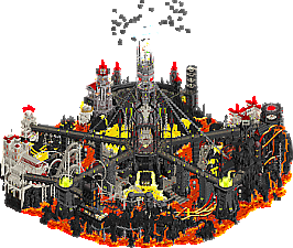
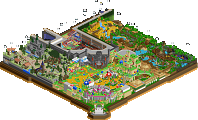
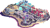
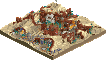

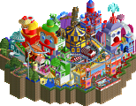
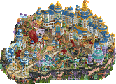
The final matchup of Round 1 is a thriller, seeing J K's Lonely Hearts Club tackle Scoop's Soda Jerks with a pair of parks that couldn't be more contrasting - one reaching for the cosmos, the other diving into the underworld.
Constellations embodies cosmic curiosity, where dreams of reaching Utopia mingle with the stars.
conclued
Hell or High Water Park
Voting rules- The poll will stay open for ~72hrs.
- Do not vote unless you have viewed both parks in-game.
- Everyone may vote except members of either team. Any illegitimate votes will be ignored or removed.
- Anyone with an account that predates the start of H2HX, or who has been drafted onto a team, may vote in this
match. Anyone with a newer account must pass the admins' account integrity checks.
- Voting is monitored by the admins to improve fairness.
Jesus guys, You all need to calm down. It's only round 1.
Madness
Screw you J K we're not friends anymore
when you know, you know, and i know
cant wait to go to hell
review eventually
Keeping in line with Scoop's habits, eh?
Been hoping for a match like this, but on the other hand, it's sad that one has to lose. This will be a really tough one to vote on, and I'll probably hold on to making a decision until I'm entirely certain. Will post review soon.
Well done teams!
Take your time voting please!
Incredible park Lonely Hearts boys - I love the constant innovation and boundary pushing with this game.
so exciting! best of luck SodyJerks!
Agree with Roomie. cannot imagine building a park like these and losing (can't imagine building parks like these, full stop).
imagine imagining
This is amazing. This game is legit unrecognizable from even a few years ago. I feel legitimately awful for whichever team loses this.
Constellations park is phenomenal and I have zero critiques but hell is just mind-blowing from a design perspective. I'm giving it the edge but I feel bad voting against a park that blew my entire mind when I opened it.
Holy shit I love H2H
Hell:
What is this? Dethklok meets RCT?
You guys are ridiculous. I think there is a lot of creativity here, a lot of little scenes, jokes, meta, commentary to make me giggle every time I open the park. Some big highlights for me was the terrain/landscaping with the lava flows and the rock gradients near the lava. Really thoughtful. There's a lot of neat details like the various skulls and jagged rocks littered throughout that really give that strong foundation of being in hell, underneath all the jokes and memes.
The music track was neat until Nickleback came on. Then that's when I turned off the park and shut down my computer. But, that additional music track hidden in a cave was amazing. Really great addition to the park that added a lot of immersion. Here's the url for those who didn't want to type it out. It's worth a listen: https://tinyurl.com/2bazn9ax
One area I think that held this back was some of the simplistic architecture. Lot of repetition with object usage.. mainly the Mayan corner trim.
There was so much motion/commotion in the park that I think on a second (and third) viewing I was able to pick out more details and vignettes which makes this park a lot of fun to view. Great work guys. It's so outlandish, but I wouldn't expect anything less from this team.
Constellations
Okay now for a palette cleanser! I viewed this park first fwiw when the match was released. It's amazing this park got completed for Round 1. If we typically see the best of the RR parks in Rounds 2 and 3, I'm scared to death of what you guys will produce.. holy cow. Immediate reaction to the park was grandiose, large sense of scale, and curiosity. What's in some of the rooms beyond archways? What are they reading about in the various libraries? How did you make that plugin? Why is the coaster changing colors? How does this all fit in the tile limit? Why is the song so short because it's driving me crazy?
Overall the theming, the village, the castle, all amazing. Incredible detail. I want to walk around this place.. it's so fantastical and I love it.
Only thing that I don't like is Stargazer. The double launches after the vertical lift is a shame. The prelift dropping into the village was such a wonderful set piece, and then the lift hill is not tall enough? Odd choice.
But, to not end on a bad note, Zodiac is amazing. Great launch effect. Really great interaction with everything around it. It's really tucked in to it's surroundings and I can only imagine that was a headache to theme. But man, it looks so good! And the spinning platform? Amazing.
Also, very funny how if I try to close the constellation window you guys have a pop up about the townspeople being left waiting.
This is insane. In R1?
what the fucking fuck
Constellations
Man what is this witchery... RCT becoming more crazy with the minute! The plug-in effect had me bamboozled... But the park also still holds up without it, that's very much appreciated as I tend to appreciate gimmick-less parks.
Lots of cool archy and superb use of elevation. Cool rides as well, great implementation of the rapids. Loved the Zodiac coaster, how well it weaves through its environment and it's super flowy layout. Would be a joy to ride irl. Stargazer was ok, liked how you did the custom trackbone but layout wise not so strong.
Very neat park, congrats Lonely Hearts.
Hell Action Park
Still a missed chance to not call it Hell Action Park It was a privilege to see this map taking shape. Starting with a fun concept, you guys went all-in on it. With every day, more and more ideas were included in the map. And it's so stacked with details and all, absolutely love it. First time seeing the final version of it, and well... that openingscene is just amazing...
Absolutely fantastic macro with the big central tower from where the parks extends. The Spinal coaster is so fun, lovely played with the invisible coaster to make the track look like its made from bones. The Pendulum is also pretty darn cool.
Love all the people added in cages, sorry for bracketman lol. Landscaping is great, fantastic rockwork and the lava is done so well. Also loving the sculpted goat/satan and the other crowned skull. But maybe the star of the show is the custom music... so good.
If this is hell, I gotta start living more sinfull.
nice
I can't access HELL (it says there's an attraction missing #X7accel) can you help me please? (if I don't see this map I will explode with anxiety)
Here you go:
https://x123m3-256.g...ides/index.html
You should join the NE discord chat too! Most of the discussion is happening there.
Come join us on the discord MrTycoonCoaster! You're already a popular figure there! Link's at the bottom of the page in the plain white site footer on the right.
I do appreciate the high concept nature of HELL, and how you guys managed to implement all of it ingame.
However, I do also just really like my theme parks being theme parks, guess I'm more of a traditionalist here
My vote went with Constellations in the end - a breathtakingly lovely piece of RCT.