Park / Troubadours et Baladins
-
 30-April 24
- Views 10,036
- Downloads 265
- Fans 1
- Comments 56
-
-
 80.50%(required: 70%)
 Gold
Gold

pants 85% no RWE 85% no Scoop 85% no chorkiel 80% no CoasterCreator9 80% no Cocoa 80% no Recurious 80% no Terry Inferno 80% no wheres_walto 80% no Xtreme97 80% no Camcorder22 75% no ottersalad 75% no 80.50% 0.00% -
1 fan
 Fans of this park
-
 Full-Size Map
-
 Download Park
265
-
 Objects
3
-
 Tags
Tags
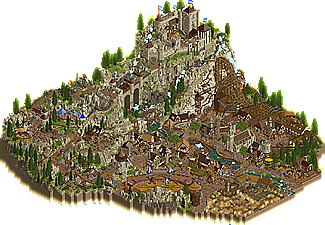
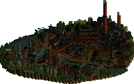
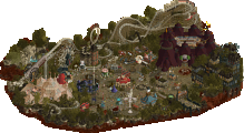
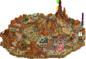
Troubadours et Baladins
Congrats on a wonderful park guys. When the matchup went live, I was just like Xtreme where I was quite worried! The world building and immersion here is superb. The music really sets the tone and overall aesthetic. I think the macro of the park is great on initial opening with the castle lording over the village.
There a lot of minor details, scenes, vignettes that demand the viewer to explore every nook and cranny of the park. Highlights for me overall were probably the quarry coaster and the windy path up to the castle bridge. Really well integrated and themed. Also the station for the RMC was very nice, love the cute little courtyard as well. Architecture is very appropriate and immaculate. Seems period appropriate? Or at least it looks like a great mesh of Manor Lords and Age of Empires! I'm sure drawing from other video games was a lot of fun.
One thing that would've put this over the top was perhaps a more fleshed out Quest viewers could do. The quest icon was begging for some sort of interaction! My apologies if I missed it.
Lostileth
Who would've thought I would do two Star Wars things back-to-back? Honestly not what I had planned to do, but I think Xtreme's interest in the theme along with my recent crack at it made it an easy project to start on. There were some other ideas that I had pitched that didn't quite land so we went with this. One thing that actually made it in the park was the rift. That was actually an idea I wanted to incorporate to add some level of visual interest to the center of the map. Originally it was from wanting to do fissures from Fallout 76 and I was particularly inspired by this Magic: The Gathering card:
Beyond that I tried to replicate and riff off of anything that Xtreme made and following our guide of ancient ruins, old archy, and newer military stuff. After he did the coaster helix near the coast, I knew that the rockwork in the rest of the park would be immaculate. Using some of the same shapes elsewhere near the library entrance, I really feel that I had to step up my Fisch rock game. I think it came out well!
For the library section, we/I used a lot of reference images of just searching "library in a cave" and mixing that with the Jedi library from the Prequel movies. Some of the comments about the spinner I will say disappointment. To me having the coaster be the "Ransack" is the visual storytelling of the Sith ransacking and plundering the library. I would argue we didn't need more static sith objects to tell that story - the ride does!
In terms of areas/views I am most proud of would probably be this corner of the library. Really enjoyed making the atmosphere of a library seemingly carved into a cave.
And lastly, this bit of the cliffside village. So lively!
Lastly, I just want to say how thankful I am to both Levis and Xtreme for letting me build on this park and to build as much as I did. I told Xtreme that building with him was on my RCT Bucket List.. and it was a ton of fun building this park. And adding a win made it even better.
I'm glad you guys enjoyed it!
Very impressed to see these behind the scenes. Amazing how high your game has gone up now otter.
otter you really are an exciting up-and-comer
Thanks guys for the behind the scenes look, so excellent to see how it all came together. Really great park that will grow on me for sure.
70% of that park in a month by Babar is amazing, you're an absolute weapon. Hope to see you again in this contest, great work all around here.
Hurricanes:
Very good park, I appreciate to go for a lot of negative space in the center of the map, worked quite well. The rifts were pretty cool, maybe a tiny bit too overdone with the blizzard objects -- it's very noisy there. Landscaping is stellar as is the seascaping. Also the archy is a success imo, the round motifs are refreshing and well done. I also liked the library, I definitely conveyed the Star Wars feeling from the movies and other games. I general this map kind of reminded me of Star Wars Jedi: Fallen Order and Andor. No idea if those were inspirations. My only issue with the park is that I don't think the story aspects fits or is presented well. Like this Sith attack is nowhere happening apart from that one platform. And then you have that cave directly under the library which I wasn't much a fan of because it didn't felt fitting logically (Jedis feel the presence of the dark force, don't they?).
Evergreen Gardeners:
I really enjoyed the park. Reminded me of Stronghold, Age of Empires and other medieval RTSs. Especially the castle stood out to me. In a positive way. I agree it somewhat blends into the landscape but that's how it is since castles are made from local stones. Structurally it's very thoughtfully crafted with several outer gates and the wonderful keep with it's rounded corners. It definitely reminds me of castles I have visited in France. Speaking of the landscaping, I'm a bit torn here. The overall forms are great, so is the dramatism of it. I especially like the curved stairs in the rocks, why wasn't there any paths for peeps though? The object usage is only almost succesful though. I appreciate trying to mix up the meta with some of the older style rocks but the end product is a bit messy in the end because it's all so random texturally. Things that stood out to me negatively were the lightning fast RMC, the mill (because of the floating and choppingly moving blades, never liked this solution) and that the map is too chaotic for my taste. There are several rides ploughing through the crowds of people, every corner is filled with something, the path is very noisy texturally. I know H2H is about filling every inch of park with scenes and details (keyword maximalism) but imo it was overdone here. This is what eventually made me vote for Lostileth, it felt overall more balanced. It was a by a slight margin only in the end, though.
Lostileth:
+ Great job capturing the idea of Star Wars. Beautiful white cliffs of dover + fantasy. That's what location scouting is all about. The geologic activity in the middle of the park was also very alien and Star Wars.
+ Brilliant use of Galaxy Express 777 and I liked seeing the return of the ETA-2 Actis Class Jedi Starfighter and Star Sprinter.
- Not enough story. The full experience of Star Wars is its story. I can't connect to any of the Jedi or Sith on the map because they have no names. Stormtroopers usually appear in huge numbers but there's only one on the map. The spinning coaster is called the "Ransack of Lostileth" but I don't see a lot of ransacking. This is unfortunate because it feels a lot like the sequel trilogy - promise of greatness but doesn't deliver the meat.
- CTRs are a little under-developed. "starwars moover" with capacity of 0? There needs to be some grammar checks.
In summary: A great Star Wars-themed park, a little light on the story.
Troubadours et Baladins:
+ Crossbow bolt timed with the coaster was cool. The quarry coaster was my favorite ride in the park. The wooden wild mouse coaster was interesting because it's a ride style you don't really see/was invented for this park, which makes it unique and interesting.
+ Verticality of the landscaping was very good. Even if the castle is small, it is very defensible on that hill. I also liked the quarry even though I didn't quite see how it fit into the narrative.
- Je ne parles pas des francais
- The park feels a bit confused on its presentation. I see a quest speech bubble, but there's no quest attached to it. This is a missed opportunity to tell a story. Caution tape is also a bit of a head-scratcher.
In summary: A great medieval-themed park. A little light on the story but there was a bit more than Lostileth. +1 Evergreen Gardners.
Lostileth:
- The opening scene with the cliff face and flyer wrapped all around it is excelent. Great rock work combined with a fantastic "realistic-fantasy layout" work so well together here along with the ship docks.
- Speaking of the flyer, this was done insanely well. What I call "realistic-fantasy" are not easy to pull off but this manages it beautifully, feeling plausable in-world, but also not out of RCT scale so it doesn't look odd.
- The little vingette scenes around the map edge are an H2H trope for a reason, then give a lot of explorability to what would otherwise be a wall of land, and the ones in this park are excellent. The one side is definitely more barron than the other, but that's minor.
- The rift/gas/whatever it is that sits in the middle of the map below the peep path feels very Star Wars.
- The library itself is super well done and the rides in it are too.
Troubadours et Baladins:
- Awesome landscaping here. The winding path up the side of the mountain, which still has it's big cliff face to one side is done super well. Feels very natural in how it would be built given the context of the map.
- The ride choices felt appropreately weird. Honestly the RMC was my least favorite of the 3 'coasters', but not because it was bad, but the other two were so weird and quirky but so well done.
- The village has some fun architecture, if maybe a touch chaotic for my tastes.
- Loved the team guarding the castle on the hill!
- The jousting match is done super well and is super fun.
I did flip back and forth on this one, but the longer I sat with it Lostileth held my attention longer and felt a little more refined. Agian, both great parks! (This seems to be a trend this H2H huh?)
Lost: Maybe the strongest park overall in the H2HX so far as of rounds 1 and 2. I'm a huge star wars fan but even from a hardcore fan, this wasn't an instant win for me, with great IP, comes great expectations. When you find out a star wars park is in the mix, its never gonna be what you expect as the source material is so massive. I like the idea of going with a unique storyline and planet, but the inspiration to Zeffo is so clear, that you might have well gone for just being zeffo. Either way, the park is amazing. Here are my favorite parts:
The tower obviously
The ships, landing pads, and everything else here.
This ride and CTR
Banshee got tons of love and I think its a good coaster but maybe too meandering and repetitive in some ways. However, this section is probably my favorite bit.
These buildings and landscape are so great
This helix is perfect
giant pit
Good supporting coaster, though the queue felt maybe too much like a ride queue
these hangars
Great work hurricanes!
Troub: This park put up such a great fight. It really took me awhile to decide how to vote for this match, and sadly I didn't go with this one, however there is so much to love in this park! Here are my favorite things:
The custom flat and the scenery on the ferris wheel
My favorite of all is the compisiton of this whole area, macro to micro its all great! The river flowing through the town is everything!
These buildings and the ride station are fantastic!
Both of these bridges
This building. Although "quest" is a weird thing to make stand out, especially when the rest of the park is in french. Which I should mention, doesn't add to the park, it would be easier overall for the community if you just used english for ride names.
The joust is great. Love that it is diagonal
The RMC looks great and first hill with the target is a fun detail. The waterfalls here are really nice.
Once again, sorry for voting against this. Just know that it was an extremely hard choice to make. I hope you gardeners are proud of the work here.
Didn't have a chance to review Troub! I enjoyed this map quite a bit.
+s for what I liked, -s for what I thought could of been better or improved
+ The dense amount of detail is unreal. The entire scene between the church, the different rides meshed in, and the fun sculptures like the beer mug really helped give it character inbetween the gritty feel.
+ The landscaping across the side up towards the castle is gorgeous. Great use of shading here and texture mesh here
+ The pathing really looks nice and beaten down. The mix up of texture and color is great
+ Little farm field labyrinth is a nice touch
- The RMC felt "shoved in". I think if it was planned to be a main attraction it may have helped give the map something it was missing.
- Like the before point, the map lacked a major focal point to catch the viewer's attention. There's a ton of great detail without what feels like a major overarching macro point to bring it all together.
- I think something like the castle may have benefited from a "popping" color maybe as part of the trim or the roof. Some ideas are maybe viridian or blue (since these colors already exist around the map). It looks great as it is, but possibly "centering" it on the map edge as well as some popping colors would of helped create a nice focal point as well as made this beautiful castle pop even more
All in all I love this map! The landscaping and architecture is unreal
Congrats to both teams for one of the best matches we've seen within R1 and R2. Quick thoughts but just trying to get up to date with reviews.
Lostileth
What a clever concept for a park. Kinda attached to an ip but enough room to breathe to give you guys freedom and put all the best accents of Star Wars in the park. Super clever.
+++ Bar scene with the band playing was just hitting all the SW feels for me
++ Storytelling with the library being taken over was excellent
++ The world-building of the map you created was exceptional from the crashing waves on the rugged cliff faces to the steamy fissures in the middle of the park. Something Stars War always does is show us why a specific planet of their universe is different, and the landscape told me everything I needed to understand this planet.
++ Custom rides and objects were amazing, excited to build a Star Wars park some day thanks to you
++ Coaster was great, as players have said, one of the best of the contest thus far. Slightly hard to follow after the cobra roll, but once you know it's diving towards that awesome element emerging from the circular pit, the rest is history.
++ Adventure ride was awesome
+ Circular architecture and the split cliff face near the library were amazing archy moments
+ Atmosphere!!!
- Wasn't the biggest fan of the spinner but I'm glad it was in there
Troubadours et Baladins
+++ This park was packed with scenes and small touches that elevated the park
+++ Three coaster in the park and enough room for that theming, you guys worked hard
++ Height in the park was great
++ Castle section was immaculate
++ Custom rides were well thought out and suited the park
++ Archy was some of the best medieval theming we've seen
+ RMC vs the arrow shot was a great moment
+ Castle shit section and Kumba made me laugh a lot
- Coaster was a bit too fast for me
- Some horse carriages weren't following the proper flow of the path so it took some section out of the illusion
- The jousting effect felt quite slow
---
This matchup was tough. Both were the top of their game in terms of their theming area, so much so that I null voted (and probably for the only time this season). Both were packed for R1! Congrats builders.
Lostileth
Probably my favourite of the contest so far, just beautiful landscaping and macro overall. Paths flowing well together with the recognizably Star Wars architecture, which isn't especially adventurous in shapes, talking about the formulaic round buildings with green roofs, but they don't need to be either. They way they nestle into the landscaping is just ace.
Red coaster is a banger, and again, everything just gels together so well, around buildings, through that very sick red tower, coming up through that platform with the hole, that hole is just great. Something about it feels iconic in a way lol.
I'm not usually a fan of cut-out scenes, but here it's done really well, when the whole end of the map is a cut out cave, and that massive entryway just looks so imposing and ancient, mysterious even.
The library is a beaut, really feels like it's under ground, although the coasters and the darkride feels a little bit unnecessary and overkill, but yeah it's h2h. Especially that blackened archive took me a bit out of the immersion.
Overall, this map is masterfully done, brimming with atmosphere, very sick details and feels very genuine and lived-in, just the depth, all the different levels, how it all gels together so well is very impressive. Love it
Troubadours et Baladins
First off, great map shape and love that castle, which looks like it has been a study of a real medieval one, with that classic shape of the keep towering over it.
The medieval architecture in general here is very well done. Love that huge bridge, that almost looks like it's on a half diagonal at first glance.
I think the mountain looks great, although in some areas, rocks look a little rushed, some of the older objects stick out a little, but not too bad. Imo I think the palette gives the mountain and brickwork a disservice, with a little too much of a yellowish tint, makes it feel more artificial than it could have, although it has grown on me.
Love all the architecture down in town, some really creative stuff, like the Nutrisco et Exstinguo, the little ale shop, the Artisanat. Details like that ballista on the rooftop. Love that jousting arena. The RMC and that scenic mountain coaster looks great. Shame about the pacing on the rmc, though.
The town overall could probably have used a bit more breathing room, cause it loses a bit of depth in some areas. Really big fan of the architecture here, feels very authentically medieval. Great work
Lostileth
The composition of the flying coaster and the hovercrafts/hoverpad are astounding. The large red fissures at the archive and on the flying coaster are an excellent execution of obscurity. The exploded view for the adventure ride and loading station is a highlight. The spinning coaster is a bit superfluous, considering it zigzags down the aisle of shelves like the adventure ride. A lowkey non-ride feature might’ve been more clutch.
Troubadours
I love the scale of this macro, the elevation is exceptional. From the opening the view perception is large. Unfortunately, the opposite view lacks love compositionally. I’m also overall not keen on the rock combinations. I love the ballista coaster concept. The design of the launch coaster facing towards the hills is interesting, but inconvenient in a theme park context. I overall enjoy that quirk though. I love the organic atmosphere of the village and its overall design. It feels that the architecture and timber frame houses were properly built from the resources evident in the landscaping.
Yes yes, Lostileth, seen it on our team Discord who cares.
Troubadours
From the moment you read the name you have a hunch who worked on this and viewing it confirmed it. This smells like a Babar park in a good way. The ideas in this are not necessarily the newest, but the execution makes up for this. So much fun little details to explore. I love how it feels like you come from the countryside into the village, and continue to go higher and higher to the castle, naturally following the path. My main gripe is perhaps it is a little too busy in places perhaps? But if that's my main criticism, it's a minor one. Well done!
Here are my video reviews for the park:
Lostileth:
https://youtu.be/kBbYNBfxgr0
Troubadours et Baladins:
https://youtu.be/7Cj5LYguObc
Great parks to both teams! I voted Troubadours, but I could have absolutely gone either way.