Park / Radio Park Tbilisi
-
 28-April 24
- Views 12,272
- Downloads 278
- Fans 3
- Comments 71
-

-
 80.00%(required: 70%)
 Gold
Gold

Recurious 90% no chorkiel 85% no Babar Tapie 80% no CoasterCreator9 80% no Cocoa 80% no G Force 80% no RWE 80% no Scoop 80% no Terry Inferno 80% no Xtreme97 80% no Mulpje 75% no ottersalad 75% no 80.00% 0.00% -
 Description
.-. .- -.. .. --- .--. .- .-. -.- - -... .. .-.. .. ... .. -....- .- .... ..--- .... -..- .--. .- .-. -.- -... -.-- - .... . -.. .- -- -... ..- ... - . .-. ...
-
3 fans
 Fans of this park
-
 Full-Size Map
-
 Download Park
278
-
 Objects
1
-
 Tags
Tags
![park_3151 [MM2014 R1] Concrete](https://www.nedesigns.com/uploads/parks/3151/aerialt2772.png)


The opening matchup of Head-2-Head-X pits Liampie's Dambusters against WhosLeon's Jazzcats. Who will claim the first win of the contest?
.-. .- -.. .. --- .--. .- .-. -.- - -... .. .-.. .. ... .. -....- .- .... ..--- .... -..- .--. .- .-. -.- -... -.-- - .... . -.. .- -- -... ..- ... - . .-. ...
concluded
Welcome to The Royal Institute of Extraordinary Biota! The pinnacle of botany within the British Empire where we collect, cultivate, and preserve flora and fauna from around the globe. A favourite among younger visitors is the recently inaugurated Edwards Greenhouse featuring more exotic exhibits!
Voting rules- The poll will stay open for ~72hrs.
- Do not vote unless you have viewed both parks in-game.
- Everyone may vote except members of either team. Any illegitimate votes will be ignored or removed.
- Anyone with an account that predates the start of H2HX, or who has been drafted onto a team, may vote in this
match. Anyone with a newer account must pass the admins' account integrity checks.
- Voting is monitored by the admins to improve fairness.
Gamma wakes up from review hibernation: Part 1
My new boss told me and my coworkers that we'll get pay cuts if we don't review every park. So, I guess I have to do this. In all seriousness, H2HX is such a hype moment that I'd be doing it a disservice if I didn't give all the parks the attention they deserve. So, let's do this!
Radio Park Tbilisi
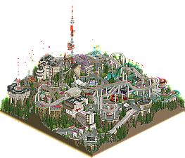
First off, what a cool idea for a park! This is the sort of stuff I was hoping for from the Dambusters, so you guys definitely did not disappoint. I'm a sucker for fantastical realism (not sure if that's what it's called, but I hope you get the idea), so, concept-wise, this park is right up my alley.
The aspect that stands out to me the most is the bold use of elevation. The Tolsimir rocks, tall trees and clever tiered construction really sell the "mountain park" aesthetic in such an impressive way. The escalators are so cool, I might consider them an attraction by themselves if this park existed in real life.
And, of course, if we're talking about elevation, I have to mention the coaster and flat rides. These gorgeous duelers might be serious contenders for ride of the round, and I'm fully aware that I'm saying this before any other coasters have been revealed. They're just that good. By the way, did I say flat rides? Because some of these bad boys are anything but flat - I'm of course talking about the genius inclusion of tower-style rides to fit with the radio tower theme. Sublime.
Moving right along, I have to talk about the architecture here. I've never been a huge fan of Brutalism in RCT, but this park might have changed my mind. The forms, textures and subtle details all combine to make for that trademark sleek RCT that [redacted to avoid open builder speculation - Liam please don't knock me over the head] is known for (the white glass does so much here!). The crunch is on point, just enough to make all the park textures believable. Other highlights of the park I'd like to mention include the Wild Mouse (sorry, Wild Morse), the radio towers, all the signs, and the super cute space-themed wall behind the playground. Oh, did I mention the microphone sculpture? Awesome.
Going back to the park idea to wrap it all up: I really appreciate all the radio puns you guys managed to fit in the park - definitely feels like something a real-life park themed to radio would do. I also love the sheer amount of rides it has, and the fact that the park doesn't feel overly cramped despite that amount.
TL;DR: creative, fun, gritty but clean.
The Royal Institute of Extraordinary Biota
We're officially in the post-Belle Isle era and I'm here for it. The vibes here are immaculate, and the geographical and historical moment meant to be portrayed are captured so well, it almost makes us feel like we're there. And man, I just want to be there. The calmness and picturesque beauty of this map are so damn inviting - in no small part thanks to the classy music choice.
In terms of technical quality, what can I even say? Perfect blend of macro and micro. It's truly incredible how well the park flows with its organically curved forms (which are seldomly made with rides, by the way - look how far we've come), and, of course, much of this needs to be attributed to SpaceK's new hedge objects - what a clutch replacement.
Micro-wise, the standouts are definitely the carefully created foliage and the few imposing-but-beautiful buildings. One of my new favorite things to do with parks is using the scenery picker to see what puzzle pieces went into crafting these structures, and the object creativity is at its peak here. Another impressive aspect is just how much life you guys managed to include at the peep level, while still retaining the peaceful atmosphere.
And, since this is Head-2-Head, of course we couldn't go without a fair bit of comedy. The plant species nameplates made me laugh for a solid 10 minutes. Super creative use of the map edge.
TL;DR: peaceful, beautiful, inviting.
All I can say is, this is gonna be a very tough vote. Luckily, being one of the early reviewers, I have all the time in the world to go back, look at both parks even more carefully, and certainly spot even more cool things I didn't see on my first few runs through. What a stunner of a first matchup to open things up. Congratulations to all builders involved, and massive props to the admins for the quick releases. Can't wait to see what's next in this awesome contest!
The Royal Institute of Extraordinary Biota:
So Peaceful and Serene. I've already spent at least 30 minutes looking for small individual details and I could probably spend another 30 only to find half of the total. I love all of the little vignettes of peep scenes and some very creative plant species. The small amount of architecture that's in the park is masterfully done as well. One of the best map edges of all time and very creative nods to the members noted from other teams to tie into the story of the map. Even though there aren't many attractions in the park and it's a botanical garden rather than the normal amusement or theme park, There is still a lot look at and keep the viewers attention. SpaceK was too good of pickup as you can already see here. Those hedge objects are amazing. The only bit of critique I might add is that I wish there was a bit of movement in the central pond right next to the carousel. Maybe a fountain or something like that. Would've given it a bit of kinetics in the only area of the park that felt "empty." I do also think that in the same area the trees behind the main building make that section a bit claustrophobic. It would be nice to look back from anywhere in the park and see the beautiful structure in the distance. Both points are heavy nitpicks though. Overall a fantastic first park and I might have to listen to it when going to bed to help fall asleep.
-Notable stuff screens
Carousels just keep getting better and better.
This patio is wonderful.
Gustavo and Hobeon together as it should be.
Another cute sculpture
Such a great maze.
Radio Park Tbilisi:
This Park is Brutal(ist). I love the height differential in this park, especially with all of the towers in the one corner. This park is much more kinetic than it's competitor which has me leaning towards this park initially. I love the architecture. Easily the best iteration of brutalism I can think of in recent memory. I also think the type of park works really well in it's setting even if we have seen it before. There have been enough evolutions of objects and techniques to help it feel refreshing. I also want to note how grey it looks like it should feel, but it doesn't. All of the accents work really well in breaking the grey up enough. Again some minor nitpicks because no park is perfect. I think the coaster is a bit too fast in some areas. Most notably the pink coaster after the first turn where it has a double bunny hill and where it goes right under the station. That would through anyone out of their seat lol. I would have liked to see a bit more crunch on the paths as well, It feels very clean and this map feels like a park that shouldn't or wouldn't be. Over all a very tough decision which doesn't seem to happen with me very often.
-Some small bits I thought were great
Favorite building by far
Really cool and well done sign.
I love how the supports compliment the structure underneath.
Macoroni!
I just love the design choice on these umbrellas.
This sign building combo is so cool.
All in all, solid 1st round from both teams! Makes me excited to see what's in store for not only the rest of your tenures, but also for everyone else. It's going to be a tough decision as previously stated. Well done.
Trying my hand at some reviews, so here goes. Some thoughts on the opening parks of H2HX
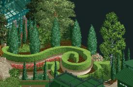
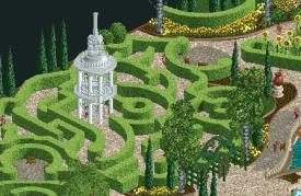
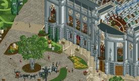
Jazzcats - The Royal Institute of Extraordinary Biota
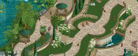
Beautifully framed like China Blue, a very curvy and green park.
Immediately noticing those sweet Spacek hedges, will definitely see those alot from now on.
Love the whole tranquil feel of the place, with students lounging around with their art and research.
Perhaps a bold move to make a park with so few rides, but it's not a detriment for me, at least.
Lots of creative object uses to make fantastical plants and of course the architecture is beautiful, especially the institute itself with that ferris wheel glass roof.
Pathwork is highly curvy and tastefully framed with layers of planters, running water and some nice rockwork. Over the swanboat ride it feels a bit much on the curves though.
It's brimming with little scenes all over the place, which makes it feel like a real place, only with some magical plants. Can really spend some time just relaxing, enjoying this.
Radio Park Tbilisi
A very different park to the cats, this is a dense themepark with some high elevation.
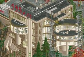
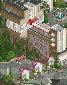
Digging the brutalist architecture here, some impressive, large structures with very interesting shapes. Big fan of that style. Great work with the landscaping also.
Really fun all the ways aspects of radio were incorporated into the different rides. Fully fleshed out theme.
While I don't have much to add to the themepark aspect of this, since I know little about that sort of thing, I'll add a couple observations.
It is packed with very well designed rides, perhaps the beautiful groove spin and that little wild morse are my favourites.
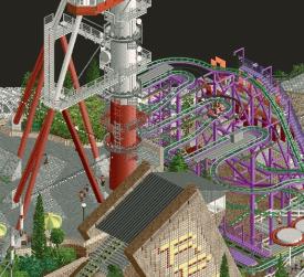
A drawback for me is that the duelling coaster takes up a bit too much visual space imo, at least in the first half. The layout itself is great, but it feels a bit overpowering in it's size. Maybe if it was weaved a bit more into the environment.
Some highlights for me is this funicular ride, the wild mouse and that massive, cool radio tower.
This wild building.
Overall, a choice I have to think a bit about.
I would usually be inclined to vote for the more calm, artsy and nature oriented park with minimal rides, like the Jazzcats have made, but the brutalist architecture of the Dambusters park and also the high mountain setting is also something I love.
Great work by both teams! Looking forward to the next batches of parks
New contest. New meta. New overly-gushy Gustav reviews babey!!!!!! IIIIIIIIIIIIIIIIIIIIIIT'S TIIIIIIIIIIIIIIIIIIIIIIIME
Radio Park Tbilisi:
+ The consistent radio theme throughout, from the huge radio towers the park is built near to the architectural motifs and the punny names. Wild Morse got me. Really has the essence of a classic H2H park.
+ Elaborating on architectural motifs, they do so much to give this park a really unique identity. Love the clever use of trackitecture in Wild Morse's awning and on the radio towers. Makes you think it's just scenery. Marconi's Macaroni using the slide pieces is genius too.
+ Love the verticality and surface area. It looks a lot bigger than the 3600 tile limit. Great landscaping too, although the black 1K ruins feel pretty dated honestly.
+ Nailed the Eastern European feel with the dueling Togos and the wonky architecture. Some areas look like [REDACTED] doing CP6, especially the FMBurger area.
+ Looking real hard for the grid and I can't find it. Very natural and flowy park layout if not a little busy.
+ Detailing in the radio towers is ridiculous.
Honestly not much negative to really say about this park. Just a fantastic little bit of grungy Eastern European goodness with a unique theme fleshed out in a whimsical way. The sensible chuckle I expected the Dambusters to kick off with.
The Royal Institute of Extraordinary Biota:
+ Very serene with some great use of open space. Can be risky in the H2H environment where the more you can pack in the better, but it works well in this context.
+ Love the swoopy hedge motif throughout, especially how it's used as a hedge maze. Amazing new object set which I can see becoming mainstream, even in place of the CTR hedges. SpaceK is already a deadly force on the Jazzcats.
+ Great archi all around, from the grand classroom buildings to the stations and covers for the rides. Also a fan of the homely little train station tucked away in the corner.
+ Obviously some world-class landscaping. Surprised how many different plant objects you managed to get away with, even the cursed argonath objects you turned into Hobonions.
+ Probably the coolest map edge I've seen in a H2H park with some great new sign objects I imagine we'll be seeing a lot of throughout this contest. Except you called me Yappus Alotus which unfortunately means I will be voting for the Dambusters. Tough luck Catboys! At least you nodded to my Italian heritage by calling me Garlic.
+ Love how the park interacts with the map edge, like the foliage hanging over or the water falling through.
- The drawback compared to the Dambusters' park is there isn't as much going on. Some lovely little peep scenes here and there and obviously a botanical garden doesn't need a hypercoaster or anything, but while it made a strong impression it didn't hold my interest as long.
Beautiful little park with some great scenes and a strong balance of architecture and landscaping. Will take some time in deciding my vote, but right now I am leaning slightly Dambusters. Excited for the next match!
Having sat on enough bleachers during incredible past H2H contests, I'll try to contribute some commentary from my front row seat thruout this milestone HXH. No promises I'll keep it up.
For fairness sake I'll open both parks at the same time side by side and roam where my eyeballs wander. Won't read any other reviews beforehand.
Won't even tell you who I vote for. You can't make me! You also can't make me read any readme.
Opening presentation in both parks was similar, starting the viewer's attention with centerpiece architecture.
Nice use of ferris wheel roofs and interior peeks into the biology lecture hall. Beautiful brutalism and signage on Tbilisi's entry building.
Motion from the Modulation racers caught my eye next, very fun dueling coaster, supports thruout are a strong point. Radio theme is clever overall.
I like the garden theme too, and the little shop of freak plants therein. Carousel and path/plant curvature carries, but I do crave a coaster. Side-friction?
Verticality (pillars, towers, cliffs) of Radio Park is impressive. Shoutout for the funicular railroad and Luka Doncic. Clips in 7.
Biota park had that awesomely ornate and cheekily captioned border. A fine day for peepwatching, colors cool.
Good first match, may the best park win.
~B-]
I'll go with my previous rating system (3 '+' is max):
Radio Park Tbilisi by The Dambusters
-Concept: **
While it's an interesting concept, it doesn't really lend itself for too much visual spectacle I feel, although your execution made up for it a lot.
-Content: ***
There was a lot of content to go through. Sometimes a bit too much though, where it was stacked on top of each other where I had to use cut-away view to see what was actually underneath, when the view was blocked.
-Quality: **
Especially the architecture had some great quality to it; well placed, interesting shapes and great height variations. I wasn't really sure about some of the color choices though, although it probably fits the Soviet theme.
Overall;
The radio tower structures throughout were great and really made the park stand out and unique. The custom music also added a ton of atmosphere to the whole and fitted so well. The coasters were well paced, a great visual highlight with all the custom supporting and really made the park pop for me. The supporting rides also were great, with the wild mouse/morse coaster signage being an highlight. The groove spin was placed so well and loved the lights going around it in all directions. Also loved all the (curvy) glass work throughout the park. And finally the height variations were great and made for some awesome visuals with the architecture hovering over the cliffs.
The Royal Institute of Extraordinary Biota by The Jazzcats
-Concept: *
Decent concept, wasn't really anything groundbreaking, but I guess you guys went for pure atmosphere and execution instead of anything gimmicky.
-Content: *
While it suits the concept you were going for, I felt the absence of a major ride/e-ticket hurt the content side a bit too much.
-Quality: ***
Here's where the park shines imo. Very consistent quality throughout the whole park. Almost feels like it's done by 1 person (at least the majority of it).
Overall;
First when I opened this I thought I was looking at the Dambusters park, because it reminded me of Andrew's style so much with all the curves. Good inspiration I guess Very relaxing atmosphere in the park, it's like the polar opposite of the Dambusters park. Love the color scheme, the curvy hedges and curvy paths throughout the park. Also love the biology lesson theatre seating hack you did, fits well. That institute/university building was nice too, just don't get why it's so open? Like the ferris wheel roof, while inventive, kinda defeats its purpose as roof by being so open (but maybe that's what you were going for?). Foliage was one of the standout features for me, fitting the botanical garden theme, with nice color choices and fluently positioned throughout the park with the RVE/garden ctr.
In the end I went with Radio Park Tbilisi, mainly because it held my attention longer and there was more to explore.
Two very good parks in this opening match and it shows how good the quality of RCT is these days. You can't be safe with any technical level, the other team might always one up you. Gonna really have to step up my game to compete with this stuff.
Radio Park Tbilisi has some great architecture. I have to assume that the vibe the park gives the viewer is exactly what you guys wanted to achieve. Uninviting and not human scale oriented concrete architecture from Soviet times. Stressful noise, radio signals, stuff built on top of each other in a somewhat awkwardly saturated and smog-related palette. A lot of verticality, really a lot, with all kinds of towers and the multiple above ground ride layers.
It's executed very well and there are some great ideas in there like the escalators, the funicular, or the outdoor DJ scene on that highest platform. The technical aspects are mostly done very well, the central position of Groove Spin is an eye catcher and I found a lot of the wordplay names quite funny. Within the frame of its concept, you really almost can't fault any of it. I like the idea behind it, and I think the execution does it justice for sure! It's really well executed actually.
Personally though, I found it very difficult to view with all the auditory and visual noise. I have to say that I have been sick for weeks now and maybe that doesn't help, as this park wants to be unnerving and it succeeds in doing so. But the viewing experience kind of stressed me so much, I eventually had to mute the sound on my second time viewing both parks today, which is something I usually never do. That's probably an issue on my end right now, and while I found that difficult, I do appreciate how much this fits to your underlying concept. I think one examplary spot for where I found the visual experience very difficult is the corner with the wave swinger. I love how many layers you have on top of each other there in theory, it's very 3-dimensional. Just that it looks very flat, simply because the vertical faces of the terraces are mostly hidden behind something or have very similar textures to the flat faces. The individual layers also have similar textures and colors. While I think it's a realistic representation, it doesn't really allow me very well to digest it. I would've appreciated if the verticality and 3-dimensionality here had been easier to appreciate visually. I'm looking at it and I kind of want a braille version of the park to grasp it. While that probably shows my inaptitude as a viewer more than anything else, in the sense of appealing to the viewer to get votes, I hope it somewhat explains where I had my problems with it.
Overall it's great work, it's different, I really appreciate it, but I couldn't really enjoy viewing it. I said this on discord, too, it's actually somewhat weird how this match could feel totally different depending on what park you open first.
__________
I guess Jazzcats got a bit lucky here with my vote that I opened the Dambusters' park first because obviously Jazzcats are going for something calm and peaceful with their work. The lucky part is the fact that I knowingly needed something calm and peaceful just when I opened it, and I was super surprised how much it delivered on that front. The Royal Institute of extraordinary Biota is a beautiful map with organic shapes, amazing architecture, and a brilliant visual presentation.
I will start with the presentation as people more often than not don't appreciate custom map edges. I do, and I think they can make a huge difference (see my choice for the map edges in my 2 parks last season). I am not a huge fan of RCT's standard map edge for the type of maximalist and developed RCT art that we're doing in this community. This park succeeds very well with its map edge and while it is already visually stunning and an amazing color contrast for the park itself, the wordplay on it is also quite funny. That pretty much evens out or maybe even goes one beyond the funny wordplay in Radio Park Tibilisi. The map edge is classy and very fitting. It brings across that museum or scientific presentation vibe.
The gardens themselves together with the music are calm and beautiful. Of course it helps welcoming a render god like spacek on the team last minute, and he's already proven his worth in creating CSO for this. Some of the organic shapes created by these rendered objects seem absolutely essential for bringing across the atmosphere and concept that you were going for. The peaceful nature, no coasters, little elevation, no thrill rides, is a very bold move. But just like I liked how Dambusters followed their underlying concept and accepted the negatives that came with it, I appreciate the authenticity and truthfulness to the concept here. I would've hated for there to be a coaster on this haha. Hated is a strong word, but damn I needed this park to soothe me when I viewed it.
In terms of technical RCT I feel like it'll soon become a given that I'll comment on great technical aspects on every one of these parks. It's up there at the very top. It feels like it's the norm now. I look at my work and think, how can I make sure my work would beat any of these. I can't. Everyone is amazing on the technical front now, and it's incredible how the elements on this all compliment each other and there is no noisy spam of trim objects or unnecessary textures like back in the day. It's just immersive and believable, through its macro, as well as through its micro.
The architecture is amazing. How can someone have this much success with this way of creating architecture multiple H2Hs apart. I don't want to openly guess. But when I checked the objects used for the curved roof of the central building, I couldn't help but laugh, that it's just the evolution of the same trick that potentially the same builder did on Mobray's years ago. I checked via cutaway view, and I must say I'm a bit disappointed that your upper floors have doors that lead into the aerial space above the ground floor haha. It's nitpicking but if you do cutaway, you could've done something with that there. Maybe balconies if you want the high ceilings to stay for the ground floor. Maybe rooms. I don't know. But if you do stuff like that and leave it unfulfilled, it breaks the immersion for me for a split second, which is why I have to mention it.
I like the design of the train station, too, but both in terms of proportion, and in terms of where it is on the map, it tells me that you really wanted to have it in there but didn't want to afford it too much space. I think the proportions in comparison to the other buildings are a bit off. The other buildings could be huge and maybe the train station is just like a tram stop. But it still feels too short. Maybe you should've just went to the map edge with it and cut it off so that it could be longer. But I guess you were too worried about the half diagonal river and preferred to keep that organic instead of prolonging the trainstation haha. Maybe you also just didn't want to cut it off, so it's a better fit in terms of map design.
But yeah, overall it's pretty fantastic. It's not super adventurous or daring, even though that in itself makes it daring. It's not more than it's trying to be. But it's amazing at what it is and it's calm, pretty, peaceful, and soothing. That's why I voted for it in this opening match.
__________
Great job to both teams, I hope my views don't come across more negative than they're intended to be. I found a lot of things I appreciated in both parks, and the quality of this opening match is great!
I wish both teams much luck in the next rounds.
Radio Park Tbilisi:
Loved it. The amount of elevation in this gives it such a large feeling. The designs of the buildings, pathing, rides, etc. are fantastic and the execution pretty much flawless. I like how the entryway is set below and there are elevators and escalators up to the main park. Lots of fun patterns implemented throughout, like the radial designs of the path colors at the entrance, the stringed lights, the geometric buildings. So good. The radio towers themselves are so cool. I also like the areas of negative space around the edges with the landscaping work that wasn't too distracting from the park itself. The coasters looked great and I especially loved the ending sequence and use of diagonal track there. Honestly don't have much to say negatively about this one. Maybe the area with the log flume and swing ride was a little less inspired from a macro-perspective and felt a little less organized than the rest. Also loved the signage sprinkled about.
The Royal Institute of Extraordinary Biota:
Love the concept of this, and I really appreciate the subtlety of the weird plant species in the park itself. It'd be easy to go over-the-top with giant plants, but this is much more restrained and properly proportioned. The species are great and I love the park edge and font. The hedge work stands out here. The strength of this one is in the execution of the curves and flowy designs. Very beautiful. There's some very quaint areas that I really enjoyed like the river boats, train station, the hedge maze, and the swan area. The main buildings were nicely done and I love the swirl hedges by the one. Really, I only felt I was wanting more content because of what was built I can't really point to something I disliked. I thought there would be a sort of underground lab or something below, knowing the builders on this team can be zany. Another thing I think was a missed opportunity was to discover all the plant species, I saw some of them were named, but only about 5 or so. Maybe I missed where I could find the names of each of the strange plants definitively, but I more direct hunt for them would be a great avenue to engage the viewer.
Radio Park Tbilisi
Biggest thought that comes to mind with this park is interaction. There's so much going on here, and yet it's quite digestible to me. Feels like a Soviet-era Blackpool Pleasure Beach on a mountain top. Also, this seems to be in a similar vein as parks like Washuzan and Tokyo Dome City, two beloved parks. As the below screenshot shows, there's so much layering which is impressive to me.
AM and FM is a really good racing layout. Dominates the macro of the park, but also provides a lot of great moments of interaction and integration, namely with the supports that are shared with the carousel structure. So incredibly thoughtful design.
Lastly, as others have pointed out, the commitment to the radio/audio theme is great. Love the motif... namely this station here.
Great work Dambusters!
Royal Institute of Extraordinary Biota
Really charming and pleasant. Lot of little scenes to look at throughout. The gardens were intricate and detailed... loved the maze in particular.
Probably the moment that stands out to me is the swan boat ride. Lovely ride.
What architecture is there on the map is quite enjoyable.. left me wanting more! I understand that the garden is the main attraction, but would've rather seen a full greenhouse as opposed to half cutaway on the map edge.
Perhaps more movement would've helped hold my attention here for longer. Having the main attractions being a double decker carousel and a boat ride is tough when compared to a park with an amazing racing coaster. I think what could've elevated this would've been named staff or invisible ride track you could hover over to see what's happening in a vignette. Or, with the latin names for builders, have little sign posts in the gardens showing each plant using the hidden ride trick from Dig Site 4.
Complaint/suggestion aside, this is a very visually appealing park. As Fisch pointed out, the technical skills on display here are great.
Long story short, going with the Dambusters here.
Radio Park Tbilisi :
I love this brutalist vibe. You've captured this post-Soviet vision, which gives that park a unique touch. Architecture is really the strong point here, these two buildings with the radio towers are splendid, the use of diagonals and curves give them a distinctive look. I also really like the area around the entrance with this cliff and these curves, then this escalator next to it, it's clever and it fits really well. Another highlight is the funicular, I really like this arrival station. If I had one criticism, it would be that the central area around the Groove Spin lacks a little detail and depth compared with the other spots, but that's purely a personal opinion.
The Royal Institute of Extraordinary Biota :
Another room, another atmosphere.
Very intimate and poetic, It starts well with Debussy's Clair de Lune in the background.My crush here is this Swans Ride, so deep and so right! Beautiful. These curves, this foliage, these little touches here and there, stunning! Same for this maze and these hedges. This main building is really nice, my only complaint here is that it's a bit massive and square, a few small dependencies around might have softened this aspect. Another point is perhaps the lack of detail in the central area which seems a little empty compared to the others. Overall a park full of charm and tenderness, un amour.
2 great parks for this first match, congratulations !
After letting the parks digest overnight I cast my vote for the Dambusters.
At the initial viewing I wanted to vote for the Jazzcats, because of the beauty and calming feeling it gave, compared to the overwhelming visuals of the Dambusters which I felt was way too messy for my taste.
Conclusion was just that Tbilisi park held my attention much longer and I kept finding the mess to make more and more sense, also fitting to the theme at hand. Kept finding more beautiful moments in the chaos. To make such a dense and vertical park fit together that well was more impressive to me and felt a bit more thought out in a technical sense. Also the brutalist architecture was so diverse and cool, probably the best I've seen in that style in RCT so far.
Not a happy vote, because both parks have exceptional qualities in so very different ways.
Quick thoughts prior to voting: this is a fun matchup, both parks feel like they exist in the same universe of subtle grounded realism. Both parks are stylish, presenting simple ideas but executing them well.
Radio Park is clean, architecturally interesting, and offers good movement, vertical layering, and themed details. It doesn't feel very adventurous, but rather a stylistic continuation of previous works. Not so much a negative here, but I hope to see more diversity later on.
Tbilisi is modern, artsy, and immersive with strong humor, but seems to be lacking a dynamic element. As a long-time fan of coasterless parks and using map edges as part of the creation, this suits my taste.
I liked both parks and enjoyed spending time exploring each of them, they're very close for me but ultimately I gave the nod to Radio Park because it felt more alive
Radio Park Tbilisi
Might not sound like the most spectacular concept for a park, but the execution more than made up for it. The first impression of this park is a bit messy, tall mountains with multiple layers of buildings, and a huge duelling coaster going through it all.
But the more you look at it, the more details you spot, and the more sense the park makes. I personally love parks with a lot of verticality, as well as brutalist/soviet architecture, and both were done so well here.
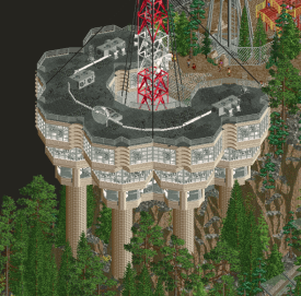
Easily my favorite building in the park:
The Royal Institute of Extraordinary Biota
What a vibe!
On first glance not as spectacular as Radio Park Tbilisi, stemming from the lack of verticality and movement. But once you look closely, this park is no less impressive. Such a different vibe, it's hard to compare the two.
I love the flowing paths and the classy glass-steel architecture. I almost always play rct with the sound turned off, but man this park is worth turning the sound on for. Would absolutely love to spend a late summer afternoon just hanging out here.
The only thing this park is missing for me is another ride or two. The swan ride is super cute and a big coaster would ruin the atmosphere you so carefully set here, but I think the park would have benefit from some more movement.
With only the first impression of these parks, I thought I had a clear favorite and the choice would be easy. But the more time I spend looking at both of these, the harder the choice got.
After careful consideration, decided to vote for the Royal Institute this round. I think the radio park is more spectacular, but the Royal Institute is park I could see myself spending a full day while losing track of time. It's just such a vibe. (also appreciate the shoutout, even though that did not influence my vote)
It was a very difficult choice, and I want to congratulate both teams on finishing such fantastic maps with such a tough deadline. Can't wait to see what else you got cooking!
How the fresh fuck has it been three more years already? Never thought I would see H2HX. Not that I thought I was going to die in the interim, but that's just a euphemism. A lot has happened in three years, though: I got a couple Spotlights, won a design totally on my own, and won a lot of awards. Oh, I also had a daughter. Have I grown as a person? Yeah, absolutely. Am I going to let it show here to annoy you guys even less? No, never. Will I continue the trend from last season of asking rhetorical questions in my reviews? It's evident. All the makings of a classic Steve Review (I never did get that trademark finalized, mother of all fucks)! I can't wait to annoy the shit out of Scoop when I rip his park a new one.
But this review isn't about Scoop or his stupid team name (damn, I'm already doing it sorry Scoop!), it's about Liam and his stupid team name. What even is a Dambuster? Hang on.
*googles*
Oh, it's a World War II thing? In this political climate, Liam? Are you trying to get me to italicize things? I mean, fine. You've done far weirder shit with far fewer repercussions. I'll let it slide for now until the next park you guys drop on your victims (see what I did there? Cause your parks are bombs... cause they suck. Or maybe they are the bomb. Whatever, it's a stupid name).
Anywhoozle, onto [redacted]'s park! ...wait, what.
[redacted]'s park is--
Liam is trying to censor me! Guys. You seeing this shit? Good lord, this is next level. I mean, fuck, I love this layout and formatting of the contest pages to make it feel official but how are you doing this? Who's coding this shit? At any rate, [redacted]'s park feels like a [redacted] park all right. Did anyone even have a hand in this other than [redacted]? I mean, it's got [redacted]'s signature style of color and macro with that eye for detailing that's a lot but never too much. What's the word for that, again? Balanced? I wouldn't call [redacted] balanced, though; they're absolutely unhinged in my DM's. Endless feet pics and all for free, too. I don't mind though because [redacted]'s work all but makes up for it usually/unfortunately. It's interesting too because I don't recall [redacted]'s contest work being too glamourous. I mean a win here or there, sure, but that's pretty standard I guess. Has [redacted] ever beaten me before? Let me check my notes... probably. Am I treading dangerous ground with this joke? Liam is either going to think it's hilarious or find reasons to DQ me for revealing builders but I haven't done anything other than lead you this far into my review so really, the joke is on you: the reader.
Well, regardless, good work on the map [redacted]! I won't applaud the rest of the team because I don't like your name and your first pick is a pain in the butt usually. Good luck with that one, Liam, sheesh.
Oh! I almost forgot: consider this first of many Steve Reviews as my official FYC for awards season. I was not nominated for Best Reviewer last time and I'm only bringing it up now in case you guys forget. I'm not bitter about it at all, though. Not like I'm bringing it up for no reason what-so-ever. Just shooting the breeze, posix. I mean, what. Anyway.
Radio Park Tbilisi:
+brutalist architecture
+radio theme
+ride design
+elevation, landscaping
~I think the Soviet/brutalism could've been pushed even harder with little scenes and vignettes. I would've loved some more specifically Georgian/Caucasus references and ideas.
Royal Institute of Extraordinary Biota:
+new hedges
+terrace section with curvy paths
+greenhouses
+curvy maze
~map edges: they tore me out of the peaceful, garden mindset; I found them distracting
~I think more could've been done with the train ride: maybe that could've been the main ride of the park!
Excellent work on the part of each team. Both of these parks were really up my alley.
Apologies for writing too much!
It feels like time flew by between draft day and Round 1. I'm expecting to say this for next match-up and every match-up of teams too, but congrats to the Dambusters and Jazzcats for putting out parks of such high quality!
The Dambusters - Radio Park Tbilisi
I did not know what and where Tbilisi was, so I googled a little. Now I see the Ferris Wheel and the main radio tower coming from that area. As many people have pointed out, this park is so full of charm and commitment to the theme! After the round, I'd be curious to hear how the conversation went to pitch and build this, and how all the radio related ideas were thought up to take this to the next level haha. All the ride names, the various structures like 'Marconi's Macaroni' lol, the beautiful playground area, the microphone on that super cool looking "on air" sign, god every single sign actually...
In particular, I love the center of the map with the pinwheel-shaped lights over top, with the flat-ride 'Groove Spin', near which almost every tracked ride moves through. I loved staying on that scene to see all those rides move around at different moments.
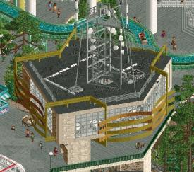
My favorite building on the park is the one with the radio tower at the center, tethered to the edges of the roof (the one Hobeon also happened to post above). In the process of taking a screenshot of that building, I kept realising I love more things next to the building until I kept expanding the frame so much that I had gone till the other edge. Basically everything is just very well laid out at a macro level. 'Ordered chaos' isn't the phrase, but I'm struggling to think of how to describe it.
The mutedness of the palette felt a little unpleasant at first viewing, but as I explored more, I slowly found out it absolutely has its place here. The easiest way to find out is to switch to the default palette haha. I also appreciate the cleanliness where it exists like the paths, and where the crunch takes over like the flat roofs. It would have been easy to consider doing crunch on every path surface as well, and I think that would have lessened my experience of feeling the balance.
It's an R1 park to be proud of. You guys really did a great job making things feel super busy, moving and noisy without being that overwhelming, at least to me.
Jazzcats - The Royal Institute of Extraordinary Biota
This park appeals to me with its theme so much. I love the violin and cello players in that huge gazebo structure with people both standing around as well as sitting on benches to hear it. Nearby is a giant cherry blossom I think, with pipes to mist the grass? It's all classically beautiful to see. The whole map feels very intently built with each building block serving its primary purpose and only that purpose, if that makes sense without sounding pretentious. The map has the feeling of being part of a larger map, while also cropping right where the most interesting parts come together.
If I had the hardware and the 3D rendering know-how I'd ask how you make objects like the ones you make, spacek! Years of experience under that old TF2 hat haha. It's a wonderful addition to the theme of this map. That maze is definitely among my favorite things on here.
The university(?) building and the botanical garden + greenhouse together are great points of interest for a map, and it was very fun exploring inside! If I were on this map I can imagine myself being bothered that I forgot the ride entrance building is visible inside the university haha but hey, it happens. I love how the interior on the university is clear through the glass windows. No more single-color tinted glass baby, we do away with it here at the jazzcats house. Or jazzcat-tree. Or jazz-catskill's. Gotta wander around the neighborhood and chat up other felines. With the greenhouse and adjacent garden of exotic flowers, those bright flowers really help introduce more strong colors to an otherwise more reserved theme-appropriate approach for the map.
I'm also a fan of the rockwork around the water, but watch me say that for every single damn park lol. Clean execution, makes me question why I'm so bad at it.
The train station is beautiful, but I especially love the texture work behind it where the olden cars have made tire tracks on the dirt roads. It pushes the realisation that this is capturing a certain time period/vibe. Very few opportunities to show that, otherwise. In fact I wouldn't mind if there were more of that in many other ways! Perhaps it wasn't a large point of focus and I'm reading too much into how that time-period thing is important to the overall vision.
Composition-wise, I love each scene in isolation so much. In small views, this is as good as it possibly gets in my eyes, but I keep getting proven wrong. The quality is through the roof these days. Anyways...
Oh I didn't even mention the map edges! Y'all, whoever did the floral pattern at the corners, and the entire thing in general, deserves all the praise. Plus if there is one sign we desperately needed, it was a serif font sign in two different weights. It is put to hilarious use, and I loved reading all of them haha.
---
It is undoubtedly a tough vote for me. I love both parks for some of the same reasons but also in the very obvious contrasting differences as well, such as the height differential and the kineticness with rides. There aren't any significant obvious flaws in execution for me so with quality like this, it almost feels harsh not voting for one over the other. I'll sit on my vote for now and see where I lean more.