Park / The Royal Institute of Extraordinary Biota
-
 28-April 24
- Views 12,272
- Downloads 259
- Fans 2
- Comments 71
-
 74.00%(required: 70%)
 Gold
Gold

pants 80% Xtreme97 80% Babar Tapie 75% chorkiel 75% CoasterCreator9 75% RWE 75% Scoop 75% Terry Inferno 75% Cocoa 70% G Force 70% Mulpje 70% ottersalad 70% 74.00% -
 Description
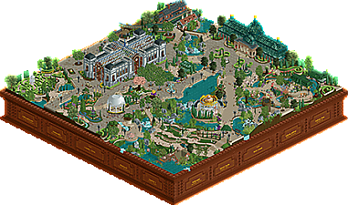
The Royal Institute of Extraordinary Biota: the pinnacle of botany within the British Empire. Plants from all over the world are collected, cultivated, and preserved. Open to the public, it is one of the most visited botanical gardens in the United Kingdom and a favourite among younger visitors. With the inauguration of the new Edward Greenhouse, plants from the tropical latitudes are also on display -- The Times 7.6.1925
-
2 fans
 Fans of this park
-
 Full-Size Map
-
 Download Park
259
-
 Objects
1
-
 Tags
Tags
I’ll try to keep these as brief as I can - there isn’t much I can say that hasn’t already been said!
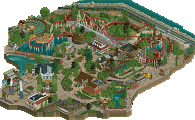
Radio Park Tbilisi: What a huge build. The best part for me by far are the radio towers. These almost serve as the park’s skybox, creating such a massive atmosphere. The park is filled to the brim with content. Much of the architecture, while not exactly pleasant to look at, is convincing at accomplishing the intended goals. My favorite gems are the little shops and stands placed around some of the plazas, as well as the waveswinger. Some criticisms - the park is bordering on being overwhelming. Even when trying to soak in every detail, I find my eyes moving to the less busy areas of the park. Oddly, I find myself enjoying the Wild Morse more than the racing Arrow coasters, though I do like the shapes and placement of some of the diagonal hills. Criticisms aside, in the spirit of Roller Coaster Tycoon, you undoubtedly have the better build. To me, it feels like the ultimate juxtaposition between a fairground and mountainous terrain, while combining old fashioned approaches with what was once considered “the new stuff” of the 80s.
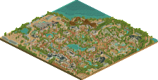
Royal Institute of Extraordinary Biota: Stunningly gorgeous, and just about picture perfect. The decision not to include a coaster was a deliberated, conscious effort. And a brave one, at that. I don’t think it hurts the park by omitting one, but considering the fact other parks are more than likely to include one, it’s a risk that won’t always pay off with every voter. If building on this park, I would have included a small Schwarzkopf looper, or a family woodie - just to check the “movement” box. Think of the GT park Fred & Jappy in The Diamonds of Antwerp. This said, I think the atmosphere is pristine. You crafted these brilliant scenes that reward the viewer as they gaze into them. The architecture isn’t over the top, and that’s how it should be. Again, the attention to color is extraordinary. To top things off, the sounds are lovely. Including Erik Satie’s Gymnopedie No. 1 was the cherry on top.
Conclusion: Two polar opposite parks, and I’d say both accomplished their wildly different approaches quite well. All things considered, there is one park I want to keep coming back to a little bit more than the other, and it belongs to The Jazzcats. The “amusement” park atmosphere is certainly fulfilled with Radio Park, and feels as lively as it should. But the tranquil beauty of Royal Institute won me over by the slightest of margins.
I don't think my vote will come as much of a surprise. Both parks were really well crafted and I'd be hard pressed to call either lacking in any way. Biota felt like a masterclass in macro, Radio Park felt like a master class in interaction. Biota has almost an 'intro' feeling to it, like this is setting us up for something across the season, but hard to tell. For me and what I really love, both ticked the box on execution but Radio Park also pushed the envelope in terms of architecture and a unique aesthetic. While Biota felt so classy and tranquil, I don't have the sense I've never seen this before and it's missing some of the flash we've seen with opening rounds in the past. I can't say that Radio Park has that much more flash, but I found myself spending longer exploring it, particularly the unique forms in the architecture. That ultimately tipped the scale to Dambusters for me.
Congrats to both on making the mad dash that R1 has proven to be. I pray for rest for all of you and longer deadlines for a game that has become increasingly demanding again.
Radio Park Tbilisi intrigued me the moment I opened it up. Great urban atmosphere in a sort of perhaps exaggerated way. It was very detail rich and had creative signs and names. I especially liked the Wild Morse pun which others have mentioned already. I don't know if a park like this could be made in the real country Georgia, but if so I'd like to see it.
The Royal Institute of Extraordinary Biota exuded a calm atmosphere. I really liked the ornate hedge mazes and the interiors. The names of people as plants on the edge of the map was a great idea. The park seems to have aimed for atmosphere which is cool, but the rides were so minimal that it went a little too far in that direction for me.
I voted for RPT but both parks were very good and appeal to different tastes.
Radio Park Tbilisi:
A great take on the architecture style chosen, some great signs and murals and some fantastically detailed radio masts. Ride design is really good, tons of great interaction moments, nicely timed racing main coaster and I like the choices of ride overall. And all the radio puns and themed names make it extra fun. Also, very clean style all over, especially for a densely packed urban park.
The Royal Institute of Extraordinary Biota:
Such amazingly calm and pleasant atmosphere. Bold choice to go with so few actual rides, it manages to do a lot with path work and foliage and I spent a suprising amount of time just finding all the great little scenes and moments. The rides that are there are very nice, the carousel is beautiful and the swans fits into the landscape
very well. Also, great map edge, fun references with the names and it along with the music adds to the atmosphere.
Almost 200 in-game years put into each entry, fucking christ alive.
You guys are insane, in the best way possible. Nerds.
Don't stop, fuck I need more.
Went with radio park, but damn both teams should be very proud. I can't even tell this game is built on a grid system, shit is so round and organic.
To think this is round 1...
Excuse me while I wipe the jizz off of literally everything, fuck me
Had to take like 4 different looks at these parks before deciding my vote, excruciating. Love both of them for really different reasons, great job by both teams on finishing to such a high standard - I think this season's round 1 is already an excellent start to the contest.
Radio Park Tbilisi:
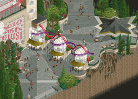
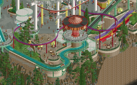
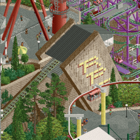
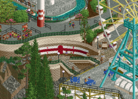
Awesome idea for a map, gives you a ton of ways to extract little ideas and rides out of the radio theme, feels like a quintessential H2H idea and mapped onto a fresh setting. The duelling coasters are really great, reminding me a lot of Daidarasaurus at Expoland in Japan. A unique choice and making use of the new diagonal pieces superbly to craft a great (if focus-stealing) layout; the final criss-cross turnaround over the cliff edges is fantastic. Beyond the coaster then, the supporting rides are all lovely and cleverly themed. Wild Morse has to be my favourite ride name in a while lol. The architecture is awesome as well - can be hard to pull off soviet brutalism without it feeling stale or purposely too-ugly and you've done an awesome job here with some really gorgeous forms.
A few visual highlights:
Entrance signage showing the waveform and the path segmentation.
The ride layering and different levels here is so good, reminds me of CP6.
Slanted funicular station with the mural is wonderful.
Hidden flag of Georgia, and the red and white motifs throughout the map are great.
The Royal Institute of Extraordinary Biota:
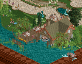
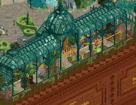
Providing something of a mirror to the typical H2H park, this is a super harmonious and enjoyable map. Took a risk going without a big ride here and while I could see something like a side friction or an older ride type working if integrated well, the possibility of it shattering the tranquility of the map is difficult to ignore. The grass is always greener on the other side. Back to the map - the two big structures of the greenhouse and lecture hall are really excellently made, very refined architecturally and reminds me a lot of British museums and botanical gardens. The time setting is also more subtly woven in with the vehicles types, but the park also has a timeless quality to it. I'm also salivating at the map edge, very beautifully done and the added humour is great. Paired with the hedges and paths, it also has me itching to try out the new objects from this map! Maybe this is an odd reference but the music, setting and general vibe reminds me a lot of the Professor Layton games from Nintendo, gives me some warm memories!
Some more highlights:
Boating station details are lovely.
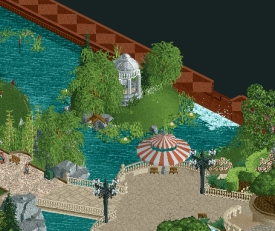
This island using the awning dome is a fantastic object choice, really breaks the grid.
Greenhouse interior is really neat!
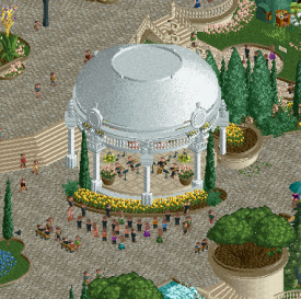
Love the band stand.
Overall my vote goes to Jazzcats. I can see myself coming back to this park just to have on in the background and calm me down. But both parks are essentially very close in my eyes, and I think it's a stunning first matchup!
Typically a park like Radio Park Tbilisi would be my choice every time, but in the end I had to go with Royal Institute as it completely won me over-- what a beautiful piece of work.
Both teams should be very proud-- these are some incredible parks that have really set the tone for the rest of the contest.
The poll is now closed. The final voting score was:
Congratulations Dambusters for taking home the very first win of the season.
Incredible work to everyone involved. Two amazing parks to kick off the season, and I was VERY surprised to see that the votes were so far apart when I voted. I think ultimately the amount of content counted for a lot with voters, it seems.
I LOVED the theme of Biota, definitely one i'm going to come back and spend more time in. It's so clean and precise in a way that my work never is, I find it very impressive. I know that doesn't count for a lot right now, but over time some of the best-remembered parks lost their H2H matchup.
posix back at it again with the fantastic website formatting!!! <3
Congratulations to Alex and the squad as well. Truly deserved! Sucks that such a serene park had to lose. I'd love to see this concept brought to a larger map.
Evergreen Gardens by alex is pretty close to what you're looking for.
I see. Well, guess that'll have to tide you over until someone makes the CSO equivalent.
Would love to hear from the builders if possible, always interesting hearing about the building process and behind the scenes.
Congrats to the Dambusters and Alex / Ulven / Roygbiv on a fantastic round 1 park!
There were many moments of brilliant interaction and layering of rides, paths, and landscaping here along with a unique architectural style. You can tell there was ample inspiration driving this park, and with so many clever tie-ins with the radio theme, this felt fully realized.
Radio Park Tbilisi
Some pretty undeniable influence and or inspiration here - overall just a general vibe to a park that I really love and find interesting. Wonderfully unique architecture and rides. One of the few things I can really critique about this from my perspective is the dull and drab nature of the color scheme as a whole - but I also think that's probably the intended effect. Fantastic job.
The Royal Institute of Extraordinary Biota
Super scenic and super beautiful; reminds me a lot of the botanical gardens here - just, much greener. I enjoy the charming, diorama-like nature of this scene. Love the flowing waterways and the overall ambiance. I thought there might have been a bit of a missed opportunity to include a few more interior details to the Biology building, but I think the bigger thing for me is the abundance of pavement for something that is ultimately supposed to focus on the foliage and landscape.
Man, what a strong start. These are the first few parks? Are we sure we're not going in reverse?