Park / The Royal Institute of Extraordinary Biota
-
 28-April 24
- Views 11,481
- Downloads 215
- Fans 2
- Comments 71
-
 74.00%(required: 70%)
 Gold
Gold

pants 80% Xtreme97 80% Babar Tapie 75% chorkiel 75% CoasterCreator9 75% RWE 75% Scoop 75% Terry Inferno 75% Cocoa 70% G Force 70% Mulpje 70% ottersalad 70% 74.00% -
 Description
The Royal Institute of Extraordinary Biota: the pinnacle of botany within the British Empire. Plants from all over the world are collected, cultivated, and preserved. Open to the public, it is one of the most visited botanical gardens in the United Kingdom and a favourite among younger visitors. With the inauguration of the new Edward Greenhouse, plants from the tropical latitudes are also on display -- The Times 7.6.1925
-
2 fans
 Fans of this park
-
 Full-Size Map
-
 Download Park
215
-
 Objects
1
-
 Tags
Tags
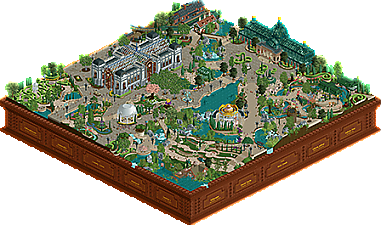
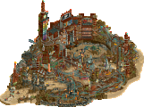
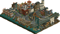
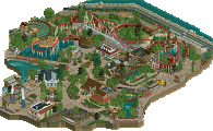
The Royal Institute of Extraordinary Biota
+ The map edge is very well done.
+ The architecture throughout the park is stellar. I want to give a shout out to the small half diagonal kiosk next to the swan ride.
+ Love these new hedge objects and the maze you made with it. Would be great to have a set of 1 unit high objects too.
- The overall quality is great, but I feel like the park has less content to explore than the average H2H park.
- I wish the white main hall has glass windows and roofs instead of the open look.
- Some parts of the map are a bit lifeless. The train station and the inside of the glasshouse for example
Radio Park Tbilisi
+ I'm a big sucker for existing places that are turned into theme parks and a radio park makes a great setting. Great idea.
+ Absolutely love the brutalist architecture, especially the one with pillars with the tower on top.
+ Compared to TRIoEB there is so much content to explore due to the verticality you went for.
+ The giant ferris wheel is cool. Are those new objects?
+ <3 the heart photo frame.
+ The placement and execution of the queue of the dueling coasters is breathtaking.
+ All signs throughout the park are really well done.
+ The big radio tower is fantastic. I really like what you've done with the boat hire track.
- I'm not sure if I like the presence of the dueling coasters. They kind of ruin the macro for me.
- The black 1k ruins are outdated.
- The foliage looks rushed, especially on the sides of the map.
What a great way to start this H2H. I do have a clear favorite in this match-up though.
"If I had the hardware and the 3D rendering know-how I'd ask how you make objects like the ones you make, spacek! Years of experience under that old TF2 hat haha. It's a wonderful addition to the theme of this map. That maze is definitely among my favorite things on here."
"Erectin' a hedge maze!" I said that, whacked the dispenser, and it dispensed some objects. Clearly the work of the gods.
dambusters park, its pretty good
jazzcats park, its also good but not as much
tough decision had to go with a null vote
gonna review as i look in the order i opened them yesterday:
Radio Park Tbilisi
Very vertical opening scene with some interesting retro soviet-feeling archy. Potentially too much white with the glass here... would be interesting to see if a different glass color gives it a bit more life, as it feels slightly sterile. But that vibe does match the concrete blocky archy for sure.
LOVE the sign on the building, and the shapes are really great - pathing, buildings, lots going on but it feels very true to the theme. Getting deeper into the park and there's a lot going on. The theme is really nicely hammered home - some design choices that are probably less aesthetic but fit perfectly. The coaster is fun if a little uninteresting, but again looks great with the setting. The building at the top of the train line is SO great, feels like a shape that has never been done before and honestly might be worth the vote by itself.
I think the risk here is the theme - which you've done a really good job of creating - but is by its nature not super aesthetically pleasing. Things like radio towers are technically impressive but I have a hard time appreciating honestly... just not really my vibe. There's a ton on this map that I can appreciate work-wise but doesn't totally buzz me.
The best bits for me are the building on the cliff with the tower in the middle, the top of the sloped railway with the letters on the side, and the little playground with the space scene on the wall behind. Lots of cool stuff all over the map though.
The Royal Institute of Extraordinary Biota
A big contrast between the maps, and another great one. First glance is a setting that is a little more my preference, theme-wise, with some interesting stuff going on. The different plants everywhere are really creative, and make the theme pretty apparent straight away. Lots of great object usage.
The map is really pleasant to explore, super atmospheric and high-quality stuff. As i'm moving around I am aware that i'm missing some rides, kinda. There are some rides and I know that a coaster might have messed with the theme, but i still miss it.
It took me a while scrolling around before I actually came to the map edge and noticed it. What a great idea, and beautifully executed. It makes the whole map feel like a little diorama, and instantly elevated it for me.
Highlights for me are the dark green greenhouse, the curved hedges are great, the train station really nicely works and obviously the map edge theming. The whole map is polished up super well, and feels like a finished product. When compared to the other park it does feel slightly lacking content-wise, but everything that is there is absolutely lovely.
This is a really close matchup for me, and i've flipflopped a couple of times. Ultimately my vote goes to the Dambusters. I have to reward the scope of the work and there was just enough content on their map to tip it over the edge against a park that I preferred to look at, but left me wanting a little more. Feels bad not voting for either park honestly - amazing work to all involved with the time-frame given, and I cannot wait to see more quality parks from everyone. Either park winning this matchup would make sense.
Just viewed for a second time and I'm in love with both of them for very different reasons. There's so much skill and thought gone into both of them. Can't decide, must view again!
Also new hedges and path textures, sfg!
Radio Park Tbilisi
Hot dam! Lots of cool and very interesting architecture in this park. Every building is very distinctive from each other but they still feel really cohesive in the bigger picture! I absolutely loved the carousel building with the animated lights, a very clean and simple carousel skin but it's the details that take it that extra step further.
I'm shocked to see how many rides you guys managed to cram in to this park without it feeling too busy! Really clever ride placement and interaction, especially in the right corner of the park.
Last but not least, I was really impressed by the signage across the whole park. Using the glass sections of the AVL glass pieces to create words is genius and something I would've never thought of.
All in all, a very pleasant park here! I know people are always searching for that wow-factor to impress the voters, but I can really appreciate parks like these which go for execution and clean aesthetics.
The Royal Institute of Extraordinary Biota
Look mom, it's my na- my sister's name!
Oh hello new maze pieces! The soothing music (flashbacks to the days where I built dirt houses in Minecraft) and the calm ambience really made me feel relaxed watching this park. The carousel here is also really well done, I could've seen this one fit right in to Belle Isle. The curves and path shapes are off-the-charts good and the whole park flows really well from section to section. Really clever object combinations around the swan ride (also c'mon onions)!
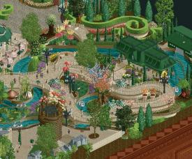
I also really appreciated you guys taking time and effort to do the interiors. I wish you would've also put some time and thinking into the custom trees to see what color combinations and objects work best together, as some of the trees didn't fit the timid vibe of the rest of the park and felt like they came right out of the disaster bench lol. I enjoyed this park! Logging off, Jasmine J. <3
+ Generally like the foliage
- In some places, I felt like there wasn't enough tree variety
+ Love all the cliff foliage.
Brought me such joy to open these parks! Just the excitement of the contest and everything had me freaking out while downloading.
It's probably a boring feeling to the grizzled old veterans... but this being just my second H2H it's the first time I can say, "wow, things have come very far since last time" and notice how the meta has developed.
Which is crazy that there is a meta, that enough people care about RCT in the year of our lord 2024 for there to be artistic movements and technical developments and everything. For there to be this digital creation and folks are like "Well my goodness the influence of Belle Isle is undeniable... reminiscent of so-and-so's recent GT phase... a delightful assortment of objects..." like what the fuck is this, how have dozens of people cared so deeply for so long about this game.
But yeah I really like both parks. Tibilisi has the verticality and dynamic layering that I crave, Biota was pristine and serene and stylish. Thanks to both teams for producing such quality stuff.
dozens? theres at least... one hundreds... of us
So many rides, wow! And they are all appropriately named and themed to the radio motif, love that. Escalators are superb. Radio towers are excellent. A quick google search of Tbilisi shows the radio tower straight away, you nailed it! The custom music with the radio tuning between frequencies is a nice touch. This park is full of content but the sight lines are relatively maintained, well done!
The Royal Institute of Extraordinary Biota
It’s so pleasant here, this park puts me at peace. I’m a sucker for backstage details and the little transfer track and maintenance building for the swan boats station had me nodding in approval, very nice. The music selection is on point. The buildings and gardens are a perfect match for each other. The theme and vision come across effortlessly, awesome job!
Radio Park Tbilisi
I love the brutalist architecture in here. I think you succesfully managed to capture the socialist feeling. The antennas are aweomse as well. The ride lineup also fits the theme very well as well. I really like how the dueling coaster sits above the park.
Regarding small things this also has some nice stuff to offer, i love the 5G demonstration! Overall i so feel like the park was a little low on small details though, i think the theme could have been explored more in that regard. I also wished for the landscaping and foliage to be a tad more interesting. Good signage work though.
The Royal Institute of Extraordinary Biota
I love the pleasant calm atmosphere you created here. It's also great to see all these new objects, i congratulate you guys again on your replacement! The foliage and pathwork is quite beautiful too. I also enjoyed the map edge, it gave this a nice diorama-like feeling. The custom music worked very well here too. My favorite small thing in this was the string quartet.
The topic of rides definitely is something that needs to be discussed here. I applaud your bold decision to not add that much in here, together with the lack of verticality it led to this feeling a bit low on content compared to the Dambusters map though which made them get my vote here in the end.
Radio Park Tbilisi
Great theme, feels fresh without it being super high-concept, which can be difficult to attain these days when so many parks have been released. Overall this feels like an incredibly solid park really fitting the H2H mould.
+ Great landscaping. The tols rocks work great here, giving it a modern yet classic look
+ Duelers! And great ones at that. I hope to see more duelers in this H2H. It is one of the original things that I think we all were drawn to when we started playing this game 800 years ago.
+ The brutalist archy seems really convincing, very well executed
+ Palette and color selection is spot on, muted to give it that worn feeling, but with many eccentric color accents to liven it up
+ Several great flat rides
+ Great signage/wall mural work
- I think the map edges could maybe have been given just a bit more love, but I understand a more classic look was what you were going for, so at the same time it's good it's not too elaborate. Maybe just some underground piping or similar could have been a neat touch
The Royal Institute of Extraordinary Biota
Such an atmospheric piece of RCT, and it feels very serene. The hedge object sets will be used and reused heavily from this point on, I am sure, as they look great (although maybe just a touch too artificial/bright looking IMO).
+ Daring theme for a H2H park in that it is not about quantity but quality
+ All the curvature going on in paths and foliage is very impressive-looking, not much looks bound by the grid
+ The two main buildings look great!
+ Carousel is perfect
- Even though it might have disturbed the peacefulness of the map, it does feel like a main ride is missing
- While I loved the shout outs to the other teams along the map edge, and aesthetically it looks really great together with the gardens, it didn't fully make sense to me. It doesn't seem to me that this is meant to be like a diorama on display in a museum, but that kind of border still implies something like that. So it just feels conceptually a bit unfounded,
- The macro doesn't always feel like it has the best flow, some curvy path and garden sections almost feel too intricate
- Not a fan of the path texture mix, it seems a little arbitrary, maybe it could have looked better if they either were more different or if there were fewer variations
- Despite foliage being a focal point of the map, it feels a little too eclectic in a few places. I understand a botanical garden should feature a lot of different plants, but to me it feels like the specific selection and placements could have been a bit more carefully considered
Verdict
I love that JC went all in for the quaint botanical garden theme in a H2H - It feels very bold. For that reason alone, I would like to have felt compelled to vote for it, but unfortunately for me the execution is falling just short, when facing a park of Radio Park Tbilisi's quality. My vote therefore goes to Dambusters. Great job both teams and what an opening to H2HX!
Bonus reviews from Minideano #1 and #2:
Radio Park Tbilisi:
"I love the roller coaster that's so cool I would ride the green one" (because it finishes first, obvs)
"That looks like the radio mast next to my school"
"They had room for one more teeny ride, but only if it was extra teeny"
"They copied my wild mouse ride" (context: that he had built from the preset RCT Classic layouts on ipad)
9/10
The Royal Institute of Extraordinary Biota
"The people in the maze are cheating" (he's talking about the guests clipping through parts of the hedge!)
"I want to see what's in that building... wow - cool!" (about the largest greenhouse with all the lectures going on)
"Where's the roller coaster?"
(on seeing a twist hidden under the map) "they should have put that Dollywood ride into the garden"
7/10
(no vote was cast on their behalf!)
Radio Park Tbilisi
I think this park is great proof that a H2H park doesn't need to have gimmicks or ultrarevolutionary new CTR's or objects. It's a solid concept executioned really good. The architecture is the star of the show here imo, with lots of cool and interesting shapes. My favorite building is also that one that Hobeon posted a screen off. The radio towers are also so good and placed so great that they don't disturb the view on the park from any angle.
I also love just all the rides there. There's so much to see and there's so much movement here. I admit that these coasters would be a "just ride once for the credit" if this park were real but they fit the park and its concept damn well. Making a duelling/racing coaster where the trains stick together so good is always an achievement to be proud of. Also like the placement of the log flume's first drop. Haha, would piss my pants there.
The Royal Institute of Extraordinary Biota
The first thing I notice is the way it's presented, like a piece in a museum. Nicely done and also love the custom plant names. Also here there's great archy to find. But overall, this park has to has it from its atmosphere. The park is a great combo from archy, flowing pathways and great landscaping and foliage.
The Swans are done fantastic, such a lovely ride. The other side of the map however does lack some movement (other than peep movement). I think an old classic scenic woodie would have worked wonders in this park, or just some more other little rides.
Favorite parts on this map were the swans, train station, boat house and the cut-off conservatory.
this matchup is truly a testament to how high the quality of this community's art has risen. two vivid actualisations of completely different ideas executed to an incredible level. the golden age of RCT continues to blaze on.
Royal Institute of Extraordinary Biota is one of the most tranquil and inviting vibes ever captured in this game. A lot of trust was placed in calm, and that is a choice i deeply respect. the inclusion of Erik Satie in the soundtrack was an obvious and powerful choice for such a peaceful place. huge commendations for the creative choices made and the fearlessness of their execution. I appreciate the flattery on the edge of the map, and for it's vegan-friendliness. the map edge was a fantastic use of the available surface, very stylish and memorable.
Radio Park Tbilisi on the other hand was a artfully balanced cacophony of rides and vertical contrast. the duellers, which by all rights should have been trite and unimpressive, are brought refreshing new life by the new track pieces. on some level, i feel as though this park was catered to just me, as if they were desperate for my vote. though there are places where it feels as though the valiant builders had time get the better of them, the core of the map is unquestionably whole and complete. in a perfect world, the landscaping and foliage would have had more vivid execution rather than filling in the gaps with negative space, but that's not huge criticism. the architectural choices are singular and invoke such a particular kind of atmosphere that i really appreciate. the rest of the rides show a level of creativity and confidence that is the envy of everyone in the community.
all in all, it was a tough decision i had to sleep on as i sincerely wanted to award both parks for their strengths, but one was clearly more catered toward me. huge congratulations to the builders for finishing such impressive pieces in such a suffocating timeframe.
Radio Park Tbilisi
This whole park was a vibe, lots of content and buildings I loved looking at, it really held my attention for a good amount of time.
+++ 93.5 FM and the radio antennas were pretty iconic
++ Great elevation changes defining the whole park, allowing you to go there with the brutalist architecture
++ Duellers were great
++ Wild Morse
+ The radiowave theme was awesome, really gave you lots of scope to play with
+ Some great small touches such as the protest and the heart arch
+ Suspended monorail was really well executed
+ Custom rides across the map
Royal Institute of Extraordinary Biota
Great park, I feel I'll be coming back to this to take in this calm and serene atmosphere you've created. The whole park to me feels like the middle gardens section of a full scale solo but elevated to a gardens area we've never really witnessed before. Ballsy, ballsy concept for a H2H setting. Great job team.
++ The swan ride <3
++ New objects such as the mazes and the half diagonal steps
++ The different combinations of new plants, looked like you had so much fun trying new combinations out
+ Greenhouses were really well done
+ Carousel was perfect
+ The map edge, great way to link the theme and involve the community
+ The diagonals and curves around the park
It was a pleasure viewing both of these, great starting matchup for the competition.
radio park is packed to the brim with content! i love all the pops of color against the dull gray backdrop and i love the layout and chonky supports on the AM/FM coasters
even though flowers park has less action and looks a little flat by comparison, the presentation is just so classy and im too much of a sucker for gardens and nature scenes for it not to get my vote
awesome first match, cant wait to see the rest
I also can't stress enough how impressive both parks are given the timeframe. One month to build genuinely two of the most high quality parks... the bar is being raised, even from Grand Tour which was a similar time-frame for the final as I recall. This contest is going to be bananas.
Opened both parks yesterday already and they're both fantastic! This was a tough matchup. Yesterday I was almost certain that I was gonna vote for the Royal Institute. Now that may have been a lingering concussion or the remnants of my hangover from the national holiday looking for some calmness and etherealism. Or it's just Tbilisi growing on me. Because on second look I decided to vote for Tbilisi. I think it just had more to offer me on second viewing.
Both are fantastic parks in their own right and would be super cool to visit.
My favorite parts from the Royal Institute were the green houses and mazes.
My favorite thing from Tbilisi was probably how it interacted with that landscaping. All those stairs would be terrible lol. Second favorite was definitely the radio towers. Very good!
So true, I'm pretty sure all of us have pretty busy lives and the expectation level is raised so high these days, it's very impressive what you guys pulled off in this short time.