Park / Busch Gardens Egypt
-
 25-March 24
- Views 3,637
- Downloads 317
- Fans 3
- Comments 7
-

-
 71.50%(required: 70%)
 Gold
Gold

Recurious 80% CoasterCreator9 75% G Force 75% In:Cities 75% Terry Inferno 75% Mulpje 70% pants 70% Scoop 70% SSSammy 70% Xtreme97 70% Cocoa 65% RWE 65% 71.50% -
 Description
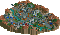
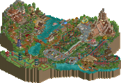
With recent large investments from oil tycoons, Seaworld Parks & Entertainment has decided to expand their Busch Gardens theme park chain to Egypt to compete with recent new theme park developments in the region. With a large amount of capital at their disposal, they were able to reproduce different world wonders to incorporate into their theme park.
% share:
Ballpit 90% (all other rides, macro, planning, buildings, architecture)
94SP 10% (feedback, tweaks, updates, Phillistine Giant layout & supports, Obelisk Odyssey supports)
I included a Readme with some shout-outs and the list of references for the architecture if you're curious about anything seen. Most of the major architecture is based on actual world wonders. -
3 fans
 Fans of this park
-
 Full-Size Map
-
 Download Park
317
-
 Objects
3
-
 Tags
Tags
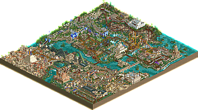
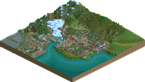
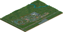
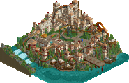

This is a very good park overall! A lot of innovative NCSO items. I enjoyed the "kids area" the most with the rock climbing wall and smaller attractions.
So many little scenes here or there that were fun to look at. The inverted coaster and hyper take the cake for me as best rides in the park. I'm going to have to steal some of the vehicle editor tricks you all used. Congrats!
Really solid park here! I enjoyed pretty much all of it, despite some goofiness that I'll mention in a moment, there was clearly a lot of craft and thought put into it. Lots of great detailing and sign work especially, the one along the darkride exterior in the entrance was really something. Very nice archy too, especially the big set pieces were quite well done. Gave each area a real distinct and memorable quality which I think is important in a park like this. Lots of great litle park type details too, games, restaurants and such. The custom flat rides also really elevate things too and IMO are pretty much a critical part of making parks like this these days, so glad you went the extra mile and included those.
As far as the goofiness goes, it's not so much a complaint, maybe more just something I noticed. But the coaster lineup has two swing launch coasters, maybe not totally strange for a brand new park like this kinda is, but I maybe would have liked to see something a bit more conventional. Generally the layouts were solid, except for the Invert which I wasn't a massive fan of compared to the others. The coasters were really the only thing I had a problem with. Some of the archy didn't really feel very theme-parky either, maybe it pushed more into semi-realism than I was comfortable with but at times it took me out of the immersion a little.
Overall, quite solid for NCSO. I think you have some real potential to make something fantastic if you keep building parks like this, further refining your style, hope to see more!
Very glad to see this released here finally. I got familiar with it through Swag's review on youtube and after watching that i was really curious to check it out ingame myself. I always pushed for DKMP-style players to build something more grand, so i'm very happy to see this!
The entrance area to the park was very nice. It's lovely to see all the architecture and details here. Great usage of the pyramid object here! When viewing this area first i had some questions in my mind though: I'm not a park chain expert, so i don't want to elaborate too much on it, but i asked myself what especially makes this a Busch Gardens park? I agree with G that this felt more like a semi-realism park to me. It's very nitpicky and probably also a bit NE-like criticism i know. And i also have to add that i feel like it's very difficult to depict this in NCSOpen, but it still somehow stuck in my head when viewing the park.
That hasn't stopped me from admiring all the awesomeness in this though. For example the Prophet and the surrounding area have been amazing. It's a solid layout with a ridiculously massive coaster station - i feel like that works here though. I also enjoyed the broken down top spin ride, almost felt very nostalgic to me.
Next i viewed the invert area and i must say that i agree with G here: the first thing that came into my mind when viewing this was that the layout isn't looking very good. I also wasn't a huge fan of the trackitecture heavy architecture. That doesn't mean that there wasn't any stuff i could enjoy here though. Falcon's Prey is a very nicely done flat ride, i also really liked the curvy wall surrounding this area.
After that my eyes went to the rapids area. I think it's awesome! I really loved the dedication to put into this, the huge drop out of the pyramid definitely feels a bit high, but over here the wackyness definitely works very well. The custom lift at the end of the ride was a nice touch too. The photo booth at the ride exit also was a very cute little detail.
Philistine Giant is an interesting ride. I think over here i have to say that i especially loved the way you did the custom supports. I know stuff like this is kind of mandatory in NCSOpen nowadays, but i feel like you did it especially well here. There are a lot of individual theming pieces to enjoy here too, for example i really liked the Babylon wall and gates or the theater. As a whole i feel like the composition was a bit undercooked here and i would have loved some more direction and symmetries.
Layout-wise the Sling probably was my favorite one in this park. I really liked how it swoops around the walls and i admire the bushy atmosphere you have going on here. I already made my point about this not being a realistic Busch Gardens park for me at the beginning of this review, so i won't make it again here, but i feel like this area is a good example for this. I really loved the playground though. I spent quite some time trying to figure out how you did the climbing frame. Very nice stuff!
Talking about not really realistic stuff - okay, i'll stop now -, let's go over to the egyptian area: Osiris' Fury is a well made coaster. I really enjoyed the sculpture inside the lift hill, made this unique and memorable. In general the sculpturing work in this area is fanstastic. Amun Ra and that tunnel sculpture after the MCBR are quite lovely! The architecture and especially the foliage and landscaping in this area was a bit of a mess though, would have loved for it to be a bit more clean, so my view could focus on the right stuff in here.
All in all i really want to congratulate you for this release, ballpit and supreme! You guys are among the rising talents in this community and i'm sure if you keep going on that path the future is yours!
I really liked this park when I viewed it yesterday. The coasters were so fun that I wish that they were real. The theming was really good and had the good NCSO vibes that I didn't know I'd been waiting for. If it were a little larger, I would consider it spotlight worthy. Good work, you two. I hope 94SupremePosse considers signing up for H2hX.
The name I chose was a bit of “nostalgia” for me - back in the day, I remember downloading LL and early NCSO parks named “Universal Studios” or “Busch Gardens x” which looked like their inspired parks but with enough noticeable differences to be it’s own thing or in some ways unrecognizable. That was the energy I went into planning this park along with the development of Six Flags Qiddiya. I largely was inspired by early to maybe early 2010 ncso parks from memory, so for instance Cairo feeling boxy was intentional. However I understand how it may be confusing to see some realism aspects mixed into semi-realism with “larger than life” architecture. I also was way too pleased with that entrance sign to then rename the park, lol
The invert was something that started as a recreation of a B&M standup that I toyed with referencing Montu to end with that. It is a bit unorthodox though in relation to how inverts tend to be. Maybe I should of tried a different coaster type to integrate into that area.
I plan to make another NCSOpen park similar to this scale, so I really appreciate these reviews that I can apply into that map. Glad you all enjoyed this!
+ The wonders really shine here, as do the roller coasters. My favorite thing though is actually the landscaping, which I think is perfectly done. My favorite area is probably the gardens of Babylon which I think has the most room to breathe. There are so many cool details, such as the midway games and the small sculptures. Your object usage is always so creative, and a personal favorite was the badminton rackets for handicapped signs.
- I think the map would have benefitted from more space. The first half in particular feels cramped. The back half feels a bit more roomy and I prefer it as a result. I also find some of the architecture boxy, though some of that is by design.
Summary: Incredible in scope with so many neat details, great job.
Since I left you a review on the original park creation contest, I didn’t feel as obligated to repost it here on NE.
While I’m certain other builders have great things to say about this park, I am pretty disappointed in the lack of comments and reviews it got upon release. I understand H2H sign-ups and the ensuing draft followed, but something to keep in mind is that this park was built in 6 months, not 1 month like the usual dkmp contests. It's only fair I come back and give it the respect it deserves.
If I had to describe Busch Gardens Egypt in one sentence, it’s a well-oiled machine. No stone is unturned. Literally and figuratively. This was an organized, continuous build from day one. It wasn’t rushed in any way. And I think it’s a triumph in NCSO builds.
There is so much to pick apart. For starters, the architecture ranges from good to excellent. And at the least, experimental. The fact it was done with NCSO is a testament to how you don’t need custom objects to make something look aesthetically pleasing. The signage and crafty object usage, like stacking the target boards for pillars, helps these buildings come to life. The marketplace approaching The Prophet is a prime example. The Cairo 2x2 buildings are wonderfully put together. Feels like a proper African streetside.
The Ra Ruins are solid. The rockwork is fair, but you have my favorite coaster of the lot with expert level pacing and transitions. Signs, games - this theme has it all. A fair amount of breathing room between festivities, which helps take the heat off. Some of these queuing, seating areas, and gift shops are lovely and inventive.
The half diagonal bridge transitioning into Babylon is pretty impressive, and likely to blow the socks off anyone who hasn’t taken a dive down this devilishly difficult rabbit hole. I’m not going to lie, the foliage here was pretty off-putting at first. Felt way too chaotic. But the more I look at it, the more it starts to work. The jungle bushes feel at place, and I almost never use them because the shading isn’t to my liking. The Sling is pretty excellent, love the supports o|o has an excellent roof. Also can’t believe you found a home for those acrylic palm trees, but they actually work perfectly for a playground. Philistine Giant is marvelous. Probably the best layout in the park if I had to pick one. And the theatre is just lovely.
Now, my favorite area is actually Lost Isle. This is where I feel the park breathes the best, while still maintaining 1st class object usage, and a towering central focal point. What a sweet lighthouse.
This screen is absolutely beautiful. Infinity Tomb is thoroughly themed and composed. Absolute knockout with theming and foliage.
The only real big point of contention I have with BGE is the macro. This thing is tight. Too tight. When I say no stone unturned, it borders almost into the realm of too much detail. As the_bru pointed out, I think what would have ultimately fixed this issue is expanding the surroundings by a great margin. This in turn would allow each area additional breathing room by 10 or so tiles. This way, the eyes of the viewer relax a bit upon scanning the park.
A more focused critique I have is with the RMC, Osiris’ Fury. I understand you have your preferences with the color. But having tried a few combinations myself, I ultimately think white supports would have been the most easing to look at. Make the track a darker shade of green, perhaps Viridian or Hunter green, if not Deep Water, and you have what I believe is a standout attraction without too much contrast. Anyways, that’s my 2 cents! Last you’ll hear about the colors from me, I promise!
Some more objective critiques with the RMC: the first downward turn after the zero g roll. The hill is plateaued way too sharp and abruptly. Not only does it need to be elongated, the entire element needs to be higher off the ground. Would help with the rest of the pacing too, which is on the faster side.
Criticisms aside, this is something I think you should be tremendously proud of. While walking through, I can catch the occasional glimpse of Alex. But I also see this toyful side emerge, almost reminiscent of the great LL spotlights. You took on the task of an NCSO build, holding true to your roots, seeking to invent your own style, and ultimately giving us something that speaks of you.
Very nice park!
Great coaster lineup with Philistine Giant being my favorite probably. Very good flow, awesome color scheme and superb ncso support work.
The Sling is fantastic too, love how it swirls through the area and the "moving" track for the launch is a very nice touch! Because of the chosen track type combination and coaster type it can be a bit wonky with minor glitching as it moves through the track, but nothing that is overly distracting - still theres probably ways to mitigate that through z-height manipulation so i will mention it here.
Not huge on Osiris Fury, i thought the color scheme, especially the supports, were too dominating for the area and it might be a touch fast even for an aggressive RMC. That could be personal preference though, as i'm by no means an expert on coasters. I liked the Ankh symbol inside of the lift hill though.
In terms of architecture im a bit conflicted. On the one side there are some incredible buildings, like the lighthouse of alexandria and the taj mahal - these honestly are up there as some of the best ncso buildings ive seen so far. On the other side i dont like how every tall and impressive buildings is in the shape of a box. Individually that is ok, but from a large overview these 5 or 6 boxes jump out immediately, bringing down the overall macro a bit down in my opinion.
I also wished the "2nd temple" was reachable for peeps, with something going on and that there was more movement in the show for "the good samaritan" theater. The area with these 2 on the edge, feels a bit lifeless unfortunately.
The foliage and landscaping all together i like quite a lot. Nice dense vegatation with different layers to it, underwater detailing and great use of the different rocks from the egypt set - very fitting. Using them as base for the supports for Amun Ra was a nice touch as well.
Especially the overgrown sections for the hanging gardens area, are so fantasticly executed, i think this might actually be one of my favorite ncso park areas of all time. The lush foliage works so well here and the coaster on top of the climbing wall and play area create some awesome verticality. Also noteworthy for me is the use of the full tile gardens with the same color as The Sling, giving a sublte pop of color while tying in the foliage with the coaster - so brilliant that im not sure its even intentional lol.
Overall there is a lot of brilliance here, especially on smaller scales all throughout the park, while the larger composition left just a little bit to be desired for me. Still an absolutely awesome park and i hope to see more large scale projects from you.