Park / SheiKra
-
 11-March 24
- Views 3,273
- Downloads 215
- Fans 3
- Comments 11
-

-
 79.50%(required: 65%)
 Design

ottersalad 85% pants 85% Terry Inferno 85% wheres_walto 85% chorkiel 80% G Force 80% Xtreme97 80% Mulpje 75% Recurious 75% RWE 75% Scoop 75% SSSammy 75% 79.50% -
 Description
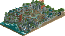
Built by swagtitties and Josh for the DKMP February 2024 Ride Creation Contest - the theme was dive coasters. We decided to go for a re-imagining of SheiKra at Busch Gardens Tampa, since the layout proved too difficult to recreate in game accurately. Like the real park, you'll also find nearby rides such as Tigris, Stanley Falls, and the Stanleyville Train Station, as well as some small animal exhibits.
Thanks for checking it out! -
3 fans
 Fans of this park
-
 Full-Size Map
-
 Download Park
215
-
 Objects
3
-
 Tags
Tags
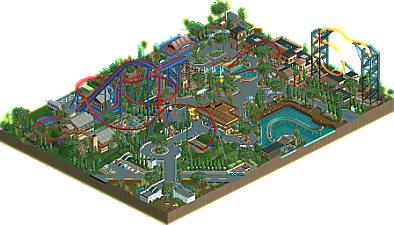
What a nice design! Swag, you showed us your huge talents in the DKSO american realism sections already with parks like Flags Fiesta, Wings n Things Fun Fair or AutumnLand. This probably is my favorite out of the bunch tho. It has not many rough edges and has a very clean feeling to it in general. Especially loving the boardwalk section, the coaster supports and the foliage, although the use of lombardy trees is a bit excessive. The architecture is a bit hit or miss for me. Some of it feels fantastic, some of it a little out of place. The huge restaurant in the middle with the awesome coaster entrance in behind is a winner for me though. In general i do think that the coaster layout and all the ride design surrounding it was very good.
Seeing you, Josh, in the DKSO department is an unexpected but nice surprise. The frozen staff humour all around the park definitely screamed you for me. It really helps to elevate this park a bit and make it interesting for the viewer for a longer amount of time. You haven't included me, i think i'll tolerate that tho. DKSO is not your home turf, i'm definitely sure you influenced this a lot in other aspects of the game next to the humorous bits too. Surely this was fun to make.
To conclude a clear design winner for me. Thank you both for creating and sharing this!
This is so nice and so clean - for NCSO, there's awesome textures in this design - like the tiger stripes, the inside of the tunnel diving under the path, the awnings - which is so difficult without custom scenery - and all without creating a total glitch fest.
I would agree with RWE, this definitely passes the design threshold.
Cool design, this may be my favorite by yours so far! It was very easy to imagine walking around and being impressed by the coaster towering over the path. I also liked how clean this is, especially for NCSO.
Wow, super good. Those supports are just epic. Almost has a Disneylhand vibe to it with some of the infrastructure and pathing. Probably the best NCSO design we've seen since Ninja, big props to you both!
Really loved this design, the coaster looks so epic. Super flowing and integrated so well. Great jobs on the supports as well. Overall this park is done super clean, composed so well, loved the foliage and all the great details. That Tigris sign is crazy for example. Faas being bullied for being short was brutal, come on guys, 1m70 isn't short.
Lovely stuff. Great layout with some superb interaction. The multiple tunnels and the splashdown were all great moments. Even the queue is pretty neat - simple, but I like the bamboo wall usage for queue fences. Haven't seen that before! The exit gift shop for Tigris is probably one of my favorite things on the map.. but there's so much to enjoy here. The quality here is through the roof.
I really like the way this was changed from the IRL ride, makes the layout work well in RCT, improves the surroundings for RCT, but is still instantly recognizable. Very clean build style too.
The design man at it again, congrats on the great score! The coaster layout (and especially the custom supports) are great and I love all the architecture around the map. As with every Swag map, the pathing and interaction moments across the map are also fantastic. Need more NCSO designs in my life <3
definitely feels like a new era for you, swag! everything is super clean, and im looking forward to your continued improvement of your signature style.
it is gutting to get half a percent away from a threshold, but thats the way the maths works sometimes, you can't get too bothered by it.
I'm excited to see you tackle a more interesting ride than a run-of-the-mill dive coaster (they're just not that interesting to me).
I also thought it may have benefited from not having the tiny slice of log flume and tigris included. paradoxically, i feel as though it may have benefitted from less content as it would have made some more negative space on that side of the map.
all in all, amazing design, great job swaggy and joshy
This is so good that it took me an embarrassing amount of time to even realize that it was NCSO. Great adaptation of the layout and very atmospheric throughout.
Congrats on design.
this is excellent