Park / Void Condensation
-
 11-March 24
- Views 835
- Downloads 141
- Fans 1
- Comments 4
-
 Description
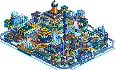
Adrift in the void, a strange industrial plant condenses unknown energies and uses them to power thrill rides.
-
1 fan
 Fans of this park
-
 Full-Size Map
-
 Download Park
141
-
 Objects
1
-
 Tags
Tags
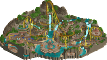
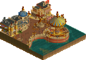
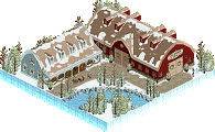
I really like it. Nostalgic but in a good way. Great use of complimentary colors with the purple and yellow plus the blue to keep it from being too on the nose.
What a nice little thing by you, Lurker! I love how you keep pursuing your own unique style. This is probably one of my favorite works by you, i really like how much movement there is to be seen here. I also really enjoy the palette and the colors which are definitely the highlight here. Please keep making stuff like this!
Wow this really took me back to the good ol' Pro Tour days. JKay/cBass style quarter block work for sure (that's a pretty good thing, of course!)
The problem a project like this faces is one of the main restrictions of RCT is the orthogonal nature of the game. Lines continue from one object to another from one of the four perspectives, even though the objects are not anywhere near each other. In a normal park, foliage helps break this up, but here of course, that's not an option.
But I still feel it would have benefited from some more organic/non-linear shapes to break up things. The tracks have some curvature which helps a ton for sure.
The turbine is one example of a great little set piece where you have some diagonals in to break up the lines and it breaks up those lines perfectly. The little clouds puffing out the top are perfect too.
I love the blue frame around the base of the park. It definitely works in game with the black void background behind it. I also love that you left the money effects in - I rarely see those, and it really works with this theme.
Great job lurker and hope to see more from you, maybe in h2hx!
This was a fun park, nice job! You packed a lot of things on a small map but it was still very legible. What I mostly dug was the esthetic and the colors!