Park / Viracocha
-
 18-February 24
- Views 4,001
- Downloads 366
- Fans 8
- Comments 14
-

-
 83.50%(required: 65%)
 Design

bigshootergill 85% Liampie 85% Mulpje 85% ottersalad 85% pants 85% Recurious 85% RWE 85% Xtreme97 85% chorkiel 80% CoasterCreator9 80% Scoop 80% SSSammy 80% 83.50% -
 Description
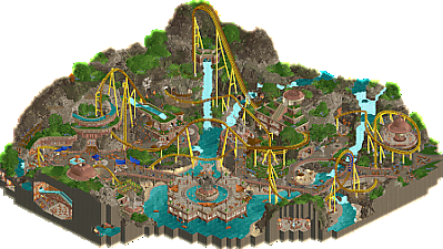
Revisit the glory days of the Inca civilization by experiencing their marvelous masonry, booming agriculture, and a towering terrain coaster made of solid gold.
-
8 fans
 Fans of this park
-
 Full-Size Map
-
 Download Park
366
-
 Objects
1
-
 Tags
Tags

![park_3229 [MM2014 Final] Cavumus](https://www.nedesigns.com/uploads/parks/3229/aerialt2949.png)
![park_3211 [MM2014 R3] Heart of Darkness](https://www.nedesigns.com/uploads/parks/3211/aerialt2825.png)
Great to see this released Terry! The coaster absolutely hauls. It weaves in and around all the landscape and paths so effortlessly. Amazing sculptures here too! So creative.
Love all the neat cutaway details as well - namely the Incaball game and where you can see all the rooms the flume goes through.
A lot will be said about Viracocha, but I loved all the interaction and storytelling with the supporting rides. But especially when you have crazy moments like this:
Also lastly, thanks for the shoutout. Randy Newman is great.
Me when I see this giga-looper:

its like aztec action park but better
incan't believe it
You've been doing quite a lot of in-depth reviews lately, so hopefully I can return the favor on this one.
I've long been a fan of the way you design both your layouts and your maps, probably because they're similar in a way to what I like to try and build. This one is no different; an expansive layout fit into an unlikely landscape. It's not necessarily unrealistic by any stretch of the imagination, but rather a scenario of "this place is cool, what if we put a coaster here?" In my eyes, it's the best way to play the game. It's fun daydreaming, you know. You get to be whoever you want, and you get to do whatever you like.
The coaster here is very good, I think in settings like this it's all about the creativity and flow of the layout more than anything else. In this case, there's plenty of great interactions with the surroundings, starting right off the rip with a big lift hill and vertical drop combo next to a sweet diagonal waterfall drop on the nearby flume ride. The stall element in through the terraces and flume ride is fantastic. I'm always a sucker for a good helix, and of course plenty of diagonals on a layout is my cup of tea. I think if I had to nitpick, this thing is absolutely hauling, almost to a fault.
You mentioned you were sad that this map was nearing the end of it's build cycle, and I think that really says something about the care and enjoyment you got out of building this. It really shows through with a lot of nice supporting rides and great little vignettes on the mountain cutouts. The aforementioned flume ride is bonkers but very enjoyable to try and follow. I really got a chuckle out of the Incaball scene, it just reminds me of how goofy and fun CSO can be if you want it to. The jewel hunt ride was nicely integrated with a lot of the scenes, although I think the vehicle itself was perhaps a bit too big for it's own good. And of course, the overall map scenery was great; when I think of the Incas, I think of mountainous terrain and terrace farming, and I think you definitely accomplished that aesthetic.
There's a lot to like here, and I really hope this is the one that gets the big score that you've been waiting patiently for.
Feels correct.
But honestly, what a fantastic map you made here, Terry! I could indeed be surveying these cliffs all day long, but there's much more to this park than just the cliffs, so let me get into it:
First of all, the landscaping. my god. Just look at it...
It's dreamlike. It's so good that I think I spent a solid amount of time just trying to figure out how you made it look this good by reserve-engineering all the object combinations you used. This park really shows how you have mastered foliage and landscaping at both macro and micro level. There's a good balance between dense foliage and open areas, great texturing all-around and I absolutely adore the color gradients in the rocks. I've never seen an Inca landscape in real life, but I would totally believe you if you said this is a 1:1 copy of real-life mountainous terrain where this tribe would've lived in the past (barring the coaster and other rides, of course, lol).
Instead of just raving about the landscaping of this park and posting tens of pictures of it from each different angle, I'll actually move on to the rest of the park haha. The coaster is great. I've seen it before without any scenery around it and had some doubts about the massive scale of it, but seeing it here, it makes complete sense why it's such a big coaster. The interaction is amazing, and the big diagonal hill in front of the waterfall is so picturesque, I love it.
The architecture is really nice as well. I love how it's all integrated into the mountainous terrain, almost like it's getting buried over time by all the eroding rocks and foliage. I'm also really fond of the amount of pathing details in the park with all the lovely patterns. It might be on purpose, I don't know, but they remind me of the complex patterns and designs that the Incas used in their tunics.
Besides the above-ground stuff, there's also some really neat underground sections. The little cutout in the back for the coaster is soooo cute, and the way the log flume and truck tour line up so well in the spiraling section is awesome. Makes me wish I had the motivation to build cutout scenes for San Avaiki, but alas. Also, the Incaball matchup is hilarious.
I'm running out of synonyms for the word "fantastic'' so lemme wrap it up real quick:
> This park: fantastic
> The coaster (and its interaction): great
> The landscaping: yes
> The behind-the-scenes stuff and mythology guide: very helpful
> You: awesome
Enjoy your break from RCT and hopefully we get to see more stuff like this from you in the future! Consider me a big fan of you.
Congrats Terry on this epic release. Probably your best work yet.
I saw the pre-release version and I must say I really love all the final finishing touches you have added, I think they really elevate this to the next level. All the staff scenes are great and the custom music that you added fits so well! It really sets the atmosphere nicely.
Overall things that I really liked:
- The coaster layout is great. I really love it.
- The landscaping is ofcourse fantastic.
- The opposite angle of the overview shot is quite a difficult angle as most of the park is blocked by the landscaping, but you managed to make it still look interesting by having all the cut-outs in the ground.
- The interaction between the coaster, the log flume, the car ride and the landscape is just fantastic and so characteristic for your style.
- I love love love the support of the logflume over the incaball field, its so well done.
- I love all the staff scenes.
Overall stellar work Terry!
As previously expressed in your screenshot, my excitement for anything RCT-related has rarely been this high. After taking a more proper look at this park, I can safely say this is my personal favorite design of all time. And I’ll do my best to explain why.
I am no stranger to Patagon. Upon seeing the incredible heights you achieved with that monstrous giga, it felt as though someone understood my childhood dreams of RCT, and fully realized them into a highly detailed, beautiful build. We all toyed around with massive coasters back in the day, making the craziest of creations in Extreme Heights. But Patagon was the first time I saw someone pull it off in a “realistic” setting. As 94 put it, the mountainous terrain depicted is an actual part of Earth. All someone had to do was say, “let’s integrate a massive coaster into it.”
While the literal height of Viracocha isn’t as towering as Patagon, there’s something truly special about this design. And I think it’s the way you framed it. I cannot think of a more perfectly integrated coaster. Sure, I’m a sucker for epic landscaping. It lifts designs into excellence.
But this is world-class. Every inversion, every section, nothing is wasted. This was a design where I can tell the creator thought carefully about every tile. Akin to how great classical musicians think about every single note in a phrase.
This mindset extends to every section of the park, including the wonderful interior scenes you left for us to explore. Interiors with ride interaction! The log flume, Un Pachakuti, is my favorite supporting cast member to a main attraction. It’s a ride full of replay value for the viewer, and concludes with a massive drop (and one that completely took me off guard!).
Seeing what you’ve accomplished with the more intricate workbenches, I’m already thrilled to see what new innovations (and simple beauty) you’ll bring to the world of NCSO upon returning.
2024 just started and i already know it will be a fantastic year for the design accolade enthusiasts again. Its an amazing release, Terry, that really shows your rapid improvement in the last years. Landscaping and foliage work is the absolute highlight in this, you're probably with no doubt among the best players in these skills around and this shows again why. Every tree, every bush, every rock has a purpose. It's all so well put together that you don't need the object spam many of us fancy nowadays to make it look good.
Added to that i also really love the coaster. If anyone writes a dictionary and needs a picture to show what the word 'flow' means, they should just put a picture of this coaster there. In fashion of many other great designs it also has so many incredible moments of interaction in its layout. I also really love the overall composition: You have a really good sense of combining symmetry (lifthill - waterfall - coaster hill - cute statue) with more chaotic moments (for example swinger area, water ride...).
The little scenes in this were also very enjoyable. They really helped to make this park feel complete and create an atmosphere. Same goes for the underground sections. Those need to be appreciated seperately since stuff like this is quite difficult to build without making it feel forced. But you managed to do it so easily!
All in all as said i feel like this is an fantastic release that should finally give you your well deserved parkmaker status.
Lots to say but I'm gonna start by saying thank god you didn't let that deadline finish this one off. The time you've put into this design really paid off and I loved seeing it shape up in Hawaii 0-Fivecord. This is really the kind of design I'd die to make myself.
+ Impeccable composition which I've come to associate with you and your releases. When RWE and I were planning out Yatagarasu for the Grand Tour finals, I took a lot of cues from the way you cater to the fully zoomed out camera as if the design is a piece of art meant to be admired as a whole. The little compositional moments, such as the way Viracocha's lift and airtime hill frame Unu Pachukuti's drop adds so much wow factor. There's enough of these moments to need three hands for, and they seriously elevate both the main attraction and all the rides and scenes around it. Viracocha itself is a star layout with great pacing and flow of elements, but it's these moments and interactions that take it over the top.
+ I remember a while ago in the Hawaii 0-Five server you mentioned while your eye mainly lies in macro planning and large scale elements, you struggle to work in the micro detailing. With the steps you've taken to fill in this gap, you've become a world-class parkmaker. Not only is the micro detail there in spades but so is the wacky object choices that can only come from a deep collab with J K. You've weaponized the new AVL and Ethan objects while somehow using the DC Shoes logo as the face of an idol. You've also made the invisible color your bitch with both scenery and track which you used as path detailing.
+ The little scenes all over add so much extra life to an already unique design. The cutaways are a hallmark of your recent style as we've seen in Undertaker and Patagon and they've come to a head in Viracocha. I am never going to get over your use of frozen staff either. Catch me goblin some groundcherries.
+ I always knew you'd (ahem) rock the Fisch rocks after seeing you use castle blocks in a similar way in Yerka and Patagon. And yeah, this is absolutely world class landscaping. Everyone says Fisch rocks are the landscaping meta but I think it's the way you've used so many other types of rocks for their own unique purposes. We've seen Pants, J K, and RWE among others embrace the landscape melting pot and you've taken to it just as fast. Gorgeous waterfalls and lush foliage too; I especially like the shallow pools on top of the terraces.
+ Unu Pachukuti and Urcaguary's Jewel Hunt are unbelievable supporting rides with some great cutaway scenes and layering. Cannot get over the layered turns in the little rocky cutaway and the big flume drop is definitely going to be one of the standout moments of 2024. I am also a HUGE fan of Amaru; a half-underground music express is such a cool idea and the positioning with the little waterfall framed by the coaster and the log flume is world class. Again with the composition!
+ Say it with me everyone: TERRY BANGER. I'll never get tired of your original scores for your releases, and it's nice seeing you state some of your inspirations in the behind the scenes. I'm getting serious Eyewitness vibes.
+ Speaking of behind the scenes, I'll always admire a nice long writeup on a release like this. Loved learning about both your insights and the mythology behind this release and snorting at the godawful puns. Pottery roll, come on now.
- There's a support on one of the log flume lifts which is rotated the wrong way and sticks out like a sore thumb. That is my one negative.
Cannot state enough how proud I am of you for finally breaking the 80% barrier. You've been one of my biggest inspirations as a RCT2 player since the Obeah days, and after some real heartbreakers in the past it's poetic to finally get that green name right before a well-earned hiatus. I voted 85 and I'm so glad most of the panel agreed. Wishing the best for you wherever you may be going and we'll be here when you're ready to return.
This is an extremely welcoming overview. the waterfall composition, the rich color blending on your rocks, the lush green. It is pituresque but you can tell from the complexity of the cooor that it is also extremely rich in the small details. The texture work on the paths and sand, the stall details, the angles of this monstrous roller coaster. This release is simply excellent
Some suggestions maybe? I don't usually do this but I want to maybe start giving better feedback just based on my impressions. It's less about things I dislike about this park but more so things I conflate myself as a fellow creator if that makes sense.
- I think that in this particular case there is a bit of a dissonance between your use of round things and hard corners. I think mostly in the architecture. The ruins to the left of the map have curves, but the ruins in the middle have diagonals and flats, and then the ruins to the right have square shapes, but with some exceptions like the top of the temple and the chairswing that is stylized like the domes. I will say, the overall map does give a strong overall impression of curve flows, with the landscape and paths that surround it, which does balance out the overall sense that this map is gridless.
.. and that's really it, kind of broad, because I think this map comes together extremely well regardless. It is an excellent map with little flaws!
Some other things I thought were excellent
- I love your cutaway views. and I also deeply commend the injection of diffeerent colors into here.
- the pattern and textile executions and stuff are so insane
- some of the best tents I have ever seen
- this roller coaster is extremely rewarding from the other angles
-I love how fantastical this logflume is!
-the sand and grass work is some of the best I have ever seen for sure.
This is a really special release, great work Terry and congratulations on Parkmaker, 79 club is going to make it!
Initially, I thought your park was a bit classical in a way, but after looking at it for a while, I finally understood why it is an excellent park, and I think I would have given it an 85%.
The landscape work is a real lesson here, it perfectly balances the composition, these touches of grass for example are incredible, they bring a deep realism to the cliffs, as well as breaking the rigidity and repetition of the fisch rocks. These curves and diagonals are sexy, bringing variety to the park.The choice of colors is superb too, and the contrast of the pink works very well to highlight the buildings and paths. That's why this park is excellent: no maximalism here, but a real mastery and great sense of detail that bring great coherence to the whole.
I'm happy for you Terry that you've reached parkmarker status, it's fully deserved, in addition to the whole of your activity on NE which is precious.
Terry releases a South-American entry with big Intamin coaster, meant as an entry for a past Grand Tour contest... what year is it?!
Really love it. The inca theme is really neat, sadly not done so much. I've thought of doing it too for my park but couldn't come with something I like. You on the other hand nailed it. Love the architecture and the colors you've used in them.
The GigaLite coaster is great, flows well and has great interactions with path and its environment. Also a lot of cool details like the cut-outs in the mountain, Chakana head sculpture, skull in the rocks... I also really liked the added custom music.
Deserved PM status. Loved it. Wished you released more stuff than contest parks.
I really like this. It is a fun coaster. If I'm being fully honest, it seems you have a thing for airtime coasters on maps with cliffs on the edge. But the Inca theme is, as far as I know, rarely done, and the landscaping is very well textured and keeps what could be a typical coaster in the mountains interesting. And the jewel hunt tracked car ride was very intriguing. In some ways more than the coaster. Congrats on a very good design and on the Parkmaker spot you got along with it!
The landscaping in this is so good, also really like how well with paths, rides and architecture fit into it so well. Ride design is really good, great main coaster (I like the decision to make it not strictly one model or another but still something that could exist) and fun and interesting supporting rides.
And the cave cutouts, love how those are done, they fit right into the map, don't break up the macro or distract and add depth to the map. Also like the custom music, adds nicely to the theme.
And of course, congrats on getting Parkmaker, great to see you break the 80 mark.