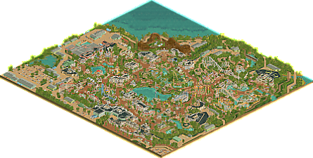
Park / Belle Isle
-
 11-February 24
- Views 9,222
- Downloads 443
- Fans 29
- Comments 30
-

-
 97.50%(required: 80%)
 Spotlight

Camcorder22 100% yes In:Cities 100% yes Mulpje 100% yes pants 100% yes RWE 100% yes Xtreme97 100% yes Jappy 95% yes Liampie 95% yes posix 95% yes Recurious 95% yes wheres_walto 95% yes Scoop 90% yes 97.50% 100.00% -
29 fans
 Fans of this park
-
 Full-Size Map
-
 Download Park
443
-
 Objects
56
-
 Tags
Tags


![park_3348 [H2H7 R3] The village and the park](https://www.nedesigns.com/uploads/parks/3348/aerialt2985.png)

![park_3806 [NEDC4 2/15] - Interstellar](https://www.nedesigns.com/uploads/parks/3806/aerialt3455.png)
Take one before viewing this park
Really cool park. The buildings are among the best i've seen, and I enjoyed the eclectic mix of coasters you decided to include.
Palette feels a bit warm and everything feels a tad samey. Yeah and uh the park is perfect. Some of the closest anyone here has gotten to sheer perfection. Pointless to go in-depth on the superhuman detailing and landscaping and ride design and atmosphere and vibes and just Good RCT of the highest order when it's just so obvious. Ascended-level. Proud of you big man. 95/yes
I need to know what kind of black magic you used to go from H2H replacement to Rajasthan and now to this in record-breaking time. An absolutely monumental release! I'm just watching in awe moving through this park from one section to the other. There's so much eye candy to take in that I don't even know where to start, but I'll give it a try:
First, it's me so let's kick it off with the foliage and landscaping which, frankly, is off the charts. The foliage feels lush yet still leaves enough room for the viewer to see every building/ride/etc. well enough. And I am obliged to mention the amazing crunch because look at this...
This is just pure art to me. It inspires me to push my foliage and landscaping skills even further and shows that little things like these do add a lot to the overall image of the park. I also have to mention how good the backstage areas of the park look; to some they might not seem as important to include, but you put just as much attention (if not more) into making the backstage look as interesting as possible. I kept roaming around thinking "gosh that's so clever" or "how do you even come up with this".
Although it's not my expertise at all, I think that the (flat)ride selection is great. All of 'em look excellent, but I have to give an extra shoutout to the "Mirage' flatride. The object usage there (traffic lights??) is genius, and I absolutely love the ground pattern around the base. The coaster layouts are very nice as well, and the final section of Blitz above the water really is the money shot.
I don't think it can be said enough how good this park is. It has all the elements I could ever wish for in a park while also executing them all to a T. I could really see myself walking starstruck through this park. Congrats on the amazing release! Whatever the color of your name will be (because let's be real, this is for sure getting you parkmaker haha), I hope you can look back at this park and all the time and effort you put into it and be proud of yourself. <3
Oh and one final thing: these umbrellas are a-ma-zing! That's all.
The overall aesthetic that you've displayed here feels super grandiose and clean. It makes me feel nostalgic for something I've never truly witnessed before. I don't quite know how to put it into words. Belle Isle has some of the most striking architecture, complimented elegantly with some of the nicest, most open plazas I've ever seen in RCT.
I took a few small screens of my favorite areas.
Please never stop building. Sincerely, all of us.
Attached Thumbnails
I don't think it's too impulsive to call this the greatest park ever made. Your work ethic on this is deeply inspiring and all of the effort you put into reworking areas until they got to where they are couldn't have paid off more.
I think what is most impressive to me is how you built everything more or less in the same style and yet each area is just as exciting as the last. Such profoundly major work <3
I knew you had potential when I picked you up during the last H2H, and then you turned out to be better… And then you turned out to be even better. With so few releases it’s kind of puzzling to reconstruct how you got to this level of parkmaking, but I’m glad the screens on the site show part of the process, and they illustrate what the difference is between 85%, 90% and 95% work.
I’m not sure where to begin when reviewing this park… I’ll take an unorthodox approach and go through the park using different disciplines of parkmaking. Roughly.
Architecture: obviously one of the main strengths of the park, and one of your main strengths in general. You’ve found an approach that works for you, and it sounds much more simple than it is. I already noticed it in Rajasthan. It’s trim and fence spam. All your buildings are covered in trims, fences and decorational motifs. I think that’s why the Victorian style suits you so well, and it makes me wonder what your work would look like when tackling something completely different like minimalistic modernist (or futuristic) stuff or something like Malinese architecture. In either case, I admire it. Though all buildings are built within the same style, with a relatively narrow scope, every building has its own identity through unique touches. The show building for Dreamflight is a good example of this - the octagonal roof and the stained glass.
Infrastructure & foliage/landscaping: the path spaces are so good in this park I think deserve to be pointed out separately. Making paths feel like their own spaces with small path features, and not just lines connecting points of interest is what sets good parkmakers apart from great parkmakers, it’s always a challenge on parks of this scale. I think you excelled here. Every planter and every seating area is great and distinct, and there are so many of them… There is no dead space. And it’s probably the most realistic and immersive aspect of the park. It’s so easy to imagine these spaces in real life. The planters and general landscaping (gardening) in this park is directly tied to this. Outside of planters and gardens I don’t think there’s anything I want to point out regarding foliage & landscaping. I suppose the mkx tree + chinese cedar hybrid is a great find. All in all, this aspect of the park (plants + paths) is absolutely gorgeous. Some of the most immersive moments:
Cool queue platform:
In the architecture and paths/foliage is also where in my opinion the park’s main ‘weaknesses’ lies. I’m always an advocate for picking a distinct aesthetic and applying it to the whole park, but I think your scope is too narrow here, and I admit that despite the attention to detail, the style becomes repetitive, like you’re applying (effective) tricks to construct another good building and make yet another good little plaza. Start counting how many clock towers and how many round plazas with spoked patterns there are. I think the park would’ve been even better if you diversified the the content a bit more, even within the Victorian style. The station for Blitz kind of approaches Chalet style. The steel roofed style around the Electric Roller Racers are also somewhat different from the rest. I think you could’ve explored this more, expanding into adjacent styles like Art Nouveau, creating some cohesive areas - without going all Lonely Planet about it, of course. It’s all a big soup right now. One of the best soups I’ve had, I will add. I think you get my point.
Aesthetics: like I said, I appreciate choosing a distinct aesthetic and consistently applying it to a park. You did that perfectly here. Part of me is sad the park is less orange/peach than originally advertised, but I can’t say the park is suffering from the current colour scheme. The park has its own voice, or I suppose you have your own voice and the market hasn’t quite been saturated yet.
Misc: I already pointed out on discord that I think it’s funny that half the screens shared are from backstage stuff. I think that speaks to the quality of your parkmaking. Your buildings and rides are stellar and built with exemplary attention to detail, but the custom vehicles, piles of rubble, overflowing trash bins, fire escapes and HVAC systems are kind of equally immersive. I can imagine being a guest in this park, and I can also imagine being a worker (or trespasser) in this park. The larger roofs in the park are so labyrinthine I want to play tag or hide and seek there. Probably the latter as to not trip and crack my skull on a GW - 1/4 Very Thin Slanted Rail R or something. Another miscellaneous thing I want to point out: the static peeps everywhere. Not a new idea, the objects have existed for like two decades, but I don’t think anyone has used them in this way at this scale. Really helps the immersion, and there are a few ‘stories’ of groups of people wearing the same shirts. Those yellow guys at the entrance… School class? So cool.
Ride design: ending on a high note… The rides are stellar again. I love the selection of rides, very classic and unique. Turn of the Century is probably the least interesting of the bunch, and I really like it. Cool pre-lift! Those cork supports! I’m not sure what kind of ride the Electric Roller Racers are supposed to be, but I love their uniqueness. Magician and the Jet Star do their jobs well. To balance out this review I will point out the glitchy supports and the bad clearance on the loop. Whiplash is very nice. Blitz is perhaps my favourite, and you’re probably the first to do a classic Schwarzkopf using the new box track sprites, really makes a huge difference. The real star here is the Antique Cars though… You completely demolished this genre of rides. Absolutely next level cool. 1200m long too? What the hell! Looks so fucking good. Those curves! The interaction with Blitz! So good!
The other non-coaster rides are also good, none of the flats feel like filler. They all have their own value and their own features to help justify this park getting an insanely high score. There’s no tile wasted in this park, even a merry go round or a scrambler are pushing the park. I will add one last criticism in this department: the dark rides are kind of boring. I don’t think your park needs interiors, but these rides need something. At least a more distinct show building I suppose. If you asked me which one belonged to Enchanted Voyage, which one to Dreamflight or which one to Mystic Manor, I would not be able to tell you. Nor would I be able to predict what these rides would actually show, though my bet is on more Victorian archy.
All in all, this park is nearly perfect in every regard, but I can identify a few shortcomings on a meta level. More missed opportunities than actual flaws. I cannot justify any score other than a 95%, I don’t remember what is the last time I gave a score this high. You deserve it! I suppose my review has been somewhat distant, as in it’s me describing what I see. I haven’t described what I feel, and I feel nostalgic. I don’t get to explore a park of this calibre often anymore… It reminds me of when Zippo’s dropped and I spent hours exploring every nook and cranny, and it was magic. With the abundant screen sharing, streaming and simply sharing unfinished files, most of this magic has disappeared from my RCT hobby. This is a welcome approximation of that same feeling. Thank you for your restrained advertising. I had other plans for this evening but Belle Isle is irresistible.
I'm glad I'm here on the day someone finally beat RollerCoaster Tycoon 2.
Huge congratulations on this Andrew. I'm only going on first impressions right now but it really feels like a landmark release in terms of modern RCT. The way everything flows together so organically is incredible.
One of the best parks to ever be released on this site. A piece truely to be proud of, Andrew. All the years of waiting for this have been worth it. This is a release that will probably totally change how we do modern rct and it already has been so inspirational for my personal work.
From the screens it was already clear this has some incredible architecture and some great themed areas in it. Seeing the full thing now it is clear you not only managed to be among the best in these areas, the other stuff is top notch too. I never expected this to have so amazing backstage areas for example. Added to that in fashion of old realism spotlights the ride design in this is spectacular. 'Blitz' probably has been my favorite ride in that regard, showing off some great interaction with an amazing car ride and being placed so lovely and interesting in that area.
And then you also have shown an incredible attention to detail in this. The peep groups, all the backstage vehicles, the ride entrances... so much to explore in detail here once you got through all the awesome macro stuff.
It was really so hard to find stuff in this to see as improvements. I feel like most stuff that came into my mind would be nitpicks or just personal preferences. For example i could say the palette felt like it was a bit 'too much' in some areas to me. But that might also be my computer, my eyes or whatever... definitely not your fault!
All in all thank you for this amazing piece of rct. 100% / yes from me. Can't wait to see what you'll come up next. Congrats to whoever gets you on their team as R1 pick in the next H2H, good luck to those who will face you, they'll need it if they want any chance of beating this quality.
Congratulations Andrew! Highest scoring park is well deserved. This park is mind-blowing. The 'turn of the century small american hometown'-feeling just oozes out of every corner. This is one of those special parks that I'll just want to revisit time after time.
yeah this is probably the best ever "park" - the most real feeling, the most interesting, one of the most aesthetically pleasing. you've chosen a really nice theme, it looks amazing, so warm and inviting and colorful.
it's crazy how such a large map of essentially the same look and feel doesn't at all get old. each section feels distinct and worth time to dive into. hell, every single building feels like it's been crafted with love and care (they probably have) in a way that most parks don't. i spent a decent amount of time in this park today, and i already want to go back and take another look and find stuff i missed.
the backstage areas are the best i've seen, the rooves are the best i've seen, the foliage and landscaping and underwater theming are up there... all in all, this is a top-quality player making a park of exceptional and consistent quality that feels like a true labor of love. the concept of "crunch" is one that is kinda meme-y now, but this is the premier example of what it should be. extra realistic touches to break up large areas of samey-ness. roof textures, land textures, hard land edges into water, large backstage areas... wherever there's the possibility of something becoming repetitive, you break it up with something irregular and organic. curved path, a patch of rock, a parked van, a pipe on the side of a building. outSTANDING.
reading into some of the comments and older screens, it looks like you rebuilt a lot of this as your skill level increased, or maybe you became more comfortable with the theme. that is crazy, and hats off to you. the outcome is hard to argue against - i'd be hard pressed to point to the order you made things in, everything looks equally good to me.
the rides are all fantastic, well themed, well designed and interesting. my personal favorite is the woodie, really great layout. other highlights were the shuttle loop, the red corkscrew and the car ride. the little areas of peep theming around are incredible too - groups in colored t shirts, etc. overall it just adds to the realism and keep me looking for cool stuff.
ironically i kept feeling like this is probably the closest we've got to a perfect disney park in RCT. it kinda does feel a little disney to me, even without the name/themes. i cannot WAIT to see what you do next, with a different theme (maybe). this release vaults you up there with the top 5 or so players in terms of skill/execution, eagerly awaiting whatever you decide you want to tackle.
Congrats Andrew, quite a triumph. There's only so much that I can add that hasn't been said already!
First thing that comes to mind is Main Street USA but with an extra layer of nostalgia, Luna City vibes, and polish. This would be a jawdropping park at night with all the lights!
Minor aside, but this park is reminds me of all the stories my grandfather grew up telling me about Euclid Beach Park.. idyllic, fun, big exciting rides.
There's not a detail spared here. Immaculately ornate flat rides, queue entrances like the one for Mystic Manor, and the path textures. Even all the light posts are custom and unique.
Also, the show building and facade for Dreamflight is stupid good.. holy cow. All the colored stained glass is beautiful.
Anywho, congrats on the Spotlight, incredibly well earned. Excited to see if you have any other showstoppers in store for us. Thank you for sharing this work with all of us.
Honestly same.
Haven’t even downloaded this yet. Just sat and read every post, checked out the screens in this thread, peeped the aerial, sat there with my jaw on the floor, and then hit the “become a fan” button.
Wow.
Incredible park - 2024 is going to be the best year for RCT yet, and I want to be a part of it.
This is just amazing... I think I found my favorite park, not of recent times but all-time! 2024 just started but we can hand out "park of the year" already.
The amount of detailing in the architecture is insane, it definitely has that Disney Mainstreet vibe all over the park. And not alone the detailing is so strong, but also the shapes and integration and composition. It all feels so perfectly done, everything fits together so well.
The lush green foliage really enhances the atmosphere here, that nostalgic atmosphere also created by a great ride line-up. Love to see Schwarzkopf classics like Magician and Jet Star 2 included. My favorite coasters are without a doubt Whiplash and Blitz, so much flow and looking cool to ride irl as well. There were also some great non-coaster rides like Antique Cars rides, which you've spent much more surface, theming and detailing to than we are used to see from this type of rides. Makes me also want to do a long version of one. The log flume and particularly its station is also another highlight for me.
From screens I thought the palette would be a bit too much but seeing this in-game, it is really all rights and it fits the park and its vibe really well.
Love it, amazing piece of rct. Congrats!