Park / Dynamic Dunes
-
 18-February 24
- Views 1,632
- Downloads 265
- Fans 1
- Comments 7
-
 49.50%(required: 50%)
 Spotlight Submission

Recurious 60% SSSammy 60% In:Cities 55% Xtreme97 55% pants 50% Terry Inferno 50% chorkiel 45% Liampie 45% ottersalad 45% RWE 45% Scoop 45% posix 30% 49.50% -
 Description
remake version of Dynamite Dunes
-
1 fan
 Fans of this park
-
 Full-Size Map
-
 Download Park
265
-
 Objects
3
-
 Tags
Tags
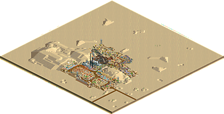
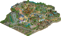
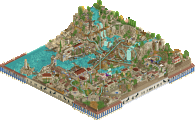
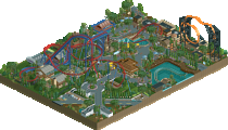
Seems like a scenario build you had a lot of fun with! Some bits of the chaotic architecture in here are definitely quite enjoyable. Your style has a nice old school vibe to it. I think the foliage and landscaping showed some room for improvement tho. I also think that the scenario map killed the vibe a bit. Would love to see you build on a custom map!
I liked this one more than the Forest Frontiers. Love the archy style and especially how it's built into the terrain, Kept the vibe of the original scenario. Some fun unique theming too!
I don't know why but I liked this park a lot!
I really liked the architecture, its so vibrant and unique! It reminds me a bit of early days bigshootergill. I also thought the plazas on this map were quite cool. The layout of the corkscrew coaster was pretty cool even though it's a bit weird and I liked the market area.
One small thing I noticed which you could do to raise the quality of your parks without much effort is the following: name your rides. You were a bit inconsistent with this. Some rides are named while others have the default ride name. I think naming rides is a small effort but it will help make your park feel more polished. Overall I enjoyed this park though!
Both this park and Forest Frontiers are very fun! I'm assuming you did FF first and this one second. If so there's good improvements between the two.
I particularly liked the themes and rides you came up with for each park. They were fitting to the scenario. And as G Force points out this kept the vibe of the original scenario.
There's also some simple things that you could do to improve your parks. The layouts for starters, they seem very crammed. Give them some room to breathe and build them in a way that your peeps can see them. You did this a lot better in DD than FF already. The second thing is taking some more time for finishing up: naming rides, giving some attention to the parts outside the park, etc.
I really like the architecture here, especially the entrance complex and Dynamite Blaster station, also some cool stuff with the industrial structures. Also like the support work and the custom ride near the entrance as well as the custom water ride in back. Also as has been said, naming all rides would help. Overall, a pretty fun scenario build.
Two small parks in one day that pack quite a punch!
Architecture here is very good, possibly your best themed buildings yet (and Lego park has some good ones). The main square near the entrance is particularly strong - some of those buildings would certainly not be out of place in a Gold park of any size. I always approve of structures being built into the landscape, and you've done that nicely multiple times. Some structures are less convincing, particularly around Bump It Up, where it felt rushed or unfinished.
Ride design is a bit awkward on this map, particularly with roller coasters (as is the case with FP). Much like the Maple Coaster on the other map, this one's anonymous corkscrew coaster launches directly into a banked turn--this time a sharp one--which could potentially give riders a sore neck before the ride has even started. Dynamite Blaster is Dynamite Blaster. I like the industrial atmosphere you've created around the famous prebuilt, which provides a nice contrast to the Arabian sandstone architecture on the rest of the map as well as some more thematic depth. Launched freefalls as flaming smokestacks are another cool (or perhaps hot) detail.
It is quite impressive how you took one of the blandest scenarios from RCT1 and made it so vibrant throughout. Bright colors are used well here to contrast the browns and tans, and the path shapes feel very relatable. I gave this one and FP the same score ultimately, but I feel that they excel in different ways that the linear score would not necessarily reflect... FP is thematically more pleasing, while DD is better technically. I am still looking forward to another large parkinho park, but I've enjoyed this one and its green fraternal twin equally.
Some interesting ideas here that pretty neat, but overall its a bit too little of a park and a bit too simple. Also having the original prebuilt layout was a bit of a bummer - especially considering it was the best layout in the park. As Terry pointed out, the entrance area was quite nice - just would like to see that on a slightly bigger scale.