Park / Chamois
-
 25-November 08
- Views 3,808
- Downloads 627
- Fans 0
- Comments 14
-

-
 66.25%(required: 65%)
 Design

chapelz 80% geewhzz 80% postit 75% Xcoaster 75% FullMetal 70% RCTFAN 70% CedarPoint6 65% Fr3ak 65% Milo 65% nin 60% zodiac 60% 5dave 55% Magnus 55% posix 40% 66.25% -
 No fans of this park
-
 Full-Size Map
-
 Download Park
627
-
 Tags
Tags
(click logo to go to page)
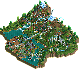
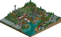
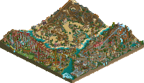
New Element is not set in stone. Sometimes, stuff comes out of left field and really surprises us. That is exactly the case with newcomer Bacchus. Though he may be fresh at New Element, he certainly isn't a stranger to the game, and has been playing for about six years. He showed promise at RCT-Guide, and after a 1st place finish in a summer competition there, he decide to try his hand at a design. Lo and behold, we present to you that very design: Chamois
I'm looking into that way too much but yeah, just irked me.
i don't know, the topics screens were amazing, the landscaping is. but i dont see a design worthy coaster. the station just seems to be there, i dont see where the time an thought was spent on random shop buildings following a theme i cant quite catch for the entrance area. i was expecting alot more inversions and some more intensity from the screens that were presented too. just falls short in alot of places as a whole.
Edited by rK_, 25 November 2008 - 07:02 PM.
The transfer track was a bit off but overall i think it was an excellent entry and well deserved its design spot.
Congrats on your first NE release.
I know the coaster may be unrealistic as hell, but when I started this I really didn't give a fuck about realism
Whatever, hope you'll enjoy it
Why? Your design was already unrealistic as hell!
Congrats on your design Bacchus!
The landscaping was nice, with a beautiful waterfall! It feels bare here and there as far as buildings go, but I'm guessing this is at a higher elevation, not many houses, walmarts built on top of mtns anyway.
Nice work, and congrats on a release!
Also, the yellow bars on the new pages look absolutely terrible, please make them clear or blue or something.
Kevin Enns Offline
Edit: By brilliant idea, I mean I love when rides go over rivers.
Also, Todd, wtFF does your thing under you're name say "That's What She Said?" We have c. the same # of posts, and I love that expression!!
Edited by Kevin Enns, 27 November 2008 - 03:26 PM.
This was a great little design. The landscaping is utterly georgous, well done on this.
FK