Park / Riverbank Museum, Public Library, and Education Center
-
 31-December 23
- Views 1,166
- Downloads 187
- Fans 0
- Comments 7
-

-
 No fans of this park
-
 Full-Size Map
-
 Download Park
187
-
 Objects
1
-
 Tags
Tags
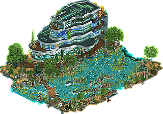
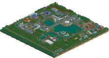
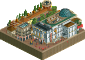
I like this take on a postmodern museum building, it definitely has that 90's science center/museum feel to it, it looks like a place I'd have loved as a kid. Also appreciate the sound design, along with the animated objects it really helps make this mostly static map lively.
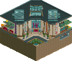
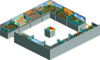
I recall a screenshot of this from a while ago, glad you've finished it up and submitted it. I think it's pretty cool, and wasn't expecting the backside to be open either giving a cool peek inside. I appreciate how determined you are to pick unique and sometimes quite ugly objects, that can have an uncanny vally effect within RCT but you find a way to make them look better in their context. The interior is quite interesting to navigate with the cutway tool as well, glad I found the ride to open!
Quite lovely little release. My favorites have been the soundtrack and the wacky objects you used all over the place. Also good job on the interior of the museum, one can really see that you cared a lot while building this!
That is one hell of a building! Great archy. Also love the river.
Love the architecture but holy hell the river is busy. I think this can work sometimes but here it's a bit distracting. I like the attempts to get some motion happening inside the building with doors, fans and gears, but I think just having peeps would have gone a long way to help there. The architecture also becomes really difficult to parse, especially in the ~top half of the back cutaway view.
I really like your park, there's always a great profusion of kitschy and messy elements that give you a unique style. It's often a mess, but in a good way. The architecture of the museum here is really interesting: it's curved, with a very interesting level play, and elements that break the linearity of the building. Then there's the back side, which is really cool: interiors, a brilliant elevator (undoubtedly one of the best I've ever seen), unstructured architecture that reminds me of Piano and Rogers. I liked the work on the river which is quite unique, this way of giving movement is very interesting. A really good Jaguar job, superb!
This is very successful at giving that 90s educational video intro feel with all of the wacky objects, the vibrant variety of the interior and of course the music selection. It's more low key than the micros of MM but that fits the project well and I'm glad you resurrected the idea after a technical setback, which can often sap motivation. It kind of defies categorization but it's always cool to see a second pass at work and this is a cool map that doesn't feel as out of place as it once could have, post Grand Tour.
I like how you always have an experimental edge, not just in object choices but in the landscaping as well. A detailed water surface and underwater layer is quite nice in the context of what would otherwise be mostly negative and dead space. I think a similar approach that is slightly less over the top could work for a larger natural map with some detailed insects, animals and foliage across water and land. Nice job, and I'm always looking forward to your next project.