Park / Jules Verne Educational Park
-
 31-December 23
- Views 3,446
- Downloads 360
- Fans 4
- Comments 8
-
-
 81.00%(required: 70%)
 Gold
Gold

RWE 90% no wheres_walto 90% no Jappy 85% no Terry Inferno 85% no CoasterCreator9 80% no Cocoa 80% no Mulpje 80% no posix 80% no Xtreme97 80% no ottersalad 75% no pants 75% no Scoop 75% no 81.00% 0.00% -
 Description
How to motivate children to learn? Bring them to Jules Verne Educational Park!
JVEP is a fun and educational park for young and old to discover and enjoy.
A semi-enclosed park open all year round, half owned by the city of Nantes and half by private investors.
Here’s a short summary of the context of my park:
I discovered Anno 1800 this summer and it really inspired me for this park. The other major inspiration is "Les Machines de l'ile" in Nantes, a place I really like and a fine example of an original and smart park. The park is following a very French tradition: educational parks such as Vulcania and Futuroscope. France's history with theme parks has always been complicated, especially before the arrival of Disneyland, which may explain a certain delay and mistrust of theme parks. France is often schizophrenic in its relationship with fun and entertainment, for better (cinema for example) and for worse, this is what we call the French cultural exception. This may explain too our lack of culture and enthusiasm for theme parks, unlike countries like Germany or the USA.
I'm sorry about the coasters, but I had no desire to build them. The park was entirely designed to hide the attractions. It's a pain in the ass to build coasters, so I'd rather release my park as is than not publish it. If you're not using the cutaway view, then everything should be fine. -
4 fans
 Fans of this park
-
 Full-Size Map
-
 Download Park
360
-
 Objects
1
-
 Tags
Tags
![park_3338 [H2H7 R2] World's Fair](https://www.nedesigns.com/uploads/parks/3338/aerialt3037.png)
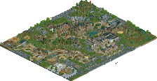
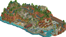
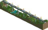
i love this, Babar, but i can't help but feel like it would have benefitted enormously from a bit more room to breathe. this, except on a map maybe 30% bigger, with some green spaces scattered through would be hard to beat. what its missing at the moment is negative space
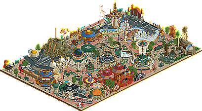
Leave it to Babar to squeeze in yet another awesome park just as the year ends. Fantastic map - love the concept of this sort of world's fair/exhibition setting showcasing all of these pavilions. And it's a perfect way to show off your sculpural skills which are the highlight of the map. Some of the standouts for me are the Gramophone stand, the deep sea area with the anglerfish and giant squid ride entrance, the library/storybook sculpture, and marionette/circus exhibit. I also love how well you've worked in curvature - both in the path shaping as well as the rounded forms of the buildings. I agree with Sam that it could have benefited being on a bigger map to give some space but given how spontaneous your building method is it might have ended up unfinished.
Well, Babar - what a great new year present! One can really see that you put a lot of heart into this. As always with your work, i totally love this! Its a great theme and concept executed on a very high level. I knew once you suggested something similar in our H2HC team that this concept would work really well with your style. You might be the best builder regarding sculpturing and putting these awesome little things into parks which is around at the moment. Just to name a few of my favorites in this park: the gramophone, the penguin exhibit, the standing clocks, the frogfish and the titanic facades.
Also i dont care this has no coasters by the way. It has enough rides and movement in it to enjoy it anyway in this aspect. I feel like if you would have added a coaster into this, it probably would have felt forced and weird anyway.
This project also shows you grew a lot regarding the usage of modern benches and objects and compositional aspects of the game. I feel like these have been like your two main weaknesses on older parks. Now that you've shown to succesfully improve rapidly in these things i feel like one might not exaggerate to call you one of the best builders on the site. And then there is also your speed in which youre pumping these out... dude, i hope so much you'll be around for the next H2H because of the amazing job you would do in any team.
Babar is showing us here how to use curves to break the constraints of the isometric view on buildings. Practically every building does a wonderful job of this. That makes the macro of the park look wonderful.
And when you zoom in there's so many wonderful little details. I love the balloon carts, the singposts, the sculptures, custom signs, the littel penguin scene with the viewing gallery for them (to form, curved), the anglerfish, the puppetmaster, the grand piano and how it seamlessly continues into the rest of the building,
I could go on.
Some sculptures are good but could have been finished a touch more, the octopus could use a little love perhaps, and other sculptures are amazing but I can't really see them! That's such a wonderful train but it needs more space around it so we can really se it and it can really be shown off.
I don't know what expectations there are on the cutaway view these days. I guess I loved the exposed track of Mr Blanc's Wonderful Circus so much I was a little let down to not see more inside, but only because I loved what was outside so much.
I haven't been paying attention in recent years but I bet you're a killer in H2H or would be if you haven't done it yet. Another set of eyes just to finesse one or two things or just to add a little space here and there would be the final touch this park needed, but I love it too just as it is.
you are insanely productive. if you just put all of these parks into one map you could have a legendary spotlight
It's hard to understand how you can build so fast and be this good... Once again, this park is so detailed and full of original and clever ideas. Archy is super detailed yet feeling very clean. My man, you're a rct genius.
congrats on yet another 80%+! Really enjoyed the park overall. Lot of great moments with the sculptures and architectural style that was consistent throughout. From a peep's perspective, there is quite a lot to see and be immersed in. Love all the path details with stalls/stands. I always am returning to your work for inspiration there. I think with a bit more macro planning and flow to the park, along with size I would've voted higher.
This park probably more than any we've seen does a real great job of capturing the big attraction exhibition type of parks that were really popular at the turn of the century. Big themed facades, just screams "come ride me"... the 20,000 leagues ride especially. Very cool stuff Barbar!