Park / De Peppelhof
-
 10-December 23
- Views 1,966
- Downloads 302
- Fans 0
- Comments 5
-

-
 52.00%(required: 50%)
 Bronze

RWE 60% In:Cities 55% Jaguar 55% Mulpje 55% posix 55% Recurious 55% Scoop 55% ottersalad 50% Xtreme97 50% CoasterCreator9 45% Faas 45% Liampie 45% 52.00% -
 Description
After a six year hiatus, my third park is out! Started as just something to goof around in because I needed something to do while listening to podcasts, am still kind of content with it though!
I know it could've done with a bit more realism here and there, and coaster layouts are still not my forte, but in my opinion the result is a fun little park which I could see myself having a nice day in.
Oh and by the way: I haven't checked this site in a few years, and it's cool to see you're still such an active and supporting community. Very wholesome, I like it.
Anyway, hope you have fun browsing this park, and thanks in advance! -
 No fans of this park
-
 Full-Size Map
-
 Download Park
302
-
 Objects
2
-
 Tags
Tags
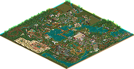
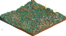
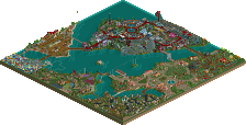
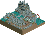
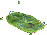
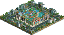
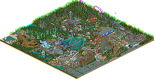
Cute park. I definitely had some fun checking it out. I think you described the park and its strengths and weaknesses pretty well: Its a fun immersive park with some nice scenes: I especially enjoyed the middle part of the map and some of the architecture that has a nice dutch retro style look to it. Obviously that also means some of the stuff feels a bit dated. In addition to that as you described yourself the layouts could have been better. I think you did better on the family oriented coasters here though that had some charming moments. Regarding the more thrill oriented rides i definitely think they have been a bit weird.
Nevertheless a good release. Great to see some work from you after such a break. Hope we dont have to wait six years for the next one!
I don't think this park is as good as your last park, I think that makes sense when I look at what you wrote on how the park came to be. Some parts are very nice, I quite like the 'Hoeve Kostverloren' wooden coaster for example. The industrial area next to it is also quite successful. But then there's stuff like the togo stand-up, the launched Intamin (ElStar) or the water coaster that are somewhere inbetween scenario play and accolade level. On average, I don't think this is accolade worthy, but I'm enjoying it nonetheless. I'll end by mentioning a few more highlights: the Labyrinth, the little beach and mini boardwalk, dumb names like 'Bessen van Berry', and the Roman section. Regardless of accolade score, I think you achieved your goal here: to have fun building, and for us to have fun browsing. Thanks for sharing your creation!
Some fun ideas and some nice scenes here, the garden areas are my favorites I think, the theme and idea for the steeplechase is also pretty cool. Coaster layouts are pretty rough as mentioned in the description (Though I like the overall side-friction, it's got a nice overall shape) and there's some kind of bare areas, but overall it's got a nice atmosphere to it, kind of nostalgic. Definitely had fun looking through it.
Some very interesting ideas on display here. Very creative. I liked the Reynaerd coaster and how it races with itself.
However it all felt a bit disjointed, and suffered from some very rookie mistakes like coasters on the ground, log flumes with turns immediately after a drop, etc.
Also some layouts weren't very good.
I think if you flesh out some of the ideas a bit more and focus on one or two of them, you can make something very nice. The creativity is definitely there.
I think this park is quite harshly rated. It's a really decent size and is full of charm. It may not be the most adventurous, but it manages to be relatively simple without being all that boring. It captures a quaint european look rather than an in-your-face USA let's-go style.