The last qualifying round, Peru, sees four entries - three of which are in RCTLL! With some shared inspiration, the maps each offer their unique spin on the country's diverse history. To help you vote in this match, please see the round objectives below:
1. Your park must be set in or themed to Peru.
2. Your park must include a large shape/silhouette.
3. Your park must include a ride that has swinging cars (eg. a suspended coaster, bobsled, wave swinger).
How to vote
Before you vote, you have to make sure you've viewed all parks with thought and care. Voting happens through the polls above. The submissions will be judged on two criteria. First, you are asked to vote for the parks that you think completed the three objectives for this round the best. Second, you are asked to judge the parks on their overall quality - separate from the round objectives. After 72 hours, the polls will close and we will add up the votes from each poll. The submission with the most votes in total will earn the creator(s) a ticket to the final round!
High in the mountains, a tourist town and park has sprung up around and near the ancient ruins, as a way to make money for the archaeological dig.
A new airport has been constructed near the Machu Picchu and the inaugural flight of Air Inti is set to depart. Enraged at this desecration to his holy land in his name, the sun god Inti strikes down the flight, sending it scrambling through the ruins as the crew braces for an emergency landing.
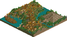
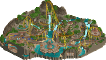
Lurker: Really glad you were able to submit an entry for all of the rounds, and I think this is one of the cooler ones of the set. Love the idea of highlighting the mountain setting with the clouds surrounding the map. Can see the Machu Picchu influence coming through with some of the subtle stepped grass layers, and the coaster is rather pleasant. Also liked the llama silhouette made of bushes, cute!
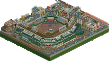
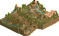
Gustav & Lilith: More LL entries are always welcome, and you did a sweet job here. Love the big sun sculpture atop the hill, makes for a great set piece with the coaster drop. I can kind of see what you're going for with the airport, I think the launch lift hack would have been cool if you could have got it to work. The rest of the map is quite nice, liking the colourful buildings.
RWE & Liam: Shame this was a rush in the end, could have ended up really strong. The architecture you did get in is impressive for how much of a time crunch you were in (judging by the stream I caught at least). Really like the dark peach and brown hues. Also quite a unique idea for the coaster to utilise the single rail track this way.
Montana Nublada: First off, I have to congratulate you for being one of two players to consistently participate in all six rounds of Grand Tour; all solo too. You've been a machine this contest and no matter what country you tackle it has your scenario play charm in spades. Right off the bat I admire the ambition to go for the cloud border, although I wonder how it would have looked with cotton candy stalls. Pretty obvious choice with the suspended coaster (which all four entries had) but I love the last helix around the big rock. Supporting rides are nice in a very traditional sense, although I'm wondering if one for the ruins would've been nice or if it's more worth it just to let them speak for themselves. I like the shaping of the bushes to form the llama, but the rest of the landscaping feels a bit scattered and I'm not sure how to feel about the castle walls for the land faces. Ruins are simple yet effective and I like the various scenery pieces and foliage to break the monotony. Hell of a run Lurker, hoping you get into finals through this round or as a wildcard.
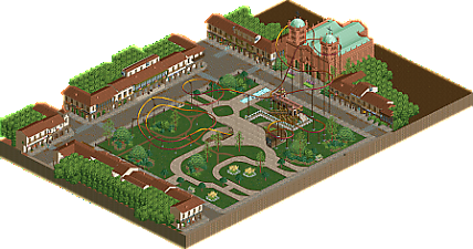
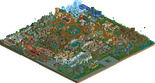
Pllaza Mayor de Cusco: Not sure if it's a typo or not but the only RCT2 park this round has LL in the title and I think that's very funny. Mad props to speed king Dubbya for the attempt to finish in a single day. Unfortunately the big black border was one of the first things I noticed, and measuring the map it doesn't exactly hit 2000 tiles which is a real shame. What's within those tiles though has a very subtle beauty and charm. SM came in clutch for those town blocks and really let you cram in those details fast. Love the unique suspended coaster with the single rail track and trains; just a shame you didn't have time for custom supports. The plaza is super nice as well with a lot of open space and natural beauty and I absolutely love the big llama shape. Unfortunately I have to point out the obvious; y'all didn't get to wrap it up and finish it. Still respect the attempt though, and both of you are in finals so there's really no harm in submitting. Makings of a very very nice little design here.
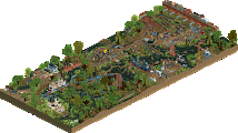
Condor: Was very excited seeing the overview for this one; it reminded me a lot of Air Inti and I was excited to see how a much better player would handle a similar concept. There's a real subtlety and restraint I wasn't expecting that really captures LL's simplicity and elegance. What especially strikes me is the open grass. This was something I noticed about Peru's scenic locales, yet I got a little scared of coming across as unfinished and added some bushes here and there to break it up. Here you've fully embraced it and left this map so so open, yet contrary to my fears it does not give unfinished. The little patches of cracked mud with the crazy paving path break up the grass and it's just such a smart object use. The foiage is shaped perfectly to frame those big open cliffs; my favorite part of the map. I also love the tiny glimpse of the waterside town nearby. I'm also pretty surprised Amaru was the closest thing we got to the Nazca lines in this round; I was expecting at least one desert entry with sand art in this round. Hell, I even attempted something like that in LL during Head-2-Head Classic! Very very beautiful design Xtreme, you're insane no matter what game you touch.
Voting for just one due to the lack of entries and Condor wins both categories for me. With that said, whoever makes finals through this round is a dark horse candidate and I'd love to see what they can pull off in the finals. (Help me help me heLP ME HELP ME HELP M)
Air Inti BTS will drop after voting ends. Very fast and fun build and Lilith deserves a shoutout for coming in clutch with the foliage in the last few days.
Air Inti: I like how the ruins were done, some great use of that wall and some nice landscaping around them. And that sculpture is so good, great trackitecture and a great eye catcher that ties into the story.
Condor: Great composition, love the open space, it fits the country well from the photos I've seen, and the landscaping and foliage is so well done. Also really like the way the shape objective was done.
Pllaza Mayor de Cusco: Obviously time-crunched and not totally finished but I like what's there. An interesting take on a suspended coaster and some good architecture.
Montana Nublada. I liked the overall vibe of this park. It executed its theme really well. I probably liked the excavation site the best but I liked the whole thing including the artificial clouds.
Air Inti. It's a little low on detail but I liked the sculpture and the airplane coaster on the runway idea was quite creative. The architecture for the airport is a little plain but nice to look at in a more macro way.
Pllaza Mayor de Cusco. The best thing about this as others have said, was the coaster. Small and short but it has the best layout aesthetics for me of any of the coasters this round. The surroundings were, due to time limitations, a little too simple but that coaster shows what could have been with a bit more time.
Condor. This was beautiful to see. It is aesthetically head and shoulders above the rest. The landscaping and the way that the architecture functions within it is good both from a functional and looks standpoint. Since this is the last comment, I'll say right here that it got my vote for highest overall quality.
I voted for Montana Nublada for best achievement of the objectives. It showed good shape, had a good suspended coaster, and just seemed to do what it set out to do better than the other two, aside from Condor which had great aesthetics but as far as my eyes could see, no real standout shape.
I feel the urge to point out the obvious: our entry is unfinished. It was my idea, but I've just been so short on time I couldn't really get it started until this week. I then got mistaken with the deadline, thought we had one more day than we did. We both also forgot about daylight savings which gave us one less hour. Most of what we built was built in one evening on two saves, clumsily put together with scenery manager. RWE tried to obscure the missing back walls of the buildings by covering it in foliage, and even that went wrong. It's a total fiasco overall, and it's kind of refreshing that one of my speed building attempts went wrong for a change.
I do think the map is far along enough to get the idea across, I'm quite happy with the second objective. RWE did a really good job with the architecture, especially considering the time crunch. More proof that RWE has stepped up his game big time.
Anyway, happy to lose to three LL entries. I made the aerials so I've already peeked a little, but looking forward to exploring them in depth soon.
Condor: The macro looks absolutely gorgeous. That almost chameleon-like sculpture in the front is so cool to look at; it's kind of mysterious-looking, but it fits the vibe of the park very well. Really love the way the coaster pops in and out of the landscaping while still having a layout that is easy to follow (and looks flowy as well). I'm a fan of this!
Montana Nublada: Really cool way to fulfill the shape objective with the bushes! The architecture around the coaster station didn't necessarily feel Peru to me, but I loved the ruins section. Coaster layout looks great and has some really nice curves to it. Nice work!
Air Inti: Sick sculpture! It actually adds something to the park instead of just being "there", which I really appreciate. I love the beginning of the suspended coaster, but the pacing and smoothness get a bit messy near the end. I would've probably tried to integrate the wave swinger a bit more into the airport style, but I dig the tower structure. Oh and the ruins look awesome, definitely my favorite part of the park!
Pllaza Mayor de Cusco: This coaster is fabulous. Love the ending and the original combination of single rail coaster track with the swinging cars. I sadly can't look past the unfinished look overall, but I will point out a few things that I loved about the park:
- That llama silhoutte in the central plaze, wow...
- The dirt trails in the central plaza, great usage of the grass trims as they fit the vibe really well!
- The architecture looks pretty detailed for being in a time crunch. The dark brown bricks and beige walls work very nicely together.
With a bit more time to work on the foliage and to finish up the rest of the park, I know this would've been a banger. Solid attempt though!
For me, Condor was pretty far ahead in terms of overall quality. All four parks did equally well with the objectives though, so it was really hard to choose the best (two) there. Great work everyone!
The Round 6 poll has now closed and Xtreme97 received the most votes across the two polls. Due to already qualifying for the Grand Final in Round 2, the spot in the finals will instead go to the runner-up of the round (see Rule 9), which is Lurker. Congratulations!
Find the results table below. The total score for each entry has been calculated from the following formula. The builders of the winning entry are eligible to compete in the Grand Final.
Score = Objectives votes + Quality votes
Entry
Objective
Quality
Total
#1
Condor
by Xtreme97
12
14
26
#2
Montaña Nublada
by Lurker
8
6
14
#3
Air Inti
by Gustav Goblin and Lilith
7
3
10
#4
Pllaza Mayor de Cusco
by RWE and Liampie
4
0
4
With the final qualifying round over, the Grand Final announcement will be along shortly, but not before the Wildcard is chosen!
It started when I found out they were building an airport right near the Machu Picchu. That's kinda messed up.
I wasn't going to enter this round. Voting for the Turkey round just ended and I was admittedly a little bitter considering I had a potentially round-winning idea I just didn't have the steam to start. I also had a lot on my plate outside of RCT and Peru just didn't interest me as a country. However, I eventually realized the Machu Picchu airport could potentially be a funny twist on the usual straightforward location park. Additionally, the town of Chinchero where the airport is located had a quaint colonial feel that was just dying to be made in LL. Ever since finishing my Ethiopia park, I had been wanting to do a LL park just so I could chill out and focus on my fundamentals instead of having panic attack after panic attack over whether my half-diagonal Fisch rocks are crunchy enough or not.
What made me cave was remembering LL had the suspended airplane cars.
I started a day after the round was announced but my progress was extremely sporadic as it wasn't a priority. This park is actually a combination of three different locations; the Parque Arqueológico de Chinchero, a small airport representing the Chinchero airport on the west side of town, and of course the Machu Picchu. Right away I was drawn to the quaint architecture and the terraced cliffs which made landscaping very easy. Recreating the town was very fun and even therapeutic. I'm also happy with the Mock-chu Picchu, although the airport and the coaster layout are not my best work.
My original partner was going to be CoasterCreator9, and we talked quite a bit as I chipped away at the park. I was hoping he'd have some room to contribute, but he got a promotion and was working 14 hour shifts which is just brutal. He intended to do the layout but just could not find the time, leading me to throw something in that played off the landscaping I had already done. Nothing against CC9 of course, I admire his dedication to LL and his willingness to try and participate. Real life is just real life.
I wanted to do a huge golden idol or statue of some sort for the big shape, but for most of the build I had no idea what specific theme to tackle. I looked into the mythology surrounding the Machu Picchu and discovered the sun god Inti, who had a very recognizable shape which could easily be done in LL with some Codex craziness. I'm very happy with how he came out but I also feel like I could have integrated him a little more elegantly. With how close I built him to the end and the fact that he's sitting on max height land, it had to suffice.
Time started to wear down, and with CC9 too busy to contribute I decided to look for a second partner. RWE put out a feeler for someone to push to completion, and having personally worked with him I knew he could provide the lightning speed required to get this sucker finished up and looking pretty. However, upon asking he confessed he hadn't touched LL in a long time and was looking to do a RCT2 build. Nothing wrong with that, but this kinda left me in a rough spot. Luckily I noticed Lilith hadn't even started her entry yet, so I popped the question and she eventually hopped on. She did the foliage on the sides of the mountain and recolored some of the houses in Chinchero which I originally had as all white matching the real life town. The extra pops of red and yellow gave some more life to the town and helped distinguish some of the buildings so I went along with it. While things did get a bit stressful near the end, we ultimately wrapped up what was essentially a week-long build!
Overall, Air Inti was a dream build. While it may not have been my best work, finally taking charge of a proper LL design was a boatload of fun. Keeping it under wraps kept expectations down and it even felt like a therapeutic change of pace at times. Watching the entries drop and finding out I had a real shot of making it into the finals of Grand Tour 2023 was completely different. Where are we gonna go? What are we gonna make? Will we even make it into finals at all? It wore on me a lot more than it should've. We all know how it went, and luckily I already hit the acceptance phase of potentially fumbling the bag by the time results dropped. It's hard to say how to feel about Air Inti; even if I could have pushed myself a little harder to book my Air Inti tickets from Chinchero to wherever finals will take us, it can't take away the fact that I genuinely enjoyed the process of making a contest entry for the first time since the Micro Madness bonus round. On top of that, Lurker has been a joy this entire contest and it's so nice to see him make it into finals for an encore. I doubt Lilith and I would have had the time to crank out a finals-level entry anyway.
Even if I may not have gone out with a bang (unless the wildcard round says otherwise), I will say this was a much better Grand Tour for me than I expected. I initially wasn't interested in participating and even mentally delegated myself to a support builder, but I ended up entering one more round than GT20, leading two out of my three entries, and creating my best work yet. I went from not even being eligible for accolade panel voting with my R1 entry in GT20 to scoring my first Gold off GT23 R3. I may not have had any huge wins but it's hard to be mad at the little victories.
Few behind-the-scenes pics. My original idea for the coaster had a dueling launched lift and some dramatic landscaping framed by the curves. SolarWing Skyway was definitely on my mind at this point.
One week before the deadline. Crazy how fast Lilith and I managed to finish considering how slow I usually am.
Air Inti originally had launched lift hills and a pre-launch section, but I found out the hard way I couldn't do launched lift hills in LL. Definitely some whiplash coming in from OpenRCT2.
Good luck to the finalists; I'm expecting a hell of a show!
Wow an LL heavy GT round was not on my bingo card but I'll enjoy it all the same.
Pllaza Mayor de Cusco: It's a fun entry and quite well rounded despite the unfinishedness, it almost feels like some Wicksteed or d4rkj4nus craziness. With a little more time the macro would have had a cool abstract and repetitive vibe. It has a Counter Strike map feel (de_peru). The bombastic soundtrack does a lot to sell it but the coaster and edges just feel a little too tacked on. I like the coaster idea though, and would like to see it explored again. The llama and park atmosphere shine through. I fully endorse the ash land tile as a black tile option.
Condor: The standout of the round imo. I enjoyed the negative space and use of grass. You embrace these older styles with just enough modern touches on the foliage and landscaping to elevate the setting. The ridgeline surrounded by dense foliage ending in the bluff over the water is beautiful. Amongst the ruins, the architecture has enough textures to keep from being too monotone. It is surprising this has the only Nazca line type sculpture and it is as simple and elegant as the map is as a whole. Little mowing handymen looked very appropriate here as well; so there is more of that old school rct charm.
This brought back a lot of fond memories of Panic's style and his unique approach to macro and ride design. The sprawling coaster with extensive underground bits feels right out of his playbook. I was aiming for something like this in H2HC so it's cool to see it realized here. Great job.
Montana Nublada: Your consistency and dedication are commendable and it's great to see you punch your ticket to the final round with this. I think this map contains some of your best work and I like ambitious and bold ideas like the cloudy map edge and small outlier islands. It ran the risk of being distracting but it works well imo and gives the map a unique feel in the round. I liked the ruins and the flowing layout of the coaster. It's funny how there are similar terraced landscaping choices in every LL entry, and it works well here with the different texture choices. The two-tone maze was neat and could be one of your calling cards (I think you've done it before?). The architecture was perhaps a little undercooked but I liked the colors and it felt consistent throughout the map. The bush llama was cute, I just wasn't sure what the second one was supposed to be.
Air Inti: It is charming how much this looks like something built in the Danimation days but with a very modern eye for hacking and with a good amount of codex hacking and stacking to create a unique atmosphere. I think you have a real keen eye for LL and encourage you to continue experimenting. This is an ambitious idea and the writeup sets the stage well. The sun sculpture was fantastic with the dense track layer and wavy lines. The inclusion of the airport was a fun and unique idea and using the classic plane car on the suspended was cool to see. Converting some of the tarmac to roads would have helped with the runway look and atmosphere. I am glad you were able to salvage the layout and it looks great where it flies up and down over the ruins. The ending is a little too fast but I know you were under a time crunch. Lilith's foliage mix is fun and chaotic, I just think the mix of dense areas and negative space around the town is a little unbalanced.
Condor is my favourite as well. I applaud when people experiment with bareness, and while not always it's still often successful here. The terraforming in general is really fantastic. It guides the macro of the map beautifully, manages elegant sightlines, produces good verticality, each camera turn revealing new themed pits to lose your eyes in. It's fun. The foliage is equally beautiful. To sucessfully mix some of the tall OG RCT1 screens into a tree combo is always impressive. You've used some that weren't the most popular back in the day, because they are harder to make look good - but you achieved it! So both of these very classic landscaping skills together produce a very nostalgic and refreshing to see entry for me. Thank you Xtreme.
The theming then is also successful. I think your use of the dark brown paths produces good contrasts and saturation, something that I connect to RRP's skills. The theming is abstract but still articulate, in a way that we don't see anymore, and that I quickly find more stimulating than power-detailed CSO stuff.
The coaster then is great. Mainly because it looks so beautiful. Several slim out and backs, helixes that offer good vistas, mixed in with slower parts reminiscent of adventure rides. Very nicely done. Perhaps if anything then it's a bit slow? I realise though that anything faster would've exploded the ratings on suspendeds, which I hope are non-hacked and genuine here, befitting to the "retro build" it would need to be filed under.
Either way, a joy to see, and again making me think what I told you privately already, that I wish the LL days had never ended.
Probably my top vote here. I think the coaster was quite sprawling - not a fan of how much of it was underground. But the moments that I could see where quite nice. The section after the second lift hill before going back underground was great. Foliage was very nice as well as Posix pointed out. Overall feels very classic in a good way. Archy was definitely interesting and encouraged me to explore the map.
Air Inti:
The big sun thing isn't my cup of tea. A bit of a DKMP trope that I've never been too fond of unfortunately. The temple ruins are well done. I like the foliage density on either side of the ruins. The foliage/density and object usage is definitely the highlight on the map. If this was just ruins and a colorful forest I would've been content! The other half of the park is less visually interesting. Airport seems underbaked. Mainly, the runway seems a bit unconvincing and overall it looks a bit unfinished in comparison to the ruins/foliage on the elevated part of the map. Shame the coaster lift doesn't really work the way you might've intended.
Montana Nublada:
The clouds as the map edge is cool. As for the coaster, I quite enjoy it. Would've maybe liked to have seen more interaction with the ruins though.. missed opportunity. I think the macro here is nice. I think this has been a great contest for you and I love the productivity.
13 Comments
Xtreme97 Offline
Round 6 - Peru
The last qualifying round, Peru, sees four entries - three of which are in RCTLL! With some shared inspiration, the maps each offer their unique spin on the country's diverse history. To help you vote in this match, please see the round objectives below:
1. Your park must be set in or themed to Peru.
2. Your park must include a large shape/silhouette.
3. Your park must include a ride that has swinging cars (eg. a suspended coaster, bobsled, wave swinger).
How to vote
Before you vote, you have to make sure you've viewed all parks with thought and care. Voting happens through the polls above. The submissions will be judged on two criteria. First, you are asked to vote for the parks that you think completed the three objectives for this round the best. Second, you are asked to judge the parks on their overall quality - separate from the round objectives. After 72 hours, the polls will close and we will add up the votes from each poll. The submission with the most votes in total will earn the creator(s) a ticket to the final round!
download All parks batch download download
Montaña Nublada
by Lurker (100%)
Air Inti
by Gustav Goblin (80%) & Lilith (20%)
Pllaza Mayor de Cusco
by RWE (50%) and Liampie (50%)
Condor
by Xtreme97 (100%)
Xtreme97 Offline
Lurker: Really glad you were able to submit an entry for all of the rounds, and I think this is one of the cooler ones of the set. Love the idea of highlighting the mountain setting with the clouds surrounding the map. Can see the Machu Picchu influence coming through with some of the subtle stepped grass layers, and the coaster is rather pleasant. Also liked the llama silhouette made of bushes, cute!
Gustav & Lilith: More LL entries are always welcome, and you did a sweet job here. Love the big sun sculpture atop the hill, makes for a great set piece with the coaster drop. I can kind of see what you're going for with the airport, I think the launch lift hack would have been cool if you could have got it to work. The rest of the map is quite nice, liking the colourful buildings.
RWE & Liam: Shame this was a rush in the end, could have ended up really strong. The architecture you did get in is impressive for how much of a time crunch you were in (judging by the stream I caught at least). Really like the dark peach and brown hues. Also quite a unique idea for the coaster to utilise the single rail track this way.
Gustav Goblin Offline
LONG LIVE LOOPY LANDSCAPES BABEY!!!!!!!!!
Montana Nublada: First off, I have to congratulate you for being one of two players to consistently participate in all six rounds of Grand Tour; all solo too. You've been a machine this contest and no matter what country you tackle it has your scenario play charm in spades. Right off the bat I admire the ambition to go for the cloud border, although I wonder how it would have looked with cotton candy stalls. Pretty obvious choice with the suspended coaster (which all four entries had) but I love the last helix around the big rock. Supporting rides are nice in a very traditional sense, although I'm wondering if one for the ruins would've been nice or if it's more worth it just to let them speak for themselves. I like the shaping of the bushes to form the llama, but the rest of the landscaping feels a bit scattered and I'm not sure how to feel about the castle walls for the land faces. Ruins are simple yet effective and I like the various scenery pieces and foliage to break the monotony. Hell of a run Lurker, hoping you get into finals through this round or as a wildcard.
Pllaza Mayor de Cusco: Not sure if it's a typo or not but the only RCT2 park this round has LL in the title and I think that's very funny. Mad props to speed king Dubbya for the attempt to finish in a single day. Unfortunately the big black border was one of the first things I noticed, and measuring the map it doesn't exactly hit 2000 tiles which is a real shame. What's within those tiles though has a very subtle beauty and charm. SM came in clutch for those town blocks and really let you cram in those details fast. Love the unique suspended coaster with the single rail track and trains; just a shame you didn't have time for custom supports. The plaza is super nice as well with a lot of open space and natural beauty and I absolutely love the big llama shape. Unfortunately I have to point out the obvious; y'all didn't get to wrap it up and finish it. Still respect the attempt though, and both of you are in finals so there's really no harm in submitting. Makings of a very very nice little design here.
Condor: Was very excited seeing the overview for this one; it reminded me a lot of Air Inti and I was excited to see how a much better player would handle a similar concept. There's a real subtlety and restraint I wasn't expecting that really captures LL's simplicity and elegance. What especially strikes me is the open grass. This was something I noticed about Peru's scenic locales, yet I got a little scared of coming across as unfinished and added some bushes here and there to break it up. Here you've fully embraced it and left this map so so open, yet contrary to my fears it does not give unfinished. The little patches of cracked mud with the crazy paving path break up the grass and it's just such a smart object use. The foiage is shaped perfectly to frame those big open cliffs; my favorite part of the map. I also love the tiny glimpse of the waterside town nearby. I'm also pretty surprised Amaru was the closest thing we got to the Nazca lines in this round; I was expecting at least one desert entry with sand art in this round. Hell, I even attempted something like that in LL during Head-2-Head Classic! Very very beautiful design Xtreme, you're insane no matter what game you touch.
Voting for just one due to the lack of entries and Condor wins both categories for me. With that said, whoever makes finals through this round is a dark horse candidate and I'd love to see what they can pull off in the finals. (Help me help me heLP ME HELP ME HELP M)
Air Inti BTS will drop after voting ends. Very fast and fun build and Lilith deserves a shoutout for coming in clutch with the foliage in the last few days.
Lurker Offline
Air Inti: I like how the ruins were done, some great use of that wall and some nice landscaping around them. And that sculpture is so good, great trackitecture and a great eye catcher that ties into the story.
Condor: Great composition, love the open space, it fits the country well from the photos I've seen, and the landscaping and foliage is so well done. Also really like the way the shape objective was done.
Pllaza Mayor de Cusco: Obviously time-crunched and not totally finished but I like what's there. An interesting take on a suspended coaster and some good architecture.
Ge-Ride Offline
Montana Nublada. I liked the overall vibe of this park. It executed its theme really well. I probably liked the excavation site the best but I liked the whole thing including the artificial clouds.
Air Inti. It's a little low on detail but I liked the sculpture and the airplane coaster on the runway idea was quite creative. The architecture for the airport is a little plain but nice to look at in a more macro way.
Pllaza Mayor de Cusco. The best thing about this as others have said, was the coaster. Small and short but it has the best layout aesthetics for me of any of the coasters this round. The surroundings were, due to time limitations, a little too simple but that coaster shows what could have been with a bit more time.
Condor. This was beautiful to see. It is aesthetically head and shoulders above the rest. The landscaping and the way that the architecture functions within it is good both from a functional and looks standpoint. Since this is the last comment, I'll say right here that it got my vote for highest overall quality.
I voted for Montana Nublada for best achievement of the objectives. It showed good shape, had a good suspended coaster, and just seemed to do what it set out to do better than the other two, aside from Condor which had great aesthetics but as far as my eyes could see, no real standout shape.
Liampie Offline
I feel the urge to point out the obvious: our entry is unfinished. It was my idea, but I've just been so short on time I couldn't really get it started until this week. I then got mistaken with the deadline, thought we had one more day than we did. We both also forgot about daylight savings which gave us one less hour. Most of what we built was built in one evening on two saves, clumsily put together with scenery manager. RWE tried to obscure the missing back walls of the buildings by covering it in foliage, and even that went wrong. It's a total fiasco overall, and it's kind of refreshing that one of my speed building attempts went wrong for a change.
I do think the map is far along enough to get the idea across, I'm quite happy with the second objective. RWE did a really good job with the architecture, especially considering the time crunch. More proof that RWE has stepped up his game big time.
Anyway, happy to lose to three LL entries. I made the aerials so I've already peeked a little, but looking forward to exploring them in depth soon.
Jens J. Offline
Condor: The macro looks absolutely gorgeous. That almost chameleon-like sculpture in the front is so cool to look at; it's kind of mysterious-looking, but it fits the vibe of the park very well. Really love the way the coaster pops in and out of the landscaping while still having a layout that is easy to follow (and looks flowy as well). I'm a fan of this!
Montana Nublada: Really cool way to fulfill the shape objective with the bushes! The architecture around the coaster station didn't necessarily feel Peru to me, but I loved the ruins section. Coaster layout looks great and has some really nice curves to it. Nice work!
Air Inti: Sick sculpture! It actually adds something to the park instead of just being "there", which I really appreciate. I love the beginning of the suspended coaster, but the pacing and smoothness get a bit messy near the end. I would've probably tried to integrate the wave swinger a bit more into the airport style, but I dig the tower structure. Oh and the ruins look awesome, definitely my favorite part of the park!
Pllaza Mayor de Cusco: This coaster is fabulous. Love the ending and the original combination of single rail coaster track with the swinging cars. I sadly can't look past the unfinished look overall, but I will point out a few things that I loved about the park:
- That llama silhoutte in the central plaze, wow...
- The dirt trails in the central plaza, great usage of the grass trims as they fit the vibe really well!
- The architecture looks pretty detailed for being in a time crunch. The dark brown bricks and beige walls work very nicely together.
With a bit more time to work on the foliage and to finish up the rest of the park, I know this would've been a banger. Solid attempt though!
For me, Condor was pretty far ahead in terms of overall quality. All four parks did equally well with the objectives though, so it was really hard to choose the best (two) there. Great work everyone!
Xtreme97 Offline
Only just noticed the Llama silhoutte in the path for RWE and Liam's.. love it!
Xtreme97 Offline
Round 6 - Peru
Results
The Round 6 poll has now closed and Xtreme97 received the most votes across the two polls. Due to already qualifying for the Grand Final in Round 2, the spot in the finals will instead go to the runner-up of the round (see Rule 9), which is Lurker. Congratulations!
Find the results table below. The total score for each entry has been calculated from the following formula. The builders of the winning entry are eligible to compete in the Grand Final.
Score = Objectives votes + Quality votes
Condor
by Xtreme97
12
Montaña Nublada
by Lurker
8
Air Inti
by Gustav Goblin and Lilith
7
Pllaza Mayor de Cusco
by RWE and Liampie
4
With the final qualifying round over, the Grand Final announcement will be along shortly, but not before the Wildcard is chosen!
In:Cities Offline
congrats lurker you king
Gustav Goblin Offline
It started when I found out they were building an airport right near the Machu Picchu. That's kinda messed up.
I wasn't going to enter this round. Voting for the Turkey round just ended and I was admittedly a little bitter considering I had a potentially round-winning idea I just didn't have the steam to start. I also had a lot on my plate outside of RCT and Peru just didn't interest me as a country. However, I eventually realized the Machu Picchu airport could potentially be a funny twist on the usual straightforward location park. Additionally, the town of Chinchero where the airport is located had a quaint colonial feel that was just dying to be made in LL. Ever since finishing my Ethiopia park, I had been wanting to do a LL park just so I could chill out and focus on my fundamentals instead of having panic attack after panic attack over whether my half-diagonal Fisch rocks are crunchy enough or not.
What made me cave was remembering LL had the suspended airplane cars.
I started a day after the round was announced but my progress was extremely sporadic as it wasn't a priority. This park is actually a combination of three different locations; the Parque Arqueológico de Chinchero, a small airport representing the Chinchero airport on the west side of town, and of course the Machu Picchu. Right away I was drawn to the quaint architecture and the terraced cliffs which made landscaping very easy. Recreating the town was very fun and even therapeutic. I'm also happy with the Mock-chu Picchu, although the airport and the coaster layout are not my best work.
My original partner was going to be CoasterCreator9, and we talked quite a bit as I chipped away at the park. I was hoping he'd have some room to contribute, but he got a promotion and was working 14 hour shifts which is just brutal. He intended to do the layout but just could not find the time, leading me to throw something in that played off the landscaping I had already done. Nothing against CC9 of course, I admire his dedication to LL and his willingness to try and participate. Real life is just real life.
I wanted to do a huge golden idol or statue of some sort for the big shape, but for most of the build I had no idea what specific theme to tackle. I looked into the mythology surrounding the Machu Picchu and discovered the sun god Inti, who had a very recognizable shape which could easily be done in LL with some Codex craziness. I'm very happy with how he came out but I also feel like I could have integrated him a little more elegantly. With how close I built him to the end and the fact that he's sitting on max height land, it had to suffice.
Time started to wear down, and with CC9 too busy to contribute I decided to look for a second partner. RWE put out a feeler for someone to push to completion, and having personally worked with him I knew he could provide the lightning speed required to get this sucker finished up and looking pretty. However, upon asking he confessed he hadn't touched LL in a long time and was looking to do a RCT2 build. Nothing wrong with that, but this kinda left me in a rough spot. Luckily I noticed Lilith hadn't even started her entry yet, so I popped the question and she eventually hopped on. She did the foliage on the sides of the mountain and recolored some of the houses in Chinchero which I originally had as all white matching the real life town. The extra pops of red and yellow gave some more life to the town and helped distinguish some of the buildings so I went along with it. While things did get a bit stressful near the end, we ultimately wrapped up what was essentially a week-long build!
Overall, Air Inti was a dream build. While it may not have been my best work, finally taking charge of a proper LL design was a boatload of fun. Keeping it under wraps kept expectations down and it even felt like a therapeutic change of pace at times. Watching the entries drop and finding out I had a real shot of making it into the finals of Grand Tour 2023 was completely different. Where are we gonna go? What are we gonna make? Will we even make it into finals at all? It wore on me a lot more than it should've. We all know how it went, and luckily I already hit the acceptance phase of potentially fumbling the bag by the time results dropped. It's hard to say how to feel about Air Inti; even if I could have pushed myself a little harder to book my Air Inti tickets from Chinchero to wherever finals will take us, it can't take away the fact that I genuinely enjoyed the process of making a contest entry for the first time since the Micro Madness bonus round. On top of that, Lurker has been a joy this entire contest and it's so nice to see him make it into finals for an encore. I doubt Lilith and I would have had the time to crank out a finals-level entry anyway.
Even if I may not have gone out with a bang (unless the wildcard round says otherwise), I will say this was a much better Grand Tour for me than I expected. I initially wasn't interested in participating and even mentally delegated myself to a support builder, but I ended up entering one more round than GT20, leading two out of my three entries, and creating my best work yet. I went from not even being eligible for accolade panel voting with my R1 entry in GT20 to scoring my first Gold off GT23 R3. I may not have had any huge wins but it's hard to be mad at the little victories.
Few behind-the-scenes pics. My original idea for the coaster had a dueling launched lift and some dramatic landscaping framed by the curves. SolarWing Skyway was definitely on my mind at this point.
One week before the deadline. Crazy how fast Lilith and I managed to finish considering how slow I usually am.
Air Inti originally had launched lift hills and a pre-launch section, but I found out the hard way I couldn't do launched lift hills in LL. Definitely some whiplash coming in from OpenRCT2.
Good luck to the finalists; I'm expecting a hell of a show!
Milo Offline
Wow an LL heavy GT round was not on my bingo card but I'll enjoy it all the same.
Pllaza Mayor de Cusco: It's a fun entry and quite well rounded despite the unfinishedness, it almost feels like some Wicksteed or d4rkj4nus craziness. With a little more time the macro would have had a cool abstract and repetitive vibe. It has a Counter Strike map feel (de_peru). The bombastic soundtrack does a lot to sell it but the coaster and edges just feel a little too tacked on. I like the coaster idea though, and would like to see it explored again. The llama and park atmosphere shine through. I fully endorse the ash land tile as a black tile option.
Condor: The standout of the round imo. I enjoyed the negative space and use of grass. You embrace these older styles with just enough modern touches on the foliage and landscaping to elevate the setting. The ridgeline surrounded by dense foliage ending in the bluff over the water is beautiful. Amongst the ruins, the architecture has enough textures to keep from being too monotone. It is surprising this has the only Nazca line type sculpture and it is as simple and elegant as the map is as a whole. Little mowing handymen looked very appropriate here as well; so there is more of that old school rct charm.
This brought back a lot of fond memories of Panic's style and his unique approach to macro and ride design. The sprawling coaster with extensive underground bits feels right out of his playbook. I was aiming for something like this in H2HC so it's cool to see it realized here. Great job.
Montana Nublada: Your consistency and dedication are commendable and it's great to see you punch your ticket to the final round with this. I think this map contains some of your best work and I like ambitious and bold ideas like the cloudy map edge and small outlier islands. It ran the risk of being distracting but it works well imo and gives the map a unique feel in the round. I liked the ruins and the flowing layout of the coaster. It's funny how there are similar terraced landscaping choices in every LL entry, and it works well here with the different texture choices. The two-tone maze was neat and could be one of your calling cards (I think you've done it before?). The architecture was perhaps a little undercooked but I liked the colors and it felt consistent throughout the map. The bush llama was cute, I just wasn't sure what the second one was supposed to be.
Air Inti: It is charming how much this looks like something built in the Danimation days but with a very modern eye for hacking and with a good amount of codex hacking and stacking to create a unique atmosphere. I think you have a real keen eye for LL and encourage you to continue experimenting. This is an ambitious idea and the writeup sets the stage well. The sun sculpture was fantastic with the dense track layer and wavy lines. The inclusion of the airport was a fun and unique idea and using the classic plane car on the suspended was cool to see. Converting some of the tarmac to roads would have helped with the runway look and atmosphere. I am glad you were able to salvage the layout and it looks great where it flies up and down over the ruins. The ending is a little too fast but I know you were under a time crunch. Lilith's foliage mix is fun and chaotic, I just think the mix of dense areas and negative space around the town is a little unbalanced.
posix Offline
ottersalad Offline
Condor:
Probably my top vote here. I think the coaster was quite sprawling - not a fan of how much of it was underground. But the moments that I could see where quite nice. The section after the second lift hill before going back underground was great. Foliage was very nice as well as Posix pointed out. Overall feels very classic in a good way. Archy was definitely interesting and encouraged me to explore the map.
Air Inti:
The big sun thing isn't my cup of tea. A bit of a DKMP trope that I've never been too fond of unfortunately. The temple ruins are well done. I like the foliage density on either side of the ruins. The foliage/density and object usage is definitely the highlight on the map. If this was just ruins and a colorful forest I would've been content! The other half of the park is less visually interesting. Airport seems underbaked. Mainly, the runway seems a bit unconvincing and overall it looks a bit unfinished in comparison to the ruins/foliage on the elevated part of the map. Shame the coaster lift doesn't really work the way you might've intended.
Montana Nublada:
The clouds as the map edge is cool. As for the coaster, I quite enjoy it. Would've maybe liked to have seen more interaction with the ruins though.. missed opportunity. I think the macro here is nice. I think this has been a great contest for you and I love the productivity.