Park / Wildfire
-
 06-November 23
- Views 2,619
- Downloads 357
- Fans 1
- Comments 7
-
 71.00%(required: 65%)
 Design

In:Cities 80% CoasterCreator9 75% Mulpje 75% Recurious 75% Xtreme97 75% G Force 70% pants 70% posix 70% Scoop 70% bigshootergill 65% RWE 65% wheres_walto 65% 71.00% -
 Description
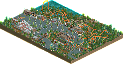
The new giga-track elements motivated me to make a Manta (Abu Dhabi) inspired layout, originally intended for a DKMP contest. After the deadline, i gave myself a bit more time to flesh it out and improve the coaster.
Scenery is NCSO, palette and coaster train are not. -
1 fan
 Fans of this park
-
 Full-Size Map
-
 Download Park
357
-
 Objects
2
-
 Tags
Tags
![park_3211 [MM2014 R3] Heart of Darkness](https://www.nedesigns.com/uploads/parks/3211/aerialt2825.png)
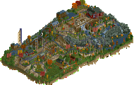
Upon first look I thought that you were going for something like Manta (the multi-launcher, not the flyer) so that translated very well here.
I loved this when I saw the version submitted for the contest, but I was worried about the pacing the first time around. I am super happy to see that the pacing on Wildfire has been fixed - it's so great now! Love all the hangtime and slowed down bits around the tighter transitions.
Great interaction throughout; plenty of places for the guests to view and appreciate the ride as a spectacle. Also, that little bridge of seats is a great little area!
Incredibly clean work with a lot of path, but it's broken up well with some delightful planters of various shapes and sizes; always been a fan of the diamond shape planters in NCSO.
Great to see you back and building! I hope you continue!
NCSO park from you when?
Yeah this is awesome Suormot! Solid pacing, great hang time in the inverting top hat and I love the tunnel section.
The curved pathing looks great and I love love love the custom stairs. Landscaping and the foliage are a banger as well. Some buildings like the staff building near the coaster station feel a bit simple and could've used some extra polish but there is lots to like in this design. Great job!
This looks so nice! Excited to download it and take a look!
A good coaster (With improved pacing from the contest version) with some nice support work, and I really like the path work (Also those stairs,great idea there), it's all very cleanly done with some nicely placed planters. Also like the object selection and good use of a few add-on pieces.
I like cleanly done stuff like this, and I also like how there's almost no glitching even on hardware mode, some excellent polish.
Lovely work, feels very cohesive in its design. The coaster is good, I haven't seen the previous version of this or the reference its based on but it has a nice flow. Some quite novel uses of vehicle hacking too - notably to me the air powered front car being used on the enterprise hut. I also find the foliage/grassland style nice in how it complements the theme, which itself is quite minimalist here. Perhaps my biggest hang up is the bridge over the two short launch sections which looks a bit roughly put together and clashes with the rest.
Thanks for the kind words Xtreme (and previous commenters). The tunnel/bridge over the double launch section was kind of intended to look artifically made and themeparky, but I can understand how this is a bit hit or miss and I probably could have done it better/differently. Perhaps I should have leaned either into a more realistic cave or a fully boxy/fake tunnel only to be experienced from the coaster pov.