Park / Journey to Rivendell
-
 10-December 23
- Views 2,458
- Downloads 206
- Fans 0
- Comments 7
-

-
 74.50%(required: 70%)
 Gold
Gold

wheres_walto 85% Recurious 80% Scoop 80% SSSammy 80% Babar Tapie 75% In:Cities 75% Mulpje 75% pants 70% RWE 70% Terry Inferno 70% Xtreme97 70% posix 65% 74.50% -
 Description
In a land close to Rivendell, an old mage used his magic one last time to leave behind a theme park for all that find it to enjoy.
This park won Deurklink's B&M Twister Coaster Contest with a score of 9.25. -
 No fans of this park
-
 Full-Size Map
-
 Download Park
206
-
 Objects
2
-
 Tags
Tags
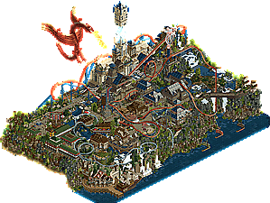
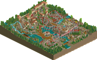
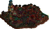
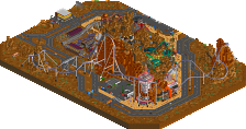
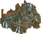
Everything in this map ranges from “really good” to “some of dkmp’s best”. While both tracked layout left a good amount to be desired, and a lot of the architectural forms feel too large and imposing in contrast to their read hierarchy- leaving the map as a whole feeling cramped and stuffy- there’s at least a half dozen instances/details that made me awestruck. The curved bridge peering over the waterfall, the stylized support work of the b&m, the ships, and the swinging boat ride are all highlights for me.
The 80% I’m giving this shouldn’t come as an indictment despite all of those aforementioned highlights really doing the brunt of deserving such a score. It somewhat feels like if late 00s to mid 2010s Kumba was a dkmp member. Id love to see both who did what and also to see a progression of all these builders as they develop and refine their styles even further.
Thanks for the feedback! Here's a dot diagram;
Blue - 94SP
Red - Ballpit
Yellow - Bluetiful
Green - Risiko

Those longboats are fantastic
Looking back at this map, the making of Rivendell remains my favorite memory in any video game, ever. Even more than my recent design. Perhaps we were all just getting to know each other, but one of the most incredible aspects of this park is how harmoniously we built. We have different styles, but we all were working towards a higher purpose. Well, several. The first one was to defeat Hobeon, haha (don’t worry people, Hobeon is well aware of our intentions). But we were striving to recreate scenes from Rivendell as accurately as possible, while also allowing room for interpretation. Or, inspiration from DKMP giants that paved the way, like Mulpje or Mamarillas.
After just a few days of building, the park took off like wildfire. And our feedback loop was constant. Just ideas flowing, people saying “yeah let’s try that,” then revising and adapting towards...well, ultimately what you see here. More often than not, someone would build an area, then someone else would go in and refine/tweak things.
In summation, I think this is the greatest contest Deurklink ever held. The top two entries ended up being what I believe would be the closest thing we have to H2H, with two teams of 4 builders constructing a map filled to the brim with content. And it was a narrow win, with the opposing team scoring a 9.24 to our 9.25. Their park is 100% worth checking out, and remains my favorite build of the year.
Anyways, I hope you all enjoy diving into and voting on this map. We’re happy it finally has a place on NE.
That said, the greatest part of Rivendell were the friends we made along the way.
First off, I have to say I'm impressed with how cohesive the whole map is, even though you worked on it with 4 people with fairly equal shares. Especially with how packed with details the whole thing is.
Really enjoyed viewing this map a second time for another review. The biggest strong point for me is the landscaping, with the huge waterfalls, the diagonal bridge, and the castle thingy incorporated in the cliffs. Covering everything in those wind sculpted rocks and trees must've been a pain in the ass.
Lovely architecture all around. My favorite building is the little castle harbor with the big ship next to it. It's not trying to be big or impressive but it fits so well and it's cute and that makes it stand out for me.
It shows that you paid a lot of attention to create impressive interactions between the various rides and the landscape/buildings/paths. The supports for Sauron's Eye are absolutely gorgeous.
Like I said in my first review, I would've liked to see a bit more compact layout for Sauron's Eye, but it being so spread out does make for a ton of cool interactions.
The little Quendi coaster is still my favorite. Just a super fun layout, nothing complex but it doesn't need to be. Love the back n forth over the waterfalls.
Overall a super fun map to look at and I can see the passion that went into this.
I also was not aware at the time that you wanted to beat me in a contest so badly but I'm glad it motivated you to build this lol
There's always been a particular charm to DKMP-style work that I feel has often gone underappreciated and this has it in spades. Beautiful landscaping with almost all the classic DKMP tricks, such as recolorable trees as rocks and a rough-looking map edge. It all lends to an amazing sense of verticality, especially with the low entrance and the huge waterfall on the other side of the map. Ride design is consistently great. Sauron's Eye is beautifully integrated with the park and the landscape and has some fantastic interactions throughout; definitely a twister coaster worthy of the win. Aesacus is one of the most unique shuttle coasters I've seen in RCT2; love the use of the fast chain lift to create a downward spike that sends the train back up. Also love the swinging ship with the synchronized sails; really gives the impression of a larger moving vehicle than just the train. Of course it's not without its DKMP setpieces either; the huge dragon, the Mulpje split tower, and the huge blue wand casting spell tree(?) thing especially stand out. Also hahaha burger cave. Some nice boats as well. Man I'm just gonna talk about every tile at this rate. Definitely some of the best DKMP work I've ever seen, 75 from me.