Park / Troublemaker
-
 06-November 23
- Views 2,662
- Downloads 224
- Fans 1
- Comments 8
-
 72.00%(required: 65%)
 Design

In:Cities 80% ottersalad 80% G Force 75% pants 75% bigshootergill 70% CoasterCreator9 70% posix 70% Recurious 70% Scoop 70% wheres_walto 70% Xtreme97 70% RWE 65% 72.00% -
 Description
A Design Bear and I made for the LSM contest on DKMP. All NCSO.
Mulpje:
Most of the scenery+restaurants+station buildings
Log flume
The Bakers Hut
The Lost Mining Crew
Foliage
Bear:
Troublemaker+supports
Foliage
Tornado
Spin to Win
Paths -
1 fan
 Fans of this park
-
 Full-Size Map
-
 Download Park
224
-
 Objects
2
-
 Tags
Tags
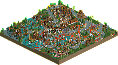
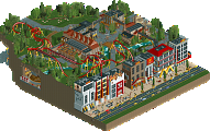
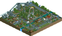
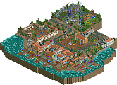
This layout is wonderful in every way: well timed, long, great pacing, and interactive - you hit the nail on the head here!
I wasn't a fan of the inverted looping coaster ride; it felt a bit tacked on and unrealistic compared to the rest of the park. A very interesting (in a good way) log flume ride that has some good moments with the main coaster. The amount of water is just enough to break up the grey path.
Speaking of the path, I think the park layout is very strong. There's a great amount of routes that would make exploring this park an adventure! Very nicely placed enterprise as well.
I think the major setback for me is the architecture - not that it's bad, but that it all looks the same. The coaster station and the structure on the mountain during the initial launch are very nice, but I wish the surrounding structures in the map had something different about them. Maybe a minor change in colors or materials, just something to elevate it a bit.
I always look forward to seeing you two team up - you both have such opposite styles and it's great to see you make a very cohesive and successful entry.
Gratz on a well deserved podium spot during the contest, and on this New Element release!
If this isn't brown theme I don't know what is haha. Pretty cool stuff in here! Love the log flume + coaster interaction. Coaster itself is pretty neat, I wish that the second launch of the coaster wasn't hidden since I had a bit of trouble figuring out how it kept so much of it speed throughout most of the coaster layout. The ending also feels a bit abrupt but that corkscrew section just before it is chef's kiss:
The park is a bit hit or miss for me. I'm not the biggest fan of the use of base blocks for the paths. Imo you're better off using the regular gray footpath which also matches better with the steel blocks. Foliage was pretty good although a bit sparse in places. The buildings also felt a bit like random object spam at times. The Spin to Win placement is fantastic though and I thought that this angle of the log flume was pretty neat:
I do feel like The Bakers Hut was a bit of an afterthought as it just feels disconnected from the rest of the park. Other than that, pretty solid work from the both of you!
Just wanna say that the dueling Log Flume and Coaster drop was a really cool moment, super nice work there. Great layouts in general.
The timing on the dueling moments is so good, this park is just packed with great interaction moments and it's so fun to watch. Only thing I don't like as much is the steel triangle blocks on the path edges, they seemed to clash a bit with the rest of the path. But the shape and layout of the paths is pretty good.
This is nice, I like how extensively it utilises the new track pieces for the giga coaster with the swooping turns. The main standout is of course the log flume drop sandwiched between the coaster elements, provides a really great visual set piece. I also like the uniqueness of the gold suspended coaster, short and sweet. Not a fan of how the jaggedness of the tarmac stands out, which dulls the grid-breaking effect of the curved pathwork.
Wow, liked this a lot. The triple drop with the coaster and the flume was a great moment as G Force said. Also that turn under the Enterprise was wonderful. Overall there's so many great interactions between Troublemaker and other various rides and paths. Also, some really great use of the invisible color to help with some crunch under the launched suspended coaster. I do agree with Xtreme that the flat texture of the paths was a bit of a miss. Too washed out. Crazy path probably would've given a nice extra layer of detail underneath everything you guys made. Kudos on a great design.
absolutely stellar.