Park / Glow Worm
-
 06-November 23
- Views 4,607
- Downloads 435
- Fans 9
- Comments 20
-

-
 89.50%(required: 65%)
 Design

pants 95% RWE 95% G Force 90% In:Cities 90% ottersalad 90% Recurious 90% Scoop 90% SSSammy 90% Terry Inferno 90% CoasterCreator9 85% Mulpje 85% posix 85% 89.50% -
 Description
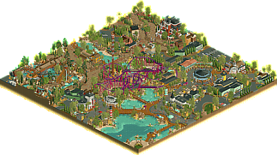
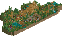
NEW for the 2023 Season - Ride the TOUCAN ROLL! Our classic, in-house looping coaster has not only received a third inversion… but has been fitted with brand-new custom trains! Not to mention a fresh coat of paint, to boot.
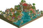
Don’t forget to visit last year’s addition to the park - CROSSROADS USA! Years in the making, the 2022 Season brought a massive new area featuring Geyser Gulch Rapids, the Haunted Manor, and a refresh of the park’s drop tower Escape Hatch! Plus, several new locations for shopping and dining.
An extra special thanks to the park’s design consulants, alex and dr dirt. They are recognized for their valuable input and organization in the early stages that made this park possible, respectively. -
9 fans
 Fans of this park
-
 Full-Size Map
-
 Download Park
435
-
 Objects
1
-
 Tags
Tags
![park_4090 [H2H8 R2] Feira do Flamengo](https://www.nedesigns.com/uploads/parks/4090/aerialt3829.png)
Kind of weird I never reviewed this design while it is one of my favorites and a map I often open in-game to get inspiration from or to see how you guys did it. Better late than never I guess.
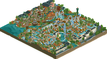
Let's start with the coaster. It makes such good use of it's space, packing in so much track while the lay-out being superflowy and super readable (no track blending in). Kinda gives me the feel this would have been a modern coaster from Schwarzkopf if they didn't stop to exist. Also loving the colors of it so much.
In fact, the color and palette choice in this map is great, very pleasant to the eye and helping the park come alive and pack so much atmosphere. The architecture present is so good, phenomenal even. A bit sad the station of Glow Worm is kinda underdone in that aspect but I'm only saying that because all the other buildings around it are so good!
Some of my favorites are the Emporium, Haunted Manor and Logans Brewery Taphouse. But every building in this map is so beautiful.
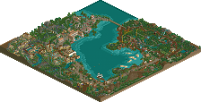
I know I can be a bit conservative when it comes to new certain (half diagonal) objects, but here every (half-) diagonal and curved piece makes so much sense and really adds to the map. The curved paths are so nice to look at and makes it look so real and believable. Pathing in general is done so well here. The landscaping and foliage is also topnotch and elevating this whole map. Really love how you also curved the underwater beach textures.
One thing I think is a bit of a shame is that the rapids has been cut off a bit awkwardly. I respect wanting to have a nice square map but I do think completing the rapids and not having a perfect square map would have been the better choice.
That's just one point I had to say, because other than that I do think this map is close to perfect. Like I said, I come back to this map quite often and I do learn a lot from it. Imo it's one of the best designs NE has seen.