Park / Superman Ultimate Flight II
-
 10-December 23
- Views 1,693
- Downloads 210
- Fans 1
- Comments 5
-
-
 64.50%(required: 65%)
 Design Submission

In:Cities 80% Scoop 70% Terry Inferno 70% Babar Tapie 65% Mulpje 65% pants 65% Recurious 65% wheres_walto 65% G Force 60% posix 60% RWE 60% ottersalad 55% 64.50% -
 Description
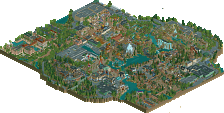
It's a bird.. it's a plane, it's Superman Ultimate Flight II!
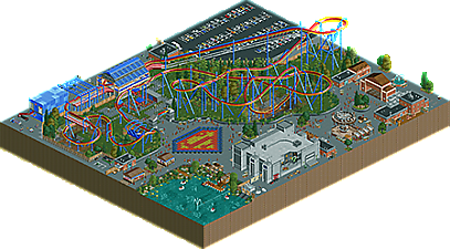
Six Flags is rumored to be working with B&M on an upcoming project for their new park set to open in 2025. The new coaster is speculated to be an updated design of their Superman Ultimate Flight flying coaster model. Notable differences include an in-queue locker system, a pre-drop soaring turnaround, and a keyhole dive through mist and rings in the shape of the Superman logo. Although these features are welcomed upgrades, fans of the original ride can rest assured that the coaster will also stay true to typical Six Flags staples, like having a clear view of the parking lot, and being accompanied by a dark ride themed to the Justice League.
This park was created with recolorable NCSO from RCT2-WW-TT.
Logo by Scoop. -
1 fan
 Fans of this park
-
 Full-Size Map
-
 Download Park
210
-
 Objects
2
-
 Tags
Tags
![park_4086 [H2H8 R1] Tahendo Zoo](https://www.nedesigns.com/uploads/parks/4086/aerialt3817.png)
![park_2824 [PT4 R2] Drop of Doom](https://www.nedesigns.com/uploads/parks/2824/aerialt2482.png)
![park_3324 [H2H7 R1] Circus Circus & Adventuredome Atlantic City](https://www.nedesigns.com/uploads/parks/3324/aerialt2970.png)
While the substance of this map is nothing particularly special, seeing more of your technical chops for ncso is still significant. I did not enjoy this as much as your raptor run design, but this is objectively more impressive as far as the details you’ve been able to flesh out using such a limited medium. I happily await to see what you’ll do in the future, synthesizing your hacking and stacking with more ambitious ideas. 60%
Good to see more work from you! I agree with previous comments in that there's a great deal of detail to be seen here. The swinger along with the pond with the swan boats were nice. For a design though, the coaster itself didn't quite work. Seems like the scale is a bit off in that the entire layout seems stretched. I think having a lot of straight track pieces between each turn, hill, element strung it all out too much. Tightening it all up would perhaps help next time.
Since I gave Ballpit and Monsterbux a review on their flyer, I think it’s time I give you one too (even though you already got my feedback on DK’s server, haha).
Not to echo the same points as above, but your attention to realism and infrastructure is immaculate. Makes me want to take a stab at realism for a change and break away from fantasy. The back of house details by Superman look effortlessly put together, and we all know it takes a bit of time to hone those elements in. The same goes for the scenes right outside your dark ride. This and the cutout for the ride look brilliant together.
The park entrance is a go, so is your parking lot. Moving towards the flyer itself, I think it’s a solid reinterpretation of the Superman clones by B&M. I too think the elements are a bit drawn out, but it does look graceful, as flyers are meant to be. The fly-through into the superman logo with the train smoke is a nice touch.
You scored well in the contest, I think you have a great shot at scoring well here too. The details really help bring this park to life. My final score: 75%
Nevertheless i think this is a great release for you. Im looking forward to see your next work!