Park / expo77: Turkey Pavilion and habitat77
-
 12-October 23
- Views 5,246
- Downloads 219
- Fans 0
- Comments 19
-
 No fans of this park
-
 Full-Size Map
-
 Download Park
219
-
 Objects
1
-
 Tags
Tags
Round 5 - Turkey
The contest has slowed a bit as we near the end of the qualifying rounds with three entries for Round 5, but all of them offer a unique vision of Turkey and showcase an exciting range of styles and culture. To help you vote in this match, please see the round objectives below:
1. Your park must be set in or themed to Turkey.
2. Your park must feature or refer to local food.
3. Your park must include a tracked ride using at least seven bridges.
How to vote
Before you vote, you have to make sure you've viewed all parks with thought and care. Voting happens through the polls above. The submissions will be judged on two criteria. First, you are asked to vote for the parks that you think completed the three objectives for this round the best. Second, you are asked to judge the parks on their overall quality - separate from the round objectives. After 72 hours, the polls will close and we will add up the votes from each poll. The submission with the most votes in total will earn the creator(s) a ticket to the final round!
download All parks batch download download
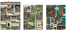
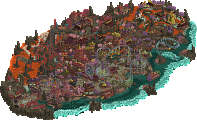
Cappadocia's Calling
by RWE (55%) and Scoop (45%)
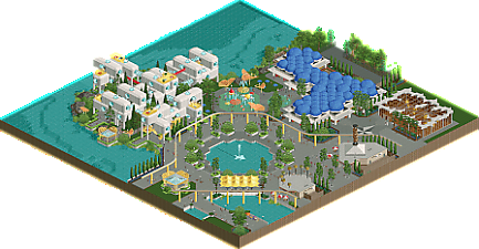
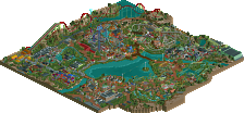
expo77: Turkey Pavilion and habitat77
by alex (100%)
Kavsak Bahçeleri
by Lurker (100%)
Cappadocia's Calling: I love the rockwork, landscaping and architecture, a great blend of objects and textures that all work together to pull off the cliffside city. And I like the ride design and think the rides are very well built into the landscape, it's fun watching them pop in and out of the cliffs. Also some nice pops of color for contrast.
expo77: Turkey Pavilion and habitat77: Another nice pavilion for the expo, I like the architecture and there's nice things all along the paths, I especially like that water park and the glass butterflies. The Piri Reis building has a lot of clever stuff in it, Especially way the maps were done.
Kavsak Bahceleri: I like the tones you used in this, the color story does a lot to give an impression of Turkey, something that has proven harder with some of the other entries you've had in previous rounds. Never considered that a lot of the base LL objects lend themselves as well to Turkey as they do Medieval Europe. I really appreciate your tracked ride with bridges; meets a kinda annoying objective in a way that is instantly recognizable. Congrats on continuing to hit these deadlines, the grind.
Cappadocia's Calling: In terms of aesthetic and overall Macro, I love the bold choices that I think really pay off. The bright colors from the balloons and the pink rivers against the rockwork is a really cool visual. I do wish there was a bit more storytelling, it felt too grounded to be so whimsical, but too stylized to be so gritty, if that makes sense. Overall, I think the biggest challenge is how uniform the colors are in the rockwork. There needed to be more depth, more mix of darker and lighter beige to give shape to all the incredible forms. But I say that realizing that kind of work is super time consuming, so I get why it may have been hard in the timeframe. Some of this felt excellent while some of it felt a little half baked, but I think it's a great entry overall and captures a very unique but well known element of Turkey. I think in terms of addressing the objectives (meh on the bridges though) you have the most distinctly Turkey park of the round. Congrats!
expo77: The exploration of forms continues to be so inspiring. These entries are like an exhibit made by some famous architect of yesteryear, wild and unconventional but pushing the boundary in terms of aesthetic and how we can use objects, both modern and new. The macro here is particularly incredible, I love the setup of the larger structures with the open space of the water and the fountain. As I've mentioned before, I am finding it harder for these to stand up in the first votes just because a park built specifically to address the requirements of a round has a bit of a conceptual leg up on you molding the expo and that style to meet that objectives. In this round specifically, I'm not sure I'd know this was Turkey if not for the name, but in terms of execution I think it's the best of the round. That being said, I think the combination of quality and a unique approach to the tournament should earn you a spot in the final regardless of whether that's winning a round or the easiest wildcard spot to give. Really impressed overall with your ability to build these, so fresh and interesting but to such a high level of quality round over round. Congrats.
Thanks to all of you guys for getting entries in, especially alex/lurker - an entry every round is amazing and should be celebrated.
Loving to see more of expo77, and cannot wait to see it all come together. I think you're always going to be kinda marked down for representing the place in question, when judged against places literally set there. But i assume you don't really care at this point, and this is another great addition. Some really excellent little bits, the butterflies, the unorthodox architecture.. lots to like, and probably the highest overall quality for me.
Cappadocia's Calling was a really great entry also. I thought it represented the country the best, and the quality was really there or there abouts with expo77. it suffered a little from readability with everything being the same color, which i'm sure was a design choice. the little pops of color were my favorite parts - the balloons, the umbrellas, and the kinda stepped grassy mountain. overall a nice entry that i can see winning, potentially.
another lovely entry from lurker also, i really appreciate your relaxed style and you don't have the urge to fill every tile which a lot of people struggle with (myself included). i didn't love the super spiky landscaping but i'm guessing that represents a real place that i don't know about.
expo77: Awesome work again, super refined and I'm getting more excited with every round by these maps and how you're incorporating unique designs into each of them. The food stalls are really fun with the kebab and baklava signage, and the architecture in general is super sweet. Love the habitat77 structure as well, another nice nod to expo67 and a unique way of completing the bridge requirement.
Cappadocia's Calling: Awesome work guys, this feels quite a unique take on the theme with some of the more fantasy elements pulling through like the pink water. The balloons are a great highlight and a good contrast with the super beige landscape/architecture that sits behind it. On that front I do think you could have spiced it up a bit with some more shades to bring out the structures more but on the whole it's quite successful and given the time quite ambitious so well done.
Kavsak Bahçeleri: Another really sweet entry, very grateful for these LL entries. The sand and beige rock combo works well here to identify the theme of Turkey and I like how you've segmented the map with quieter portions of farmland and old architecture.
Cappadocia's Calling. I think that it's a pretty neat choice for a theme. I like the hot air balloons and I know somebody who's been there. But something about the choice of rocks you used rubs me the wrong way like a comic artist using too thick of contour lines. The rivers of wine(that's what I'm guessing they are)are a cool choice for the food reference. I consider it the most ambitious entry with the best use of the themes. So I'm voting for it for best use of objectives.
Expo 77: Turkey Pavilion and habitat 77. It isn't as immersive in terms of culture as Cappadocia's Calling but I like the rides and the aesthetics. As others have pointed out, the rock kabob was a brilliant touch. And I like the powered ride with the 7 bridges. I probably wouldn't have voted for it in any other round but this is my favorite park in terms of enjoyment of the three.
Kavsak Bahceleri. I like it. Not quite as much Expo 77 but it is a nice change of pace from the more ambitious themes which has been true of some of your other entries as well. A nice blend of old and new in an out of the way place makes it fun to look at. You've proven very consistent at entering each round and I am impressed by your consistency in getting an entry in, even when so many others failed to do so.
Not the biggest round but good on all of you for doing artistically good work, some of which was to my tastes and some not, but solid craftsmanship from all three entries.
Kavsak Bahceleri : This like the best LL entry for resembling the country. The best object set for this. Really pleasant parkmaking. Red undertones were excellent. Great schemes.
Expo 77 : Shawarma 10/10. Texture work is great. Ugly ass buildings I love. This is like picking up an architectural digest magazine from the 1970s. Bigger fan of these awnings with the spacing gaps. The little butterflies are cute. I like the blue eye monster building and scuba building. The glass building was nice to look into and the restaurants are pretty classy. Overall felt AI generated at times but my fav of the round.
Cappadocia's Calling : Maybe a little over ambitious but I like the ideas here. Balloons were good to break stuff up but balloons kind of a cliché theme here. Way more grass and green like the big centered tower I would've liked. Just really beige and a lot of leftover water. The purple rivers are nice but I didn't really understand it. The tracked rides are the best here.
Cappadocia's Calling - Love this park. It feels very original. The minetrain layout is so weird but the weirdness makes it so cool. I like the interaction with the landscape. The balloons reminded me a bit of the big smoke from the last ground tour. While the execution of this park is great if I can have two nitpicks it would be the following: the balloons while cool are a bit blocky and it's a bit on the edge for me for some. The balloons with patterns look great but the ones which have an even colour look very blocky. I think it would have looked better if they all had patterns. My second nitpick is the landscaping, it feels a bit messy and overwhelming in places and I think it could have benefitted from some more foliage to break it up somewhat or just some different colours to break it up, even if that is not completely realistic from the real life reference. Overall a strong entry though.
Expo 77 - This is again a great entry. For me maybe not as strong as some of your previous entries but still pretty good. For me the link to turkey was a bit to weak for this entry. Overall the architecture is again strong as always. While this entry on its own is maybe not super spectacular imo when compared to the other entries you have made I think this part of the park will do well in rounding out the full scale park when all the maps come together, so fair enough. I thought from a purely technical perspective this entry was the strongest, so very nice work!
Kavsak Bahceleri - This is a cute litte entry. Like others I agree that for a LL entry this entry ties in well with the country of Turkey and feels recogniseable. I do think that compared to some of the other entries you made for this contests so far the coasters were maybe a bit weak in this entry. Overall still a lovely entry though, so well done!
Cappadocia's Calling: I swear to god Cappadocia is the most me city ever; all rock-cut architecture and flying stuff. As such, this entry immediately has my heart and I'm so glad to see you two could finish on time. While most of it does read beige, the subtlety of the architecture with the very basic shapes and forms and the occasional balcony or arch poking out of an untamed rock just tickles me so much. There's a lot on the street level to add some pops of color, and while it may not be very accurate and could even take away from the streets I also wish that extended up the rest of the rockwork. The rivers of flowing wine do the job well though, and I love the surreal touch they add to this map. I also love the obviously RWE balloons; shoutout to The Big Smoke.
Both coasters are very nicely integrated into the landscape and it's Sloshed'in Sarkisi that hits the seven bridges requirement. There are times where it feels like the bridges take away from the pacing of the layout, but you can't deny those views must be gorgeous especially the curved bridge facing the ocean. I love how the mine train is tucked into the mountain with all sorts of terraces and tunnels. God I love it so much. Not exactly loving the dated flat rides though. All in all, lovely little entry and the ode to Cappadocia this round deserved.
expo77: Turkey Pavilion and habitat77: Once again, smooth and classy as always. The glass butterfly awnings definitely steal the show here. I'm also a fan of the kiddie splash area with the gears and half-transparent awnings. Was not expecting a Habitat 67 reference here, although with its Expo roots it makes sense. Unfortunately this is one of the weaker Expo pavillions to me. It doesn't hit the objectives as well as the past pavillions, and honestly I'm not a huge fan of how the Turkey Pavillion is laid out with the blue dome spam. I can't deny this is a damn good piece of parkmaking with a lot of thought put into it. Great stuff and I can't wait for the Peru Pavillion!
Kavsak Bahceleri: The lack of entries this round really shines the spotlight on those truly committed to the contest. RWE, Alex, and now the LL machine himself. Once again I will say it is so hard to even remotely dislike anything Lurker. A miniature railway is a great choice of ride for the seven bridges requirement, and even if it took a bit of translation I like how all the rides are food-themed. Once I understood the latter, I started noticing little details like the meatball sculptures near the kofta-themed invert and how the flying saucers are sitting in a pizza crust. It's such a charming little entry; a word I use a little too often for Lurker parks, although damn well deserved. It once again nails that 2001 feel with the single-wide path and jagged landscaping. Great little park!
What Could Have Been: Turkey is my favorite country featured this Grand Tour, and I really wanted to enter with an idea I was very excited about. It would have been a huge Turkish Delight island surrounded by literal rose water with big Petra-style rock-cut temples on the edges and Cappadocia-styled houses up top. Because it's Turkish delight the interiors and rock-cut sections would have been bright and shiny resembling Turkish delight filling, a stroke of genius by dr dirt. There was also gonna be a big palace and a metric assload of hot air balloons with a port for them and an airship or two. Birth of an Ocean meets Endswell basically. I was pumped for the idea and had a partner at the ready who whipped up a layout, but I just kinda lost all steam the moment I started. It's sad because I think executed well enough I could have gotten a win here, but at the end of the day my heart really wasn't in the game and it may not have been worth it to push everything aside for that.
Even if the quantity is going down, the quality isn't. While Cappadocia's Calling had the highest overall quality, Kavsak Bacheleri stole the show for best objective use. Great entries everyone!
Cappadocia's Calling: Cappadocia with the balloons was one of the most obvious things to go for this round, I’m glad we saw at least one entry doing this. I’m a bit conflicted on this entry though. There’s some cool shit like the balloons in different colours and patterns, the bobsled which I think is really cool, and the general atmosphere being quite nice and complemented with the kind of Turkish pop music I would expect in a touristy destination here. On the other hand, it would’ve made sense to include more modern touches and signs of tourism here. I think that’s symptomatic of the main issue here: a lack of thematic focus. We’ve got a wine themed coaster with fantastical elements, a mine (?) themed coaster/tracked ride, the balloons, the architecture/rockwork being very traditional, and somehow this bit is set at the side of the sea/a lake. And who’s calling? I’m liking all the architecture and the style of detailing on the paths a lot. The rockwork… not so much. For a map with such prominent rockwork I wish it was put together a bit more carefully. But all in all, you finished and it’s cool shit and I’m enjoying it despite its flaws.
expo77: Turkey Pavilion and habitat77: it’s obvious that you were pressed for time here, this is probably the weakest entry from you so far, with some obviously rushed bits. I am confident that as a part of a larger park, it’s not much of a problem. All the trademark stuff is there, and it’s very enjoyable. The kebab, the baklava and the butterflies are the show stealers here. I’m also fond of the Turkey Pavillion itself, pretty cool look. I like how you’re exploring the power of repetition in this park. Habitat77 is a great looking structure and a clever ride, but I wish it had a bit more detail to make it more interesting. The Piri Reis Pavillion is also cool, even though the interior is a bit sparse. All in all: very likeable, but a tad underwhelming relative to what we’re used to. I hope you will polish this section some more for the final release!
Kavsak Bahçeleri: I can’t get enough of your stuff, it’s my comfort zone as much as it is yours. The central village is really cute stuff. I like that this map has several distinct sub-areas. The areas with the flats is stylistically different, but not different enough to feel incohesive. The link with food is alright. The turkish pizza, great. The kofte are also a fun touch, though the coaster is very short. With the baklava the link doesn’t seem to go further than the naming, which is a bit weak… The surroundings I appreciate for having some more subtle features to them. Orchards, rock dwellings, and a castle. I can see some Turkey in this, but I’m not sure I would’ve made the connection outside of this contest and disregarding the ride naming. But anyway, one of your best maps this GT I think!
Quality
1. Expo77
2. Cappadocia’s Calling
3. Kavsak Bahçeleri
Objectives
1. Kavsak Bahçeleri
2. Cappadocia's Calling
3. expo77
This is actually really close. I gotta give it to Cappadocia as a theoretical overall winner because I can’t give it to a map on which the Turkey objective felt like an afterthought (expo77), but I thought Kavsak beat the other maps on the other two objectives. It’s really close. Not sure how to handle that with these polls.
Cappadocia's Calling: The first shot is epic (albeit a bit too beige for my liking). Looking at the rockwork, it is clear that you used a good selection of various rock objects. I just wish there were some more color gradients and/or variations to break up the repetitive color scheme. Love the hot air balloons. For my part, you could've done more foliage sections like the ones you did up and around the central tower, as that was probably my favorite part of the park!
Expo77: Love the butterflies and the kebab; both are super clever ideas and executed so well. Very unique take on the seven bridges requirement, I like the originality. Also really like the way you mapped out the area around the center fountain, with the stairs to the lower area around the fountain being separated by those lovely hedges. This was my favorite of the round!
Kavsak Bahçeleri: The LL terrain definitely lends itself well to the Turkey theme, as I loved the spiky and sandy terrain. Makes me wanna try out creating LL parks/designs myself one day. The final drop for Kesme Siçramasi is super picturesque. And no one does miniature railways better than you do <3
Excellent work from all involved; really classy and fun LL, another wonderful Expo section from alex, and some particularly impressive rockwork from RWE and Scoop. I think I'm in the minority with which I prefer the most, but great work from everyone.
Round 5 - Turkey
Results
Round 5 has now concluded, with RWE and Scoop emerging the winners with Cappadocia's Calling and taking one of the last remaining spots in the Grand Final! RWE's determination in participating in each round so far has certainly paid off and it'll be exciting to see this duo in action again!
Find the results table below. The total score for each entry has been calculated from the following formula. The builders of the winning entry are eligible to compete in the Grand Final.
Score = Objectives votes + Quality votes
Cappadocia's Calling
by RWE and Scoop
23
expo77: Turkey Pavilion and habitat77
by alex
9
Kavsak Bahçeleri
by Lurker
11
Don't forget to tune into the final qualifying round in Peru!
congrats RWE and Scoop!
Congrats guys! See you both in the final!
Congrats! Nice match. Not very close, but very interesting because these parks were so different.
Thought it would be much closer. Actually i thought Alex has this. Wonderful entry again with a lot of Innovation and creativity. Also really enjoyed the way of dealing with the objectives with the guided tour and the rockwork kebab.
Also some wonderful work again from Lurker. Really fun LL with so much charming stuff in it. Not easy to represent Turkey in LL, but i think this park does a perfect job at it. I think i wouldnt even have been surprised if this entry would have won.
Congrats RWE and Scoop on the win!
congrats to the winners!
lurker and alex have been fucking crushing it this tournament, keep it up
Expo 77 Turkey Pavillion
Another great entry into this series. I love the continuation of colors and the somewhat abstract representations of the host countries. The execution is sublime and the motifs are carried over so well but it is yet another extremely interesting and unique entry with lots of to explore. It is crystal clear and watertight with your execution and outside-the-box ideas!
The butterflies!
That water feature is awesome in general
The big dome thing looks like some mutant blue skin infection, it looks AWESOME
The walking area a step down near the center pond is a very nice touch
The kebab sculpture, come on man. YOu are so good at just getting that one object wonder man
This tunnel of horror abstract ride thing is a highlight for sure. SO well designed and I like the continuation of primary color motifs
The little patios on top of the bridge ride thing are also some cool stylish touches
Once again the foliage is mint
There is no shortage of brilliant ideas like these vegetation boxes on the roof of the baklava store
I will never get tired of the fact your peeps can sit down, and also they are littering which is kind of sweet actually haha
Capadocia Calling
Lovely idea. I love the massive air balloons are all so well done and add such great patterns and pops of colors. I also really enjoy the abstractions like your purple water. Both of the main coasters are so cool to watch fly around the map. I like this sort of scale for the sense of mystery around different views. Because when you turn the angle with these big mountains and see the different pieces you get a new perspective and understanding of the whole map and what it could be like to adventure through here. Overall a nice atmosphere in this park
These rock formations are immense!
I adore both of these coasters, gerstlauer bobsled-type rides are so underrated!
I like the rings of foliage around the main peak, very nice differentiation and sense of depth from the beige stuff
I respect the bold choice to go so monochrome, the fortresses and whatnot look well built into your landscaping and, logically, based on the same materials.
I like the sort of overgrown bursts of foliage on the path level as well as on top of the rooves. It is a nice change of pace from just flat rooves or pitched rooves.
Kavsak Bahceleri
Even if there weren’t many entries, I am happy that both you Alex, and RWE continued to go strong and make the appearance for every-ish round. (also shoutout Scoop). I like the architecture here. I feel like this kind of style and similar islands nearby like the Greek archipelago is well suited for the sort of loopy 2x2isms. It looks really good and the different tones of color with these classic textures are also really lovely
Other stuff I liked
Cool flying saucer arena!
The water coaster feels unique and it is just so lovely with that final drop. The train passing by next to it is Chef Kiss
Your foliage is so classy
The default stalls work well standalone here as it stands! And add nice pops of color.
I love that the gold and yellow is a motif here, with some of the architecture being Tanish gold, the rides being gold, and how the castle scenery has these yellow accents. Nice way to tie this all together
The sand spikes are a cool concept and I like his landscaping!
The train is so good, what a nice layout and the structures for it. It feels very necessary and classic. I want to build more trains like this
I was working on a Turkey entry too but was too busy to finish it in time to my liking, I am still working on it so it was nice to see these interpretations. All of these parks are sweet!