Park / San Avaiki
-
 26-October 23
- Views 3,010
- Downloads 385
- Fans 4
- Comments 16
-
-
 83.50%(required: 65%)
 Design

Recurious 90% wheres_walto 90% In:Cities 85% Mulpje 85% pants 85% SSSammy 85% Terry Inferno 85% ottersalad 80% posix 80% RWE 80% Scoop 80% Xtreme97 80% 83.50% -
 Description
"Captain... where have we washed ashore?"
Starting as a contest entry on July 22, 2022, this park was quickly abandoned, with clear signs of it just ending up like many of my other abandoned parks: cool ideas that are left to rot. Then, around April 2023, I got the urge to work on it again following the announcement of the Free-for-all contest over at RCTClub. While it was not finished in time before the contest deadline, I kept working on it and used it as a project to improve my CSO skills. That brings us to now, a finished park of which I'm super proud, and something that really shows how much I've grown when it comes to RCT. I hope you all enjoy it!
- A special thank you to the members over at RCTClub for kickstarting this project and helping me along the way! -
4 fans
 Fans of this park
-
 Full-Size Map
-
 Download Park
385
-
 Objects
24
-
 Tags
Tags
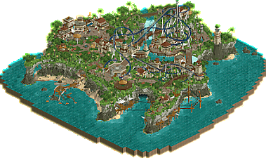
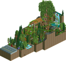
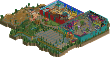
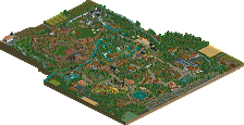
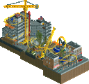
Rockwork and foliage are stunning (That shark cave entrance is a cool touch), and the details and architecture make this all feel so lively and natural. Tons of great interaction moments and overlooks for the guests, also some great pathing with the and grid breaking. The ropes course, shoestring and ziplines all work great as support rides and the main coaster itself has a nice layout and some great support work.
Only thing that annoyed me was the chainlift sounds on the birds rather than using a silent ride type (Like air powered vertical made invisible with the invisible color option), but that's a tiny thing that didn't affect the score I gave.
Overall, amazing stuff, it's awesome to see this get released.
I think this is the new gold standard for landscaping and I reckon a lot of us will be coming back to study it for a long time. The mix of objects is so clever and the shapes are beautifully organic. The ropes course on the cliff is such a fun idea, I'm jealous of the peeps who get to experience it haha.
It's bold of you to center a design around a spinning coaster like this, which might just be a supporting coaster in another park, but it's been detailed with such care that it really feels worthy of anchoring the map.
The only thing that I had an issue with was the coaster queue's entrance being so far away from both the exit and the coaster's sign. The octagonal exit plaza is so grand it almost reads more like an entrance. That being said, the micro around the queue entrance is one of my favourite parts.
Other highlights for me are the waterfalls, the apple picking scene and the placement of the drop tower in the middle of the coaster bowl. Lovely work, big big fan of you!
From the extra time spent on coloring the supports with neat patterns, to the extra bit of loving you gave to the different track types at the proper sections throughout the ride, I must say I am impressed with your patience and craft.
I'm not sure why, but the scale of this design really gives me a warm feeling. It's not too large, and it's not too small - This in itself is a feat, especially with a coaster type that is generally on the smaller size.
I will say that pants beat me to the queue's location being a slight turnoff by a few minutes... That said, I love how you designed the queue; that bridge is perfectly placed under the coaster and in front of the waterfall.
The landscaping is beautiful.
I appreciate the fact that I'm placed in one of the most interactive spots in the park, thank you for that.
+Rope course
+Demon Cave Mouth
+The use of wet sand as path in some spots to break up the crazy path for just enough space
+Crashed Boat
+Staff scenes
+Coaster sign, though I think it's located in an odd spot
Congratulations on such a strong Design, Jens!
This is awesome. Really enjoying looking through this!
So many small details, many already mentioned. I thought the rides like the rope course and the zip line were so well done, and really added something to the map.
The coaster itself was beautifully done. The blue in that palette is just perfect and highlights over the landscaping so neatly.
Congratulations on the design!
Small maps work when a ton of love and detail goes into every aspect of them, and this definitely happened here.
Since you gave me a review on my design, I feel like I owe you one on your design First of all, congratulations on the release. I’m not well-versed in CSO, so there might be details and skills I won’t pick up right away, but I do know when things look good. And upon first glance, this is an excellent park.
I know there is more to this than just the rockwork, but it remains my favorite aspect. It’s not fancy or over the top. It’s just natural. It looks real. That’s gotta be difficult to do. Just hovering my TI over the cliffs, I can see how many nooks and indentations went into making these rock formations look like something you'd see on an actual island. So great work, there. Going into the meat of the park itself, there’s a lot of small-scale architecture, but it’s juicy and full of details. Looks like we both have object preferences, I’m usually not into the animated ones, but I think you made them work well here. Gives the park a little more life. Only thing I would have changed is adding some crumbling land textures to the back border, just to cement the castaway island feel a little more.
For the design itself, Ngaru is a great Maurer. It doesn’t do anything mind-blowing like a Mack multi-launch or a B&M invert for example. But it’s a wonderful coaster, and a refreshing change of pace from the new wave of multi-launch coasters. As a whole, Ngaru is framed extremely well. Gorgeous color choices, and they pair so wonderfully with the foliage. The layout has some awesome sections, I love the first drop and turnaround into the first brake-run. My favorite bit is the tunnel into the station area. I love how you did that crumbling fade into the void color. Makes me wish I added that touch into my design.
Great work Jens! You’ve innovated so much on DKMP, so I’m eager to see where you take things here. My final score: 85%.
This was beautiful. Your acute micro meets macro necessity, and it renders a rather fruitful result. So many good and even new design ideas, in pretty much all areas of parkmaking: foliage, landscaping, ride design, theming. Well done Jens. It's like you chewed on the meta, spat it out, and we can all just marvel at the output.
Congrats jens! What a fantastic design.
I love the layout, spinning coasters are some of my favorite IRL! The blue color is super rich and the supports are so fun. Love the stripe detail. The amount of interaction is outstanding and so fun. Two wraps around the tower is wild. I love that the station has the only blue roof. I think it could’ve been three or four cars rather than 1! I also had a hard time following the queue?
The surrounding environment and village is outstanding! What stellar rockwork. The shark cave is a huge standout! The adventure course over the cliff edge would be so scary. Love it! The tall lighthouse with the green roof is super well done!! I love how it looks out over the whole thing.
I really enjoyed watching this develop! Gonna be looking this for ages Well done
Congratulations Jens! I thought this was brilliant - such smooth but dramatic landscaping, nice flowy coaster and overall composition and a totally unique architecture style. I also found the relatively small building scale to be refreshing too. Almost diorama-like.
Well done, Jens! While the map is excellent in nearly every regard, I think the rock arch with the beach and the shipwreck and the foliage is just an iconic scene. Shows a masterful grasp of parkmaking in that one moment alone.
To be honest, I have no remarks to make on this. Wonderfull throughout. The foliage is masterful, the archy is great, the coaster is nice. Full of little details and scenes. Well done, and deserving of the high score!
Wow, stellar work here Jens! Especially love the crunch you did all over the map. Also the architecture and color scheme are top notch and give this so much atmosphere without overdoing it. Coaster flows nicely through it all, and again, great color choices here. Grats!
Honestly, one of my favorite releases of the year and I think a landmark in the ongoing rise of Jens. I was pleasantly surprised by how much I enjoyed this and how long I spent exploring all the details and nuance. The architecture in particular felt incredibly fresh for a theme that isn't necessarily the newest on the block; the different forms and the way you baked in unique elements really brought this to life. The execution is near flawless, something I really appreciate as a nitpicky builder. Really, there were very few things that I thought I'd have done differently in terms of execution, and many of them are down to how anal I am more than anything else. The atmosphere, how all the details came together, was so well done and demonstrated a very meticulous approach to crafting your vision. I really appreciate the balance between theme park and real world, this landed right in the middle in a perfect way that makes it engaging without requiring us to be critical of its realism or lack of realism; that is something I aim at often. Finally, the crunch here is just astounding. The grass areas and how you showed cowpaths and dirt where people would walk and water would wear away at the landscape was beautiful. Sometimes I feel like my crunch is more artistic than realistic, this felt like both and like you really carefully considered how to use crunch to build a realistic landscape with incredible depth.
I usually try to point to some thing I think could be improved or worked on, but this feels so accomplished I'd honestly just say that we need more. That's the feedback, we need more!
Huge congrats on the design (I obviously think it should have scored higher) and huge congrats on parkmaker. I am now even more excited to see where you go after this and how the next year looks for you, particularly H2H where I think you could be a draft steal if the captains aren't smart.
Wow, well deserved!
Late Review #1: San Avaiki
I always loved the screens from this map, it's embarrassing that I never patiently properly explored it... I'm sure there is great stuff that I have overlooked. I'm finally able to zoom in with my game, so no better time to review some parks like San Avaiki. I am rewarded with indeed many details that stand out when I look at this map now, but more on that later. It is well known that San Avaiki is held in high regard for its landscaping, and I support that. This is some of the best rockwork we've ever seen in the game. Nice organic shapes, credible strata in the rock, the debris at the bottom (and not at the top) - it all makes sense and looks great. Foliage is excellent as well. What truly gives this map its character is the theming and architecture. I love that you embraced the octagonal grid instead of going for maximum curviness, because the result is a consistent and cohesive strong aesthetic. Lovely layer-cake look with the brown horizontal elements (and good tan ornamentation as well), and good colour choices in general. This extends to the coaster, the blue is the best colour you could've chosen. The whole thing is just exceptionally beautiful. Now on to the details that I mentioned: funny head/totem on top of the roto drop, the NE members hidden throughout the map in various functions, the wildlife, the treasure site, the clothes lines in the village near Huri Huri (which I also loved), the obstacles in the ropes course (the rock climbing bit looks especially good). Some criticism: some parts I found anachronistic, such as the humongous water silo, and things like road signs. The crocodile cave, while well done, was a bit silly and served no real purpose. Since this is a design submission, the coaster should be central. It's a flawless coaster, but considering the size and scope it can't really live up to the surroundings. Not a flaw inherently, but it perhaps affects it's status as a design. However, I would've voted a 85% regardless.