Park / Apothicon Servant
-
 26-October 23
- Views 3,380
- Downloads 327
- Fans 0
- Comments 12
-

-
 71.50%(required: 65%)
 Design

Scoop 80% In:Cities 75% Mulpje 75% pants 75% Terry Inferno 75% Liampie 70% Recurious 70% RWE 70% wheres_walto 70% Xtreme97 70% ottersalad 65% posix 65% 71.50% -
 Description
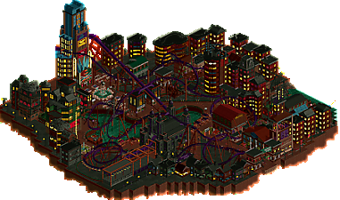
Since December of 2022, I’ve been enamored with the map Shadows of Evil, taken from the game Black Ops 3. Upon seeing the neon night cityscape of the 1940s, I thought to myself, “I wonder if I could ever make this in RCT.” Fast forward 9 months later, I began my journey to realize this map.
Shadows of Evil is a first person shooter survival map where you fight against hordes of the undead. As the rounds change, jazz music seeps into the city. Throughout the journey, you encounter Margwas, which are giant tentacle monsters. You can buy and upgrade weapons. There are perks in the form of sodas that enhance your character, like Juggernaug for added health, or Speed Cola for a faster reload. You can even complete a quest that finishes the journey.
The name Apothicon Servant is taken from one of the wonder weapons you can build. It is perhaps the most overpowered weapon in the game, as it shoots a literal black hole that sucks in every zombie in sight.
Now go ahead, take a flight on Apothicon Servant, and cue those smooth jazzy sounds into the night.
This park won Deurklink's Flying Coaster Contest with a score of 9.52. -
 No fans of this park
-
 Full-Size Map
-
 Download Park
327
-
 Objects
132
-
 Tags
Tags

I like the atmosphere, there's a lot of good grid-breaking and I really like how clean it all looks. And after looking it up this seems to capture the feel of the level pretty well.
OddmentsAlchemyLab Offline
I love this build. The detailed architecture is fantastic and it carries all the way through the little apartments along the front. It's cohesive, but has a lot of individual details that break out each building.
The is not a critique, but just a question: why the curved ducts? I've been seeing this on recent builds and I find it confusing and unrealistic. But there seems to be a trend. It's been a while since I bent duct, but long curved runs were not a thing. Possible? sure. Common. No way.
That aside, this is a gorgeous build.
The cityscape is cool and pretty well detailed. I think the coaster itself though struggles for speed on the second half of it. Overall though, this is very well laid out, great composition.
edit: maybe it was just my framerates dropped - I let the park run for a bit and the coaster pacing seemed much better. Not sure whats up there.
I think this release has some of the coolest use of color I've seen in a hot minute. The use of the dark reds and cool shadowy colors literally paints a picture, and I can feel myself as one of the peeps wandering around.
The deep violet wrapped around the structures feels like a set of calculated brushstrokes, perfectly paired with its polar opposite on the color wheel peeking through the majority of the windows (that's yellow - keep up, kids.)
Interaction, interaction, interaction.
Though I personally know what your next build looks like, I am very much anticipating the next project you whip up!
Cool park Bluetiful! I have to be honest that I'm normally not the biggest fan of the recolorable NCSO objects but the theming here was pretty neat. Some interesting and unique ideas with the crane supporting the goober loop (love the name lol) and the street lights made out of trackitecture (very clever!). I think the diagonal string lights are almost there, if only there was a track that would make the separate bulbs more clear. The ones using the top of the martian and castle walls though are absolutely flawless wow.
The coaster has some pretty sick elements like the pretzel loop and the aforementioned goober loop. I do think it lacks a bit of pacing near the end, but I love all of the interaction with the city. Almost feels F.L.Y.-esque. Nice job!
Thanks Lurker for the review, I'm glad you enjoyed it!
Thanks, I'm glad you like it! For the ducts, you're referring to the HVAC systems on top of the buildings, right? Yeah, I've noticed that trend myself, probably picked it up just after looking at so many builds recently. Your experience is certainly something I will factor into any future city entries.
Thanks Otter! I appreciate the review
Thank you so much Hex! Looking forward to our release here next, and your own design too!
Thanks Jens, and congrats on your release too! Yeah, someone mentioned the F.L.Y. resemblance after I released it on DK's server. I'm glad I did the goober loop some proper justice
This is one of the best maps created in the genre. Great atmosphere, great coaster, and some nice object usage such as the tennis nets to create a letterboard look. Has that been done before? Not that it matters much. The naming applied to all the buildings helps the world building enormously, though the overall narrative isn't too clear to me. What is an Apothicon Servant? What is the Margwa and why do you need to escape from it? Aesthetically this park was good, but a few things I didn't like. Curved ducts are a curious choice like has been pointed out already, and sometimes I felt like techniques were applied for the sake of it, such as the single rail coaster diagonal trims that didn't contribute to either the theme or the setting, nor were they technically impressive. The expansion objects were hit or miss. I voted 70%.
Thanks Liampie for the feedback! Definitely some tips and notes that I'll incorporate into future entries. I'll also update my design description so other people can read a backstory behind the map, that way the references aren't missed. In summary, the Apothicon Servant is a wonder weapon you can build in the game. It's pretty epic. Margwas are big tentacle monsters you battle. I'm super happy you enjoyed this map, a big thanks for giving everything a thorough look!
Was never really a fan of this map in game, but this was really nice. Starting with the coaster, I enjoyed the length and the interaction of the elements with the surroundings, real nice park design there. As far as the theming, once I sort of got my bearings there were a lot of landmarks I did recognize from the map, the gumball machines were a real nice touch. Great work!
Great work, and what a way to get make a name for yourself! Especially love the way you made the crunch with those cola pieces and invisible color, so clever! Also the color scheme and palette give this such an unique atmosphere. Can't wait to see what you cook up next
Just downloaded this and checked it out. I wasn't a fan of Frightmare Hills but Beautitful, but I really enjoyed this. The coaster had an appealing layout with a good balance between the elements and the overall flow. I can't say much new about the architecture but I liked the lighting and how you managed to make the buildings look good even though they're a bit boxy. I will look at whatever else you've made that I've missed and look forward to your future projects.