Park / Dream World Indoor
-
 17-July 09
-
 Dream World Indoor
- Views 27,010
- Downloads 1,435
- Fans 3
- Comments 63
-
 65.83%(required: 60%)
 Silver

Kumba 75% RWE 75% Scoop 75% G Force 70% WhosLeon 70% CedarPoint6 65% Cocoa 65% csw 65% Ling 65% chorkiel 60% Faas 60% Poke 60% Xeccah 60% posix 55% 65.83% -
3 fans
 Fans of this park
-
 Full-Size Map
-
 Download Park
1,435
-
 Objects
332
-
 Tags
Tags
![park_4134 [H2H8 R5] Romon U Park](https://www.nedesigns.com/uploads/parks/4134/aerialt3926.png)
![park_3324 [H2H7 R1] Circus Circus & Adventuredome Atlantic City](https://www.nedesigns.com/uploads/parks/3324/aerialt2970.png)
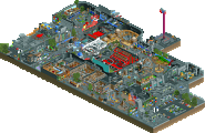
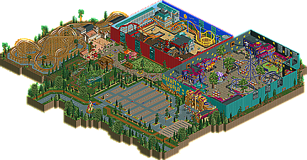
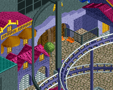
Then I looked at the 2nd hall and I was really disappointed that the coaster was not running. I just turned it on but why was it not running? Then I saw the top spin which wasn't working either. All in all I was kinda disappointed since that seemed to be the main area of the park since there were the best thrill rides. I loved that little building though were you were supposed to walk through I guess.
Then I saw the woodie which was good but the queue for it was just a mess because there were people running through the fences going the wrong way in the queue and it just didn't look right. The ride itself was nice. It's kinda like the real ride which I think is good and I liked the end of it, too.
The survival course I though would be better. But oh well I don't know how you could have made it any different. But since they were just walking it didn't hold my attention for long since nothing really happened. All in all I really didn't like the outside of the park.
I don't really know about the lake and the river. Where was the lake and where was the river? Was that meant to be a metaphor maybe? If so, man that was a stupid metaphor! You should have named it differently but that doesn't really make any difference in the end since it's just the name so don't worry. I liked the invert's layout! But when I watched it it was by far too fast. Also why did you not let it run in the block break mode? I noticed that there were two trains on the track at the same time and I thought why? It doesn't help at all. I really enjoyed seeing the architecture next to the thief though. That was really nice and also that hill up there with the few buildings was nice. But all in all why were there only so few things in the whole park? If this was a 256*256 park you might have had about as many rides as the Roman Vice park. But this was just not enough. There was by far too much bareness for my likings. That's just not very impressive to look at. For example if I look at the thief's queue: Why did it need to take up so much land in the middle of the park? Also why did you not build some more things in that section in the middle? I just don't understand because you had to know when you built this that your opponents would probably have a full sized park (okay they had the parking lot this time and blablabla but still).
Then I looked at the part with the woodie. I mean I din't really like the woodie. It was just big and the layout didn't really have a purpose for me. I mean a layout doesn't have to have a purpose but I personally enjoy looking at GCI ripoffs or for example old fashioned woodies. I don't know what this was supposed to be though. I didn't really like the station either because the buildings there all had the same type of brown and were just too "boring" in my opinion without trying to be insulting. I liked the few buildings infront of the woodie though but again why were there only so few?
At last, the entrance...no ticket boothes, no real entrance, I don't even know what really to say. I kinda think you just used that as a filler!
So all in all, guys, next time just use all the space provided or use only this much but then have the best architecture, the best rides and the best theming I've ever seen or there won't be a chance of winning I'd say.
Glad to have been able to see 2 more very nice parks and good luck in the future guys!
Fisch
Really? How'd you work that one out?
AL's park. Lovely atmosphere. What you didnt bring to the table with ideas unlike the Germans you certainly brought atmosphere. Thats a hard thing to do so congrats because all your buildings were beautiful. Some of the the compnents that made your rides excited was also well thought out. Overall a solid park, certainly not one of the best or worst we've seen this season. Just take a clearer theme apply your style and step your ideas up and your'll have some real memorable work.
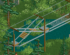
Whilst the Toverland-inspired park didn't hold my attention for too long, I voted for it on the basis that it was something a bit different and for the most part, was executed really well. The GCII didn't grip me too much - really like the rope wires course though (haven't seen that done before) - and the whole indoor section, with each separate building have a theme, was nicely pulled off. Good stuff.
Anyway guys still love the parks. Not the Belmont or the testament that we were expecting but both have precise visions that have been pulled off well. Plus complete parks.
Download the park, alright for people with LL i understand but people now are just getting lazy. i always download them, thats why i have over 12000 objects in my objdata folder. Maybe thats why people don't download parks, they dont want new objects.
try the 35,000 + i have
Travis, do you actually even play RCT?
I mean, between bong hits and shit.
Why does this guy always think my name is Travis and that I smoke?
Edited by Wanted, 22 July 2009 - 11:01 PM.