Park / Dream World Indoor
-
 17-July 09
-
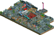
 Dream World Indoor
- Views 27,122
- Downloads 1,441
- Fans 3
- Comments 63
-
 65.83%(required: 60%)
 Silver

Kumba 75% RWE 75% Scoop 75% G Force 70% WhosLeon 70% CedarPoint6 65% Cocoa 65% csw 65% Ling 65% chorkiel 60% Faas 60% Poke 60% Xeccah 60% posix 55% 65.83% -
3 fans
 Fans of this park
-
 Full-Size Map
-
 Download Park
1,441
-
 Objects
332
-
 Tags
Tags
![park_3324 [H2H7 R1] Circus Circus & Adventuredome Atlantic City](https://www.nedesigns.com/uploads/parks/3324/aerialt2970.png)
![park_4134 [H2H8 R5] Romon U Park](https://www.nedesigns.com/uploads/parks/4134/aerialt3926.png)
Congrats on making it to the post-season guys
inVersed Offline
First - I don't like the name. haha ^^ There wasn't either a real lake or river in this park, so it was a bit confusing. The invert was clearly the best ride in the park. I especially liked the batwing and the dives under the station. Really good work. What I didn't like was the missing BBS and the sloppy hacked backbone. You should have lowered the monorail 1/2 unit with object manipulation, same goes for the bobsled under the log flume. It just looks better. The archy was good in most places, I especially loved the station of the invert, and the area around the fountain. The other buildings didn't really fit the theme, if there even was one? I can't really tell. The woody wasn't that bad, but still I didn't like it that much. Only good parts were the dive under the bridge and the twists and turns after it. The giant signs looked good, although the poison sign didn't make sense, as it was not anywhere the entrance as the other sign. If the park was build in the same quality as the area around the invert it would have been much better, this way it looked rushed IMO. Good work, though!
Dream World Indoor:
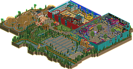
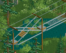
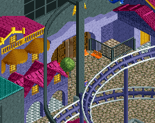
I immediately recognised the inspiration for this park and I must say it was executed really well. I loved the outside of the park, the parking lot, the signs and the bicycle stands (important for the netherlands, eh? ^^). The entrance sign and building looked fantastic. The first hall had a nice dreamy atmosphere. The stars totally fitted the theme. The coaster was solid, although it broke down a bit often. The trees inside and the hopper ride were also a nice touch. I liked how the coaster interacted with those. I liked the colorful seating areas, the playground and the RC boats too. Good job on that. The archy looked also good, although a bit repetive in some places. I wondered why the coaster in the second hall was closed. I'm not so sure about that one, I think 1-2 more inversions would have made it better. But those path interactions were great again! I liked how the hall was divided in some sort of good and evil place with the sun and thunder storms on the other side. Nice idea. The villa fiasco-style ride was a nice touch. This hall looked a bit bare compared to the other I must say. The flying ride was also really nice and added a lot to the park. The outdoor area was nice too, although a bit crammed. This area has written Toverland all over again.
TroySparta has a nice twisted layout and only a station fly through was missing. The last highlight for me was the Survival parcour. Really great work with that. I like the minigolf idea to make it peepable. Thanks for giving me a throwback to my Toverland visits with this one! Good work!"MFG"
invert looks pretty familar...
Edited by Nokia, 18 July 2009 - 09:01 AM.
The other park was by no means a slouch, an excellent invert and a good woodie. It just had nothing too special about it.
Wait, you mean it isn't named Toverland?
Flying Germans park was nice as well, but didn't understand the survival ride...they walked around?? and it seemed the parking car thing was just to use up a lot of space...I don't know...the park just didn't make me smile as much as the other park did.
AL - The invert was far too pacey to be enjoyable, though I thought the layout was quite good, the train is just going too fast through it. The monorail track could have been left off really, unless it's lowered to the proper height. The woody had an okay layout imo, not overly spectacular. I thought too much of the woody was unsupported, and I'm really just talking about the bit that goes over the path. I know it's diagonal track, and it's tough to support, but perhaps that's a design flaw then.
FG - The coasters were pretty meh, as in the AL park, but I thought the park worked together as a whole, and it managed provide a different experience than most RCT2 parks, so quite simply, that's why I'm voting for it.
Good effort by both teams even though the match is meaningless (in my eyes).
Edited by LDW, 18 July 2009 - 04:11 PM.
Edited by jaguarkid140, 22 July 2009 - 06:41 PM.
FK
Judging by everyone's reactions its safe to say that a certain someone will be the second player in H2H history to have 6 wins...
However, while the atmosphere might be so brilliant, the park didn't offer much entertainment. I watched the coasters, looked at the architecture and tried do discover cool signature details. There were very few unfortunately... I was done with the park in literally five minutes, that includes the time I was deconstructing the park to see if I missed anything.
Actually finding out the meaning behind the name took me longer. The park seems to be inspired by some music album by Dear Hunter. I don't feel like reading the whole story so I don't know if the music helps the park to make more sense. Including a readme could've been useful here...
While the AL' park has a stronger atmosphere, I think our park offers more details to discover. I understand this may be a hard choice for some people!
Good atmosphere, good architecture but not really much to see.
Dream World Indoor:
Reminds me of Toverland. Good atmosphere and a good architecture. I didn't like the hall on the left though. Mainly because of the tan path. The architecture was't too impressive either. Exept for the building to the right of the topspin.