Park / Supreme Field
-
 10-September 23
- Views 1,899
- Downloads 232
- Fans 0
- Comments 16
-

-
 59.50%(required: 65%)
 Design Submission

Mulpje 75% RWE 70% In:Cities 65% Camcorder22 60% G Force 60% pants 60% Recurious 60% wheres_walto 60% CoasterCreator9 55% posix 55% ottersalad 50% Scoop 50% 59.50% -
 Description
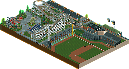
A loose interpretation of Lakemont Park and its' interaction with the neighboring Double-A Altoona Curve Baseball Stadium.
Coaster inspirations include Leap The Dips, Skyliner, and Crystal Beach's Giant Coaster.
Winner of the Side Friction Coaster Contest for DKMP (RCC 53, Score 8.81) -
 No fans of this park
-
 Download Park
232
-
 Objects
2
-
 Tags
Tags




Summary: Absolutely phenomenal build. Super creative object usage, and everything is well executed.
Positives: Great use of jazz man. Exterior of stadium looks wonderful. Coaster painting scene is really cool. Pathing is well executed. All the baseball tricks (running the bases and home run ball) are so cool. Diagonal lights are epic. Coaster layout looks great. The ceiling on the enterprise is great. The signage is some of the best I've seen.
Neutrals: While the layout looks great it's a bit fast to me. And I think the supports are cool, but for me they're not really an improvement over the base supports being augmented with some additional posts/support structures to justify the amount of work done on them. That's just a taste thing. The stadium lights are cool, but I wonder if another row on either side of lights would have looked more realistic.
Room for improvement: Only negative for me is the scene inside the stadium is a bit dead. Some fans walking around buying hot dogs in the stands or a beer garden or something to make it more lively would have made that area pop more for me.
I gave it a 90. You are one of the best I've seen at object usage and signage.
Having been to Lakemont and an Altoona Curve game this was a lot of fun. It's an interesting fusion and I'm impressed with the custom support work.
This park really is well done. As someone who worked part time for a minor league baseball team during the summers, I can relate to this on a personal level. The side-friction is also extremely well made with the signage and custom supports. It might be a little bit fast in places, but it doesn't crash, so who cares! Am I right? I agree with the comments about the stadium feeling slightly static. Maybe you could have added more paths for the guests to walk on in the flat concourse areas? Either way, nice work, and I hope you submitted this as a design.
This really nice and shows a lot of potential, love the Lakemont inspiration too.
Overall falls a little short of design for me though, the coaster, while well done, isn't particularly interesting or unique enough in my eyes. I do like the supports, but other than that it's a pretty basic layout.
I think with a little big of expansion and a little more interesting of a coaster you'd have a real strong Design. So hopefully we see more from you.
I like this a lot, but I find myself wishing it was more of a fully-realized park. I'm not sure the layout is quite strong enough for Design, personally. I do absolutely appreciate the inspiration behind the coaster, as I love the style and era quite a bit.
Appreciate it dude!
Glad you liked it, especially since it is close to home for you!
Thanks! always neat to hear when it hits someone on a personal level
I think these are fair points, I do think the contest requirements may have hindered me here. It does however make me wonder if a strong design is possible with this coaster type. That being said, i'm glad you guys liked what was there.
I like the coaster and the enterprise. The coaster felt like it could go off the track at any time and the enterprise is well themed. The baseball game was interesting but since it's so incomplete it ruined it a fair bit.
This was a nice little park, the in-game construction is much more interesting than the overview suggests. I'll always be impressed by DKSO conventions, they feel so foreign to me
Thanks for the comment, i'd be curious what you would suggest to make the game more complete apart from what was mentioned above.
I agree that the overview feels deceptively boring haha. I'd be curious to hear what feels very DKSO-esque despite the object list not containing any actual recolorable NCSO.
Really interesting idea here and some cool detailing with trackitecture. I think judging this as a design accolade, the coaster just doesn't do much for me. Very basic layout and the supports don't look aesthetically pleasing at all unfortunately. Having said that, I agree with Walto and the others that the object usage is unique and I applaud that. Wish it was a large slice of a park.
As someone who submitted a shuttle loop as a design, at the end of the day it's a side friction coaster.
Technically very well executed but not a lot to see. Maybe we're just spoiled at this point haha. I think you've done an outstanding job with this. Coaster is nice and the enterprise station is super unique. Baseball stadium is very clean. Overall this is a great little map!
This is exactly the brand of realistic NCSO I hoped to see more of back when I switched to Open 7 years ago, and even though we only see a snippet of the entire stadium, it is nonetheless a very convincing rendition of a minor league ballpark - you could have built the entire thing with just vanilla objects and it would be some of the best NCSO realism we've seen in years. Something about the nostalgia of an old-fashioned wooden coaster hits a chord that's so harmonious with baseball that placing one next to a ballpark seems as though it's returning to nature.
As this was released while I was away from RCT, I managed to avoid the minor existential crisis that would have occurred trying to score it properly. Would I have scored it as being Design-worthy? What would have held it back for me? Who knows? I'm not going to spend much time thinking about a number when I can just enjoy the map for what it is. I love the overview, and I love the zoomed in parts - the stadium has great form, the brand signs on the walls are perfect, the coaster is exactly where it needs to be, and it feels like a real place overall that I would want to visit.
Ultimately, it is probably the limited map size that held this one back panel-wise - not only is most of the stadium cut off from view, but the coaster is right up on the edge of the map on two sides, with only a parking lot edge on the third. There is not much room on or around the path for anything other than the coaster and the enterprise, so that area may end up feeling more bare than it would on a map with a larger path layout simply because it takes up a larger percentage of the map. If you had had the option to expand the map on the leftfield side, the parking lot side, and the side with the coaster's first turnaround (10-15 tiles in each direction), I believe you could have given the "theme park" area more context while allowing the coaster to become the centerpiece. And with the quality of that stadium, anything you would have placed along that hypothetical path would have been amazing. The form is so beautiful already, I believe a little bit more content would have pushed it over the threshold.
As for the question of what would turn a side-friction coaster in a realistic setting into a strong Design, it would generally boil down to the surroundings being as realistically relatable as possible. Even though it is a regular woodie, the boardwalk rendition of Woodchip by alex and others is a good example of one where the coaster is the dominant feature of the map but the surroundings are what really elevate it without being separate features altogether. Yes, it would be more difficult within the confines of DKSO (or NCSO with base-game objects only), but what would be the fun of having such limitations if we didn't get to push them in the first place?
I want to reiterate that I think this is stylistically wonderful, and I hope to see more of your take on realistic NCSO or DKSO regardless of whether you use recolorable WW/TT objects (but I do prefer the recolorable expansion objects to the original versions, mainly because my WW/TT discs have been missing for a decade). Even though I've always loved NCSO, I've grown to like the expansion objects recently as well, and you're certainly one of the builders who has helped me enjoy them more.
Appreciate the review Terry! I certainly am looking forward to working on more sizable NCSO projects in the (hopefully) near future.