Park / Scenes of Georgetown
-
 10-September 23
- Views 1,981
- Downloads 258
- Fans 0
- Comments 16
-

-
 69.00%(required: 60%)
 Silver

pants 75% RWE 75% wheres_walto 75% Camcorder22 70% chorkiel 70% CoasterCreator9 70% Mulpje 70% Recurious 70% Xtreme97 70% posix 65% Cocoa 55% G Force 55% 69.00% -
 Description
Sometimes, art imitates life.
Please consider viewing this park on the latest release version of OpenRCT2 as well as the OpenGL drawing engine if you are able to. Also, please consider enabling in-game music.
Hoya Saxa!
Logo by Scoop -
 No fans of this park
-
 Full-Size Map
-
 Download Park
258
-
 Objects
1
-
 Tags
Tags


Really liked this, Rob! I thought the scale of everything was great and there are so many great little details that really bring it to life. Those two brick towers might be my favourite part of the map. They're simple but clean and very effective. That library is wonderfully ugly, it's so fun to see buildings like that rendered in rct.
Wasn't as crazy about all of the grass trim pieces around the brick paths and the diagon alley hedges. The textures clashed a bit with the natural tones of everything else. Also thought there was a slight over reliance on the base game 3D signs. Thought you could have found some slightly more creative alternatives that didn't have that flat, bulky background. Those are really just nitpicks and I found the overall map to be a real success.
I'm already highly anticipating your next project. Hope things are going well for you this semester!
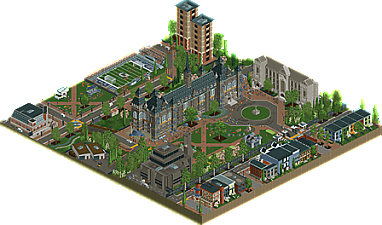
Did some google earth research and from looking at it this does a great job of capturing the look and feel of the area, Healy Hall is a great centerpiece. Also the library, a really good take on brutalist architecture in RCT.
A lot of good scenes too, really adds some life to the map, also the motorcade going by was a nice touch.
Pretty nice! Nicely done recreation.
I commented on an incomplete version as a tester. I like how you changed up the rock pillars on the main building. The buildings under construction on the left side look good though it's clear that you're working with limitations of objects and there's a little bit of skew as a result. I like the chants, the soccer game, and all the architecture is neat. Nice map even though it doesn't have any rides.
Neat idea for a map, I haven't seen too many like this. Lots of nice little details to see, the chants were interesting and the soccer game looked fun. I sometimes found the chant drowned out by the car chase noise which is an easy fix by changing the ride type to one of the quiet unknown ride types. For the most part the buildings are well detailed, although a few are perhaps a bit out of scale, or might have some suspect object usage on occasion. I really liked some of the custom vehicles you made, like the food truck and the garbage truck, though kind of chuckled at the miniature box truck behind the latter.
Nice map that held my attention for a lot longer than i was anticipating, seeing as it didn't have any rides. I think more maps of this style would certainly be a good change of pace from the norm.
I really enjoyed this, great work! I don't know the place personally but i feel like this must be really close to the real thing. the architecture and atmosphere was obviously really great, but the liveliness and little scenes throughout really elevated this to another level.
personal highlights for me were: the football game, the library (my uni in england had a really similar feeling one), the curved flowers were really nice, the stolen golf cart, the towed car was really clever, just lots to really like and see.
feel like the little extra bits really kept my looking around for way longer than i expected, and make it feel like it's set in a real place and time in a way i really like. also very much like the palette.
great work!
I quite liked this. It hits the notes that have become signature to your style (well-scripted in-game events, relaxed settings and moods) and feels very personal to where you're at in your life right now. Great stuff Rob
Cool stuff here, some lovely buildings here with some cool details added. Don't know the place, but it feels very real. Nailed the vibe. Laughed with AJ getting towed, lol.
A very impressive showcase of your architectural skills. It's nice to see how much you seem to enjoy this aspect of the game. Many people do, but I think it's quite clear you have an eye for adding nuances that capture more of the source material. A lot of authenticity was achieved here.
The concept of a town scene maybe made it hard for the park to be interesting enough beyond the impressive stylistic accuracy. I enjoyed the little things you added, like the Biden cars. But to me these things are still more in the gimmick category, and don't fundamentally elevate the work. Making a non-park is nice, but if you're not interested in rides or coasters to be attractions, what else can be? I feel like this could sound a little unfair to what is a really lovely submission. I hope you know what I mean.
posix, on 13 Sept 2023 - 10:31 AM, said:
I guess I sort of know what you mean, given this is RollerCoasterTycoon and all, but don’t seem to recall such criticism from you in many other non-parks we’ve seen recently, such as the ones from Babar or walto’s Ohio Stadium (another University recreation). If what you mean is my park specifically doesn’t have a lot to offer content or execution-wise compared to those other non-parks, then I understand your opinion more. But I’m not sure this is what you meant? It’s just a little confusing to me, and feels a little unfairly targeted.But in any case, I really do appreciate the comment and the comments from all the others as well. I know we’re all busy people so I really do thank you for taking the time to give me some feedback.
Such a sweet release D3! What I mostly love about this park is that there's so many different architecture types being shown: from the brutalist library to the row of colorful houses, all buildings felt unique and well-executed. I especially found the following 2 buildings very nice:
While I didn't know anything about the Georgetown University prior to this release, the "college feeling" was very much present because of all the little details. The garbage truck is fantastic, loved the use of the path add-on objects as fallen blossom leaves and I would definitely get too attached to the bouncy castle haha. Great work!
Ive never been to ths states but this park has U-S-A written all over it. Impressive work in a lot of aspects of the game from you, Rob! I especially really like the architecture as well as all the little scenes you created in this to make it feel very immsersive. Also these really helped to make me look into this for longer than a few minutes: Crucial thing for non-parks!
All in all a great submission that shows you are a well developing player people should watch out for! Good job!
this is a lovely slice of life. some nice archy and moving parts. perhaps a bit of inconsistency in scale and detail of buildings, but wholesome content all up
This was so good! Immediately reminded me of getting lost there over a year ago. Captures the university and the area well
I got to see this right before it was finished, but I didn't get a chance to express my full appreciation of it in its finished state until now. You did an excellent job here not only incorporating so many different distinct architectural styles into one small map at once but also tying everything together realistically to create one of the most relatable slices of American life of the past few years, and that includes an entire GT round themed to this country. Of course the centerpiece building is the architectural highlight (as is the real Healy Hall), but the way you've placed everything so harmoniously around it is what truly allows that building to pop in such a lifelike way. Getting the details right here was not simply a matter of quantity - you are instinctively adding the right details in the right places, and this is a key component of building photorealistic recreations that truly feel like real places.
2023 was a landmark year for your growth as a builder, and I'm very grateful I got to see some of it unfold in real time during the Belgium round, a building experience that I will always remember very positively. You literally started with a bang in MM, and then you churned out three increasingly good small parks over the summer, acquiring three new accolades under your belt as the lead builder, culminating with this beautiful tribute to your alma mater. These releases have proven your abilities to be strong in creating (and recreating) detail-rich environments as well as cementing you as one of the best in the game when it comes to time-based scene direction. For when you find the time to build again, I am greatly looking forward to everything you create when that happens. A full-sized map with the care, precision, and dedication to the subject matter with which you produced Georgetown would be something truly special.
Thank you for your very thoughtful reply, Terry. It was a joy building with you during the Belgium round; it was undoubtedly the highlight of this year's Grand Tour for me. Wishing you (and everyone else) all the best.