Park / expo 77: Ethiopia Pavilion
-
 14-August 23
- Views 15,377
- Downloads 220
- Fans 0
- Comments 30
-
 No fans of this park
-
 Download Park
220
-
 Objects
20
-
 Tags
Tags

It can be.
https://elevenlabs.io/speech-synthesis
what on earth
Pretty undeserved joke in my opinion.
I think it's really nice to read about the entire history being the park. Feels like watching a behind the scenes documentary about a movie and I am a sucker for those.
I liked the write-up, always like when builders post a BTS like that. Was a wild ride, I remember seeing previews and really hoping it got finished as I thought it was promising (And it really impressed me in the end), and I was happy when it did. Also building with limited internet access and sketchy set-ups is pretty relatable.
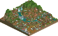
The story of my park was basically just me deciding if I wanted to enter or not, making a couple of weak failed attempts at an entry in RCT2 (One of which I made a scenario out of), then rush building my LL park in like 2 days, then spending another couple trying to improve it. Like replacing a bunch of filler foliage with more mechanical or concrete details around the plant, adding the dam and also last minute color changes to try and make it fit the theme more.
Also, Congratulations to Liampie and Turtle on taking the win, Yirgacheffe is a great park that has a lot of my favorite things from mid-2000's building with some nice use of modern objects.
Also Gustav:
"The single most stressful and involved RCT grind of my life and it's going to result in a pathetic finish that undermines how much went into the park. Is this going to be my legacy? Am I going to be that walking punchline known for putting his all into contests only when the competition is completely insurmountable? Am I blowing my one chance to really show the rare genuine support from a community I'm involved in isn't in vain?"
With nuggets like this I don't think the legacy will be the parks you make at all. It's just a rollercoaster game, dude
Nice park though, and proud of you for finishing. Keep walking the walk instead of talking the talk!
I remember my laptop had issues with internet in the past and I thought "If Lurker can do it then so can I." One detail I left out; my laptop literally couldn't connect to any network due to an issue with the OS (thankfully fixed with a quick restart) so I had to save the park to my phone and upload to NE through there! Also pretty crazy your park came together in just four days considering it's some of your best and most unique LL yet.
That's the stupid part. There's so much that keeps popping into my head against my own will and believing it just turns me into the person I'm already freaking out about becoming. It's messed up and I should kinda stop doing that. Thanks though, happy I could buckle down and finish this thing.
Alex - Expo 77 Ethiopia Pavilion:
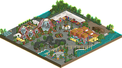
This park was great. Probably my favourite entry from you so far. I absolutely love the architecture, it looks really cool. I love the colourful awnings that you used everywhere and I like how you managed to make something which looks good with relatively simple shapes and forms. I also really like how you managed to implement the coaster with 7 enclosed section requirement. I thought this was implemented in a really clever way and that is why I voted for your park in the objective category.
Gustav and V1 - Birth of an Ocean:
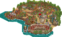
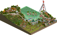
First off all, this park looks really cool in the overview. Definitely the best looking park from a zoomed out view. I thought the coaster layout was cool, I especially like that banked turn/helix at the edge of the cliff. It interacts nicely with the path and terrace below. While the landscaping was cool, I did think it looked a bit unrefined and blocky in places. So if anything could be improved I think it would be that. The last thing I think could be better is that especially on the "middle level" of the park the details are lacking a little bit. This section of the park looks very monotome and I would have liked to have seen more stalls and details here to add some more life and colour to this section. Despite my two critiques this was still a solid entry, so great effort!
CC9 & Milo - Dallol Maar
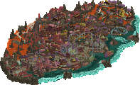
This is a cool entry with lots of fun stuff to explore also. I liked all three coasters, the idea of a shuttle mine train is cool to me. I also really liked the section of the invert which went through the valley between the two rock hills. I do think that in places the park looks a bit messy with a lot of clashing textures, but maybe that is just because it is LL.
Josh and RWE - Ethiopia Action Park
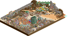
This entry is great! I was really impressed by this. Glad to see an RWE entry and I think this is some of your best work yet! I love the custom music, thought it was pretty funny. The city outskirts were beautifully done and the park itself was well done as well. I like the little yellow truck near the coaster entrance and I also love the landscaping. If I could have one critique I would say I would have liked to have seen a bit more content in the action park itself. It feels like the park doesn't really have too many attractions and it feels a bit lacking in that way. Overall a great entry though, top 3 for me for sure.
Lurker - Hydro harvest
It feels a little bit hard for me to judge this park as I couldn't see the LL textures and this park seems to rely on those quite heavily. So I don't think the park shows up correctly for me. Despite that I did enjoy watching this park. My favourite bit is the wooden rollercoaster which is great. My critiques would be the following: I think the area near the hyper coaster is very busy and a bit overwhelming (but this could be because I am missing the LL textures). My second critique is that this park did not at all remind me of Ethiopia. The concept is cool though.
MK98 & Hydroportal - The legend of Memnon
Looking at the overview I did not expect too much from this park, but this park actually ended up being one of my two favourites! I really love this park and I think it is actually a tad underrated. I feel like this park deserved more votes! I absolutely love the landscaping and all the architecture, looks really cool and uses half diagonals in a tasteful way. I thought the two inverts were really cool and I love the two big stone statues! Also love the little waterfront area near the invert loops. Lastly I love the underground section of the coaster near the corkscrews with the towers sticking out through the path. This entry deserved to be higher imo and for me it was my shared favourite entry. Great work MK98 and Hydro!
Liam & Turtle - Yirgacheffe
Togther with the entry from MK98 & Hydro this was my other favourite entry. I think this entry is very refined and beautifully composed. The mine train is great, I love how it weaves into the landscape and into itself. The arch bridges stacked on top of eachother works very well and creates a nice layer effect. Architecture was stunning everywhere. The only critique I have is that the texture on the green rocks/cliffs is a bit repetitive in places. I think that could have been done slighlty better, but that is a minor complaint. Overall I think this entry was really strong with high quality, so great work.
General thoughts
Overall I liked all the parks in this round a lot more than I thought I would. There wasn't really a bad entry in this round and all parks had things to like. Great work to everyone involved, I enjoyed watching these parks!
The Legend of Memon
This map is very fun to explore, lots of great composition. A really lovely balance of colors and architecture all around. THe grid braking efforts are excellent here and the cutaways are also really well composed! Instead of doing a wall of text, I will include bullet points for other things I liked.
I love the wildmouse haha
The layering with the tops of buildings appearing above ground is ridiculously cool
Phenomenal diagonal and half diagonal work!
The duelling coaster is very awesome.
The main town area has lovely shape and architecture and it fuels to the overall sense of exploration with this park looking at it from different angles
I really like the crops/rows of foliage motifs
The station for the duelers is epic
Yirgacheff
Really fun an experimental macro that I love. THe overall look of this park is so so fresh. The landscaping is excellent throughout, really creative solutions for the different resource representations and plenty of exciting/ unexpected vignettes. What I really like about this park is that with everything being unique with this theme every piece of architecture is intriguing to me, be it the city scape or the ruins. And it all works together really well for a strong unique vibe
Other stuff I like
Massive mine train! Love to see it, so many crazy elements too.
The sort if ne-ufsion-y glass acecntuated architecture by the river rapids is so good.
The river rapids itself is so good
Love the dam. It helps mark the verticality of the overall composition I really appreciate as well from other angles
And plus one for that super clean waterfall!
I like that the trucks are themed to shipping stuff I feel like that hasnt been done before it;’s usually just “:vintage car” themed.
In love with the geometric complexity of the mine train coaster ruins
The minetrain coaster interacts with itself really well too!
Ethiopia Action Park
The color gradients are to die for, really excellent use of the resources theme. THis park is full of so much life and color for such an extremely industrial concept. It just feels so scrap-punky and fun with this hybrid coaster and all the quirked up rides. The infrastructure is so good, all of the micro details just add so much atmosphere
Other things I liked
The hotel and the hotel sign are stupendous!
The landscape colorrssssss
I really appreciate stuff sort of in motion real life like the construction sites and the weird scrappy set up race thing with the top thrill dragster sign lol
The springs are so clutch
The aerial of ombezi included in the park, twice the content!
This gas station is particularly well done
Noticing more of these advertisements from josh on this view haha
Train station is fire with some nice little touches like the switch track stuff . The facade is also beautiful!
Birth of an ocean
Beautiful colors! This landscaping style is so well done here, I could stare at it fo r a while. THe overall macro with the layered look around the other views is unique and super interesting to me. It has a great sense of exploration that I liked about the egen of menmon as well.
Love the storytelling a concept, as well as the intro scene. Sets the stage well
The gren water is a nice choice
The temple entrance facade is sick, such great texturing and small details.
The tents bring a lot of nice color to the main plaza
The headline coaster is so sick, the layout is absolutely nuts
The underside of the rocks into the fade is a sick visual effect
Dallol mar
If there was a round i think best suited for ll i would say this. The execution of it here is extremely well done. All of the coasters are really lovely LL with really sweet interactive elements. I love the reverser coasters theming around it, all this mine theming stuff just works ridiculously. There are some really excellent setpieces, you guys displayed some serious LL mastery here tbh. LOts of excellent and inspiring ideas
I love that coaster station and the coaster itself. O awesome to see reverser in the building! Lets get all reversed up man
Side friction i mean. Also whatever is going on here with the glass is so cool./
The go karts with the GAS PUMPS is perfect. The parked carts too
All this mining theming works so well
I really like the use of open space here man. Thats where ll works best
The map is super well peeped!
Hydro Harvest
Man I love this kind of LL. City of dreams is so sick. THe big mega mechanical city is probably my favorite breed of LL in general. SO colorful and fun and full of life! Really excellent entry, might be my favorite from you in this contest!
This industrial mega structure is really sick!
This dam is well doe, the glass motif is really fitting for the industrial vibe
YThis wooden coaster is water tight and really great!
I like the wood fort area by contrast to the industrial area. It allows the bright colors nad mechanical stuff to pop but it offers a nice relaxing escape,
Expo 77
This might be my favorite expo of the whole contest. These concepts and executions are insane! The overall color palette is excellent and I love these yellow awnings so muhc. THis thing is just really well put together, I am excited for this full release!
Stuff I liked
The spiral lift coaster and the water fall details is really sweet. I also love this architecture concept in general, stupendous
The crazy pattern awnings are incredible, I love them very much. One of the coolest vignettes of this entir contest
The walk through minigolf exhibit thing is yet another stroke of brilliance
THese large glass structures and the wayy you incorporated the ethiopian flag colors is chefs kiss.
And interiors on the glass structures to boot, they look so so good.
The outdoor section of the glass egg exhibit thing is another one of those things where Im like “dang, thats awesome you thought of that
The backstage stuff is sublime too