Park / Amras Telrunya
-
 06-September 23
- Views 3,195
- Downloads 332
- Fans 5
- Comments 21
-

-
 80.00%(required: 70%)
 Gold
Gold

bigshootergill 85% no pants 85% no Xtreme97 85% no Camcorder22 80% no CoasterCreator9 80% no Liampie 80% no ottersalad 80% no Recurious 80% yes Scoop 80% no G Force 75% no posix 75% no RWE 75% no 80.00% 8.33% -
 Description
So this is it, my first project I have spend more then over 900 hours of work in. This park feels like everything I ever wanted to get out of this game. Those 900 hours are mostly me learning to use CSO. I also had to rebuild the first area because this project started as a NCSO park with a custom palette (picture's will be shown on discord when the park comes out)
The fantasy genre is something I hold with a special place in my heart and this park is all those ideas and imaginations thrown into one big product. After putting in some much love, energy and time into this park I really wanted this to be my own personal achievement of all those hours put into one product.
This park was made out of love for a genre, in a game that I play out of nostalgia, for a community I think is worth all the effort.
Their will be a story off all the different inhabitants of this land that provides some backstory. Its not a must read but it can be helpful to understand what is going on.
Special Thanks to posix, J K and Hobeon for helping me during this project! -
5 fans
 Fans of this park
-
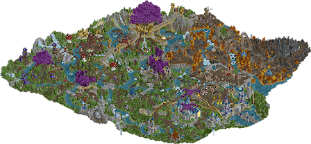
 Full-Size Map
-
 Download Park
332
-
 Objects
2
-
 Tags
Tags


I still owed this park a proper look and review, for large scale fantasy parks are quite rare!
- The entrance is a delicious start. Beautiful colours and stylistic touches. Turret overload, in a positive way. Great subtle use of half diagonals. The yellow crystal sculpture behind the entrance also looks great.
- The village that comes after feels like it’s straight from a video game, and I don’t just mean RCT2… Exceptional atmosphere. I think the village is too sparse, though. Buildings plopped down on a sea of path, it rarely feels like you are walking actual streets. No biggie.
- The horror area is very good. I don’t love the coaster, it meander too much… But I applaud the custom supports job you’ve done, that adds a lot! Excellent foliage too. I like the coaster’s station, but maybe Christian architecture feels a bit out of place in this high fantasy setting. Another standout moment for me is the windmill scene, with the purple flowers, the smoke rising from the ground, and the hysterical dancing peep. This is quite haunting.
- I’m rarely a big fan of big trees and this is no exception, it’s hard for me to grasp the geometry and I’m just looking at a big purple stain on my screen. Having one giant tree be overtaken by fungi is also a cool idea. The toadstools look great, and the added detail of spores raining down is very clever and unique. The architectural elements are again very nicely done, and I’d like to point out the rapids station here.
Some pros and cons:
+ Foliage
+ Architecture
+ Colour schemes and visual motifs
+ Scale! It’s large and I love it!
+- Ride design. Your coasters aren’t your strongest point, though the theming can carry them. There’s potential here.
- Generic fantasy theme, collage of genre cliches
- World building a bit incomplete? Not everything needs to be explained (windmill scene is perfect) but the world you crafted is not really becoming alive for me. A lot of the time I don’t know what I’m looking at.
- Did you use the scenery manager a lot? That tends to mess with animated objects. Quite a few waterfalls and other animated things were frozen for me.