Park / Amras Telrunya
-
 06-September 23
- Views 3,195
- Downloads 317
- Fans 5
- Comments 21
-

-
 80.00%(required: 70%)
 Gold
Gold

bigshootergill 85% no pants 85% no Xtreme97 85% no Camcorder22 80% no CoasterCreator9 80% no Liampie 80% no ottersalad 80% no Recurious 80% yes Scoop 80% no G Force 75% no posix 75% no RWE 75% no 80.00% 8.33% -
 Description
So this is it, my first project I have spend more then over 900 hours of work in. This park feels like everything I ever wanted to get out of this game. Those 900 hours are mostly me learning to use CSO. I also had to rebuild the first area because this project started as a NCSO park with a custom palette (picture's will be shown on discord when the park comes out)
The fantasy genre is something I hold with a special place in my heart and this park is all those ideas and imaginations thrown into one big product. After putting in some much love, energy and time into this park I really wanted this to be my own personal achievement of all those hours put into one product.
This park was made out of love for a genre, in a game that I play out of nostalgia, for a community I think is worth all the effort.
Their will be a story off all the different inhabitants of this land that provides some backstory. Its not a must read but it can be helpful to understand what is going on.
Special Thanks to posix, J K and Hobeon for helping me during this project! -
5 fans
 Fans of this park
-
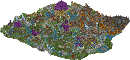
 Full-Size Map
-
 Download Park
317
-
 Objects
2
-
 Tags
Tags


So excited to download this and check it out! From the overview it looks epic!
wow this is super gorgeous, your style really blossomed through this. it looks like you got better as you went and i love that! The opening coaster is classic. I like how the village to the right is rather dense compared to the open forest on the left. that lush foliage is great! The golden fruit flat is cute.
The hybrid coaster is my favorite in the park, i think the supports are great. it flows super well and it highlights the environment its in super well. The wrap around the tree in the garden was spectacular. I really enjoyed that there were several of them across the park too! Plus that all black church and graveyard is super committed and i love that stuff. That windmill with the pink flowers is my favorite spot in the entire park.
The large af Vermillion Swarm is really impressive, i do think your ride deisgn is cool and inspiring but i wish the expressive lines could include a bit more satisfying pacing for the trains. But this mushroom village is super fun! I wish there was one huge one!
lol always looking forward to any new mulpje!
You know how I feel about this park already but just wanted to leave another review haha. We've seen you experiment with CSO in H2HC and MM23 before, but I would classify this as your break-out CSO release. The market area behind the entrance is great and it wouldn't be a Mulpje park without some insane looking custom trees (wish you would've used some single rail coaster track for the roots here and there to diversify them a bit but that's just a personal preference). The fairies flying around the river rapids and central tree is such a neat detail but really adds to the interaction and immersion.
One thing that holds the park back for me are some of the coaster layouts. The gold entrance coaster is awesome (those supports omg), but "The Vermilion Swarm" felt too spread out which indirectly also made the first part a bit too fast for my liking while "The Raised Dead" lacked some of that RMC punch and felt like it focused too much on turns. These coasters are for suuuure better than some of the ones you made in the past, but if there was one thing you could work on for a future release is improving those coaster designer skills. Then you'll become unstoppable.
This is one of my favourite windmills ever. The half diagonal works so well here!
While the shading for the left cave could've been a bit better, I do love these lift hill supports.
I recommend everyone to check this area out in-game as the effect here is so cool and the picture won't do it justice. I could go on about things that I love or nitpicks that I found, but truth is that this is a fantastic park periodt and something to be really proud of. Congrats on the great release Mulpje!
Beautiful work here Mulpje. Love what you've done with this fantasy style, really brought it to a completely immersive setting. Since you and I are on the same page when it comes to building styles, I obviously love everything you've done here.
A few things that stand out:
- Scraping the normal coaster for supports for something fantastical and whimsical... and they're aren't just functional supports, but they're beautifully crafted that add so much charm to your park.
- Serious purple tree skills! Mixing trackitecture tree trunks and branches with foliage often (like 99% of the time) looks terrible (which also includes my own attempts haha), but you obviously took your time, trial and error no doubt, to make these giant trees look amazing. Harder than it looks, but you made it look easy.
- Rockwork and foliage is incredible. Not sure we've seen a park essentially made just from Fisch rocks. The forms are top notch, with a nice blending of colors through various gradients. From the large waterfall (which is just fantastic), to the little falls scattered throughout the park, and the great mix of wild foliage, you've gave this park a breathtaking setting.
- With the buildings and structures, you've maintained a style and standard throughout, but none of it feels "samey"... each building has it's purpose, with many size variations. The larger buildings (the coaster stations and the giant castle) really standout, like seriously that coaster station built into the tree is insanely good.
- Um, Quinlan's Quinto's Loop <3 <3 <3
- Your ride selection is so much fun, those coasters are fantasy-quirky, yet have such a nice flow and design to them. Beyond that, a lot the smaller rides are just pure fun, the Golden Fruit twist hanging from the tree, echoing Jens comment, that windmill is everything I've wanted to see in a windmill (not a ride but it's noteworthy!), the water rides, How to Train Your Butterfly.
I've been looking forward to seeing this park for a long time, thank you for your time, energy and patience to bring this creation to life for all of us to enjoy!
Those are a lot of kind words Bsg! Thank you very much.
I wanted to comment on your review purely based on the fact that it was TQOQQ that inspired me to build this park.
So cheers to that man and im glad you enjoyed my park as much as I did yours!
Love seeing a fullscale high fantasy park. A good introduction with the wonderful entrance complex. And the landscaping is amazing, rockwork, waterfalls and rivers, foliage, all so well done. And the use of deco trims is great, consistent through the park, perfect for the theme and varied at the same time, the way the ride's supports are done in the curved trackitecure/curved deco trim style is fantastic.
And of course, the setting. Great atmosphere, some nice backstory and context for everything and some great use of the classic base game music styles.
This is incredible. I love how you integrated the layouts into the overall theme with beautiful support work and inversion elements that tie into the entire magic/fantasy feel in both color and placement. The pacing of the rides was a little fast at times, but I think it depends on how much of a stickler you want to be from a realism perspective. To me, the way they tie into the overall theme felt more integral than what exactly went on in the elements.
The color use is great, and there's a ton to see. There's so much atmosphere here. I always loved your older NCSO builds, so seeing you go all out like this with CSO is inspirational!
Quite lovely, Mulpje. Very fantastical, great world building with very a immersive atmosphere. Spent quite a lot of time just exploring the map and getting lost in it! Highlight for me is the waterfall around the purple portal thing that Jens shared above along with the Butterfly training castle area - that is a showstopper right there!
I might differ from other commenters in that the ride layouts are a bit of a miss for me. I don't think they need to be "realistic" - the issue for me was pacing on the coasters, namely Vermilion, and how your layouts seem a bit strung out. They tend to be stretched out to be able to hit various landmarks and do a helix around them. Both water rides seemed very tame as well. But again, perhaps I'm in the minority here but I think this would be a high 80s park for me if the ride design was top notch.
Regardless, this is quite a park. Congrats on the release, and I really look forward to what you whip up next.
I really loved this. Was initially hesitant upon seeing how closely it mirrors a lot of the ideas from Droomvlucht, but it has so much heart and detail that I couldn't help but be won over. I also don't think I fully appreciated the scale of it until my second viewing! Goddamn this map is big!
The detailing around the paths especially caught my eye. From a peep perspective, there's so much to catch the eye. The small monuments and textures really sell it.
I found myself being drawn back to the graveyard area. The monochrome palette contrasted by the golden foliage is so striking, and those individual tombs are so lovingly detailed.
Like others, I also had issues with the pacing of the coasters. I'm not completely sold on the trackitecture tree trunks and in some places the Fisch rocks were a bit repetitive.
For a fantasy park, the cohesiveness of the layout was striking. That combined with the lovely readme was what really pushed it over the edge for me. Even though I've planted my flag pretty firmly in realism, I think this is a park I'll be returning to for inspiration. Major congrats on the release, Mulpje!
Really unconventional layouts, which suits a full fantasy park for sure. The highlight here is really the diverse, intricate supportwork on bridges & coaster track. I love that each zone manages to feel pretty distinct despite no reliance on classic zone themes.
The mushroom zone was really unique with these huge mottled mushrooms and the spores constantly falling from the bigger ones, my only complaint is the path through there is just kinda empty and it's not big enough to be a feature of its own, it's just kind of a thing happening off to the side of the golden tree fort.
On the whole I don't have much else to say. It does a fantastic job of feeling magical throughout. The little wizard village at the entrance is great, super cozy, maybe a little brown, but makes me think of Hogsmeade.
Finally got a real chance to look at this. The overview was really impressive and immediately feels like unique vision that you executed super well. I have to say the support work and general design throughout the park was extremely cool. The supports on the RMC especially were unique and not really something we've seen before. Also want to give you kudos for the foliage, which I also think is super well done. Felt super natural but also whimsical enough to elevate the theming and park in general.
Maybe would have liked some more classical rides and attractions in the park, it maybe was a bit bare in that department, but guess I can't really fault you for that either. Since the ones you did include all were quite well done and unique.
Very cool theme, and I like your dedication to seeing it through with the supports and the like - really sold the idea and made it super immersive.
You should be proud of this park, and it is a wonderful representation of your style into a full-scale, CSO release. I think the ride design is a step-up from a lot of your DKMP work, which is great. The custom support work on many of the rides, especially the RMC, is great. I do think my main criticism would be that some of the areas feel too vast for how much content they encompass; that is, not enough content. Perhaps some more "life" in some areas would have been beneficial. But I do think your foliage game is on-point, as is your use of set-pieces. Overall great work and again you should be proud!
This is one of the most fundamental and purest fantasy solo releases we've had in a long while, especially outside of a contest. Congratulations Mulpje.
Unbelievably happy to see you get parkmaker off this. It's been a hot minute since we've had a big full-scale fantasy release and this hits the nail on the head. Highlight of the park for me is the huge gold tower going up the tree with the gradient rocks below. So big and over the top and I'm so here for it. Rock that green name king
What a release! I def agree with Posix that this is the purest and one of the best fantasy solo's we'e ve seen here on the site. The whole park feels so immersive, it really pulls you into that fantasy world. Really liked how the story of the read-me is translated into the game.
The eleborate and super detailed coaster supports are crazy. I think the supports of the Arcane gift are the best ones, coaster-wise the RMC is my favorite.
That big tree with the building and path/fences around was impressive, def one of my favorite areas of this park together with the How to train your Butterfly building. Those were super and I enjoyed them a lot. Also a big fan of the foliage and especially the different shades of trees, and the purple trees ofc! Purple trees rock!
Congrats Mulpje, what a park! Def one of my fav fantasy parks.
Congrats to parkmaker and a well deserved gold win, Mulpje! This park shows a very unique fantasy aesthetics that shows a lot of creativity, but also creates a lot of immersion for the viewer. It also shows a lot of technical parkmaking skills displaying a lot of development in your personal style coming from the typical DKMP contest park aesthetics that can be clumsy at times to a more matured style.
The obvious strong point of this is the foliage and landscaping. I also think you did a good job on all the paths work. Also im a huge fan of the RMC both regarding ride design as well as theming. I agree with G Force about the amount of rides in this: Wished it had a little bit more to offer in that regard, but that also shows how good the design of the already existing rides in the park is - i really want to see more from you now!
Oh before i forget it: parts of this are themed to mushrooms it seems. Conceptually weak choice!
I still owe this a review but I'm curious to hear why mushrooms are a "weak choice" for a concept. Seems rather subjective.