Park / Tivoli Utrecht
-
 06-September 23
- Views 3,702
- Downloads 334
- Fans 3
- Comments 25
-

-
 78.00%(required: 70%)
 Gold
Gold

ottersalad 85% RWE 85% Babar Tapie 80% bigshootergill 80% Camcorder22 80% G Force 80% CoasterCreator9 75% pants 75% posix 75% Recurious 75% Xtreme97 75% Scoop 70% 78.00% -
 Description
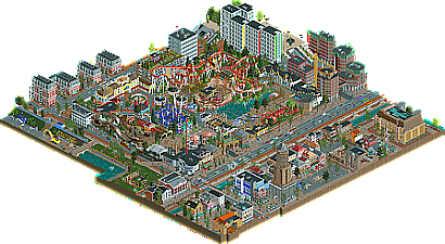
Welcome to Tivoli Utrecht. I have lived in Utrecht for over 10 years now, about as long as it took me
to create this park.
For me this is more than an RCT park, it’s a diary of my life here in Utrecht (and some travels/life events that happened in the meantime), and probably contains tons of references to my experiences here that would go over everyone else’s head. The other ten year journey that is visible is my progress as an RCT-builder. There are parts built in 2011 and parts built in 2022.
Since it’s such a personal, and ongoing project I actually have a hard time releasing this, but every diary runs out of pages forcing you to start a new one.
- Don't forget to check out the readme for reference pictures.
- Special thanks to Gustav Goblin for helping with making some of the traffic work. -
3 fans
 Fans of this park
-
 Full-Size Map
-
 Download Park
334
-
 Objects
1
-
 Tags
Tags


Excited to check this out one last time. I'm a fan of your style and I'm sure this will be no exception.
Ohh now this is lovely. This park is not my usual style of RCT but I very much enjoyed it! The Samurai layout is great and that entrance building feels very fresh compared to some of the more "old-school" style buildings in this park. I noticed that the cars on the Wilde Muis (most of the times 2 at once) were stuck on the block brakes section at the top, probably would have been better to remove a (few) car(s) or to delete some block brakes and hope/pray they never crash into each other lol
Having the text on these posters/billboards be the same color as the trims made them a bit difficult to read, especially the case for the ones with the white trims and white text. I would've gone for a different text color or some spacing of the letters to help with the readability there.
These buildings look great! They sort of remind of the buildings seen in the Bumbly Beach scenario (y'know the ones with the red walls and grey roofs), but obviously looking way better haha
Shoutout to this teapot, so cute
Awesome. Just awesome. Great work in general Faas!
I like it a lot, working on a similar project, your park gives me a lot of ideas, especially for the coasters.
It's dense, full of life, simple but terribly eye-catching. I love these mini rollercoasters and these little buildings all over the park. Always cool to have a readme, I like the way you've captured Utrecht's architecture, and all the little references! A really good park, not the most technical but very creative and personal, that's what matters the most to me.
Ps: I couldn't find the mascot
Nice park
Very nice little park faas. I think you've always been a very strong micro builder, and it shows here, lots of atmosphere everywhere. You mentioned building this over the course of many years, and I think you did a really good job of blurring the lines between the older bits and the newer bits. Couldn't really pick out anything that felt especially dated from an RCT sense, which for something as old as this is quite impressive. Wish it was bigger naturally, but totally get what you were going for, and I think you did it quite well. Both of the major coasters were quite nice and unique enough to really make this memorable. Also all urban surroundings were really well done and didn't feel repetitive, which can be difficult to pull off. Anyways glad we finally got to see this completed!
P.S. glad to see you hiding your queue entry signs in most places here
This is so lively, love the micro scenes and things to explore around the map, the clickable scenes add nicely to that (And help a bit with me being from the US, I know some stuff flew right over my head but I still found a lot of funny stuff). Architecture is varied and captures the look of the city very well in RCT from what I was in the reference photos.
I really like the ride design, great takes on real life coaster with great support work and a nice selection of ride types. Also, I couldn't really tell very easily from the older and newer parts of the park, they're blended quite well and nothing really looks dated to me, really well done considering the time difference.
Congrats on completing this Faas! Lovely park. I think where this shines the most is how well this small Tivoli park fits into a vibrant urban environment. I spent a lot of time viewing the surroundings because of how detailed and lived in the city felt. It's obvious how much this was a passion project. There's a great sense of verticality as well with the added underground bike storage areas and the interiors you peppered around the map edges.
One thing I noticed and made me enjoy this park even more is how well integrated everything is, and what shows this probably the best is the purple and blue slide next to the yellow crane in the "Urban Mistakes" corner of the map. So dense, but it all fits so well.
In terms of the park itself, it's very small, but realistic. Rustschbanaan is such a lovely attraction and been a fan ever since you shared a screenshot of it years back. While the base game flats are a bit simple, you've elevated them with the ornate covers and rooves.
Lastly, the inclusion of all these architectural styles/facades/buildings is quite a fun hodgepodge. I would say as well it's great to see another Tivoli park since the last one was what, 2012? Anywho, great work and glad you were able to share this will all of us.
Faas does legit realism! Gasp! Haha, well you've been heading in that direction here and there, but I guess if this was in the works for 10 years than it's been longer than I realize.
As I mentioned on discord, the entrance is really cute and fitting for a downtown setting. Samurai layout and theming/scenery is totally on point, a compact yet somewhat lengthy coaster with good flow isn't always easy but you nailed it. And it has it's share of authentic Faas details too.
The city setting is very well done. Seems like some of the larger buildings are older work, but it's not over noticeable. The clusters of city buildings are perfectly crafted, you've added just the right amount of details to make them totally readable but not overly cluttered.
Great park, thanks for your endurance to bring this to completion for all of us to enjoy!
OddmentsAlchemyLab Offline
This is one I'll go back to and look at a lot. Amazing realism, inspiring detail and recreations, and a pickle statue. Enjoyed the reference document and using it to tour the park looking for the various recreations - all were executed expertly.
Been looking forward to this for awhile, as I enjoy this sort of urban park. Very Faas-brand realism, which is fun to see. Clearly a lot of passion went into this, and I think it's good that you didn't go through and rework too much over the years.
Very nice score, and your biggest statement to date. Well done. I hope you've seen the positives I've tried to describe in my discord announcement of the park. I did mean them.
If you wanted a criticism, I think you could maybe lean away from microdetailing and photo realism, and try something more artistic. I don't think that's your comfort zone at all, and I understand that RCT is intended as a comforting hobby for you, which makes total sense. But just if you want my point of view for where I'd see potential of higher scores, that would be it. I think you could do more with colour. A lot is very bright and blends in. Even the intentionally contrasty track colour on the BM seems to behave as expected. In the bigger picture, this blocks a deeper aesthetic value in your work. I also think you could do with more organic macro. You're typically one to cling to blocky classic RCT standards. This holds its own charme, but can sometimes be a bit technocratic.
I agree with the others who say this is your biggest accomplishment to date, accolade wise. This park captures a sense of modern Dutch urbanism quite well, while also maintaining your unique style as a builder. Great work.
Lovely park and a well-deserved Gold! Your style never gets old, very few players would be able to maintain such a long build timeline without destroying much of their older work, it speaks to your lasting effectiveness as a builder
So glad to see this one finally released! Have to admit I thought the park bit was bigger than it is... No complaint, it checks out to have a small city park and there's quite a lot to see in this map.
 The best coaster of the park is obviously
Really liking the entrance zone of the park with the 2 carroussels and the podium. I also really like the wild mouse station and I think you did a great job on Rutschbanaan. But why would a Dutch park give their old woodie a Scandinavion name, missed opportunity for Roetsjbaan
LieveheersbeestjesbaanSamurai. Also liking the addition of the 2 nautic jets, very fun rides and very fitting for this park.A lot of cool architecture to see here, a point where you really improved on compared to previous Faas' releases. It's clear that you got a lot of inspiration out of your home town and it shows. Never been to Utrecht so I can't compare, this map kinda makes me wants to go to Utrecht. But yeah, the outskirts of the park really make this map shine. Love the hipstercafe/bioshop buildings, the dom and the square, canal, hoog Catherine blokken...
Congrats Faas, lovely release. Enjoyed it a lot.
Im very happy to finally see this. Great release, Faas, and a well deserved gold win. I think one can definitely see the amount of work you put into this. Every corner of the map shows a lot of care and passion that got put into it.
I feel like this is a very immersive map. Viewing this i really want to visit Utrecht one day. Also i love how much personal note there is in this: So many little things to explore! Ive looked at the park for quite some time and i probably havent found everything yet - and probably never will considering there are probably some insiders. I also like you put some more meaning into this by even including some political messages like the billboards next to the Rutschbanaan.
Stylewise this fits into your park portfolio very well developing a unique traditional style outside modern meta trends like (half) diagonals or crunch. Although i agree with posix it sometimes feels a bit too a bit technocratic and maybe a bit too strictly clinged to classic rulebook rct its a nice variation from many other parks we see nowadays. Youre not doing something different just for the sake of it. I appreciate this. Good job!
There's simply SO much content here, I love it. I really enjoy a busy, lively map, and this is absolutely in that category. It's like a clean, functional, european version of one of my action park maps - but with like twice the content haha. Something going on everywhere you look. Details packed everywhere. I can tell that this map is personal for you. Even without knowing the history behind the construction of this, it's very evident that this was built by personal experience and I can really appreciate that.
You're an excellent builder and I really enjoy seeing your work. Congrats on the momentous release.
wonderful, its very refreshing to see a bit of classic rct charm. the urban environment is fun and really reminds me of utrecht, its awesome seeing all the references. the park itself is small but cute and colorful, really a great idea all up tbh. rutchbanaan was probs the highlight for me there
This is a great park. I'm glad that as you keep getting better and better you don't lose that ability to make charming parks that are so distinctly Faas.
Enjoyed this park a lot. Tivoli actually fits Utrecht very well so that made for a great concept. Your version of these buildings is very recognizable. You've been advocating playing for fun over scores a lot and you can always see it in your work. This park feels like the epitomy of that philosophy, so it would have been great to see you become a parkmaker with this park.