Park / Tivoli Utrecht
-
 06-September 23
- Views 3,504
- Downloads 277
- Fans 3
- Comments 25
-

-
 78.00%(required: 70%)
 Gold
Gold

ottersalad 85% RWE 85% Babar Tapie 80% bigshootergill 80% Camcorder22 80% G Force 80% CoasterCreator9 75% pants 75% posix 75% Recurious 75% Xtreme97 75% Scoop 70% 78.00% -
 Description
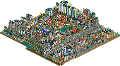
Welcome to Tivoli Utrecht. I have lived in Utrecht for over 10 years now, about as long as it took me
to create this park.
For me this is more than an RCT park, it’s a diary of my life here in Utrecht (and some travels/life events that happened in the meantime), and probably contains tons of references to my experiences here that would go over everyone else’s head. The other ten year journey that is visible is my progress as an RCT-builder. There are parts built in 2011 and parts built in 2022.
Since it’s such a personal, and ongoing project I actually have a hard time releasing this, but every diary runs out of pages forcing you to start a new one.
- Don't forget to check out the readme for reference pictures.
- Special thanks to Gustav Goblin for helping with making some of the traffic work. -
3 fans
 Fans of this park
-
 Full-Size Map
-
 Download Park
277
-
 Objects
1
-
 Tags
Tags


This is so awesome to see. Love all the little Utrecht details you've got in here. From Roost aan de Singel, to the removing of the highway, to the scaffolding around the Dom. And also great recognizable other buildings like the old post office, the station area and the building side of mediamarkt.
For me it's so great, that I had a longer time watching all the city details than the park itself, which was just there for me. I loved the small details, like the small chinese/japanese towers, and the entrance.
Good job Faas! Thanks for bringing Utrecht to life in RCT2.
Ugh, this has gone wrong.
Come on, Faas' park isn't that bad is it
This was a fun and super charming park. I really enjoyed it.
Here's a video review:
https://youtu.be/eXyqn1MK8W4
You’ve shown a lot of this park over the years, so not much here is a surprise to me. But enjoying this thing in full at my own pace, with carousel music blasting from my speakers, that is new! The park shows its age in varying quality in the architecture. You’ve begun to explore modern styles more and more over the years, and I think that’s also where you’re best. The towers near the station, the blue warehouse, the glass turret, the library… These are fantastic. The historical stuff is more hit or miss for me, but as a whole it succeeds in creating a convincing lively urban environment that I enjoy spending time in. I find myself exploring the perimeter of the map, skipping the actual park… It’s good, though. Samurai obviously steals the show but there is a lot of smaller stuff that I enjoy as well. The mat slides, the little depressed seating area on the water nearby, the performance stage and the curvy white architecture next to it, the ride naming (A2 Racer, Rotondepret… Love it). I think your park overall is a good blend of actual good parkmaking, a portrait of Utrecht, asinine random references and political commentary. Well deserved accolade score.
Amazing to me that this map uses under 7,500 tiles. With the amount of urban content you've fit here, it feels full-sized. I'm not going to count every tile individually, but the rough count suggests that this is about the equivalent of two H2H maps, which I find to be mind-blowing.
Equally mind-blowing to me is that you built this whole thing essentially in .sv6 format without exceeding the object slot limits until the very end (only 255 small objects used, so you only needed three more when you switched to .park). I saw this when it was very close to completion in 2022, and, as someone who struggled to remain within these limits on maps half this size, I was amazed at how far you stretched your architectural objects in particular to incorporate so many different styles. This brand of resourcefulness has become something of a lost art in CS parks, but it deserves recognition here because this is a park that proves high quality RCT can still exist within Chris Sawyer's original limitations. Not to mention that a significant portion of these objects are from a 2014 bench, and the park still looks fantastic in 2024.
As for the actual content of the park, that also deserves recognition. Lovely coasters and flat rides with fun theming (the mat slide is cooked to perfection) accompanied by jaunty theme park architecture that feels real and accessible but also evokes pure RCT fun. And it's all surrounded by an immersive urban environment packed full of lifelike details, combining traditional and modern Dutch styles in a way that feels very relatable in today's world. Overall, what I love most about what you've created here is that it looks like a realistic Dutch urban setting even to someone who has never been to the Netherlands outside of the airport. For someone who lives here or is familiar with Utrecht, this map may evoke Leo DiCaprio pointing at the TV, but you've channeled the identity of the place well enough for it to feel familiar to those of us who have only seen it in pictures.
I love parks that come to life as real places, and I love parks that channel the raw joy of building a RCT park. You've done both here, and the more I look at this park, the more this becomes one of my favorite releases of 2023.
And I love that there are bicycles underwater in the river. As someone who occasionally includes land vehicles inexplicably finding their way into various water ways (go karts are my preferred weapon of choice), with the implication being that someone out there is just that bad at driving them, this will always be funny to me.