Park / Charybdis and Scylla

22 Comments

  • Babar Tapie%s's Photo

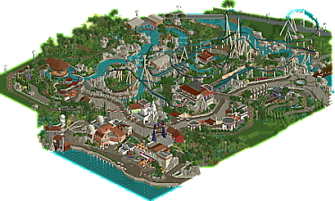
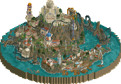
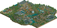
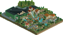
    I haven't had the opportunity to rate this park, but I think I'd give it a solid 85%. I find it very fluid, coherent and realistic. Some elements are truly inspiring : the queues, the scenery, the paths, the foliage and so much more. Some might say that it sometimes lacks detail (I haven't read the reviews), but I think it's a pretty good example of mastered simplicity.

  • Lurker%s's Photo

    I really enjoy the style and composition of this, the shades of green on the foliage have a nice pleasant contrast with the park. The main rides have some good interaction, great support work and well done details (I especially like how the track switch was modeled).

    Paths are another highlight for me, great use of diagonals and materials and that area by the ride entrance is so good. Architecture has a nice variety and good atmosphere, especially the area by the water.

  • Terry Inferno%s's Photo
    This one grows on me the more I look at it.
     
    If ever one were to somehow forget that you have a keen eye for real-world aesthetics, the way you've used curves and half-diagonals in such lovely conjunction with right angles to create such natural shapes in your buildings, paths, grass and waterways reinforces this knowledge. Sure, it has a few supports underwater and a crown moulding or two missing (and the one little corner that seems to be unfinished), but considering all that is on the map, it is difficult for me to take off a significant percentage for what is otherwise one of the most naturally-flowing Design maps of the half-diagonal era. In a strange way, the slight unfinished bits almost add to the charm in this particular case, as they do paint a further portrait into understanding the artist. All of these buildings work in wonderful harmony with one another, and your object usage for clever new details--the laser bridge and the curved staircase over wooden track are just a couple examples--continues to shine as it always has. Such a pleasure to take this one in, and like most of your maps, I will be using this regularly as a reference as I experiment with the ever-expanding set of half-diagonal objects.
     
    If my only real bit of feedback is that the color of the coaster blends in a bit too well with the landscape*--I like to see coasters in all their glory from space, so light water or a bright warm color like red or orange would have accentuated this coaster's aesthetic power--then it is a testament to your abilities in all facets of the game and bringing them all together to create a larger picture. Worldbuilding comes to you very naturally, so I hope you are able to find some amount of positive something or other from the creation process.
     
    *My shirt is literally the exact color of Scylla as I type this, so I certainly appreciate the mystic draw of dark water as a whole.