- Views 2,779
- Downloads 401
- Fans 1
- Comments 15
-
-
 64.00%(required: 65%)
 Design Submission

Jaguar 75% RWE 70% SSSammy 70% CoasterCreator9 65% In:Cities 65% ottersalad 65% Terry Inferno 65% Faas 60% G Force 60% posix 60% Scoop 60% Xtreme97 60% 64.00% -
 Description
There are two things that mainly inspired this park:
The release of the RMC hybrid and single rail roller coasters. Literally game changing.
A visit to Miniature Wunderland in Hamburg. I visited yesteryear and found the way they use varying scale and loads of small/hidden details to entertain and keep the attention of viewers fascinating. So when I started this park I did so with the goal that there should be something to look at everywhere, including under water and on the most remote rocks.
Also, a honorable mention to Wildfire at Kolmården for transforming enormous roller coasters built in unlikely locations from fantasy into realism.
The park look best when viewed using the OpenGL renderer as there is some glitching I did not manage to fix when using the standard renderer. -
1 fan
 Fans of this park
-
 Download Park
401
-
 Objects
97
-
 Tags
Tags
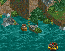
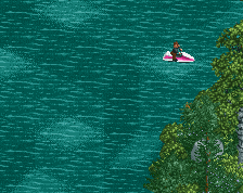
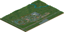
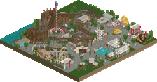
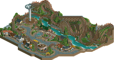
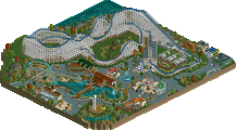
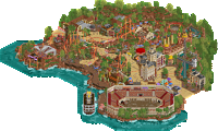
Solid little map Narc. It's dominated by the hybrid coaster, obviously, but I think the supporting attractions are also very solid. The detailing around the raft ride was quite good and kept me peaking around for long than I probably would have normally. Archy wise, things are a bit blocky and perhaps a little lacking in color, but overall functional and believable, feels very much like it would belong in a smaller park like this. I think you've made some great progress with your work recently, hopefully more is coming.
OddmentsAlchemyLab Offline
I'll do the criticism first since it's brief. The stats of the RMC are off-putting and a bit disappointing. I know it's the drop number and the layout size it what it is.
That's it.
The praise is a bit beefier.
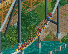
This island-hoping layout is fantastic. For an out-and-back this is terrain perfect. The water-hopping supports are really sharp. And the splash boat ride passing under the supports is perfectly chill and smartly placed. The modified dogleg works well and keeping the tracks tight increases the movement visuals of the train.
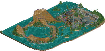
The waterwork and landscaping is on point and immediately (after the towering RMC) catches the eye. Flipping the park around shows how much detail went into each chunk.
The plaza is clean and sharp and the Single Rail is tight and simple, the more traditional dogleg creates a great boundary and draws the eye back to the path and buildings. It does have a State Park feel about it, but it is all very well composed. The size variation while keeping with an aesthetic choice mirrors State Park shelter design and adds a depth of realism for me.
Honestly - all of these parks that dropped on 8/22/23 have been attention grabbing. Not sure what the challenge was for these builds as I don't visit discord. But they all have an elevated realism which I didn't think I'd like as much as I do.
Edit - Forgot to mention the Apex Ride Sign/Arch. It deserves a round of applause.
Great to see this out! Congrats on the release! I love the singe rail, one of the most realistic layouts ive ever seen. I love the way it cuts into the landscape while the woodie doesnt. It kinda goes with the man (edgerunner) vs nature (apex) subtext. It looks like you got better while you making this! I’ve already shared alot with you but on discord but its great to see this released. Cant wait to see the next thing! Always gald to see you enter the build challenges
Really cool layout you got here Narc. Layout is ace - it is quite massive, but realistic. Hauls ass through the layout and looks like it would be an amazing ride experience IRL. Really the highlight on this map as it should be.
The rapids was a bit of a letdown. You have great detailing around it, but it's just a slow loop through the bay and around the supports.
I think the architecture on the map is what holds this back though. The blocky, underdetailed archy is maybe low bronze work which is a let down considering how much I enjoyed the main attraction.
Having said that, I will say that the foliage, landscaping is excellent! Hope this lands you a design.
Thanks for your comments, criticism and praise!
Spot on really.
Fictional architecture is something I find difficult and perhaps even somewhat intimidating. Custom scenery would probably help making creating interesting architecture easier for me as it's better suited for more advanced shapes (a fledgling example of this can be seen in my latest MM entry). However, in most of my releases up until now, including this one, I've tried to build in a style that's true to an idea of a somewhat difficult to define vanilla RCT2 look. Keeping within that stylistic framework most of my attempts at anything but utilitarian and boring (but realistic) boxes looks really amateurish and out of place. So I settle for simple architecture that I personally feel don't detract from the overall map, and let the main set pieces and overall composition do the heavy lifting.
I'm starting to feel like I've done all I want with this look, and expect that my building style will shift noticeably in the near future. However, I'm still occasionally working on a larger solo that there's still a decent chance that I will complete and I'll certainly keep your criticism in mind as I try to complete it.
My particular park is not part of any challenge, it just received the honor of dropping together with a bunch of stellar work. Not sure about the others.
I like both coasters. Apex brought me vibes of Iron Gwazi at BGT and gave me an intuitive sense of what it would be like to ride it in real life. EdgeRunner looked pretty fun too, better than the Raptor I've ridden in real life.
I liked how daring and imposing the coaster is. I also loved the rockwork and foliage around it.
The actual park bit (with the peeps) was a bit confusing to me. I think considering the composition of things more will definitely turn your work up a notch!
An example (there are more) is the little square where Apex's coaster entrance is. The layout of the square leads you to the head of it, where you expect the coaster entrance to be, including a cool eye catching element maybe. Instead all of the attention is focused towards a rather underwhelming souvenir shack and a blind wall. The entrance to the ride is actually to the side, followed by an immediate sharp turn towards the station. It would have made a lot more sense if you switched the shack and the coaster entrance. See below for what I mean:
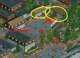
I think the entrance area of the other coaster was much more succesful in this regard.
A design submission should focus on a strong layout, a clear composition of the coaster in relation to its environment, with the two naturally interacting. In my opinion you just missed the mark on those aspects, but with some more focus on these aspects, I definitely see some very cool stuff for you in the future!
Talk about an impressive coaster damn! I really like the massive scope of it, the pacing is great and the layout itself packs a punch. My only wish would've been to see footers for the RMC Hybrid but I know how much of a pain that is for bigger coasters (which this one definitely qualifies as lol).
I really like that you paid as much attention to the underwater surface as the park itself. Nice sub-aquatic terrain. And I found the treasure
While pretty simple, this entrance (sign) works really well imo and is worth a special shout-out. Great work Narc!
Very pleasant map with fun details. Definitely an improvement over your previous work in just about every way. Apex is a whopper of an RMC, and Edge Runner has a straightforwardly flowy layout that would feel at home in any large park. You've done well keeping this within a classic "RCT" style without it losing its identity or becoming particularly generic.
A few notes to take into your next build now that you've branched further into the semi side of semi-NCSO...
- Waves look cleaner when there is a larger form to their construction... throwing them in one at a time all over the place can detract from the illusion that they are actually waves, as there is no clear path of motion to create the effect. The best waves on this map are the ones in the corner around the jagged rocks near the Egyptian ruins, as they create larger lines to show where the water is coming from and which direction it would be moving in.
- Ruins as rocks are a classic technique, but much like waves, they really shine when they are built to create larger shapes rather than just standalone pieces. Jagged land rocks seem to be becoming increasingly popular these days, and even these look best when you use them to create larger forms rather than each square doing something completely different from every square around it.
- The rowboats all eventually freeze in place trying to squeeze into the boat hire track at once, which I'm not even sure how to fix other than to just avoid using the track pieces altogether and instead just going full freeform - that's just one of those annoying old RCT2 oversights that Open will hopefully find a solution for eventually.
- Shifty Corp's design is somewhat curious as a river rapids ride, as it begins with the climax of the ride and contains almost no other thrill elements afterwards.
I see what others mean in regards to the (N)architecture feeling more on the generic and blocky side. Stylistically, I believe the colors and textures you've used here show noticeable improvement over your previous works, and though they do tend to be almost exclusively large rectangles here, the style is believable and has its own identity... it could pass more or less as a real set of buildings. The next step for you will probably be to branch out from full-tile objects and add quarter-tile blocks and roofs into your architectural palette, as then you will have even fewer limits as to the shapes that you can create. Shifty Corp's station is the star of the show here as far as buildings go.
Although this did miss Design by just a point, a score so close indicates that it really could have gone either way, so I truly believe you will get there with your next attempt.
I like the clean, semi-CSO style this has, also the landscaping and foliage. The underwater scenery is nice and finding the hidden stuff was fun.
The main coaster is impressive and pulls off the island-to-island setup well, and the supporting coaster has a good layout with some really nice clean support work.
Tough miss this one Narc, but I'm looking forward to what happens when you develop your game a bit more. No concrete advice other than to keep playing and experimenting, and never to lose the focus on aesthetic value.
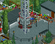
First reaction when I opened the map: meh architecture, uninspired unncessary blend of NCSO with a few modern objects... While the architecture remains this map's weakness, as a whole it got better the longer I looked at it. Talent is shining through. We saw that before, but there is clear progress. What a fun, rich little map you made! Lots of cool details. Apex is huge. And fast. Perhaps too fast. But it's cool. EdgeRunner is very nice. I'm liking the rapids too. I'd even say that the area around the rapids station is the best bit on the map, together with the S&S towers. The covered drop/lift, the queue looking out over the lake, the multi level paths, the foliage, it all comes together here. Super nicely done. Now upgrade your architecture for the next release... I'd do away with stuff like the windowed walls and the railings on the roof first.
Anyway, I'm convinced your next submission will be a winner. Great stuff Narc.
That's some good criticism. Initially the entrance was where the shop is now but I wanted a longer, more winding queue and moved it. For future releases I should probably involve the community more at an earlier stage, I mostly seek criticism at a late stage when I'm only inclined to make minor changes.
I'm glad that you all like the ridiculous size of the coaster, it's one of the reasons I tagged this as semi-realism. Considering I placed 2000 or so 1k ruins I could perhaps have bothered with footers as well... You'll enjoy one of my upcoming releases, it's a more modestly shaped RMC featuring footers.
And great job finding the treasure lol
My intention with the water objects were not exactly waves, but rather to illustrate the surf based on how imagined the current travelling (image below). The water over the Egyptian ruins is supposed to move in a direction perpendicular to the shore. Perhaps this effect wasn't as clear as it was in my mind after starring at it for 100 hours heh
I don't think there's anything inherently wrong with "randomly" placed rocks (ruins) in unkempt foliage, there's many natural environments where they occur like that. Of course, it's a stylistic choice and your opinion is certainly not wrong. I'm exploring larger shapes based on ruins in an upcoming release, I'll post a screen next time I'm at home.
And yeah, the boats are a pain in the ass. I didn't get full freeform to work as scenery blocked the station, but in hindsight I could perhaps have fixed it by moving the surface to the absolute top on those tiles.
The design of the rapids ride suffered slightly from it being an accessor to Apex. I did think about it but couldn't come up with a solution that didn't change my vision for Apex too much.
Also, (N)architecture lmao
Your tip to experiment more with quarter tile objects for roofs is certainly a good one that I'll make sure to remember as I finalize my next submission.
Finally found time to reply to the last comments!
I'm really glad that people are enjoying the underwater stuff. All things considered I probably spent more time on the underwater world than I did on Apex (supports included) itself.
I might be in a minority here but I love supporting steel coasters. Building realistic and fun supports within the constraints created by your design is a fun puzzle.
Without diminishing the value of the Design Accolade, I'm really happy with the score for the sheer entertainment value of hitting 64%. (And also, it's not a bad score.)
I'll really have to apply myself when it comes to architecture. My next release, without any windowed walls, is coming Soon™.
Apex is certainly (and intentionally) pushing the bounds of what is possible to build in RCT2 while keeping it realistic. I've left trim brakes visible and choose to avoid inversions during the first half in an attempt to help with the suspension of disbelief. Earlier iterations looked absolutely ridiculous.
Got served this in the 'Similar parks' list while reviewing something else - I love the macro, what a lovely overview with the big Hybrid against the water. Nice landscaping and foliage. Would have been a design worth vote from me!